With the recent update, Divi Blog Extras has become even more functional and creative. Now, users can create Masonry blog pages with the new Divi Masonry blog layout option. For Divi Blog Extras’ users, now they have a total of 7 blog layouts for Divi blog styling. Apart from these blog layouts, its additional customization options are available to help you create attractive and engaging Divi blog category pages.
Now, without any further due, we should move on to the topic, how to create Divi masonry blog pages. However, before we start building our blog pages, you should take a look at some of the Divi blog examples.
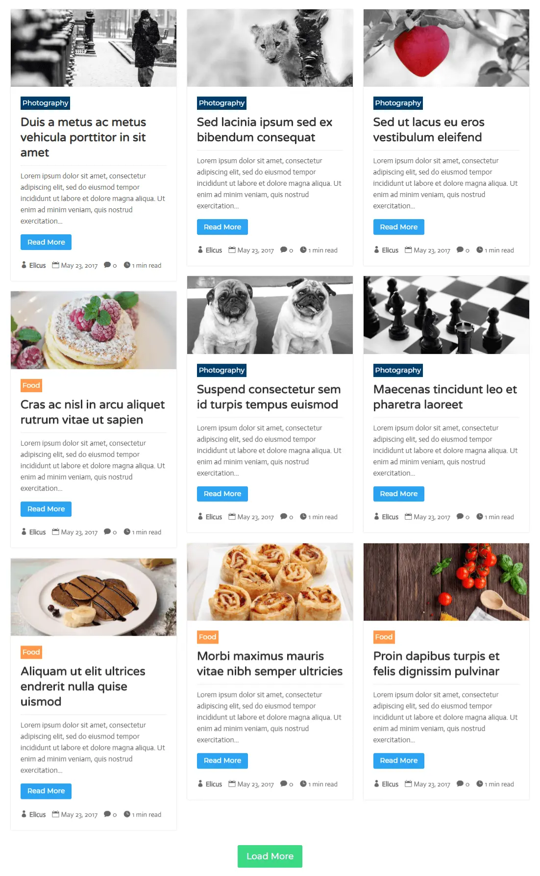
Preview 1
Masonry: Vertical Grid Variant With 3 Columns
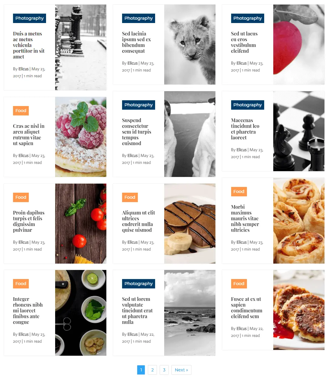
Preview 2
Masonry: Grid Extended Variant with 3 Columns
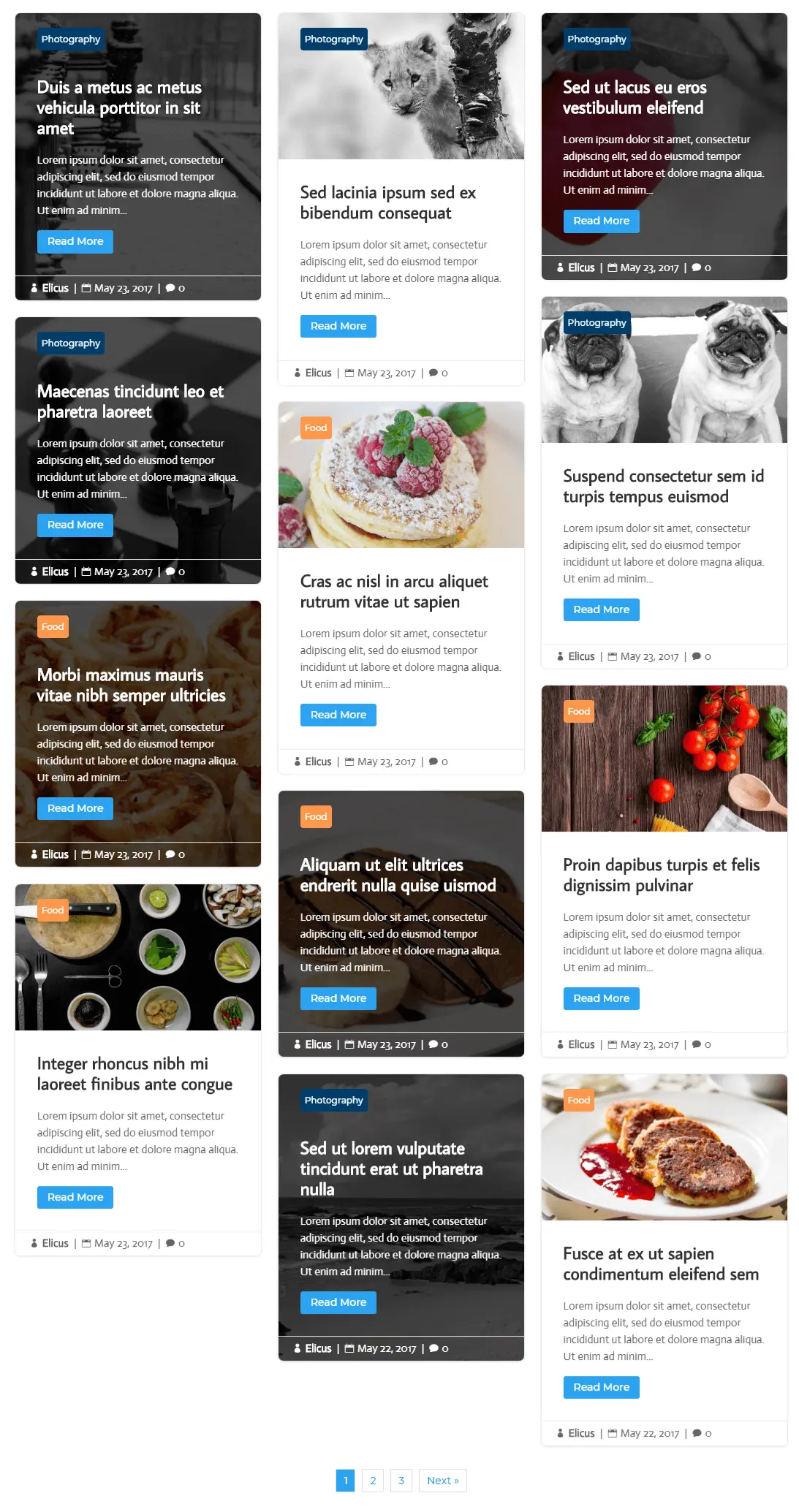
Preview 3
Masonry: Block Extended Variant With 3 Columns and Featured Image Position Alternate
Basic requirements to create Divi Masonry blog layout
To create Divi Masonry blog pages, you need to do a few things first.
- If you haven’t yet, purchase the Divi Blog Extras plugin.
- Then, install and activate.
- Once the plugin activated, create a new or edit an existing one, where you want to create a Divi Masonry blog.
- Deploy the Divi Front End Builder, where you’ll get the white canvas to start Masonry blog page design.
Add Divi Blog Extras module to create Divi Masonry blog page
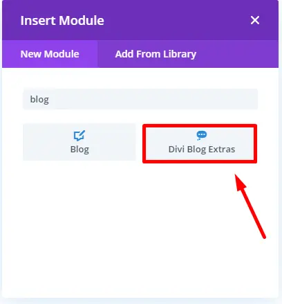
Once the Divi visual builder loads, add a single column row and insert the Divi Blog Extras Module.
Choose Divi masonry blog layout in Divi Blog Extras
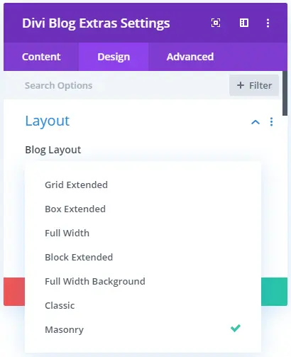
Then go to the Design tab of the Divi Blog Extras module, and inside the layout setting, choose Masonry blog layout.
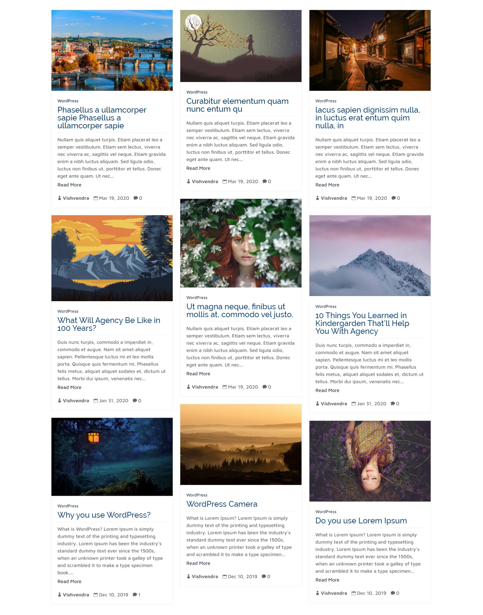
As soon as the module gets loaded, the below blog page appearance would come by default.
Customize blog page content
Before we start Divi blog styling of our masonry blog layout, it’s for best practices that we should customize its content first. There are multiple options to customize the content, which makes the masonry blog page look more impressive.
Content
Content settings of the Divi Blog Extras module allow users to set the number of posts they want to show in a single page view. Users can skip how many posts they want not to display. Select the order of the post display and choose how you want to order them, such as date, title, slug, and more.
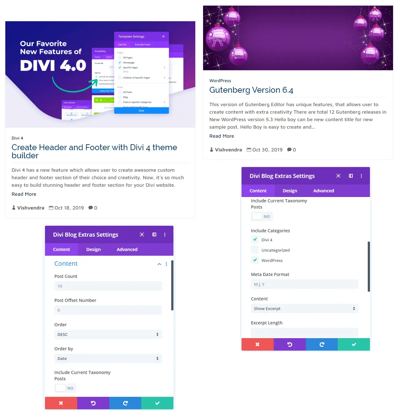
Users can also choose to display posts based on several categories and taxonomies. Display either all categories posts or select specific categories to display blog posts on the blog page. Content settings also give user functionality to change the default date format, Show Excerpt, or complete content. Everything is in the control of the blog page designer.
Elements
Elements setting available in the Content tab of the Divi Blog Extras module gives users the ability to add or manage the post element of a blog page. Using this available option, you can decide to show Read More link, author name, show date, comments, read time, and more.
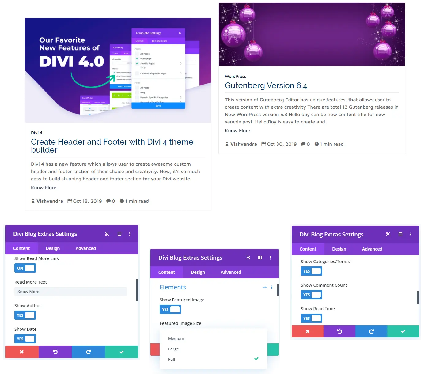
Elements setting also gives users the ability to display a featured image or not. You can even choose the size of the featured image you want to show. Available options for the featured image display are Medium, Large, and Full.
Pagination
With Divi Blog Masonry Layout, you also get the option to add pagination on your blog page. It comes with 2 pagination layout options, Numbered and Ajax, that you can easily apply by going to the Pagination settings in the Content tab, and check the “Show Pagination” as “YES.” In this same setting, you’d also get the option to select the desired pagination type. The below image showcases the Ajax Pagination of the masonry blog layout.
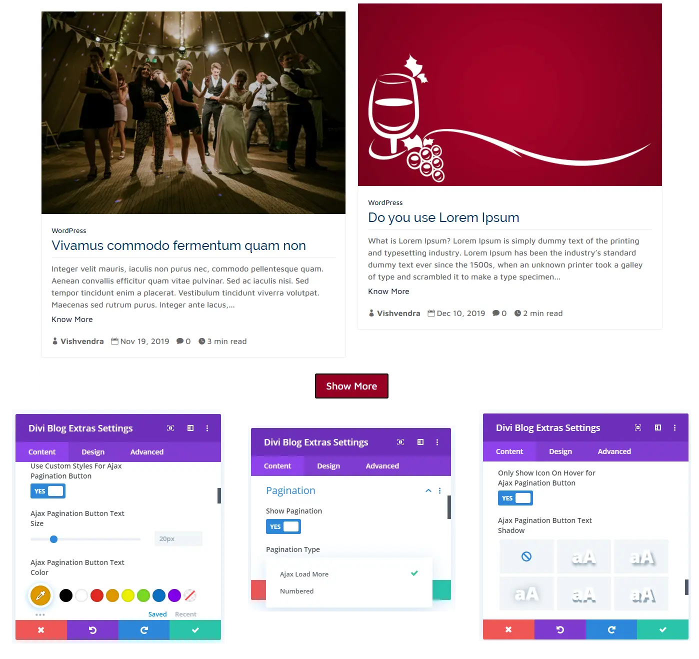
In addition to the pagination types, there are multiple customization settings also available that make the pagination look even more beautiful. Using these pagination settings, you can change the size of the button text. Add the desired color to the button text. Apply hover effects, shadow effects, and much more.
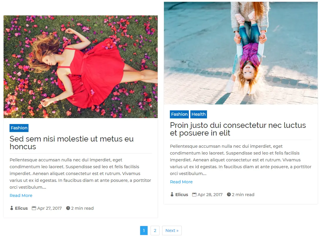
The above illustration depicts the Numbered pagination type that is available with Divi Blog Extras’ Masonry layout. Using the same extra settings available in the pagination, you can also customize this.
Design Divi masonry blog page
After you choose the masonry blog layout, you get multiple options to make a blog page even more attractive and unique. One of the fantastic features of Divi Blog Extras’ each blog that they come with additional settings and variation. And this same applies to the masonry layout it offers.
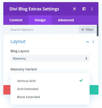
Masonry blog layout variant available with the Blog Extras plugin are Vertical Grid, Grid Extended, and Block Extended.
Vertical Grid
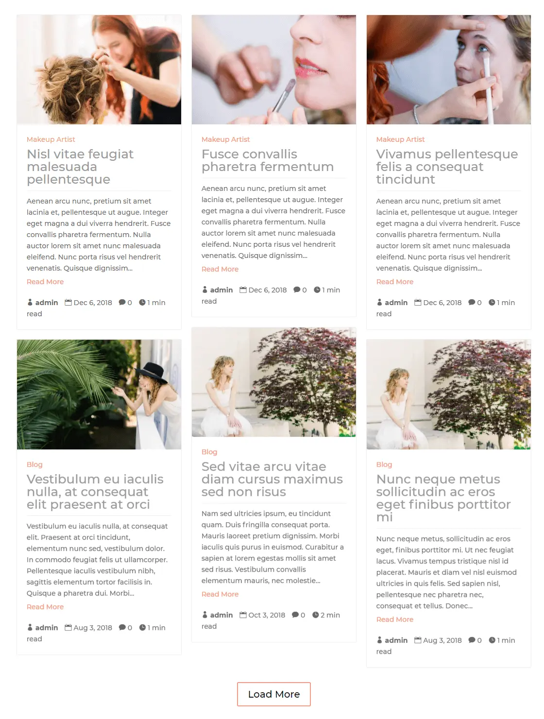
Vertical Grid Masonry blog layout comes with featured images at the top, and post title & category underneath it in a column separated by a line. And after them, post excerpt and meta description with read more link. The above image showcases the 3 column variation of the Vertical Grid Masonry layout, but you also have the option to choose 2 and 4 column placement.
Grid Extended
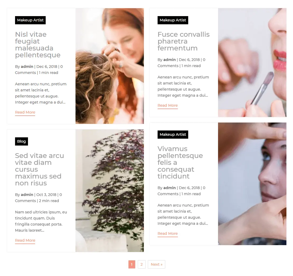
Variation Grid Extended, of the Masonry layout display, featured image side by side of the post content. Just like the Vertical Grid variation, you can choose the number of columns you want to display posts in. Furthermore, there are other options also available to customize the layout.
Block Extended
Block Extended of the masonry layout has a more number of options to create a unique blog page than the above layouts. Unlike Vertical Grid & Grid Extended masonry blog layout variation, it has featured image positioning options. Using this feature, you can display images of the posts on the blog page at Top, in Background, and choose to display both with Alternate options.
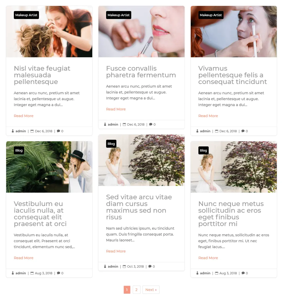
The above image depicts the Block Extended Masonry Blog Layout with images at the top.
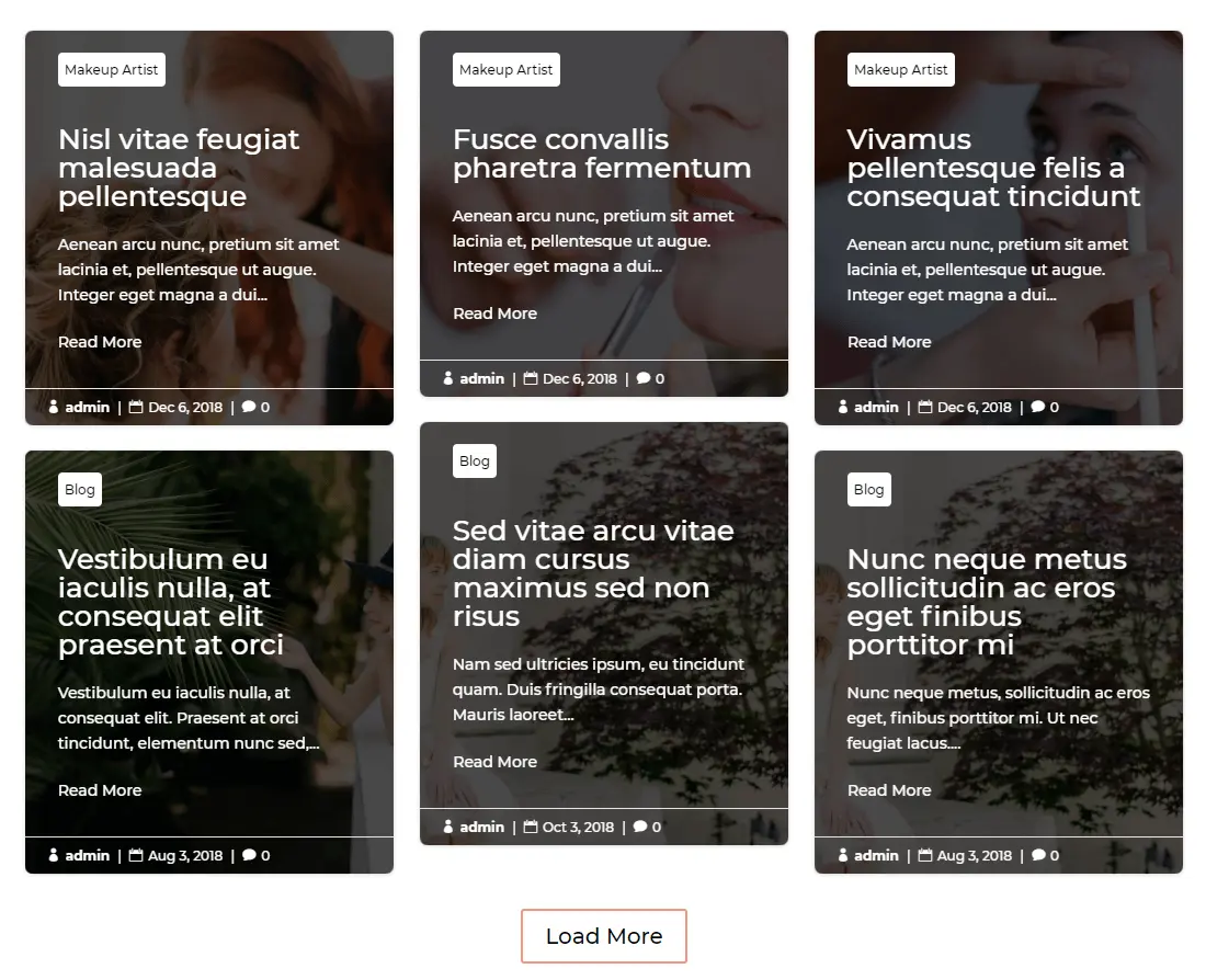
Here, this illustration showcases Block Extended Masonry layout with featured images in the background.
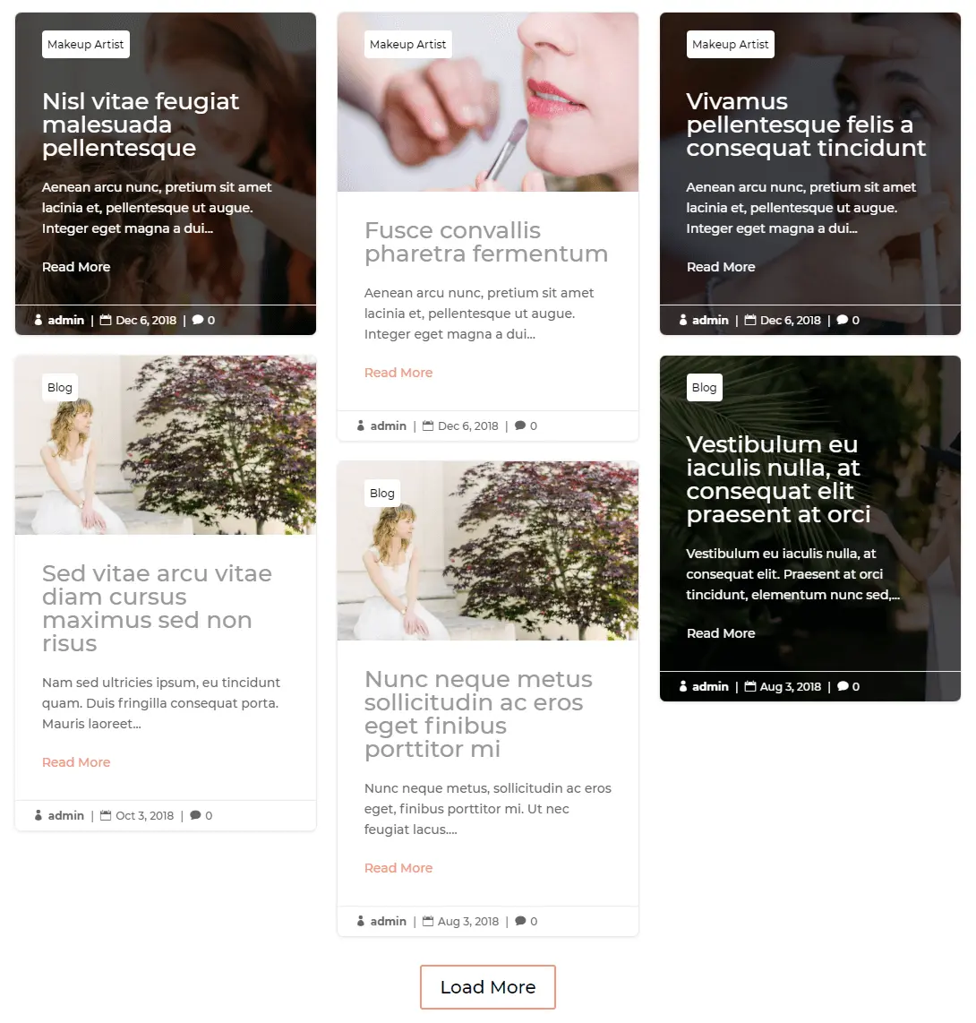
And finally, the above image represents the Alternate featured image position of the Block Extended Masonry blog layout variation.
Summary
Above, we’ve shown you how you can create Divi masonry blog pages using the new layout of the Divi Blog Extras plugin. We’ve covered all the features of the new masonry blog layout. So, you can create even more attractive and engaging blog pages with complete functionality. Therefore, if you haven’t got this plugin yet, and want to create beautiful Divi theme masonry blog, then go and get this plugin now!




Hello! I am trying to get a blog layout like your first example, the vertical grid, but it won’t give me an option for where to put the featured image. It is showing up below the title and snippet in the grid, which makes it confusing for readers. I’ve switched to block extended for now because that allows me to have the featured image on top, but it crops the image and I haven’t been able to figure out how to make it not crop. Thanks for any help you can provide!