For a digital store, a product page must look admissible and provide users with the required information and excitement to attach their feelings and emotions to the particular product they’re reviewing. It makes it easy for them to reach the decision state from considering, which is converting or we can say purchasing what they’re looking at. The same is true with the Divi WooCommerce product page layouts.
If you’re building a Divi shop then it’s essential that its product pages should create urgency in customers’ minds. With the available Divi product page layout on your site they can connect and engage with its different elements. So, they can review better and decide better. It further improves the user’s session duration which further improves conversion rate. Good for customers as well as the website owner.
Therefore, if you’re looking for the ideas to create your highly converting Divi Ecommerce product page layout yet admissible, engaging, and thought-provoking then the following tips can help you build that easily.
So, let’s check them out.
(1) Clear and Concise Start Without Distractions
It is found that after opening a particular page on a website, users only take 50 milliseconds to build their opinion, whether they like it or not. And if your Divi product page isn’t looking good from the start and distracting customers with several different elements, then you could expect them to turn your product and website down.
Therefore, it’s recommended that your Divi website’s digital store have a clear, concise, and authentic product page layout from the start. Nothing too much or nothing too less that would neither excite nor help them remain focused.
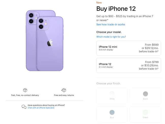
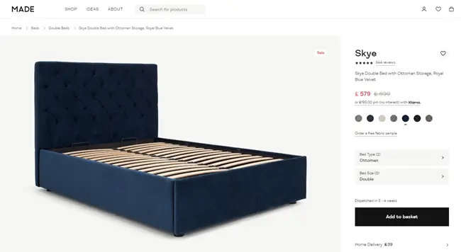
The above product page design of Apple’s iPhone 12 you could target for your Divi digital store, but if you want to add a little more details to it then, Made.com’s furniture product page could become your inspiration.
(2) Product Images With Visibility
With a name, what we remember is the face of the person. We might forget the name, but we always remember the face, if it’s not decades. The same is true with products. Users remember how a product looks even if they forget about its model name. So, when you create a product page with adequate information, it’s crucial that you definitely add its images.
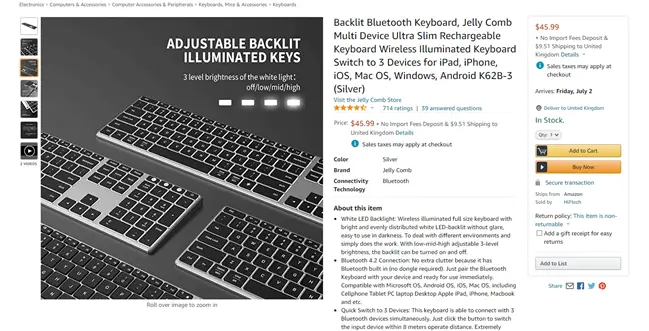
Images impact users’ ideas and beliefs a lot, and with that, they also attract and encourage them to engage with the fine detailing of the product seen in the graphic. No matter what category the product is, whether a physical like furniture or a digital one like software and all, images like information are a must.
The perfect location to show product images is at the start, and the perfect example for it is Amazon.com. It displays product images nicely, plus, the zoom effect sets everything for the customer.
(3) Win Trust With Star Ratings at the Start
Trust is vital in all businesses. And for a digital store, star ratings are the form of virtual trust. They display how good a particular product is performing and how many supporters are there for it. When creating a Divi eCommerce product page, you should consider adding a star rating area clearly visible to the website visitors.
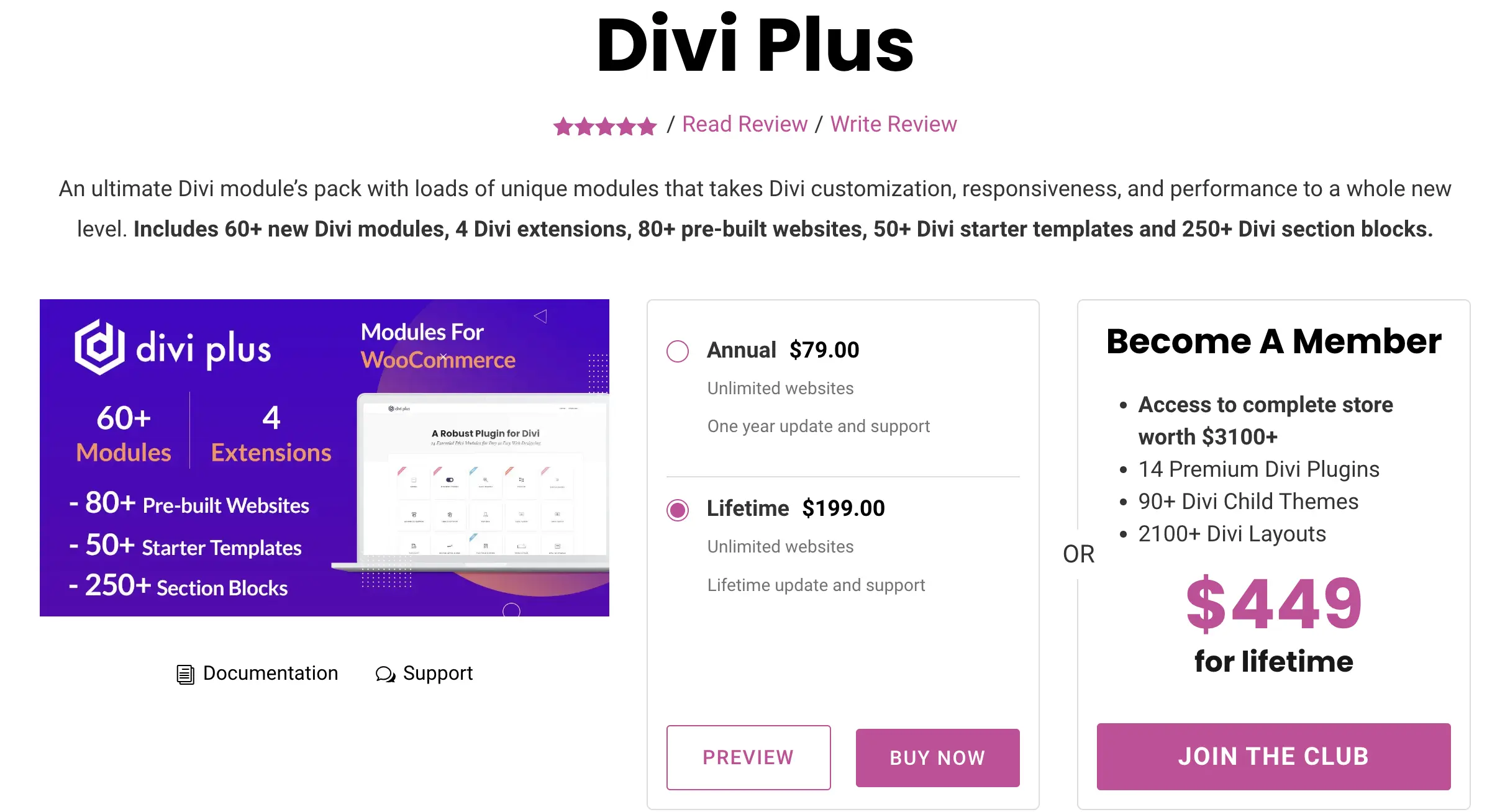
Not only do they build trust but also infuse this feeling of satisfaction in users’ minds that when they purchase this particular product, it won’t disappoint them. For a clear star rating area selection, you could take the Divi Extended product page as an example.
(4) Divi WooCommerce Product Page Should Follow Proper Flow
Everything has a structure. Without it, nothing works at all. The same applies to Divi product page layouts. They should follow a proper flow or structure to present its features and details to the customers in the best possible way. You bring elements randomly without any apparent intention, then all they’ll do is confuse customers with the content and pressure them to leave the page right away.
So, when creating a Divi shop product page, follow the proper structure. If simply put, then keep them straightforward. Don’t take users from one point to another like an upside-down steep.
(5) Don’t Forget CTAs on a Divi WooCommerce Product Page
If you don’t include CTAs on your WooCommerce Divi product page, how could customers purchase the particular product? And not merely CTAs but dual CTAs at the start and bottom of the page. Or if two won’t satisfy your need, then you could choose to add multiple ones. Because a product page with multiple CTAs allows customers to perform different fulfilling actions.
For example, one will enable users to add the product to the cart—another for allowing them to purchase instantly. And a third CTA to help them add that product to their wishlist.
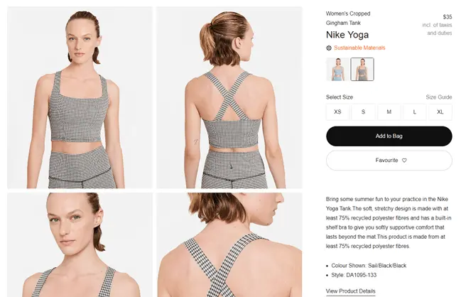
However, with multiple CTAs, it doesn’t mean you should overboard your entire Divi WooCommerce product page with CTAs as doing so would irritate users and on the place of buying they’d ignore. Too many CTAs feel like spam or forcing someone to invest against their will.
(6) Include Customer Reviews
What makes users trust more rigid with star ratings is the positive feedback or reviews from the old customers shown on the page. Customer reviews not only tell users why your product is good, but they also put in front of interested users why they should trust your product—your service.
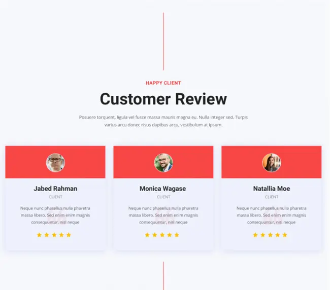
Customer reviews leave a positive impact, excite users, and helps them reach the decision stage from the considering one. Furthermore, it’s a fact that 72% of consumers won’t take any purchasing action until they read reviews. So, if your product page is missing out on customer reviews, then there’s a lot to consider before investing in your products.
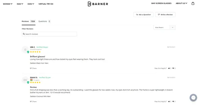
For design inspiration, you could take Barner and Amazon’s product page layout to display customer reviews. They mention how many customer reviews are there with a star rating, and when users click on them, it simply scrolls the page down to the customer review.
The key thing to notice here when displaying customer reviews is that you should be open to show people both critical and positive testimonials. In this way, you’d show customers that you’re not faking your services. Then, of course, there are single stars and five stars as well.
(7) Provide More Options on a Divi ECommerce Page
A product page dedicated to itself won’t help your digital store reach its full potential to be seen by customers. Without any other similar products or products suggestion, users will come to the current page, review it, and if they don’t like it, they’ll probably hit back, which will increase bounce rate and affect your website’s performance.
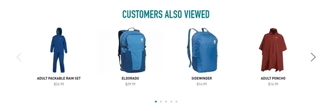
However, if you display some similar products the same as Amazon in the sidebar or at the bottom, then if they won’t like the current page, they might switch to the similar one. And perhaps reach their decision state to buy what they’re seeing. Hence, it will improve the website’s bounce rate, session duration and more sales to your business.
(8) Start With Concise Information, End With Complete Information
When creating a Divi WooCommerce product page, the wise step is to start a product page with clarity and concise information. It doesn’t distract users and provide them with all the necessary information to stick with the page or the product.
Nevertheless, key information at the start is enough to excite the users and motivate them to explore more. But, it won’t keep them longer; plus, for SEO purposes, you’d be left far behind. So, to clear users’ all doubt and perform well in terms of search engine results, you should work on your product page’s body.
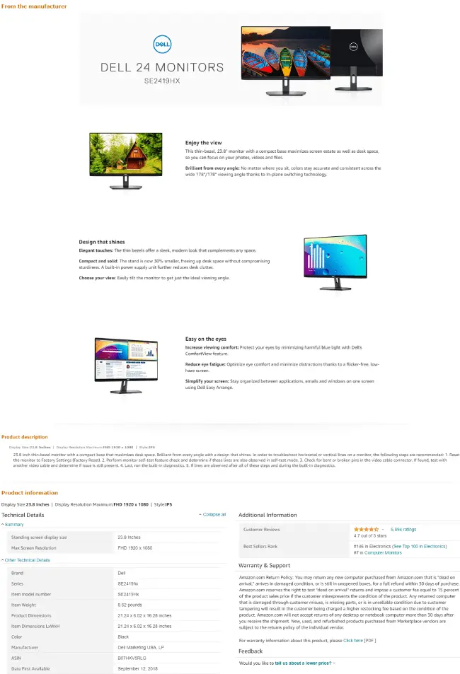
To make the Divi product page layout fully functioning, you must include complete detail about the product in the middle and at the bottom. In this way, customers will know more about your product and prefer it over other competitors. More is always helpful but in the right manner. So, keep this in mind as well that with additional information, you won’t overwhelm your users.
(9) Leverage Social Sharing
The influence of social networks on people, customers, consumers and whatnot, is more significant than everything. It could take a brand from rags to riches in a spare time. Over 60% of Instagram users stated that they discover new products on the platform. And 60 is a lot. Even, 10% of users from those, discovers your product; then you could profit a lot.
And social networks aren’t limited to Instagram. With different social networks, you could turn your 10% to 50 or even 60%. Therefore, when going for a product page for Divi, it’s recommended, you should include social sharing buttons. Users you’d find your products interesting will share them on their news feed, and from there, you could take the leverage.
(10) Ensure Responsiveness of Divi Product Page Layout
The internet users of the world are more active on their mobile phones than Computers. About 63% of traffic to retailers website happened via mobile phones in 2019, through 53% of sales generated. And if you ask mobile users whether they like to visit a website that’s not designed suitable for mobile phones, 57% of users will say no. Meaning, you’ve lost a significant amount of leads that could turn into conversion. And not just significant, but perhaps all of it.
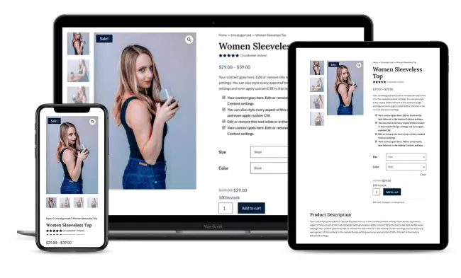
Therefore, when creating or choosing your Divi store’s product page, always keep these statistics in mind. Design or choose product page layouts that are responsive as well as look good on all the devices.
So, whether customers or consumers visit your online store using mobile phones or desktop, they’d never disappoint and choose your products without a shadow of a doubt.
(11) Try Pre-Built Divi WooCommerce Product Page Layouts
Creating a Divi WooCommerce product page from scratch is a time-consuming process. And for a digital store owner spending time to create a product page, not a favorable choice. Therefore, in this situation, what an eCommerce user can do is try to use pre-build product page layouts.
And to fulfill this need of Divi users, we’ve created Divi Layouts for WooCommerce. It’s premium Divi product page layouts pack that include over 10 different ready-to-use WooCommerce product page layouts for the Divi theme.
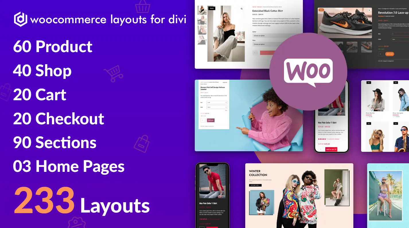
The layouts available in this package meet all the essential aspects and tips mentioned in this post to qualify as a standard product page layout. Like, responsiveness, proper structure, customer reviews, CTAs, and much more. When you create your Divi digital store’s product page using these layouts, you’ll notice a tremendous positive change in your store.
Here are some of the layouts from the Divi Layouts for WooCommerce pack,
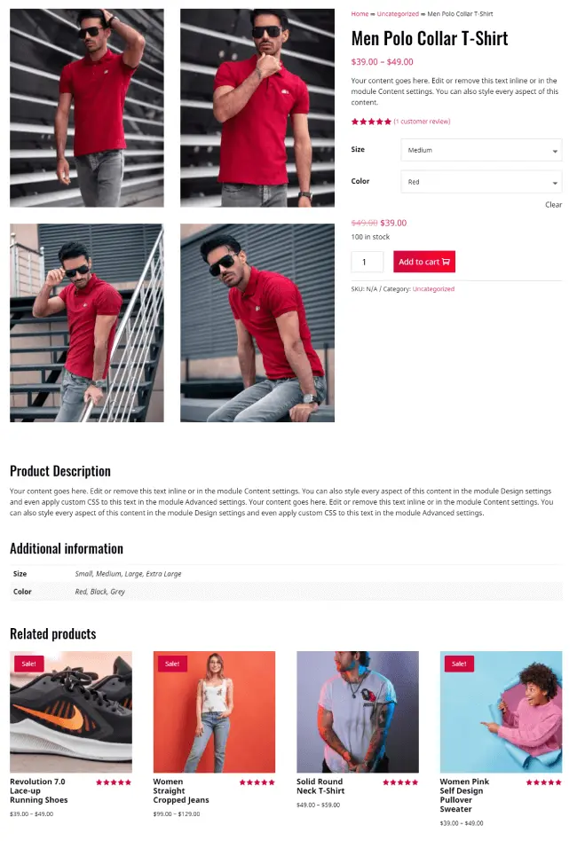
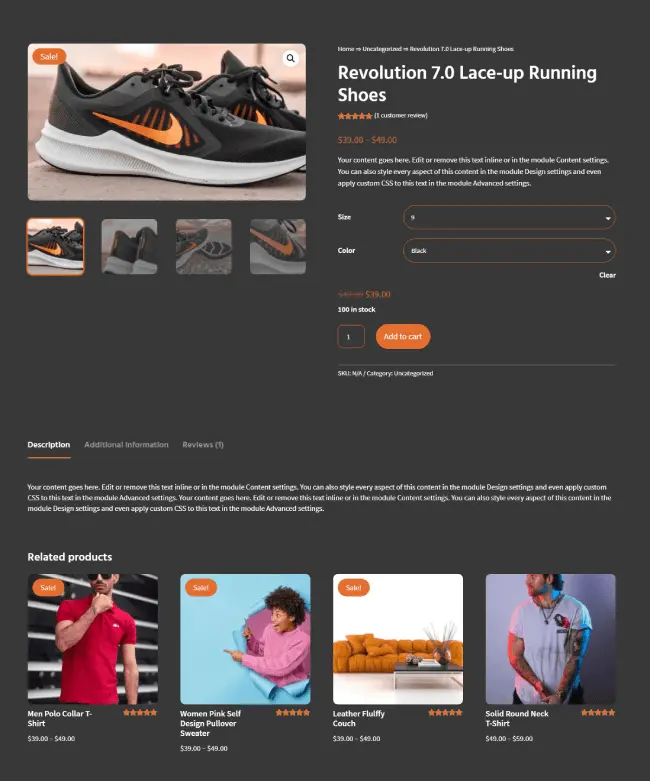
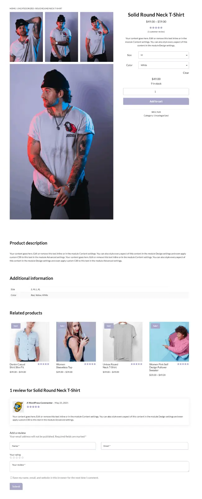
Like what you see? then go and get the Divi Layouts for WooCommerce pack today and turn your simple Divi shop into a modern one.



0 Comments