If you’ve purchased the Divi Restro Menu plugin and now wondering how to create beautiful food menus, then this blog post will help you in many ways. In addition to this, if you want to know more about this plugin, then you might want to check out this blog post.
Follow all the step by step instructions and you’ll be able to create delicious and attractive Divi restaurant menus in minutes.
Note: This post has been updated to improve quality & product information.
Preview
Divi Restaurant Menu A
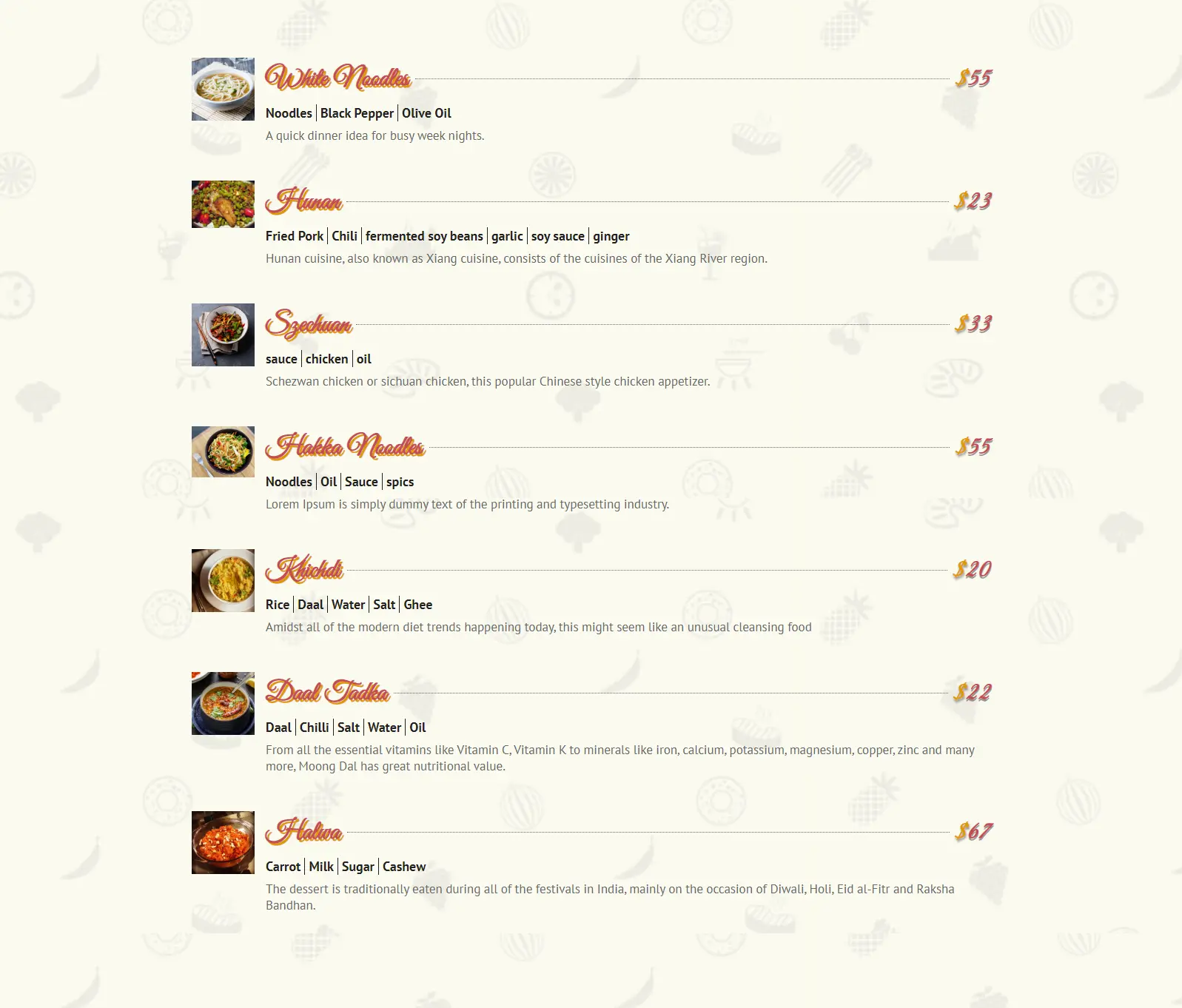
Divi Restaurant Menu B

Easy Steps to Use Divi Restro Menu plugin
Before we move on the steps to design restaurant menus make sure you’ve successfully installed and activated the plugin. Once sure, we’re ready to dive into our food menu creation process. However, if you’re finding it hard to install this plugin, then you can visit the plugin’s documentation page.
Easy Step 1: Creating Preview Restaurant Menu A
To display items on a restaurant menu, first, we need to create food items and categories with proper information. And to do so, go to Restro Menu custom post type in your WordPress dashboard created by the plugin.
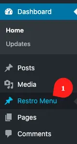
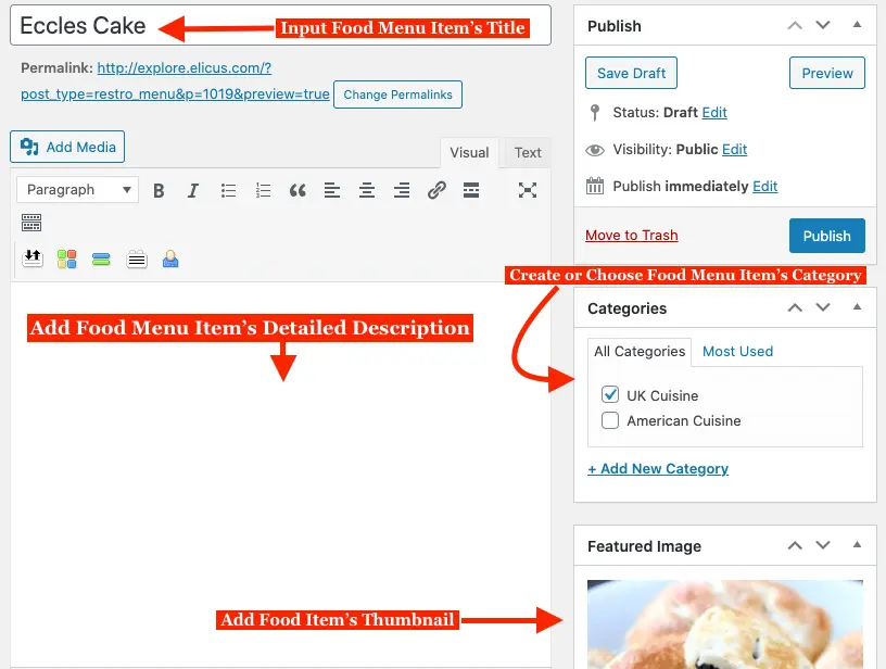
After getting into the restaurant menu food item library, click Add New to create food items.

Upon clicking the button, you’ll be advanced to a new window, where you can add information about the food item. Such as item name, category, and long description.
Below this area, you get one more menu where you can add additional information about the food item. Like Currency Symbol, Price, Ingredients, and Shot Descriptions.
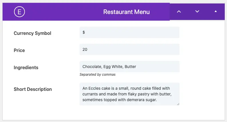
Once you’re done creating enough food items to show on the restaurant menu, you’re ready to move on to the next step.
Easy Step 2: Adding Divi Restro Menu’s Module
Edit an existing page or create a new one where you want to design food menus using this new Divi restaurant menu layout plugin.
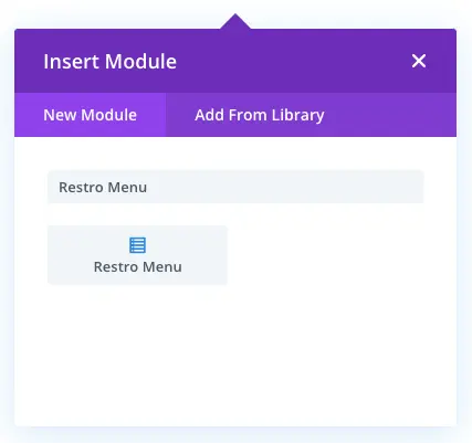
Insert the Restro Menu module on the page.
Keep the default settings upon inserting the Restro Menu module.
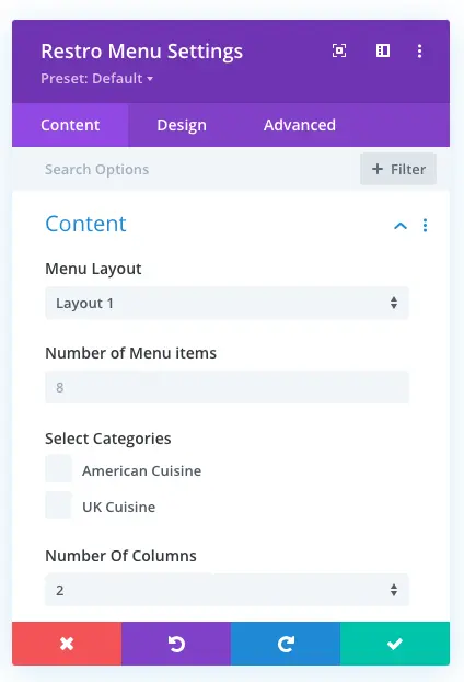
You’ll be able to see all the food items that you’ve created. Now, let’s design this area a little bit with layout 1.
But first, go to Section Settings, then add a background to section. You can add image, gradient, color, and video if you like. This would increase the presentation of the restaurant menu.
Easy Step 3: Customizing Content
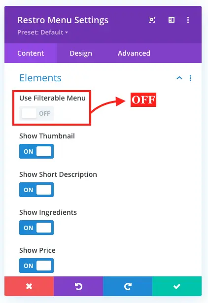
Go to Elements settings in content, and check all the elements as “ON” except “Use Filterable Menu”
Easy Step 4: Customizing Design
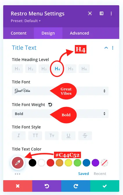
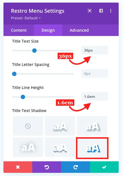
Now move on to the Design Tab, and go to Title Text. Where apply customization as follows,
Title Heading Level: H4
Font: Great Vibes
Title Font weight: Bold
Text Color: #C44C52
Title Text Size: 36px
Line Height: 1.6em
Title Text Shadow: Look in the screenshot
Title Text Shadow Color: #E09900
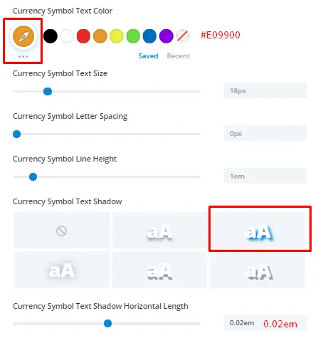
Step 4A: Currency Symbol Text Settings
Currency Symbol Text Color: #E09900
Symbol Text Shadow: Look in the screenshot
Currency Symbol Text Shadow Horizontal Length: 0.02em
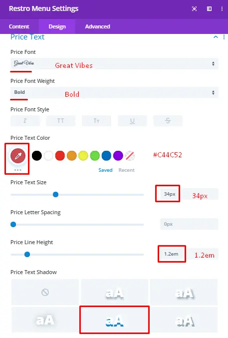
Price Text Settings-
Price Font: Great Vibes
Font Weight: Bold
Text Color: #C44C52
Text Size: 34px
Line Height: 1.2em
Price Text Shadow: Look in the screenshot
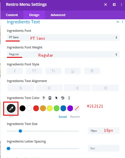
Ingredients Text Settings:
Font: PT Sans
Font Weight: Regular
Text Color: #212121
Text Size: 18px
Description Text Settings:
Font: PT Sans
Font Weight: Regular
Text Size: 17px
That’s it, we’ve successfully created preview 1st of the restaurant menu layout.

You can bring changes in the layout by adding some CSS and doing some other customizations. Follow the steps to create unique restaurant menu layout with some CSS.
Creating restaurant menu using CSS with layout 1:
In above restaurant menu layout, we kept Number of Menu items default, therefore this time input 6, and set Number of Columns as 2.
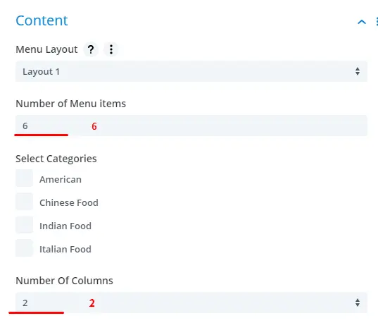
Keep Elements settings same as were before.
Design Tab
In addition to make attractive food menus, we need to tweak food item info a little bit. Therefore, head over to the title text.
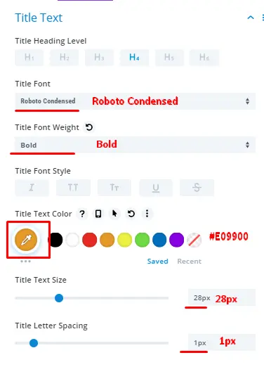
Title Text-
Title Heading Level: H4
Font: Roboto Condensed
Title Font Weight: Bold
Text Color: #E09900
Title Text Size: 28px
Letter Spacing: 1px
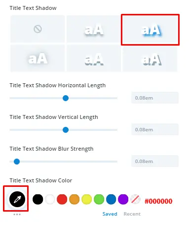
Title Text Shadow: Look in the screenshot
Title Text Shadow Color: #000000
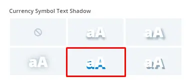
Currency Symbol Text-
Keep all default settings as they are; except color, shadow, and shadow color.
Currency Symbol Text Color: #000000
Currency Symbol Shadow: Look in the screenshot
Shadow Color: rgba(0,0,0,0.4)
Price Text Settings-
Price Font: Great Vibes
Font Weight: Bold
Text Color: #E09900
Text Size: 34px
Line Height: 1.2em
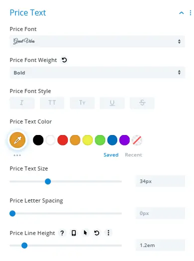
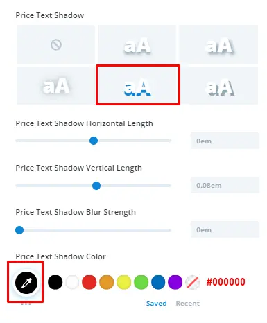
Price Text Shadow: Look in the screenshot
Price Text Shadow Color: #000000
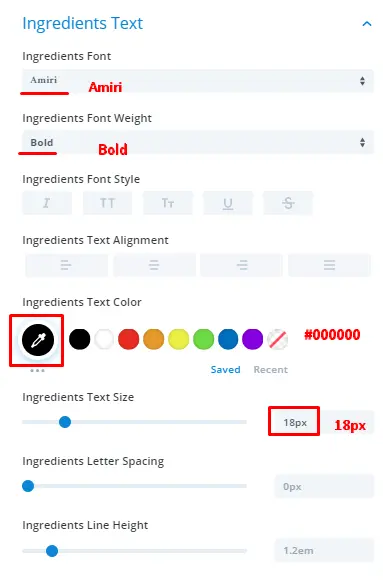
Ingredients Text Settings:
Font: Amiri
Font Weight: Bold
Text Color: #000000
Text Size: 18px
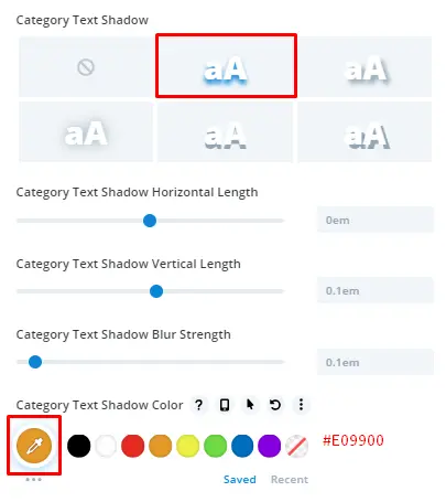
Ingredients Text Shadow: Look in the screenshot
Ingredients Text Shadow Color: #E09900
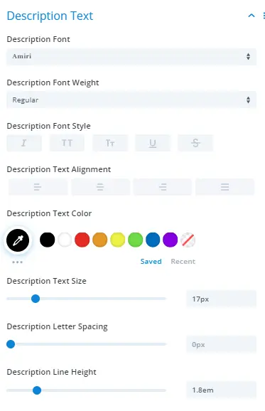
Description Text Settings:
Font: Amiri
Font Weight: Regular
Description Text Color: #000000
Text Size: 17px
Description Line Height: 1.8em
Apply some CSS-
Go to Advanced tab, in CSS Class field, and input “el-box-shadow”.
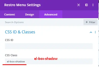
Further, save the layout, and then click the Three Bullet icon under the section.

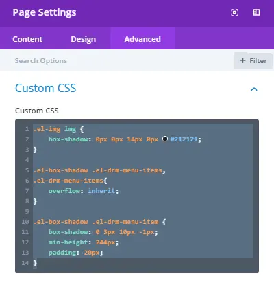
After this, go to page settings, click the icon near the delete button.

Then go to Advanced Tab, and add below CSS in the Custom CSS section.
.el-img img {
box-shadow: 0px 0px 14px 0px #212121;
}

.el-box-shadow .el-drm-menu-items,
.el-drm-menu-items{
overflow: inherit;
}

.el-box-shadow .el-drm-menu-item {
box-shadow: 0 3px 10px -1px;
min-height: 244px;
padding: 20px;
}
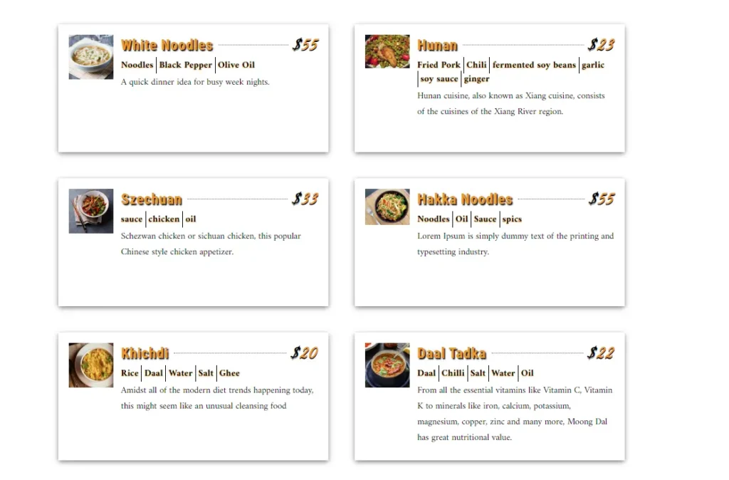
Save changes and your restaurant menu with Custom CSS is ready.
Easy step to create preview restaurant menu 2:
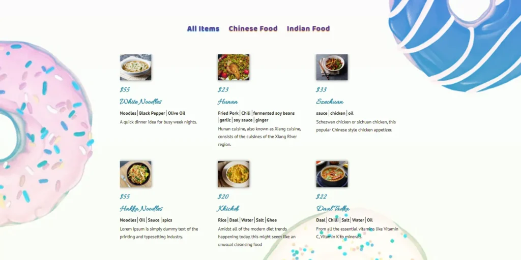
In addition to the above Divi restaurant menu, we’ll now create food menu of preview 2 using Divi Restro Menu layout 2.
Step 1
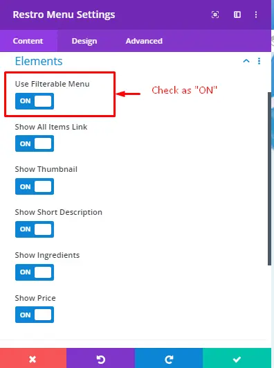
Upon inserting the module on the page, choose layout 2. Set Number of Menu Items to 6, and Number Of Columns to 3. Further move on to the Elements setting and check “Use Filterable Menu” as “ON”. This would add category filter bar over restaurant menu.
Step 2: Divi Restro Menu Layout 2 Design settings
In order to make Divi restaurant menu layout more attractive and beautiful, we’ll now customize design of the Divi Restro Menu layout 2. Head over to the Category settings.
Category Settings-
Normal-
When user don’t select any category for the view.
Category Font: Baloo
Font Weight: Regular
Category Text Color: #583BA0
Text Size: 29px
Letter Spacing: 1px
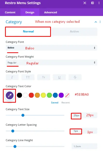
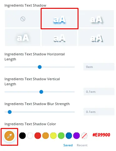
Category Text Shadow: Look in the screenshot
Category Text Shadow Color: #E09900
Active-
When user selects a particular category for the view.
Active Category Font: Baloo
Font Weight: Regular
Active Category Text Color: #583BA0
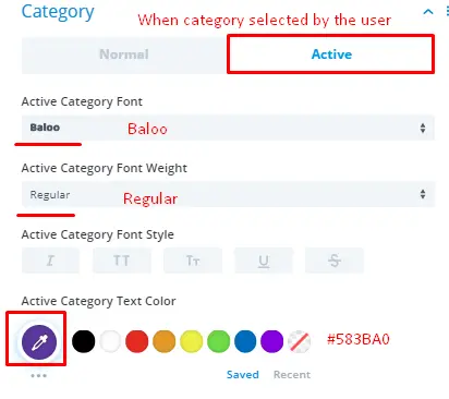
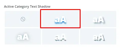
Active Category Text Shadow: Look in the screenshot
Text Shadow Color: #288FAB
Title Text-
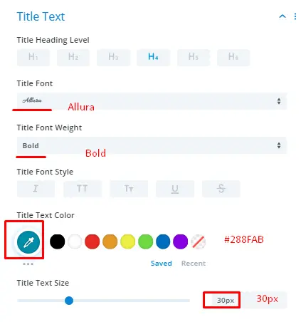
Title Heading Level: H4
Font: Allura
Title Font weight: Bold
Text Color: #288FAB
Title Text Size: 30px
Currency Symbol Text Settings-
Keep all default settings.
Price Text Settings-
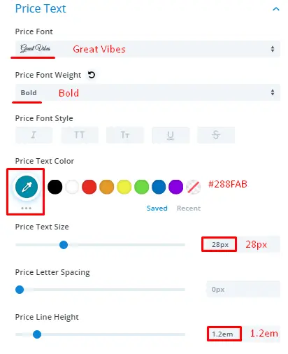
Price Font: Great Vibes
Font Weight: Bold
Text Color: #288FAB
Text Size: 28px
Line Height: 1.2em
Ingredients Text Settings-
Font: PT Sans
Font Weight: Regular
Text Color: #212121
Text Size: 18px

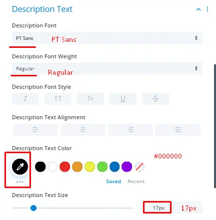
Description Text Settings-
Font: PT Sans
Font Weight: Regular
Text Color: #000000
Text Size: 17px
That’s it, we’ve successfully created preview 2nd of the restaurant menu layout.
Summary
In this blog post, we’ve shown you how to use Divi Restro Menu plugin and create restaurant food menus on your Divi theme website. If you’ve tried this plugin and created food menus, then share your views in the comment section. And if you want to purchase this plugin, then go to this link here.




Is there a way you can rearrange the order the menu items in a category show?
What size would you set the background images to?
Hi there,
Great plugin! Works well, and is easy to install and manage. Is it possible to set a default Category to display upon page load?