In 2021, we published an article with 33 effective tips on designing a website. Now, we’re back with another rule for designing a website that you can follow in 2025 for any kind of website project. Combined, you’ll have 54 rules for designing a website.
With these rules, you can easily create a great-looking website design that gives your audience a great first impression of your business. Integrating website optimization will also make it rank well on search engines to drive the right audience to your site.
It will also set you apart from your competitors who have websites.
Additionally, it will be easy for your audience to find you when they search for you through social media sites. A website makes your business more visible, boosts lead generation, and increases the conversion rate.
In this article, we will provide more information on the rules to follow in website design, how great website design impacts its performance, website design basics, and trends.
The Effective 21 Rules of Designing a Website
You need to adhere to the rules of designing a website to meet your audience’s goals and purpose and increase conversion rates. The website design basics are easy to follow, whether you are a beginner or a professional developer. You won’t have to worry anymore about what to consider when designing a website.
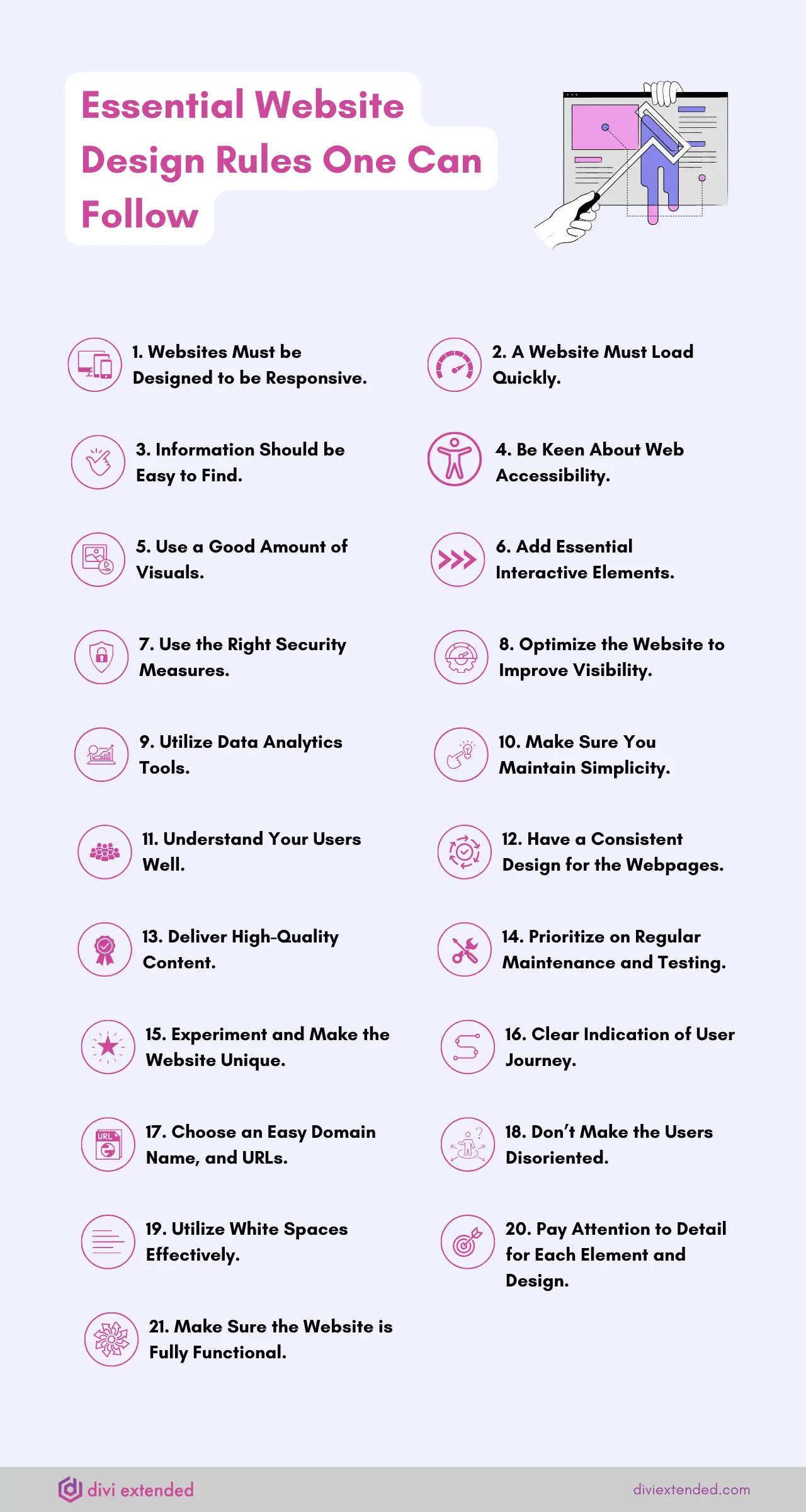
1. Websites Created Should be Responsive
It is a necessity to ensure the website fits perfectly on all screens: computers, laptops, tablets, phones, etc. Most people access the internet using their phones, so if they access your website and need to zoom in and out, they might end up leaving the site immediately.
According to Paperthin, 1/2 of people will never return to a site if they have trouble accessing it due to unresponsiveness. The website should adapt to various screen sizes, resolutions, and orientations.
2. A Website Needs to Load Fast
Many people leave a site in the first three seconds if they notice it is not loading fast.
Slow loading also reduces the conversion rate by 7%. Therefore, as a web developer, optimize the website links, images, content, text, and other media to make it load fast.
3. Information Should be Easy to Find
Another rule for website design in 2025 is to ensure that it has an easy-to-use navigation to prevent an increased bounce rate.

Therefore, ensure the main menu is placed strategically.
The site shouldn’t be so complicated that it makes the users lose interest in your website. A great website navigation menu is like a reimagining of book distribution, which has two menus that are well-placed to ensure the audience isn’t confused.
4. Be Keen About Web Accessibility
For great website design, it is important to ensure that all users can easily access it without any issues, even when impaired.
You can check the WCAG guidelines to know what to adhere to.

You can also try and enable keyboard navigation, use the right text size, optimize code for screen readers, alt text for images, diverse images, suitable language, and ensure great contrast for easy readability.
5. Use a Good Amount of Visuals
Another crucial rule of website design in 2025 is to ensure you have enough visuals to keep users engaged. Users can easily get bored just reading a block of text.
If it’s an e-commerce site, ensure the visuals are compelling to make the buyers want to buy. Also, with a blog or a business, visuals speak louder than words at times. Therefore, use the right colors on CTAs, use headings strategically, use contrasting colors, and use the right images.
6. Use a Considerable Amount of Interactive Elements
Incorporate interactive elements in your website to keep the audience engaged – it is a key rule to follow in 2025. People also get more familiar with websites when they can get in touch with customer support through chatbots, filling out polls, or surveys to get served better.
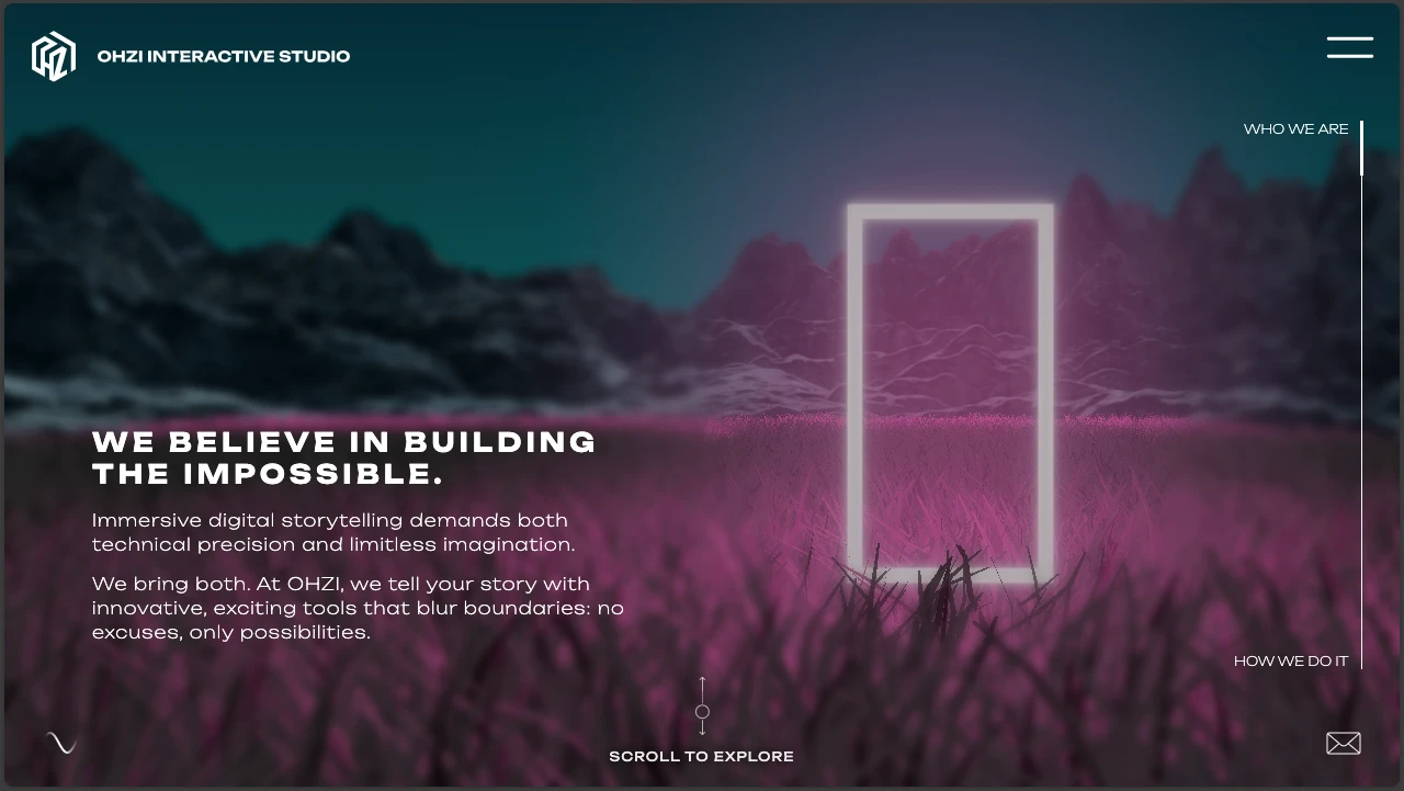
Also, with a great number of animations, people will easily find what they are looking for. An example website is Ohzi
7. Putting the Right Security Measures
As a developer or a website owner, integrate the best security measures to prevent user data from being compromised or any online transactions intercepted at any one point. You also need to have an SSL certificate that makes the website more secure.

Additionally, update the website’s themes, software, and plugins to ensure there are no unforeseen vulnerabilities. Your password and username should also be strong.
8. The Website Needs to be Well-Optimized to Improve Visibility
Search engine optimization is key to ensuring the website loads fast and performs well.
It includes the use of relevant keywords, alternative text on images or other media, compressing images to reduce the load time, having content that is relevant to what your website is about, clean code, using a meta description, the right tags, metadata, and much more.
9. Utilize Data Analytics Tools
One great rule of website design is to integrate analytics tools such as Google Analytics or Page Speed to check user behavior and analyze the site. The initiative will make it easy to know how best to improve the site to attract customers.
Additionally, the analytics will be informative enough to let you know how you are faring.
10. Make Sure You Maintain Simplicity
Another crucial rule of website design is to ensure you don’t put many visual elements all in the same place. They should be well aligned to prevent users from leaving the site without achieving what they intended to.
Look at all elements on the site and evaluate their use to gauge their usefulness.
11. Understand Your Users Well
One other vital rule is understanding your audience well.
What can you do to ensure they have a great user experience? The user is the center of all the website decisions you make. Therefore, you ought to figure out what will excite them most. Even after website creation, carry out regular surveys to know their feedback.
12. Have a Consistent Design for the Webpages
It is important to have a consistent design for the web pages, for instance, theme color, font, spacing, white space, page layouts, etc. Also, if you have a blog, ensure it looks the same on almost all pages to ensure that readers don’t get confused and for the best user experience.
If you have an e-commerce site, ensure that the images are uniform and the page structures are similar.
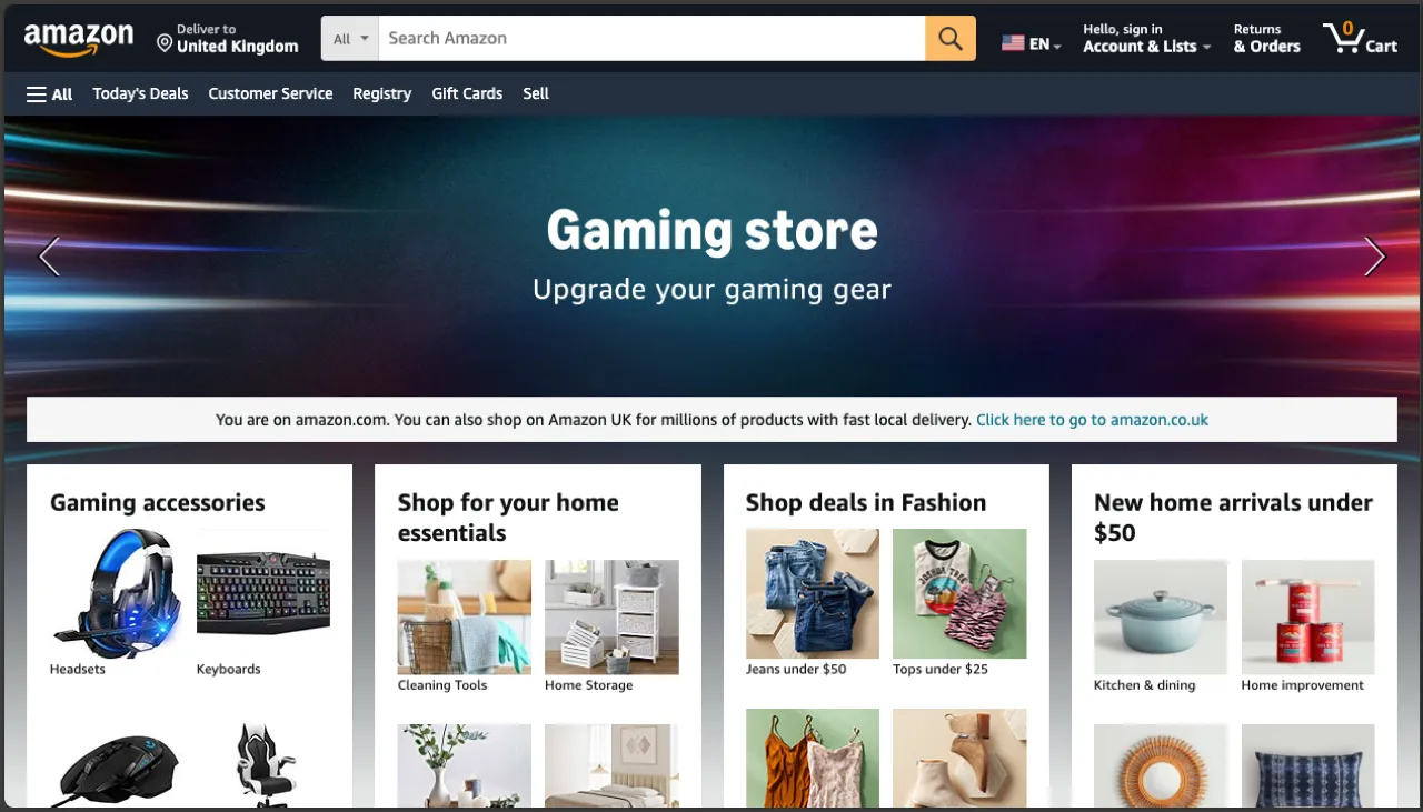
Take the example of Amazon, with all its simplicity and the great buyers it acquires per day.
13. Provide Quality Content
Quality content is one of the vital rules of website design in 2025, as it entices the audience and makes websites rank better on search engines. Moreover, you need to consider internal linking, which will keep users glued to your work as they get more insights.
14. Prioritize Regular Maintenance and Testing of Your Website
Regular website maintenance is key to ensuring all elements are working perfectly.
Additionally, it is important to test it regularly to improve user experience by removing blockers and find new opportunities. Also, always undertake regular backups of the website.
15. Make the Website Unique
Always look for design inspirations to know how best to make your website.
You need to ensure the design stipulates your brand well.
- What message are you passing through?
- What’s your target audience?
- And who are the users?
Also, don’t copy another person’s design without considering whether it will work for your audience. The website needs to be unique to attract the right audience.

An example of the Norway Salvation Army website is a pure illustration of uniqueness.
16. Clear Indication of User Journey
Whenever a user is on your website, they need to be able to know where they are currently.
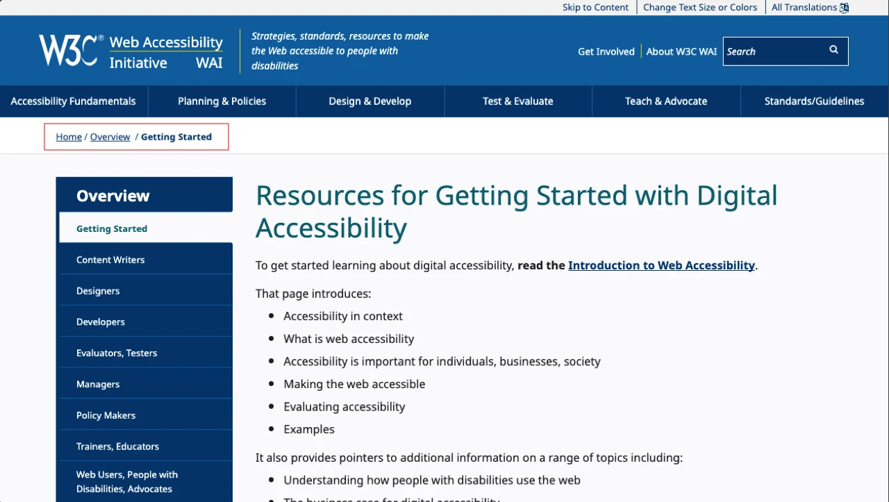
They should know how they even got there and be able to go back to where they started. The breadcrumbs make it easy to know where you are currently.
17. Choose an Easy Domain Name and URLs
Another rule in website design is using a proper domain name that is easy to remember and spell.
A user should be able to remember the domain link and search for it on the internet to find what they want. Also, ensure the name you choose resonates with what your website does. That’s part of the rules of website design in 2025 that will be carried forward.
18. Don’t Make the Users Disoriented
When users access your website, they should find it self-explanatory without thinking too much about what they should be doing. A clear structure, the right visual elements, and recognizable links make it easy for users to navigate.
19. Utilize White Spaces Effectively
White space and less clutter are vital in any website. It makes it easy for users to see the presented information. Users first scan the page and try to understand the presented information easily. There should be a visual hierarchy based on the content’s importance.
20. Pay Attention to Detail
Use sections to break up the content for easy visibility. If you provide a big block of content, sure thing, the users will get bored and leave the site.
Try to set a single idea per section, use bullet points where necessary, use headings, use images, use a maximum of 3 fonts on the site, and use other design elements. Your logo will also control the fonts you will use.
21. Make Sure the Website is Fully Functional
The website should be fully functional and meet the user’s needs. Treat yourself as a visitor and see whether you will encounter an issue.
If people can’t achieve the motive of the site, they will be disoriented.
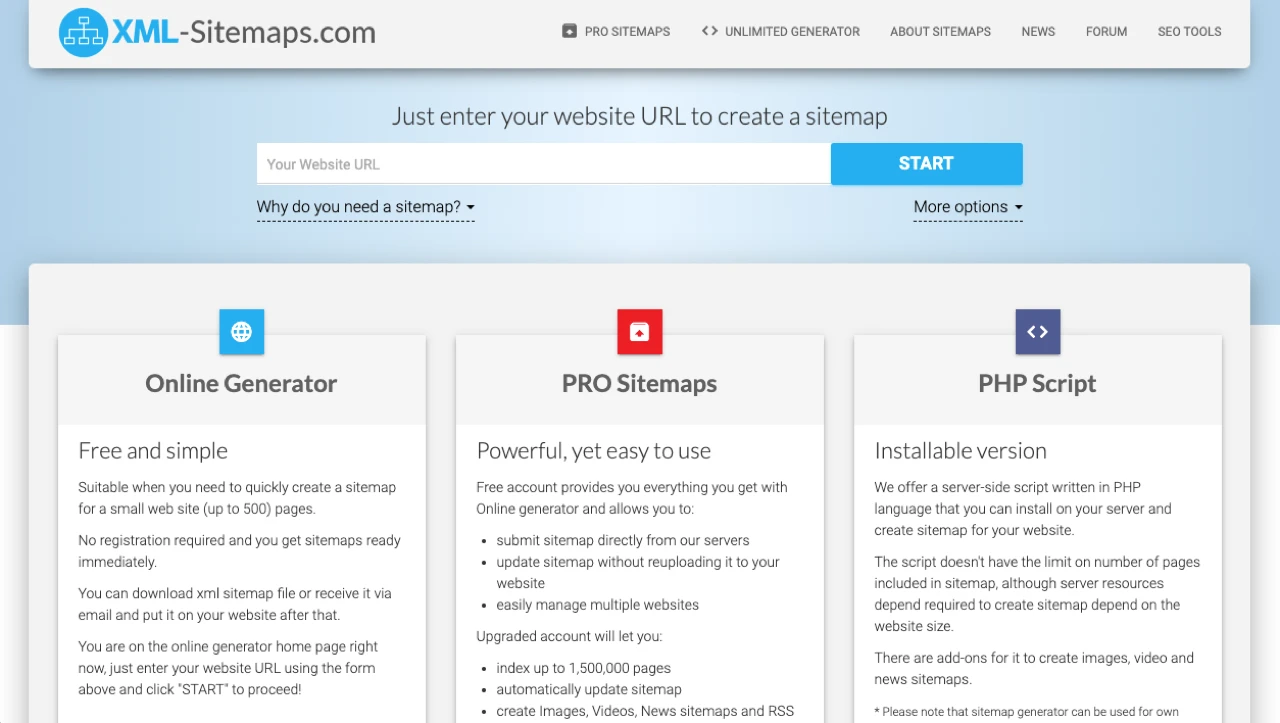
You may also include captcha tests to get rid of spam, display customer testimonials, and include a comprehensive sitemap on your site. (You can generate it on an XML sitemap and upload it to your root folders on cPanel).
Latest Trends in Website Design in 2025
We have highlighted certain of the latest trends in web design that you can embrace in 2025. Apart from rules to follow in website design, you should also consider adhering to these trends to make your website stand out.
- Custom illustrations – Custom illustrations are an important trend in website design that embraces the use of inspiration from traditional art formats and other print publishing formats. This can include 3D cursor interactions, digital cut-out styles, slow change of color, or gradient shading. You can use some online tools to make them.
- Full page headers – People are also embracing full page headers, but with call-to-action buttons and eye-catching images to give users direction.
- Parallax scrolling – People are also embracing parallax scrolling, which exposes a bigger part of the site while scrolling up or down. Images and animations can also appear.
- Playful cursors – Another vital element is to have playful cursors, such as the example of Paolo Fornasier’s website. Visitors will even want to check the website more.
- Engaging stories – For users to engage easily with your content, it is important to tell compelling stories in your content and also advertising campaigns.
How Great Website Design Impacts Its Performance
Great website design impacts its performance since people will easily relate to the content you have provided.
- It leads to increased conversion rates.
- Great website design ensures users meet their goals while navigating your site.
- A website will load fast and reduce the chances of a user leaving the site because of slow loading.
- People are more likely to make purchases on an e-commerce site and, therefore, not leave items in the cart.
- It reduces the bounce rate and ensures the website ranks well.
FAQs – Frequently Asked Questions
a. What impacts a website’s speed the most?
Various parameters affect a website’s speed, such as images, videos, server/hosting, code, browser caching, and HTTP requests.
b. What tools can you use to check page speed?
You can use Google Analytics or Page Speed.
c. Do animations have a positive impact on search engine optimization?
Yes, they help to boost engagement with the audience and improve user experience. However, ensure they are well-optimized to prevent slow website loading.
Create a Great Website Design for your Audience
Your audience needs to be compelled when they visit your site. Therefore, you should strive to ensure that they don’t leave the site immediately if it delays loading fast.
Also, when you want to use images, GIFs, videos, or animations on the website, ensure they are well-compressed. Additionally, always have a purpose for the website. What would you want to achieve with your website? Is it to promote your blog? Sell products? Advertise properties?
That should be your driving force at all times. These 21 rules of designing a website in 2025 should always guide you.


0 Comments