Menus on Divi websites act as a main door through which you can explore and navigate the entire website. Specifically, the hamburger menus represented by three horizontal lines are a compact, smart, and intuitive solution. These hamburger menus are a blessing for users browsing the websites on mobile devices. You can take that interactive experience to the next level by changing the hamburger menu color, size, and background on Divi websites and customizing it by adding a background image or animation. Divi gives you amazing possibilities to personalize your hamburger menu to resemble your brand and improve its visibility. If you don’t have a hamburger menu on you website, you can learn to build a Professional and personalized Divi hamburger menu on your website.
In this step-by-step guide, we will show you how to customize the hamburger menu in Divi without any hassles using some easy CSS tricks. Follow these simple instructions and transform the menu to engage customers on your Divi website.
Now, without further ado, let’s start.
1. How to Change the Divi Hamburger Menu Color
This is the first personalization that every user wants to perform on his Divi website. The hamburger menu color should align with your brand and Divi gives you the power to do it.
Let’s see how it can be done.
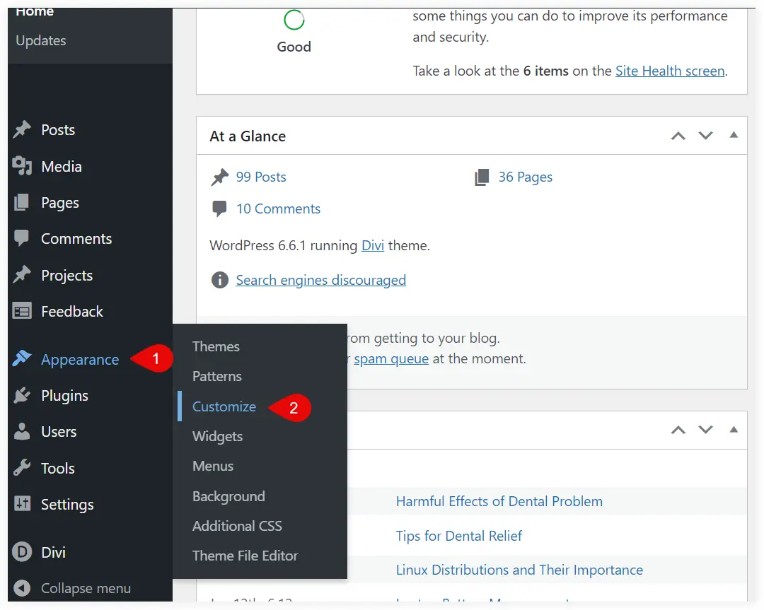
1. Navigate to your WordPress website and go to its dashboard. Hover on Appearance and select Customize.
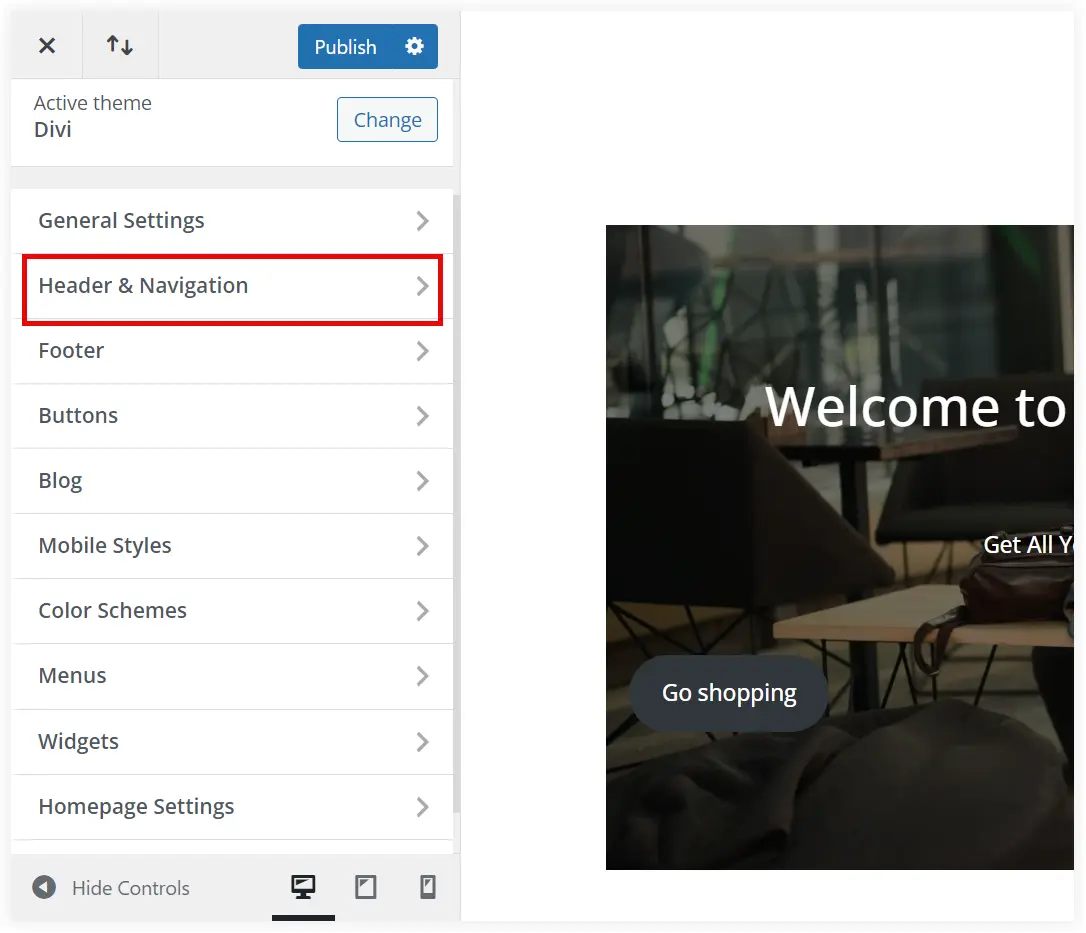
2. Select Header and Navigation.
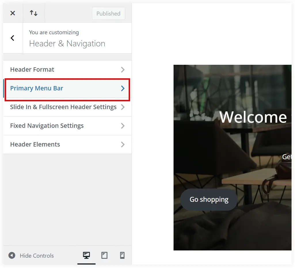
3. Click Primary Menu Bar.
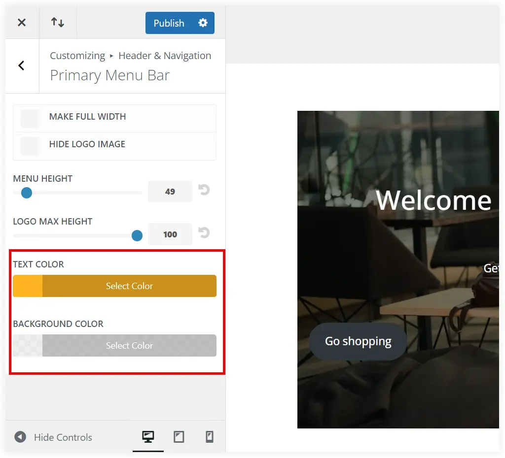
4. Select a suitable text and background color for your hamburger menu.
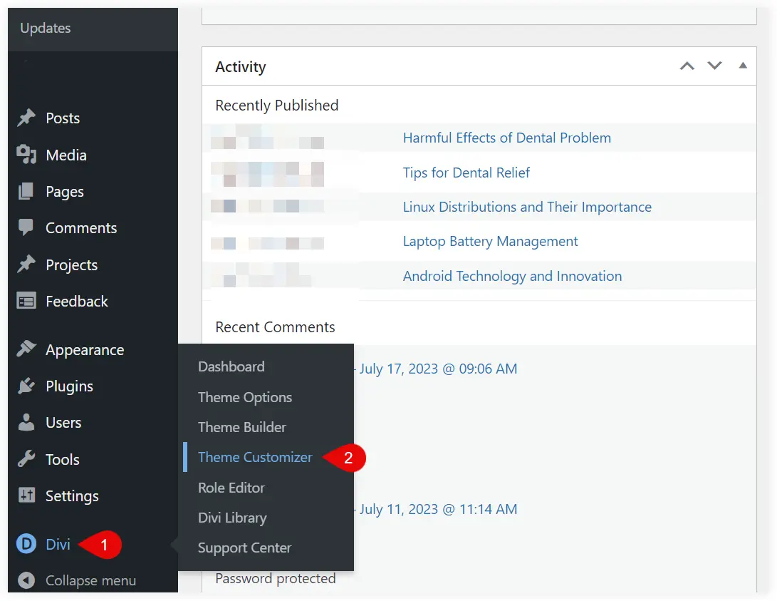
5. If you want to change the color of the horizontal lines of the hamburger menu icon, navigate to Divi Theme Customizer.
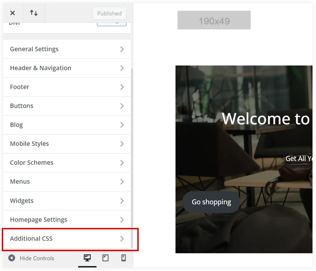
6. Select Additional CSS and paste the below code at the bottom.
.mobile_menu_bar:before {
color: #32CD32;
}
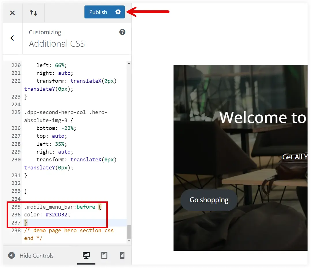
You can replace the color code with your desired color and click Publish.
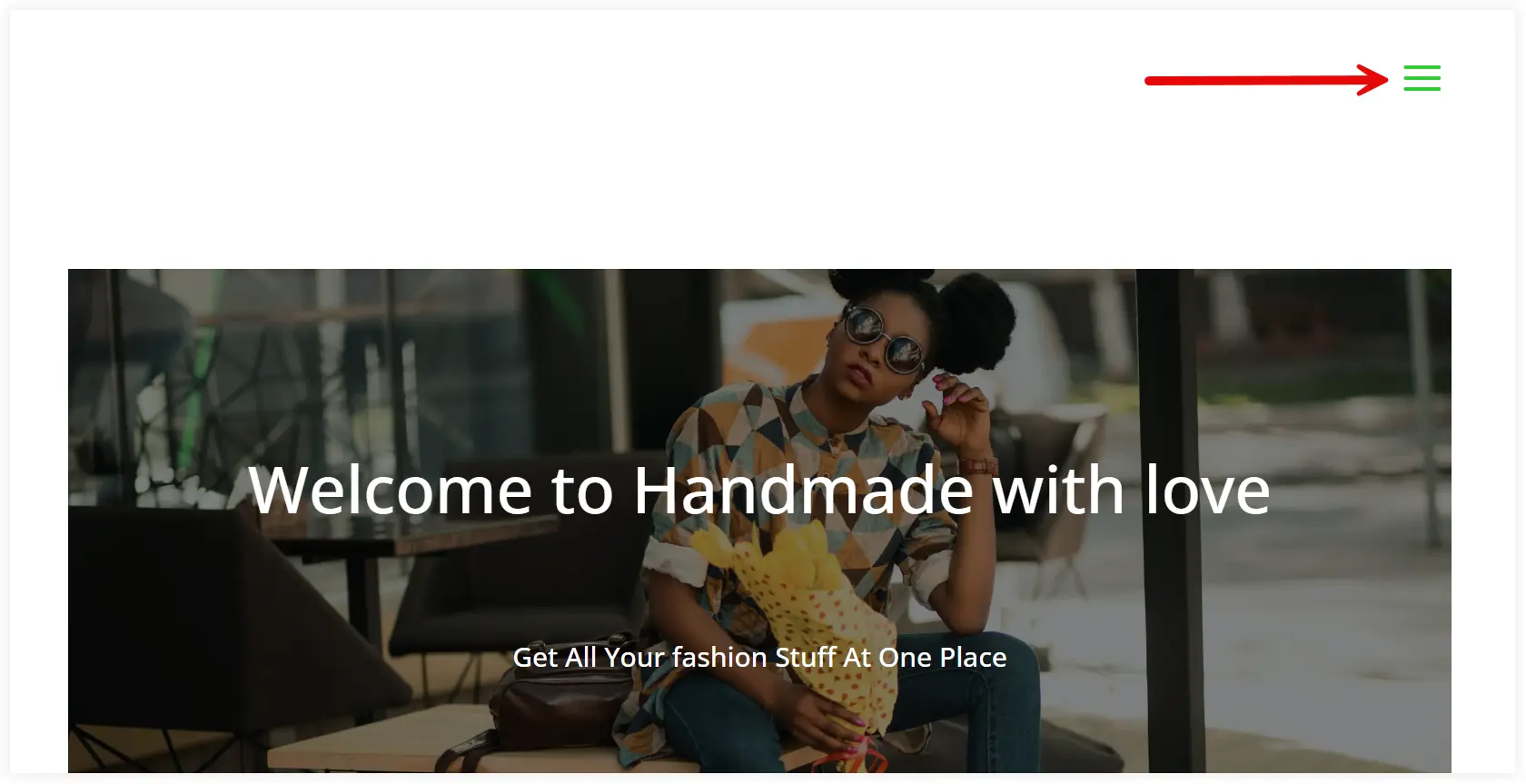
The color of the Divi hamburger menu icon has been changed to green lime as per the color code.
2. Create a Dynamic Hamburger Menu Color in Divi by Using Hover State
This is one more fantastic customization of the Divi hamburger menu icon by changing its color with user actions. The hamburger menu icon will respond to user actions(such as hovering and clicking) with a color change. This will make your Divi website’s design more responsive, and appealing, and improve the user experience.
Let’s see how we can do it.
1. Login to your website and Navigate to Divi Theme Customizer.

2. Click on the Additional CSS section to open it.

3. Set the base color of the hamburger icon by copying the following code and pasting it to the Additional CSS.
.mobile_menu_bar:before {
    color: #000000; /* Replace with your desired base color */
}
We need to set a color for the hover state to provide that lively experience to users on hover action. For that copy the code and paste it into the Additional CSS section, just below the base color code mentioned in the previous step.
 .mobile_menu_bar:hover:before {
    color: #ff0000; /* Replace with your desired hover color */
}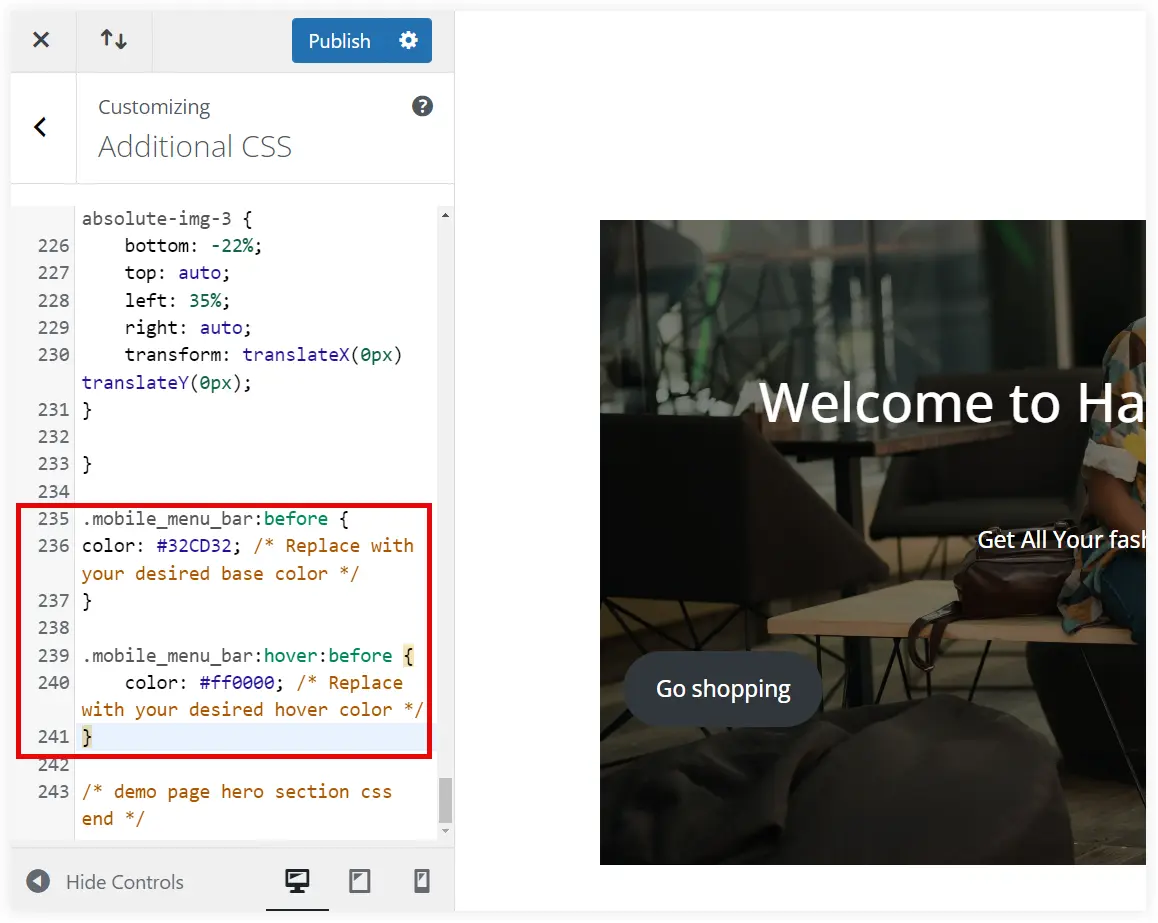
After pasting the above codes, click on Publish button.
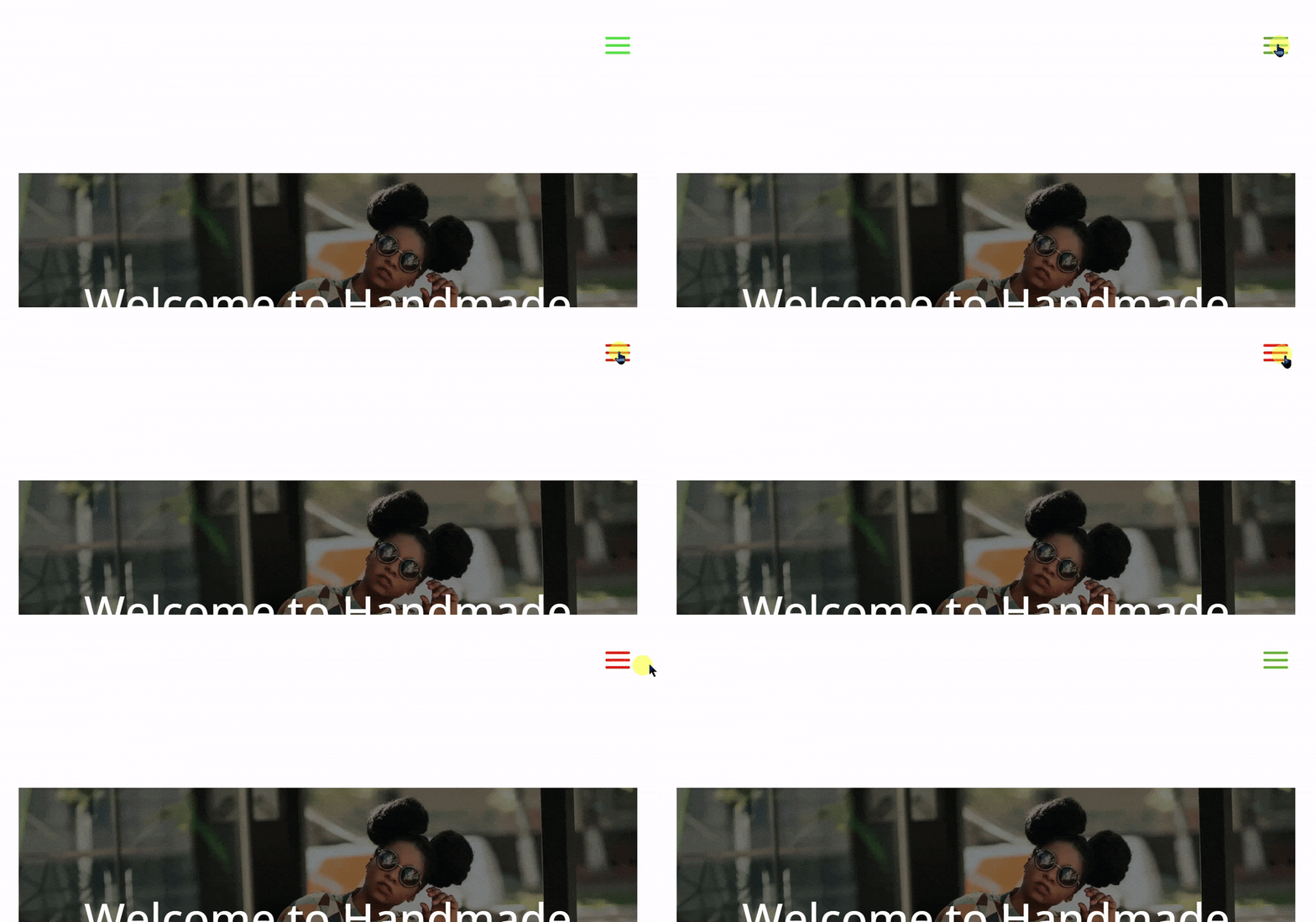
Observe what happened. The horizontal lines of the Divi hamburger menu icon change its color on a hover action.
3. Change the Hamburger Menu Icon using Prebuilt Divi Icons
If you need to give a unique look to your Divi website’s hamburger icon, select any icons from the Elegant Themes Icon Font. You can use around 360 icons in this font pack. Select an icon that closely looks like the hamburger icon. Unique icons will make your menu more appealing and make it stand out in the competition.
Let’s see how to do it.
1. Go to Divi Theme Customizer after logging into your website.

2. Click on the Additional CSS section to open it.

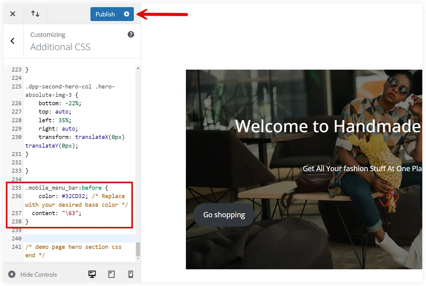
3. Copy the code, and paste it into the bottom to set a unique menu icon that looks unique and can replace the hamburger icon. Also, change the color that perfectly complements your icon.
.mobile_menu_bar:before {
    color: #32CD32; /* Replace with your desired base color */
    content: "\63"; /* Replace it with the Elegant icon unicode  */
}
You need to replace the Unicode for your desired Elegant Font Icon. Explore the Elegant Themes Icon Font and utilize icon unicodes to show them on your website. For example – Unicode of an icon is ‘& # x63;’, then you need to mention 63 followed by ‘\’ as the value of a content attribute.
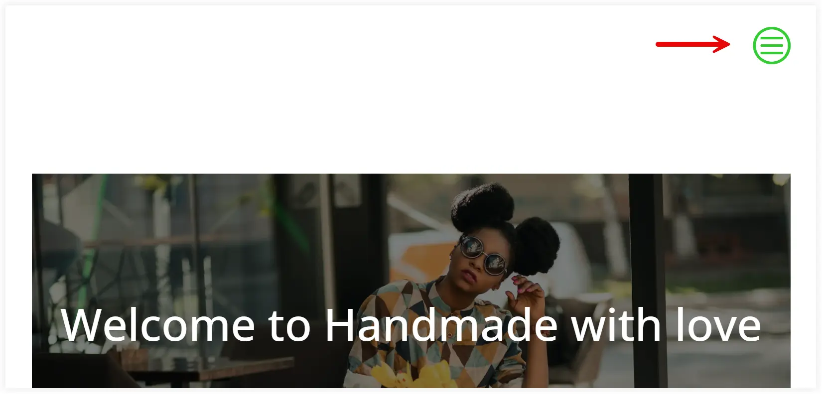
4. The hamburger icon has now been changed to the icon you selected from the Elegant Theme Font pack.
4. Change the Size of Divi Hamburger Menu Icon
Now, you already have an idea about how to change the color and icon, but what if you wanted to enlarge it so that it appears larger in the Divi menu? This is a requirement on websites that do not want to feature more links on their menu and keep everything hidden inside the hamburger icon. These can be restaurant websites, vehicle, electronic, or technology demo websites that want a clean website structure without any visual cluttering.
To increase the size of the Divi hamburger menu icon we only need to put a small code in the Additional CSS section.
Let’s see how we can change the size of the hamburger menu icon.
1. Open the Additional CSS section from the Theme Customizer.


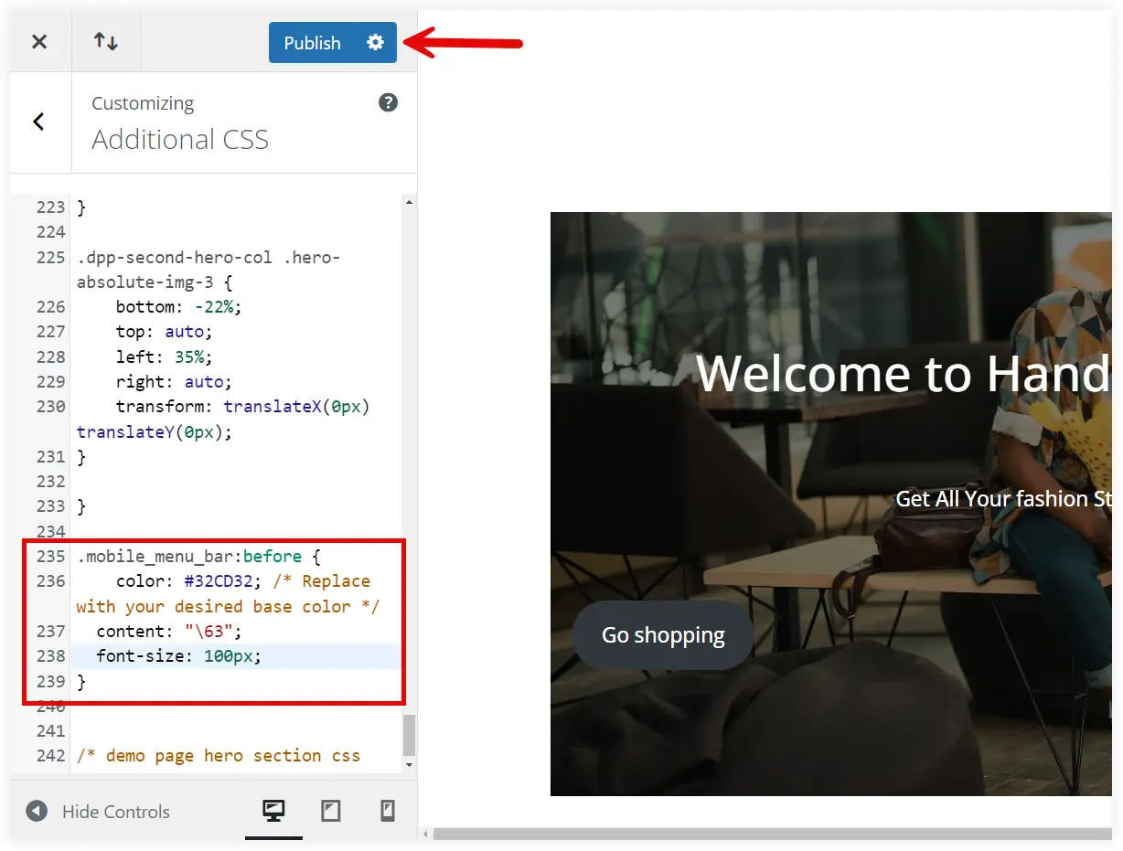
2. Copy the below-mentioned code and paste it into the bottom of the Additional CSS section. It contains the ‘font-size’ property which can be used to adjust the size of the hamburger icon as per your requirements.
.mobile_menu_bar:before {
    color: #32CD32;  /* Replace with your desired base color */
    content: "\63"; /* Replace it with the Elegant icon unicode  */
    font-size: 100px;  /* Replace it with the required icon size  */
}
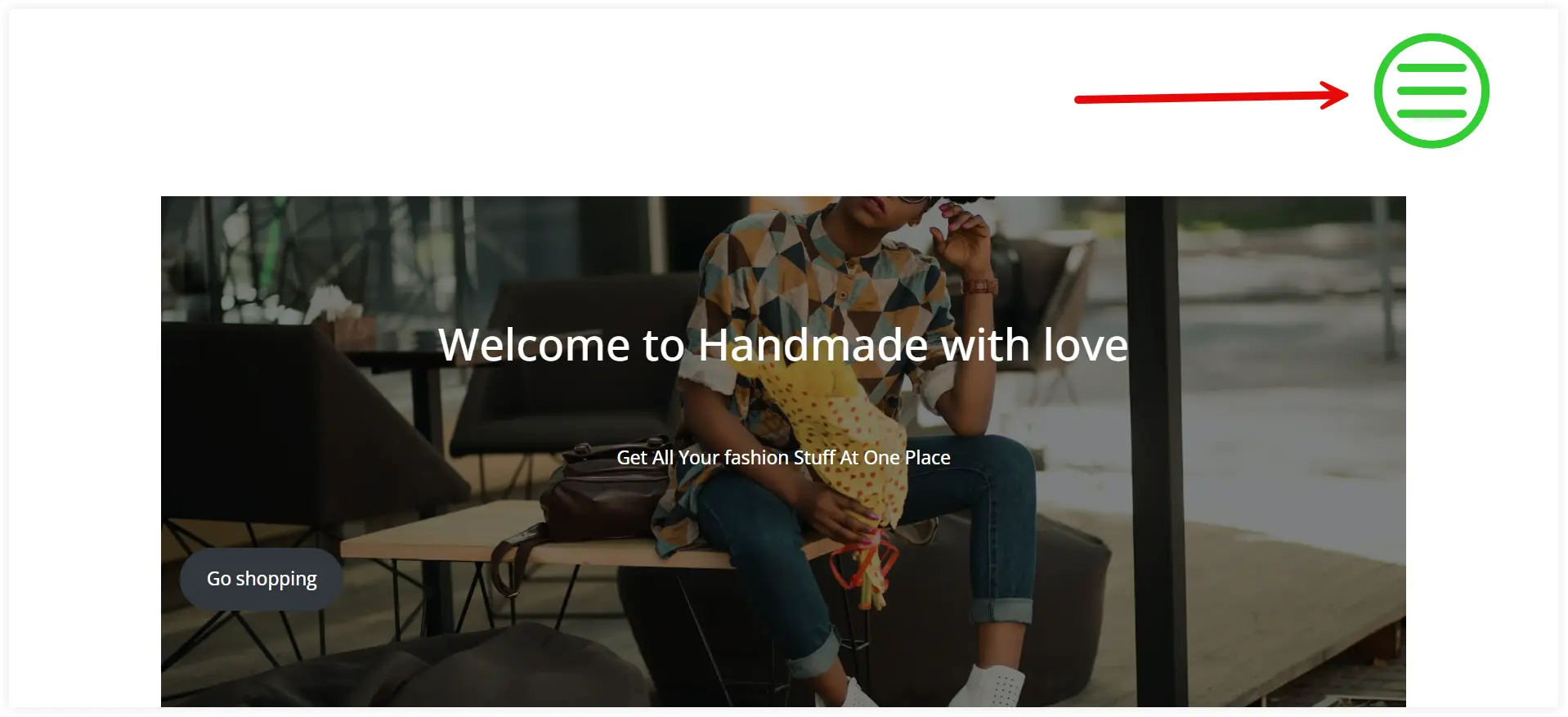
3. Click Publish and view it in the front end.
5. Add an Image, Background Color, or Gradient to the Divi Hamburger Menu Icon
You can turn the hamburger menu icon on your Divi website more fancy by adding an image, background color, or background gradient. This won’t be the choice of all the Divi website users but it would be suitable for entertainment, kids, and puzzle websites. This kind of website needs to be more fancy and eye-catching, that’s why a hamburger menu icon with a bright background or gradient will do the job perfectly.
Let’s start making the hamburger eye-catching.
Hamburger Menu Icon Background Image
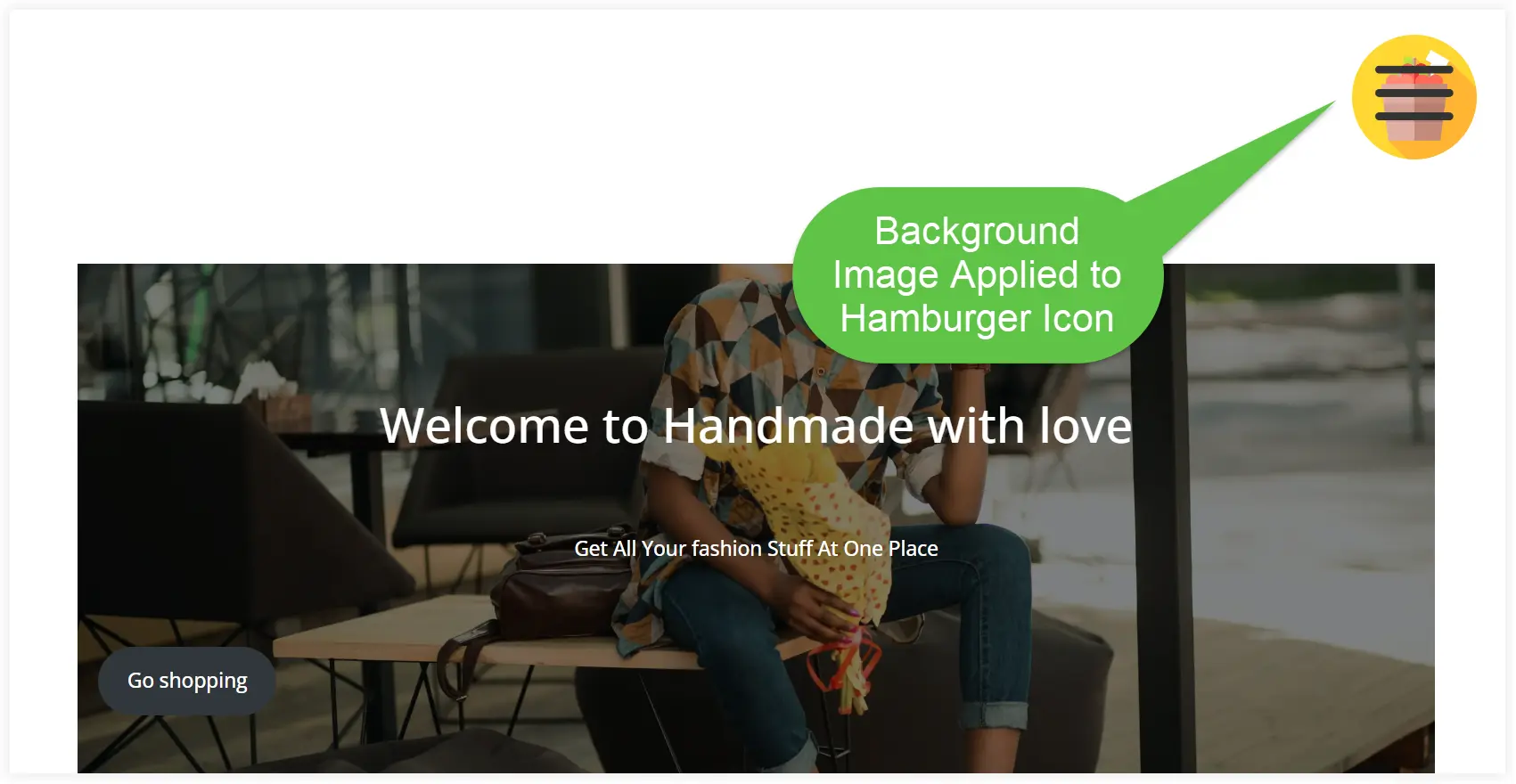
First of all, let’s learn how to add an image background to the hamburger menu icon. You can use subtle images that won’t disturb its look and will enhance its overall appeal. This trick can be used to display a hamburger menu icon with a relevant icon image in its background. For example, a suitable icon for the food niche can be used in the background of the hamburger menu icon of a restaurant website.
Excited to see how we can do it. Let’s start.
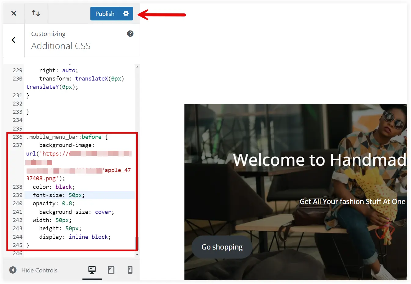
1. Open the Theme Customizer and navigate to the Additional CSS section.

2. Copy this code and paste it into the Additional CSS section. Replace the URL with the image URL you want to display. We have also kept the hamburger lines black and gave a transparent effect using the opacity property. Keep the values of font-size and width same to align the background image with hamburger menu icon.
.mobile_menu_bar:before {
    background-image: url('https://www.example.com/jahiu/wp-content/uploads/2024/05/icon-03.png');
	color: black;
	font-size: 50px;
	opacity: 0.7;
  	background-size: cover;
 	width: 50px;
  	height: 50px;
  	display: inline-block;
}
See how it looks.
Hamburger Menu Icon Background Color
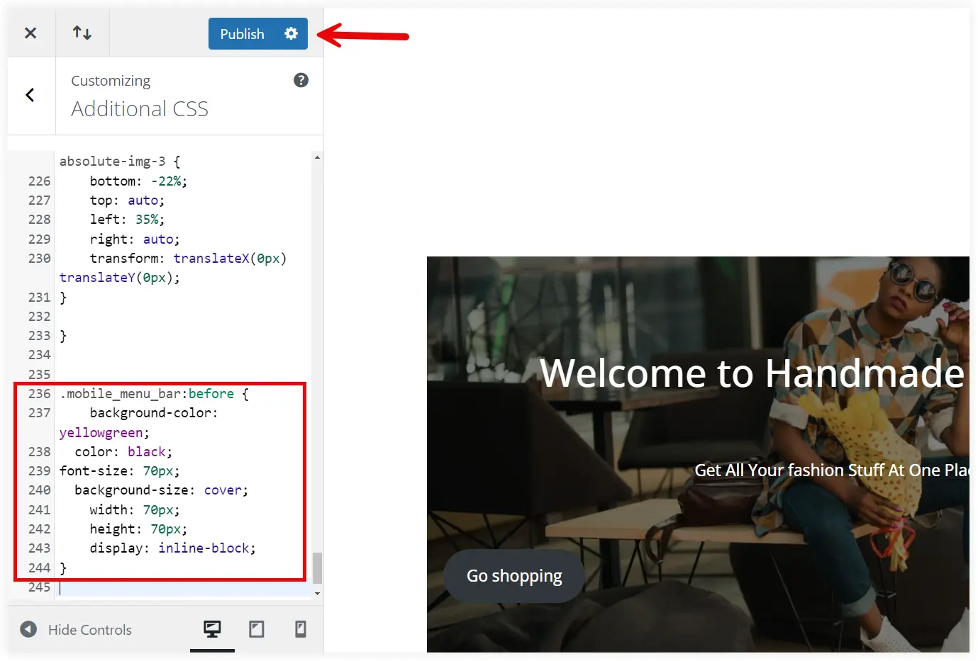
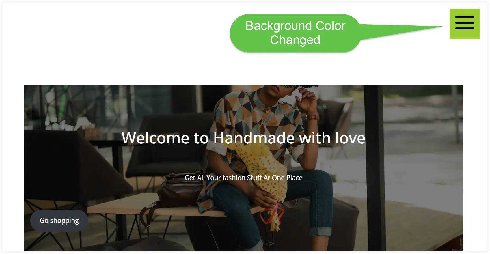
If you want to imbibe a color background instead of an image use the following code. Replace the color in the code with the color hex code or name you want to use.
.mobile_menu_bar:before {
    background-color: yellowgreen;
	color: black;
font-size: 70px;
 	background-size: cover;
  	width: 70px;
  	height: 70px;
  	display: inline-block;
}
Take a look on that after adding the code.
Hamburger Menu Icon Background Gradient
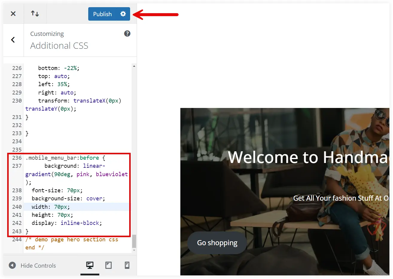
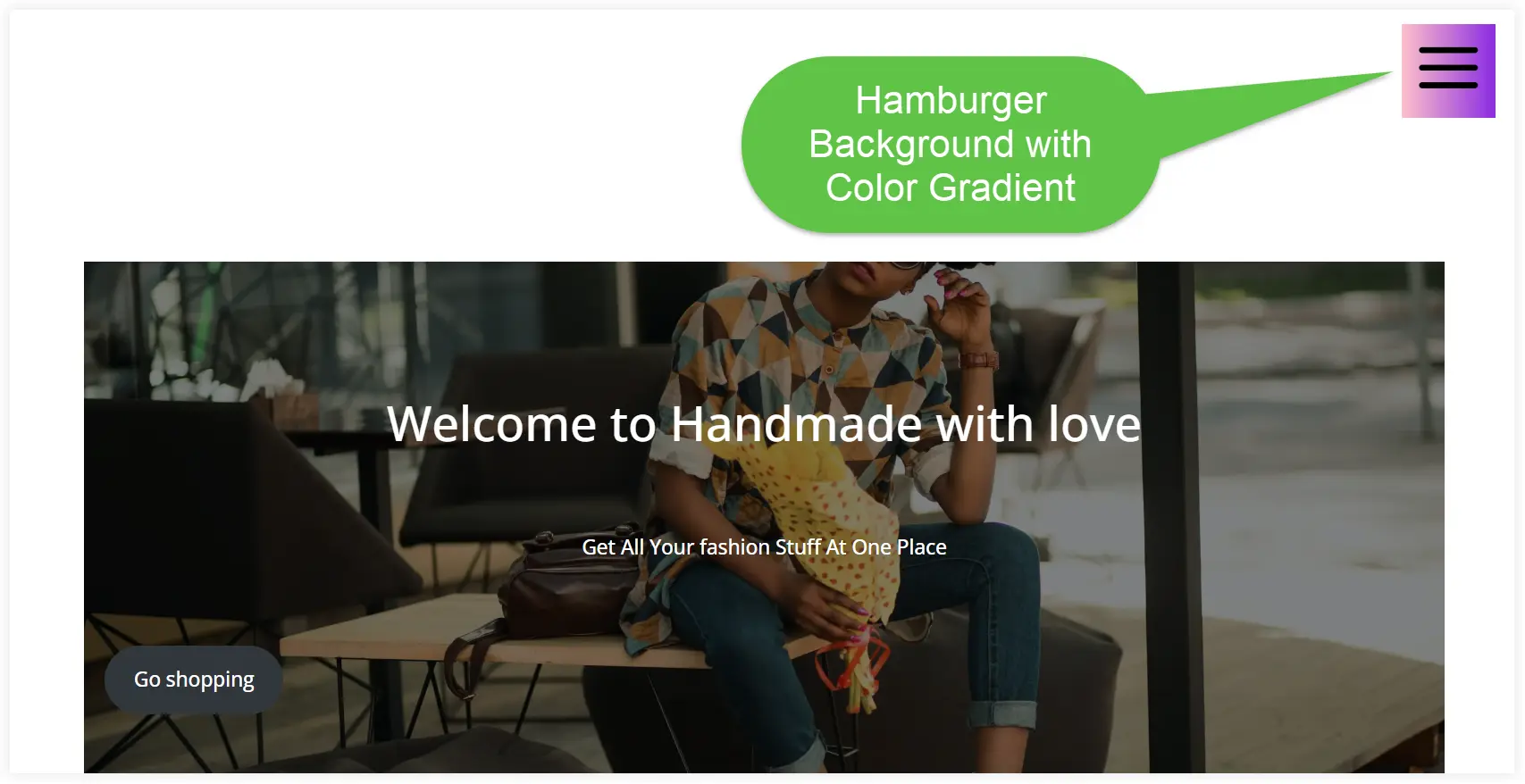
Want to add a sensational touch to the Divi hamburger menu icon? Background-gradient is the solution. Use the following code to add a gradient to the background. Enter the rotation angle of the linear gradient and the desired color name or hex code in place of the color in this code.
.mobile_menu_bar:before {
    background: linear-gradient(360deg, pink, blueviolet );
   	color: black;
font-size: 70px;
 	background-size: cover;
  	width: 70px;
  	height: 70px;
  	display: inline-block;
}
Take a look at how it changed the appearance of the hamburger menu.
You can also learn to build a Professional and personalized Divi hamburger menu on your website. to If you want a more professional-looking header menu with hamburger icons on your Divi website, you can explore and find one from the prebuilt header layouts.
Final Takeaway
You may quickly modify the color, size, and background of your hamburger menu so that it matches the branding and appearance of your website by following the instructions provided in this tutorial. These small but effective modifications can improve the readability and appeal of your navigation for your users. To maintain uniformity, don’t forget to clear your caches and test the modifications on various devices.




0 Comments