In today’s time, for a business or professional to thrive in the market is extremely intense. Yet, it’s nothing that can’t be achieved. By applying some tips and tricks, one can quickly start the flow. And once the flow has begun, they must be consistent as well as iterate.
One of those tips and tricks is building a website. It’s one of the essential keys to market better and generate leads. However, building a website isn’t enough. Instead, keeping your visitors tangled with the content and how to reach it is extremely important. Usability and user navigation are top requirements for an online platform’s success.
Therefore, it’s essential you work to improve website usability, and by reading this post, till the end, you reap all the key tips on how to do it. But first, let’s start with why making a website user-friendly is essential.
Why Is It Crucial to Make Your Website User-friendly?
What if what you’re reading now was highly complex and used vocabulary only a grammar nazi can understand? In that case, you wouldn’t have read it. And the same is true with websites. If you don’t make them user-friendly, they will be hard to explore, and a website hard to explore isn’t a good place to explore the internet.
Thus, your visitors will leave as soon as they try to navigate different areas.
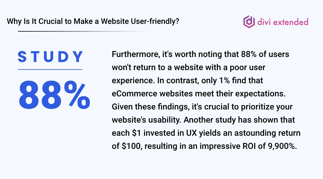
It’s also found that 88% of the users won’t return to a website if their user experience isn’t good. And where only 1% of users accept that eCommerce websites meet their expectations, it’s vital that you take special care of your website’s usability because another study showed that every $1 invested in UX results in a return of $100, which means ROI = 9,900%.
Therefore, improving website usability means improving your business, which won’t cost much compared to marketing. All you have to do is follow some general tips, and you’ll do pretty good.
How to Make Your Website More User-friendly? 6 Essential Elements to Improve Website Usability
A good website is one that utilizes necessary webpage elements. And a great website is one that ensures those elements are improving website usability. Before elements, the crucial aspect of building a user-friendly website is whether it’s mobile responsive or not. If your website isn’t responsive and doesn’t load in under 3 seconds, then there’s no use in implementing usability elements.
Hence, before you apply the following elements to your website, ensure it’s responsive as well as lightweight. Once you’ve done that, you can proceed with what’s mentioned below.
1. Enhanced Website Navigation
Navigation on a website isn’t an element. Instead, it’s a group of different elements that make user navigation seamless and improve the website’s usability. The elements you need to focus on to improve Navigation are,
- Header or the link menu.
- Search.
- Page navigation.
For the header or the menu bar, you can lower the number of items and increase space between other elements, such as CTAs. Keep only 3 levels of menu hierarchy, i.e.,
- Menu
- Sub-menu
- Sub-sub-menu.
- Sub-menu
Don’t go beyond the sub-sub-menu-link because it will increase the margin of the menu and make Navigation confusing. In addition, implement a search bar in the menu to help users find required information easily.
You can utilize an Ajax Live Search that lets users see search results immediately without opening a search page. Whenever they type a query, they can see the result right under the search bar.
Another impressive element to improve navigation and website usability is Page Navigation, which comes in the format of,
- Breadcrumbs.
- Pagination
The breadcrumbs element clearly displays a hierarchy of pages the user has accessed to reach the current page like the following,
Home → Page → Sub-page
This helps the user quickly go to a desired page without opening multiple pages. It also improves SEO. Hence, it is an excellent way to enhance usability.
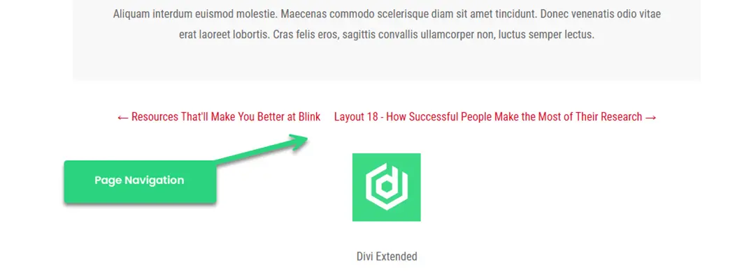
Pagination, on the other hand, allows users to switch back and forth from one page to another. It’s a nice element that can be used in blog posts to help users easily explore content.
2. Optimized CTAs and Contact Forms
In the list of components of a good website, what comes next are the CTAs and Contact Forms. CTAs of a website give the users much-needed elements to interact and initiate an action that can help them avail of the services. If it’s not optimized, you are snitching the customer’s right to explore the website effectively, further affecting the web usability.
To optimize CTAs on your website, you can try the following,
- Make your CTA stand out from other site elements.
- Use clear and concise language.
- Create a sense of urgency.
- Test different CTAs.
- Personalize your CTA.
To maximize the use of CTAs, don’t get motivated to use them over and over on a short page scroll. Instead, place them sparingly, keeping the space for other content to breathe.
Regarding contact forms, ensure they are highly readable and include fewer fields. You might be intimidated to use more fields to acquire more information from the user. However, it’s a bad approach that can affect the website’s usability as well as the contact form’s usage.
Also, style contact forms, keeping the look and feel of your website in mind. If you use Gravity Forms in Divi, you can use Form Styler to streamline the styling process.
3. Utilize Carousel Elements
More often than not, web pages are lengthy. Some due to copy and some due to the elements framework. But a long page will cause more no. of scrolls that would turn users off. For example, a shop page of an eCommerce store or testimonials spread across the page in a grid layout.
More scrolling means more effect.
Okay, for a moment, if we ignore the scrolling, what genuinely annoys the user is interactivity on the page. If the elements aren’t interactive, they’ll not connect with the user. Several studies have found that interactive websites bring more registration or customers than non-interactive ones.
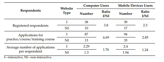
From MDPI, an Empirical Study on Website Interactivity.
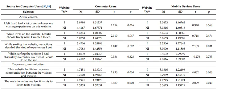
And it’s not only about users’ cursor interaction with the element; rather,
- What users wanted to choose to see freely.
- Whether users’ action decides their expectations of experience.
- Facilitation of two-way communication.
So, what can you do to improve interactivity?

Well, you can use carousels. A carousel on the website is a slider element that can rotate several elements of your website and increase interactivity. For example, you can use,
And team sliders as well if you want to highlight your team. With these elements, you’ll provide users the space and choice of what they want to see and interact with. You could also explore the possibilities of adding different type of carousels. Using our Divi carousel plugin that in house 10+ carousels, you can present your information in much engaging way.
4. Add Content With Visual Dividers
If you’re not separating the content, you are not creating compelling content. Every element and every content piece needs a little space to make them seem unique and purposeful. And if you are not doing that, you are affecting the interaction. Hence affecting the web usability.
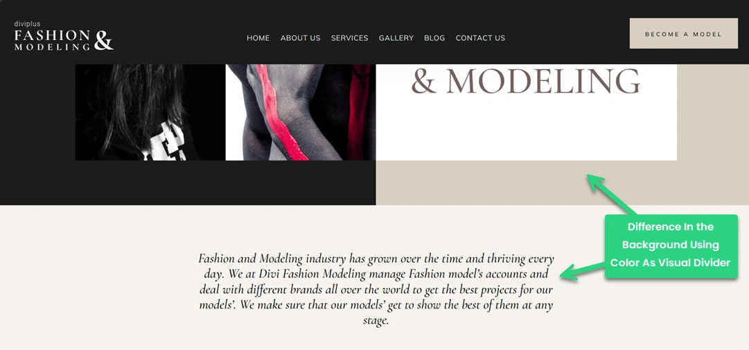
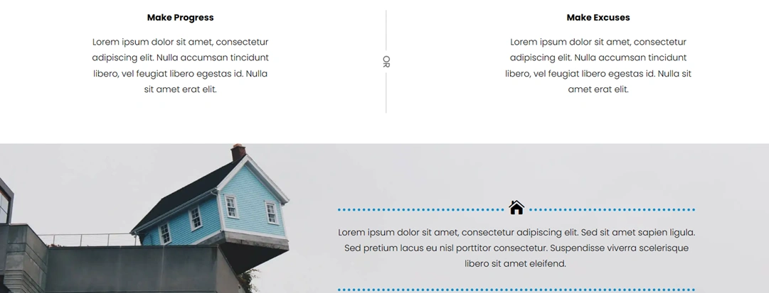
Therefore, it’s essential you take special care of content spacing, and for that, you can apply visual dividers that could be,
- Different background colors for each section. Or create randomness like the following example,
- Using separators of different kinds such as text, icon or shadow.
5. Enrich Galleries With Filters
Galleries are the life of a website. Whether a personal website or a professional one, there are loads of instances when one needs to showcase one’s work, skills or even moments of life and with a gallery, it becomes easier.
However, simply adding images to the gallery is only good for the aesthetics but doesn’t add value to the website’s usability. Therefore, to improve website usability by considering galleries in mind, you can implement the filter option. A gallery with filters allows users to sort images per their requirements quickly.
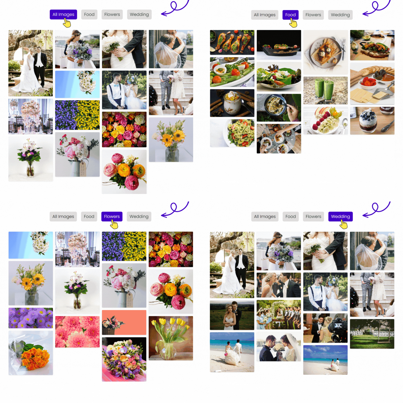
They don’t have to look/see every image available. Furthermore, to improve the usability of the gallery, you can enable,
- Overlays.
- Pagination.
- Lightbox.
- And even column spacing.
With these, you’ll improve your galleries drastically and, with that, your website as well.
6. Use Toggles and Tabs to Improve Website Usability
There are several times when content takes more space, even if we don’t want to. But more, just like any other content that doesn’t satisfy the user, it will only make them scroll past as soon as possible.
But every problem has a solution, and for big and essential content, there are,
- Toggles.
- Tabs.
- And Accordions.
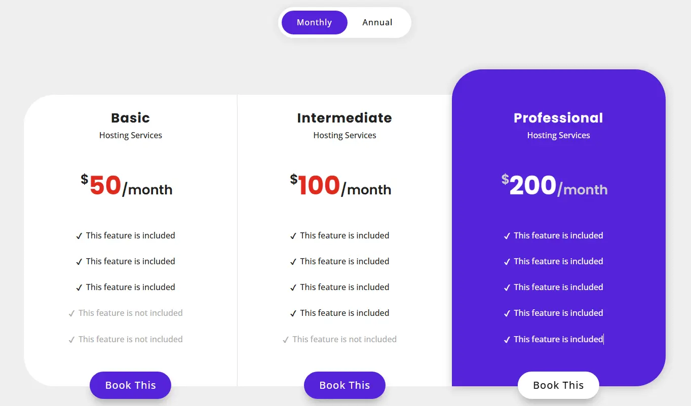
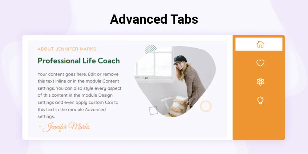
Using the toggle, you can add content with various versions, such as data to compare statistics. Or you want to display features of your product. With a content toggle, you can easily showcase those without eating more space. Plus, it improves the interaction and, with that, website usability.
If you are planning to add content in a sequential manner, then you can use tabs or accordions to place the content in a concise manner. Yet, with interactivity and good design, just like the following examples,

The Bottom Line on Improving Website Usability
When you go and try to improve your website’s usability, ensure you apply changes, keeping minimalism in mind. The less, the better. Furthermore, use elements that are needed, not that would add something extra to your website.
Keeping essentials is the thumb rule of designing a highly functional website. Therefore, when you implement one of the above elements, make sure it reflects your profession and the underlying requirement. Don’t go further to make something extensively unique. Yes, unique looks good, but it should make sense.


0 Comments