It takes more than just writing an excellent blog to succeed. That is why Blogy provides you with the finest animated Divi blog layouts and post templates. You can use them to add uniqueness to your excellent content. The Divi Blog module empowers you with more than 60 layouts that are enough to make your website stand out from the crowd.
In this blog post, we will demonstrate some of the stunning animated blog layouts from the Blogy pack and will discuss about their practicality in brief.
Now let’s stop talking and take a quick look on these beautiful Blog layouts.
10 Best Animated blog layouts that can make a big difference
Blog layout 3
This is a beautiful layout that exhibits all your blog posts in two well-arranged columns with decent-sized featured images. The overlapped image with the title gives the audience a clear idea of what a post is all about. The Zoom out effect on the mouse hovering over the image makes it look more attractive.

Best For : News and Magazine websites
Why
The images are large enough to help the audience easily understand what is the news and what is its gravity in the present scenario.
Blog layout 41
Three column structure of this blog layout enables you to showcase all your posts in a very tidy manner. The slightly shifted images on the right side add an elegant visual appeal to the page. The enlarging effect on the mouse hovering over the post enhances its overall look n feel.

Best For : Community and Informational websites
Why
A blog or community website has tonnes of content that need to be structured properly on the webpage. The featured excerpt and category help the audience to distinguish a variety of posts at first glance.
Blog layout 43
If you want to entice the audience with exceptional animations then this would be the perfect pick for you. This is because the audience can get an immediate idea about the freshness and kind of a particular post. Last but not least is the fade in animation with the read more link emerging at the center of the featured image is a point of attraction.

Best For : Event and Entertainment websites
Why
If you have a website showcasing various types of events, then a little animation is required to grab the attention of the audience instantly. The spectacular vivid images of the events complemented with animations would do the job perfectly.
Blog layout 44
This might be the perfect blog layout when there are requirements to feature the excerpt and keep it as the top priority. The unique thing about this layout is the animation which fades the image and hides it under the excerpt on a mouse hover. In this way, the audience would be able to grasp the overview of the post by looking over the excerpt.

Best For : Consulting websites
Why
The consulting websites need to show their services to the customers in an engaging manner. For that purpose, the animated excerpts used in this blog layout are quite perfect.
Blog layout 45
If the post title is the priority along with some extraordinary animations, then this would be the simplest blog layout for you. The featured image is loaded with a background color animation that triggers on a mouse hover making the featured image small and eye catchy.

Best For : Entertainment and learning websites
Why
The Entertainment blogs doing movie, event, and show reviews need a title on the top along with a featured image and some information. The same thing goes for learning websites or blogs. That’s why this layout can be an ideal choice for those kind of websites.
Blog layout 49
This is one of the most beautiful blog layouts displaying large-size and trendy featured images for each blog post. The split and slide animations implemented on the post title and excerpt quickly draw the attention of the audience. The author and the category are placed in small fonts below the title to avoid an over-busy look.

Best For : Travel and Food blogs
Why
Travel blogs often require decent size images to display the beauty of places along with a little information in a sleek way. The same thing is required in the food blogs where focus is needed on the images of several delicious foods and dishes.
Blog layout 50
This is almost similar to Blog layout 49. The only difference is that it comes with a two-column structure and more enlarged images. From the animation point of view, the title and info part has been kept static and only the excerpt is sliding in from the right side with a zoom-in effect.

Best For : Photography and Portfolio blogs
Why
This Blog layout is an excellent choice for Photography and Portfolio websites where more spotlight is needed on the images.
Blog layout 54
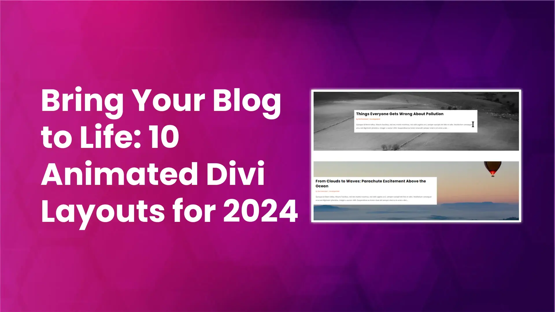
This can be the best pick if you want each blog post in a single column covering the full width of the layout. This section immediately slides in towards the right on a hover action giving a black & white effect to the featured image. In this layout, the image along with the animation plays an important role in engaging the audience on a specific post.

Best For : Portfolio and News blogs
Why
The portfolio websites generally give preference to the highlighted photos to grab the audience’s attention instantaneously. The headline section of a News blog has the same type of requirements to portray the gravity of certain news. This Layout acts as a game-changer for both these types of blogs.
Blog layout 55
Your search comes to an end here, if you are an animation lover looking for a stunning Blog layout to enhance the visual appeal of your blog. This Blog layout is filled with extraordinary slide and flip animations that come to life on a hover action.

Best For : Health blogs
Why
Health and fitness blogs need to convey all the information directly through images. The audience should be able to grasp the topic of the blog with the first look at its title. Moreover, a little information in the form of an excerpt is enough to give a vast idea about the blog post.
Blog layout 60
Bloggers who want to reflect their blog posts in a clean and tidy manner would love this blog layout. The audience doesn’t need to put stress on their eyes while looking for a specific piece of information. Everything looks well managed and the rotating animation of the featured image on a mouse hover feels like a cherry on the cake.

Best For: Philosophical and Spiritual blogs
Why
Philosophical and spiritual blogs need to put more weight on words instead of images. This blog layout has more enhanced typography to make the words or spiritual quotes look more enchanting to the audience.
Apart from these layouts you may also take a quick look on some of the other fantastic animated blog layouts from the Blogy layout pack.

Conclusion
These beautiful blog layouts from the Blogy pack will do the trick in a matter of minutes if you want your site to be one of the most popular ones right now. Out of Blogy’s layout collection of 18 animated blog layouts, you can choose the one that best suits your demands.


0 Comments