Divi is a renowned name in the web design industry that offers unmatched flexibility to open your creativity. It doesn’t matter how experienced you are with Divi, finding inspirational design ideas from top Divi websites can be a game-changer. To clarify it more properly, we created a list of the best Divi website examples you can explore to unlock fresh design ideas for your website. This list of top divi website examples includes sleek portfolios, scalable e-commerce platforms, and dynamic business websites. You will notice that each website in this list is built using Divi and demonstrates a unique design approach to use layouts, typography, color schemes, and dynamic elements. This highlights the flexibility of Divi to craft a refreshing design idea into reality.
In this post, we will show you some of the best Divi website examples covering a wide range of industries and business niches.
Let’s start.
Inspiring Divi Sample Websites You Need to See in 2024
The listed Divi sample sites will work as a valuable resource to generate refreshing design ideas in your mind for creating some unique website designs.
Let’s get straight to the list without further ado.
1. Whyfi
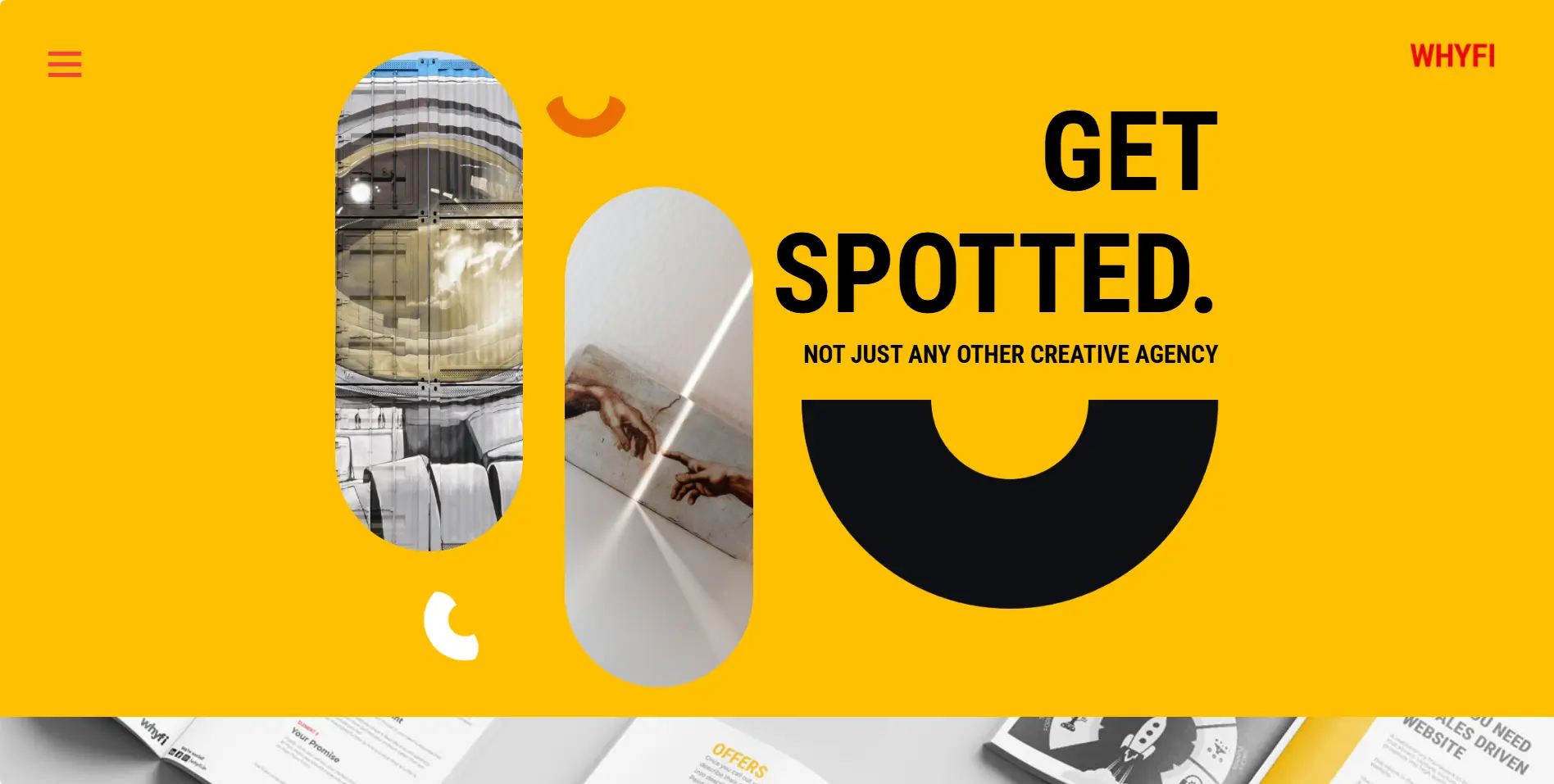
That’s a creative digital agency and branding business website that showcases the “Get Spotted” slogan on its homepage. The website has a vibrant color scheme with bold typography and vertical headers. It uses interactive elements in some sections to entice and engage visitors to explore its services. This website stands out in the competition by utilizing the power of Divi and introducing an awesome design that keeps visitors glued to it. This Divi website example will be inspiring for creative branding agencies looking to construct their own.
2. Devlin Photos
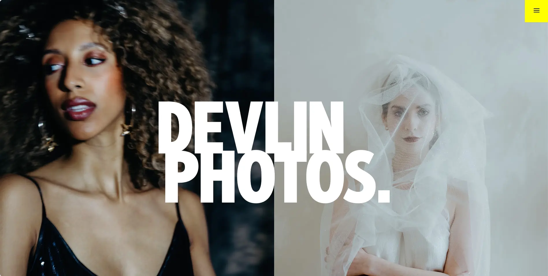
Divi allows you to create beautiful-looking photography websites; Devlin Photos is a great example. The top section showcases large full-width images in the background highlighting SVG of “Devlin Photos” in the center. The homepage contains video sections, moving images, and a full-width image section displaying the portfolio. The links are in the form of large clickable circles with arrows that attract visitors and redirect them to other pages of the website. Divi helped this website to have a vertical menu that avoids distraction and keeps visitors focused on the visuals. This is a perfect Divi website example for photography businesses to create their website and sensationally display photos.
3. Buy from Tasmania
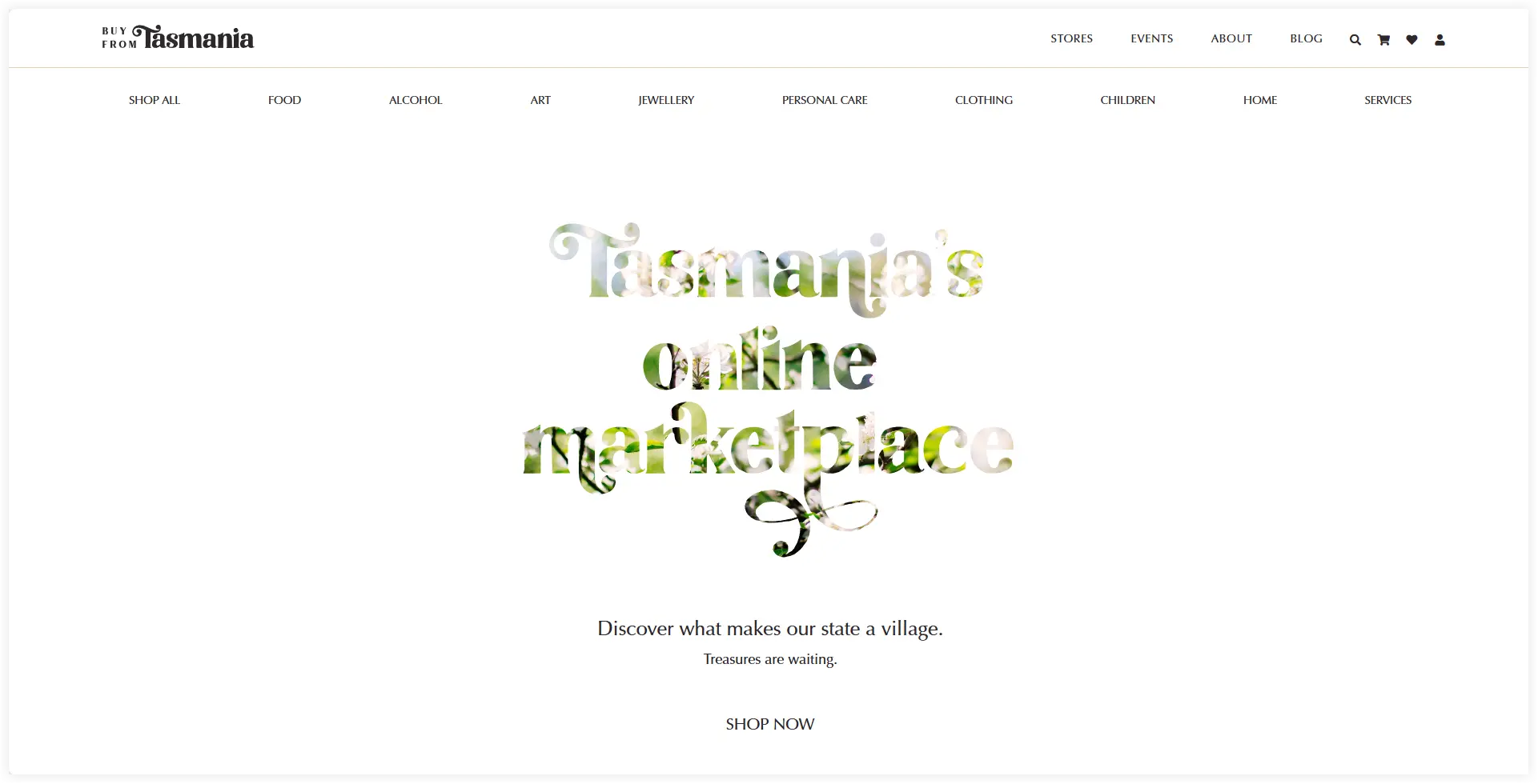
Divi theme not only powers business or personal websites but also stands robustly to function marketplaces. This website uses both the Divi and WooCommerce platforms and sells products and services from native local businesses in Tasmania. It showcases a clear hero section with beautiful headings decorated with image overlay. The designers kept the Shop Now CTA simple to merge with the heading and create a pure vibe of a native place. Designers also placed all the handcrafted and homegrown goods in large eye-catching sections, while the product grid section introduces the offered products along with their prices. It is one of the best sample Divi website examples to get refreshing ideas for creating a Food and e-commerce website.
4. 9AM Cinematography
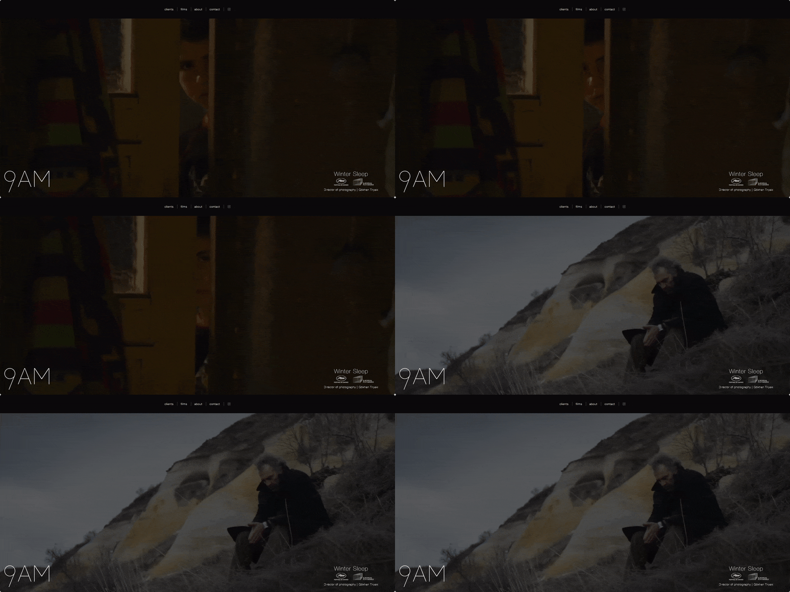
9AM Cinematography is a Mexico-based agency that helps video photography directors in the film and advertising industry. The homepage has a video background to engage visitors. The website focuses more on visuals as it is relevant to the advertising industry. Every project is showcased with a continuous video loop playing in the background. You don’t need to scroll through this website and visitors stick to the videos while browsing. However, a sleek and simple navigation menu is placed on the top which helps you explore the films, clients, about page, and Instagram profile. Out of the perfect Divi website examples, this one is perfect if you are a cinematographer looking to create your portfolio website.
5. Southern Bancorp
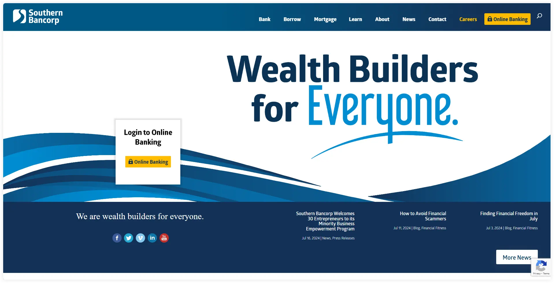
This is a perfect example of how banks and other financial institutions use Divi for their websites. In addition to providing traditional banking services, Southern Bancorp also offers community financial services. Divi gives it a professional portal look which helps visitors easily find what they are looking for on the website. The homepage is made using four sections. The top section allows visitors to access online banking with large bold fonts. The headings are oversized to capture visitors’ attention instantly. The next section displays the options to get in touch with the bank. All the helplines are there in the footer along with a useful footer menu redirecting visitors to the policy, career, accessibility, and FAQ pages. The large navigation menu is the backbone that segments all the offered services and helps visitors explore each of them easily.
6. Peace of Mind Dental
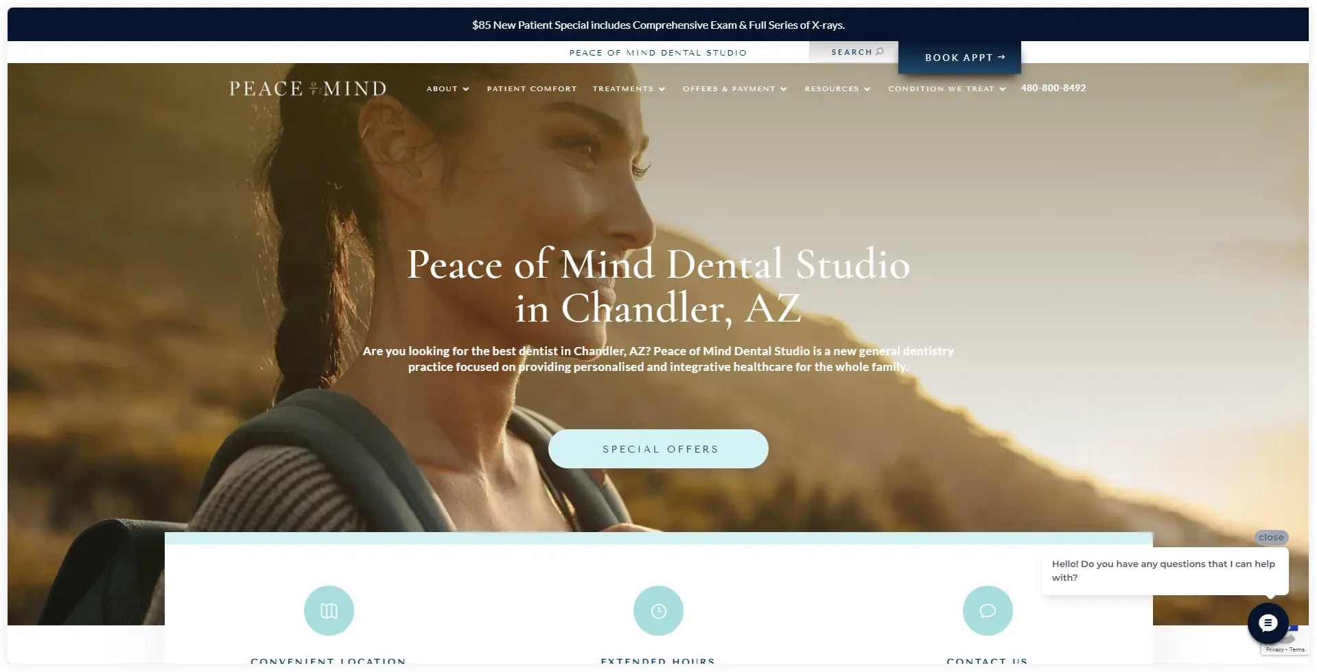
Healthcare is another business niche that can utilize the power of Divi to create innovative website designs. Peace of Mind is a dental studio that offers diverse treatments and services through its Divi website. The Hero section mainly focuses on advertising the location of the dental studio with bold and attractive headings. The working hours, address, and contact details are placed right below the heroes section. The text font is painted in blue color variations. They attempted and were successful at, replicating the vibe of a dental clinic using Divi. A large navigation menu on the top assists patients in finding and exploring what they need. You can consider it a good Divi sample site for the healthcare niche.
7. WordStream
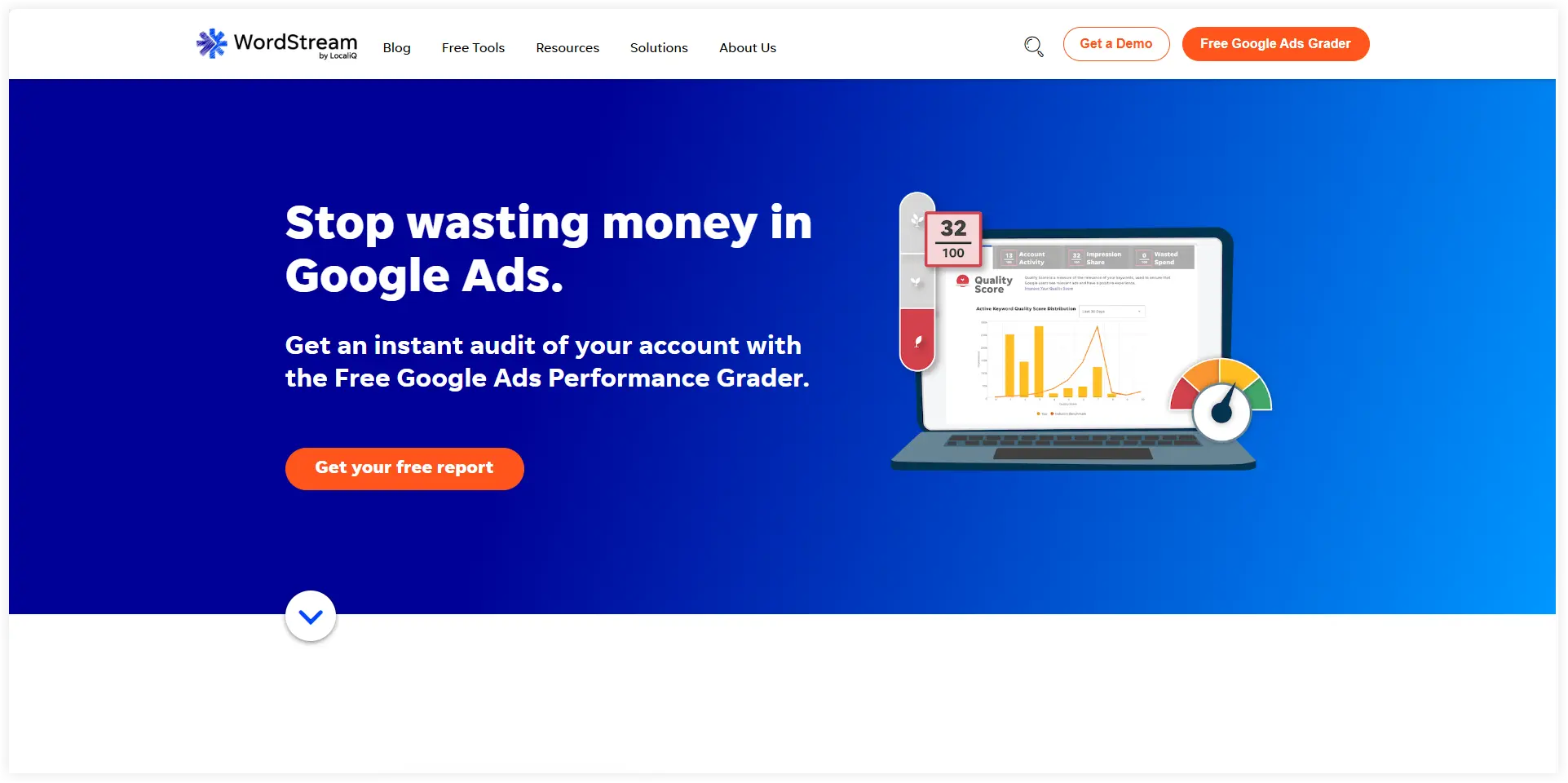
Many big names in the IT industry are already using Divi to sell their products and services. WordStream is one of those, which offers an online advertising management solution to businesses. The top section speaks with a blue gradient background with white flashy fonts in the heading elaborating the primary purpose of this tool. The CTA buttons are given a bluish and orange touch to encourage visitors to search keywords and explore its guide. The navigation menu also provides options to search and get a demo. This can be the ideal example for you to design a website for a related niche.
8. Bause Biowein
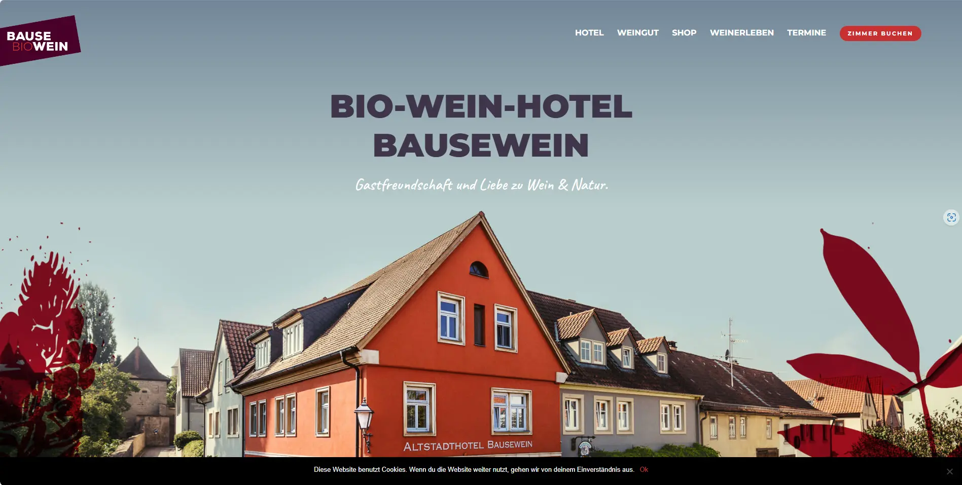
This is a prominent food and lifestyle website built using Divi. The website adopts a colorful style that displays beautiful scenic images of the hotel. The natural wine-processing images also add a unique appeal to the website. The hero section is filled with full-width images of the hotel. The navigation menu floats on the same hero section image providing a uniform clean appearance. The Online shop CTA button is shaped circularly to match the website’s pattern. This is a perfect Divi website example in the food and lifestyle. It might serve as a source of ideas for creating a distinctive lifestyle website.
9. Barefoot Bride
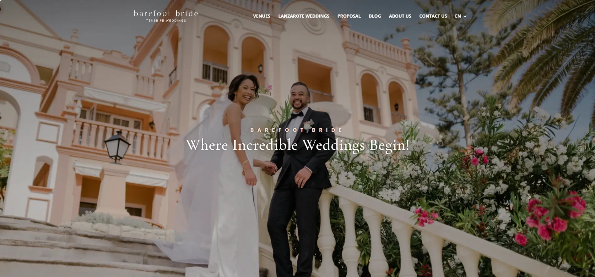
If you are an event planner looking for Event websites specially focused on showcasing wedding ceremonies, Barefoot Bride is the best option. Divi provides it with delicate, soft, and light styling to beautifully highlight wedding images with romantic vibes. The hero section features a wide and eye-catching image of the bride and groom. The headings are not oversized and are kept subtle to maintain the delicate look. From marriage proposals to venues, every page displays mesmerizing pictures and photos. Divi provides parallax effects and wonderful animations to enhance engagement on the website.
10. Vanderhall USA
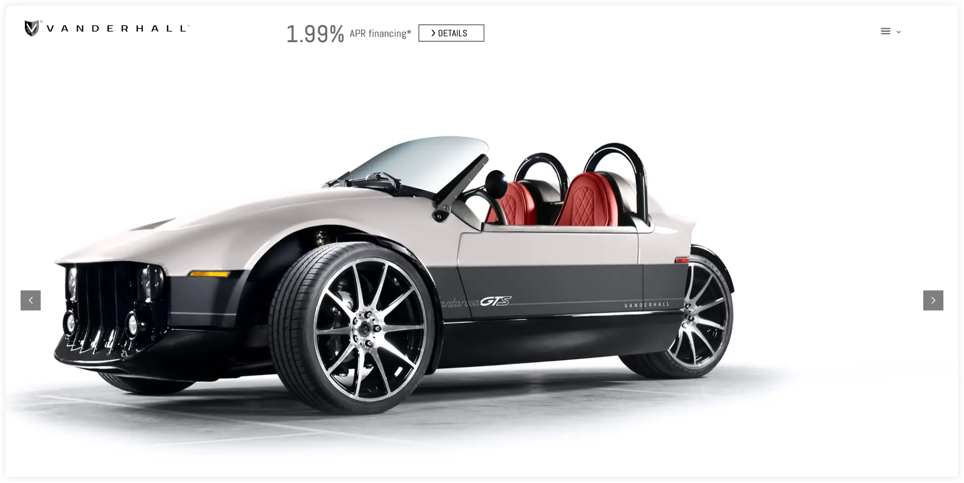
Divi not only drives conventional business areas but also helps cutting-edge companies exhibit innovative concepts and ideas. A prime example of that is Vanderhall USA. This website offers automobile enthusiasts an amazing user experience by utilizing the filters and motion effects that Divi offers. This website’s main goal is to entice visitors and make a purchase by providing them with gorgeous, in-depth vehicle photos. This Divi website example can serve as inspiration for any automobile firm wishing to exhibit its concepts or ideas.
If you want to give an appealing look to your website like these, you can take the help of customizable prebuilt Divi layouts and child themes. You can easily create such websites with the help of the prebuilt Divi layouts and child themes.
Final Takeaway
Finally, we can say that it doesn’t matter what’s your business niche or industry, Divi offers outstanding features and functionalities to build full-fledged professional websites easily. These can serve as a strong inspiration for web designers to gain some practical insights. These sample Divi websites demonstrate the flexibility and power of Divi. It also gives you a better understanding of the latest trends in layouts, color schemes, and typography for websites related to different business niches and industries. Analyze these Divi sample websites to take your website design to new heights.


0 Comments