Developing a new website? And looking for website sliders, a.k.a carousel to take your website to another level. It would be best if you looked for these inspiring slider examples we quoted.
The survey suggests that around 38% of people stop engaging with a website that doesn’t have an eye-catching and attractive layout or content. So, your website must be able to retain your customers for longer periods and want to come over to your website again.
It will require you to pour your love into website design, and for that, you need to use the most intricating sliders. You can elevate your website’s first impression with visually captivating sliders.
Just imagine if you land on a website homepage and are welcomed with plain text all over the page. Would you like to continue? We doubt you would. Instead of this, you should be greeted with a dynamic slider that tells the story of a brand.
So, to find the best of the best sliders, we have 11 Inspiring slider examples for your next website. Have a good read!
1. Homepage Product Slider
If you are planning to make an online shop or an e-commerce store, the homepage product slider is the best way to present your trending products. Your customers can easily find the product of their choice by browsing through the product carousel, just like what Amazon’s website has. You will witness a terrific product showcase that will instantly grab your interest.
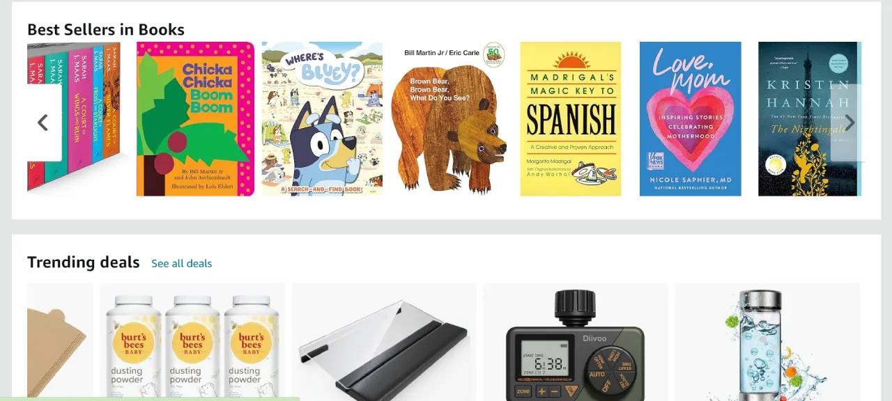
And if you really want to stand out like Amazon and make some sales, you should showcase the upcoming sales, promotions, and discounts here.
2. Logo Carousel
Are you thinking of taking your business website to new heights? Why don’t you showcase your best work in the form of a logo carousel?
The logo carousel displays the logos of different brands, partners, clients, or organizations that have worked with you. This is the perfect way to grab the attention of anyone visiting your website.
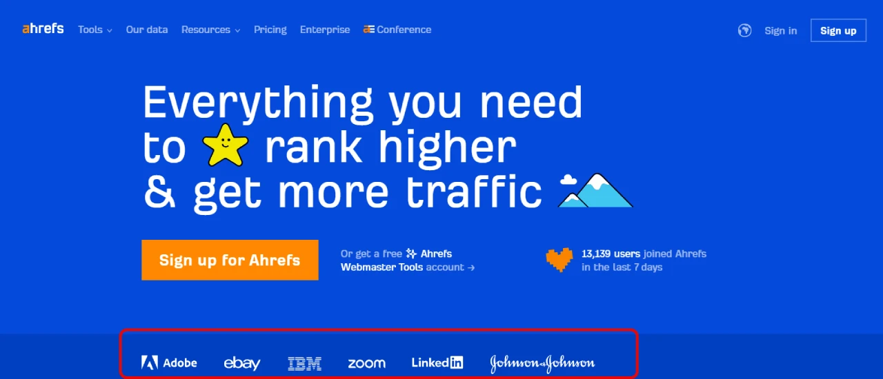
You can see the beautiful depiction of the logo carousel on the Ahrefs website. By the way, you need not scroll down to find the logo carousel, it is found as soon as you open the website. How smart! Check out ur Divi logo carousel module if you’re looking to implement something similar on your Divi site.
3. Interactive Text and Image Slider
Text and Image slider makes a great combo of text that slides with the perfect high-resolution image. You can use this slider to represent any highlight story, blog post, text release, or even subscription. The image interaction with the text makes it a Call To Action (CTA).

Just like what Oracle is doing.
They are showcasing all the important news, press releases, and stories here to keep their users engaged.
Loving the whole concept! You should display relevant images and text that speak about your brand’s strengths and values. This is how you can promote your brand and get some sales on your hands.
4. Testimonial Slider
Do you want to win your customer in a go? Then, add a feedback testimonial slider to your website.
Testimonials add value to the product or services that you are selling. These testimonials can be in two ways. A single testimonial with navigating arrowheads or in the form of multiple cards slideshow.
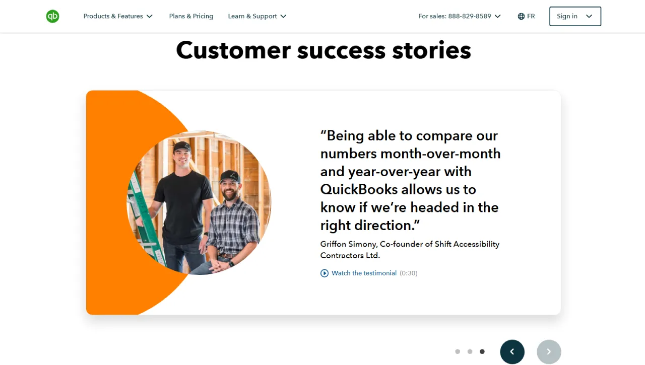
This website QuickBooks uses the former type where the logo of the brand or CEO feedback is displayed in the testimonial sliders. Star rating is popularly added to these sliders to win customer loyalty. A powerful approach indeed!
5. Full-Size Image Homepage Slider
A full-size image slider is the most conventional and commonly used slider. It uses the full width of a page, giving an eye-catching first impression to the user. The popularity of this type of gradient is due to its versatility and adjusting of dynamically appealing background images.
All you have to do is to select the high-resolution images that resonate with your brand and use them on your home screen.

Wild Planet Foods uses a beautiful full-size image homepage slider with the website-themed images. And for better accessibility navigating arrows helps users to engage effectively. This image slider is a 100% width layout acting as a homepage with a button “SHOP NOW” which will take you to the featured products. Amazing example of any responsive slider!
6. Vertical Slider
Let’s try a bit different approach from conventional horizontal sliders. How about a vertical slider?
A stunning way to display your page’s content in this section while keeping your customers engaged. Personally, it’s one of my favorites; it’s like being unique. An intuitive way to introduce your products or services with smooth vertical slide transition and navigation.
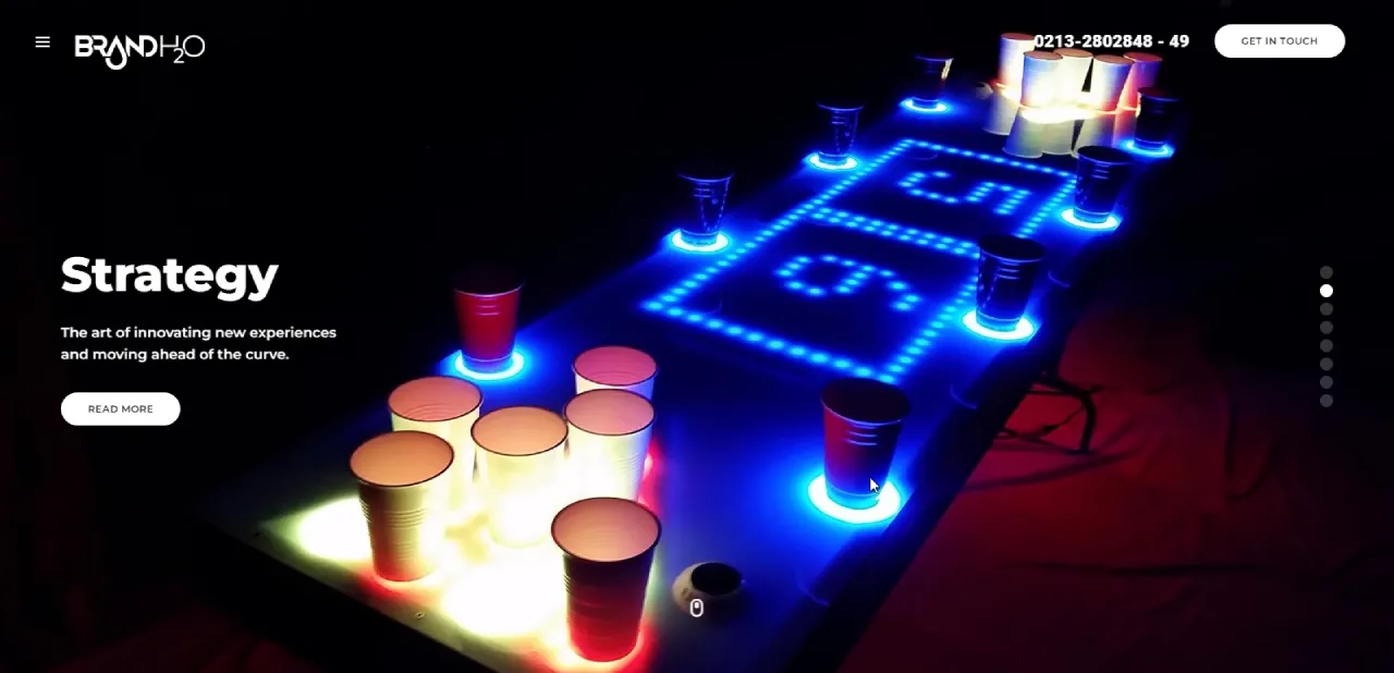
The BrandH20 website is an example of how a vertical slider can be incorporated into your website. Upon scrolling down, landing pages are displayed in a vertical array thus covering a little space as compared to the horizontal design. Incredible and space-effective approach!
7. Split Screen Slider
The split screen slider is the upgraded and modified vertical slider. A split screen adds a more fun and appealing touch to the simple vertical slider.
A split slider is a modern way to showcase your content, images, or video. The major concept behind this slider is the right and left sides of the slider will move in the opposite direction giving a splendid visual design. You can’t get over it easily!

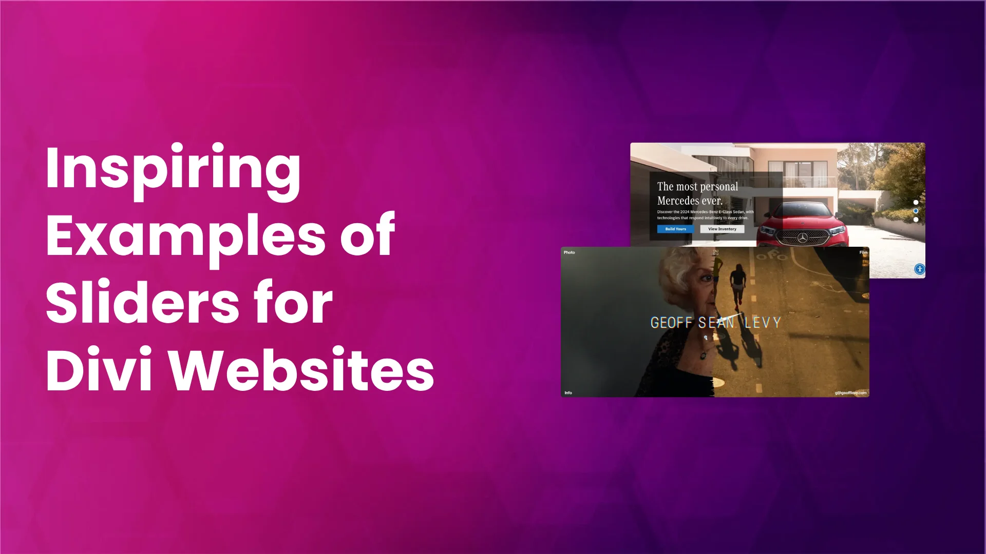
Geoff Levy’s website is a portfolio website, which beautifully opens with a split screen. One side is static and the other side is dynamic. A splendid way to represent your gallery items.
8. Layered Slider
Want to give your website a unique touch? No horizontal design? Let’s give it a textured or layered touch.
Layered sliders are super powerful and easy to build, and you can easily impress your visitors with mind-blowing images, animations, and effects. It has a multi-text layer, image background, and animation for each slide.
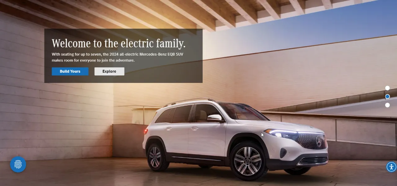
Go to the Mercedes-Benz website and witness the spectacularity of the layered slider yourself. It is indeed jaw-dropping. The scroll button will change the slide vertically, a smart way to catch your attention.
9. Video Slider
Images, images, and more images. Are you getting bored of using image-based sliders?
You can get your hands on a modern video slider, a sleek way to represent your brand’s voice. It’s time to take your website design to the next level by replacing image elements with video elements. Would undoubtedly going to use a video slider for the next website.
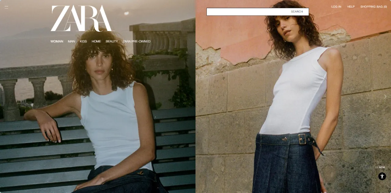
ZARA clothing brand is using a video slider that is captivating and is hooking viewers the time they set eyes on it. The video is used in the background while the buttons and elements are displayed over the video.
10. Team Carousel
If you are looking for a carousel to showcase your services, team members, or freelancers, you must include a team carousel on your website.
You can display your team members attractively using the customized team carousel slider. This is a great way to build trust in your hesitant customers and gives a personal touch to your website.
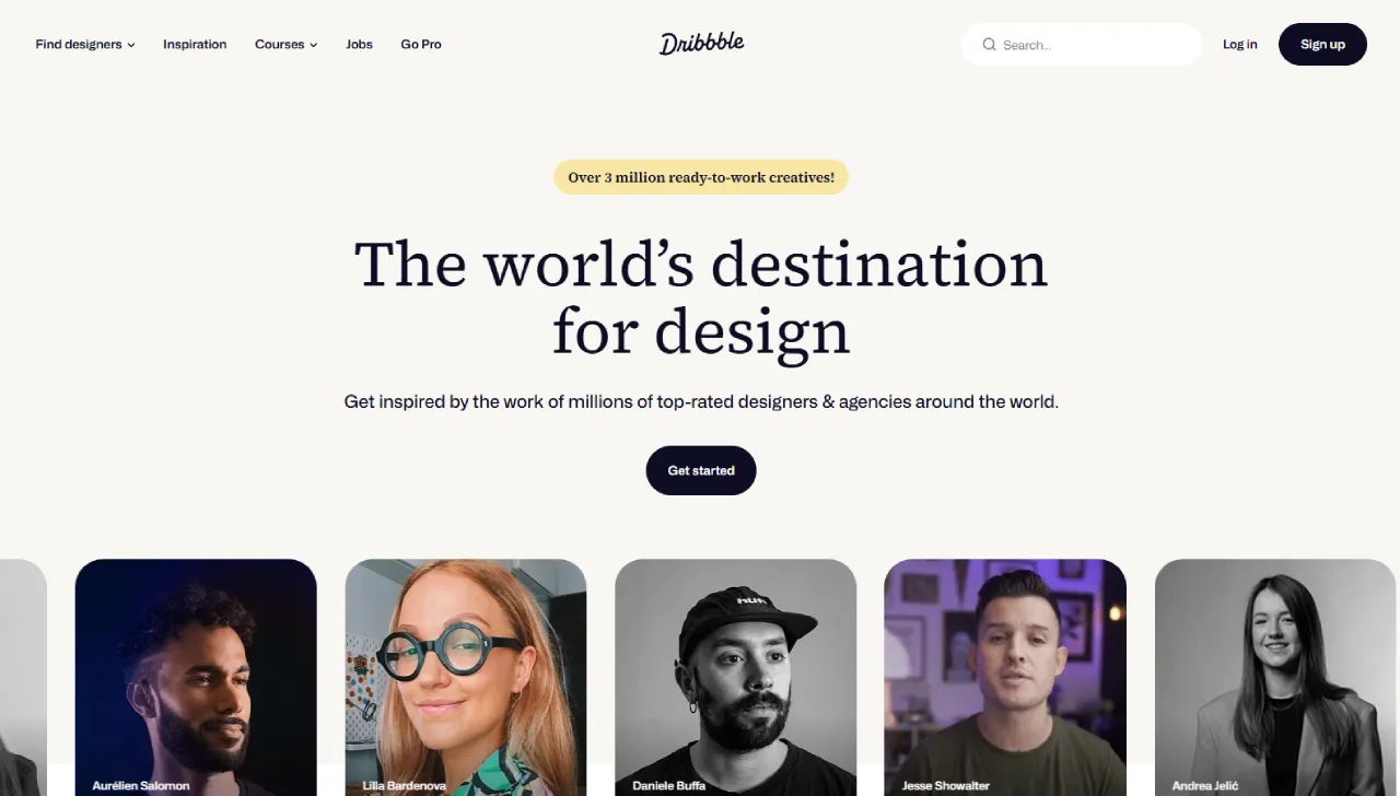
Dribble’s website elegantly displays its designers in an automatic slideshow that showcases their profiles. This makes it easy for the customer to select their favorite designer conveniently.
11. Instagram slider
Socializing and marketing is the key to win more customers around the globe.
So, the best way to engage your viewers on your website is by displaying Instagram posts here, often arranged in an Instagram carousel to make the feed more interactive.

A former popular athlete, Usain Bolt, owned a clothing brand, and his website has an Instagram slider where Instagram posts are shown. This is a great way to gain customer loyalty by wearing his brand and linking it to the website.
Use All in One Carousel for Divi to Create Customizable Sliders for Your Website
If you want to take your website to new heights and make it super engaging, install All in One Carousel for Divi for your WordPress website using Divi theme or Divi Builder.
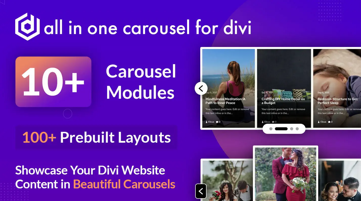
- Image Carousel
- Content Carousel
- Blog Carousel
- Card Carousel
- Team Carousel
- Testimonial Carousel
- Portfolio Carousel
- Timeline Carousel
- Product Carousel
- Logo Carousel
- Pricing Carousel
For that, it’s not necessary to be a tech expert or be required to code. You will get more than 10 types of carousels, pre-built layouts, and customization options to add a personal touch to your website.
This Divi Plugin offers subtle options to add a highly interactive carousel in Divi that would present your vision with utmost satisfaction. Using this, you can create team sliders, testimonial sliders, logo sliders, and much more, just like the slider examples you saw above.
Furthermore, the options it provides are customizable. Therefore, you get the control to shape the slider however needed.
Just install it, activate it, use its modules, and you’re all done with beautiful sliders.
Learn more about the All in One Carousel for Divi plugin at Elegant Themes Marketplace.
Final Words
Website sliders make your website more engaging, fun, and appealing. These are some of the slider examples that you can use to hook your viewers.
It is not necessary to use a slider on your website, but if you want to enhance your website, make it more interesting, and increase viewer retention, you should include it. Whether you add images, videos, or animations is your personal decision.
With the mentioned plugin, you can make that decision even better if you’re using WordPress and Divi.




0 Comments