To make an online platform thrive, it needs a good design. And good design cannot happen just right away. You need appropriate elements in the appropriate location to make any website look outstanding.
The same is true with photography websites. If you want to build good photography websites, use the right elements to make your websites do wonders.
If you’re looking to build a website for photographers or just photography websites to showcase your talent, this blog post can help you significantly achieve that. In this, you’ll find details about all the essential elements that are the root of building inspiring photography websites.
Below, we will discuss 10 essential elements for building good photography websites.
1 — Using Image Gallery on the Website
If you’re managing a photography website, it means you’re managing an online platform full of images. Without images, you can’t have a photography website. Hence, a website full of images and your designing skills to present them in the best way possible.
Adding images to the website isn’t complex; however, how you present them matters because no matter how good those images are, if not displayed well, they won’t move the users.
Therefore, you must take special care in adding images to the website. In this regard, one of the best ways is to use a gallery for the website. With a gallery, you can bring all the awesome images to a single place, providing users with accessibility to explore them better.
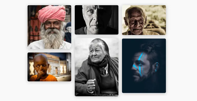
In addition, you should use an image gallery on a website because an image gallery can
- Help you showcase your portfolio.
- Help you increase your SEO ranking, especially in the Images tab.
- Increase social sharing of your work.
- Help you improve user sessions as well.
The above reasons are enough to create an image gallery on your website. However, don’t just create a basic image gallery while designing a photography website. Instead,
- Use masonry galleries.
- Apply filter option.
- Apply the lightbox effect.
- Use multiple columns.
- Add paginations and other customizations.
With these, you’ll successfully build one of the best sites for photographers or photography.
2 — Highlight Customer Testimonials
You have a great portfolio of outstanding images. But is there anything that can back their authenticity? Their novelty?
Well, client testimonials are a great resource to support one’s portfolio of great work. If you’re a professional photographer, for example, a wedding photographer, then using couples’ testimonials would greatly benefit you.
Whether you’re operating offline or online, having authenticity and trust among your customers is the ultimate selling point. Whatever you show, people will believe if you have the data to prove your claim, and testimonials can help you achieve that.
It’s found that 85% of consumers, before purchasing a product or trusting a brand, prefer to read at least 10 reviews online. Hence, you can’t ignore them.
When you work on your photography website and want to display customer testimonials, you can try the following:
- Use client testimonials with a star rating schema.
- Show testimonials on a slider.
- Apply masonry effect.
- Showcase client image, name and designation.
Only displaying client testimonials shouldn’t be your primary focus. Instead, you should focus on the best way to present them.
3 — Add Client Logos
In addition to the client testimonials, what else you can do to build trust among users is display client logos.

If you’ve worked with organizations as a photographer or your client for whom you’re building the website, then it’s highly recommended that you add logos of those companies. A brand that is already popular and has worked with you adds more authenticity to your services. People will take you as a brand as well.
They will trust you to provide state-of-the-art services because that’s why those brands trust you. Therefore, ensure you add client logos when creating a photography website.
4 — Pricing Packages
You offer photography services, and you’re not telling how much you charge might take away your potential customers. Many photography websites don’t share their fees and deal directly after the user has contacted them through a phone or form.
However, many customers are budget-oriented, and if they see the price packages matching their budget on a different website, they won’t bother contacting you.
Therefore, don’t miss this potential element to build one of the excellent photography websites.
Clear and easy-to-understand pricing on your photography website will drive the customers to enquire further. Also, don’t overdo anything when you go after this particular element. Keep things to a minimum.
5 — Highly Engaging Hero Section With Optimized CTA(s)
The start of a website should be engaging. If the hero section of a website isn’t convincing, users won’t scroll below it. They will leave as soon as they arrive, increasing the bounce rate. Hence, bad SEO rankings.
When designing a photography website, make sure you build an engaging hero section comprising essential elements, persuasive copy and high-quality visuals. The essential elements could be,
- Optimized CTA(s).
- Contact form.
- A sliding hero is entailing different services.
- And client reviews, if possible.
From the above, what’s highly recommended are the CTAs and Contact Form. These two elements will guide the user to your chosen targeted page or help you capture the lead as soon as possible.

You can also go with dual CTAs if you plan to redirect the user to the pricing page and contact you, like the above hero section example.
6 — Services and Benefits Section
Good photography websites never miss to highlight what they can offer to their customers. If you’re building a photography website, then it’s all about services unless you’re not some merchandise.
You need to ensure that the homepage of your website should contain a section to showcase what services you offer. Plus, what benefits can the user have by choosing to avail them? In this case, what’s best is to use image cards or blurbs instead of typical content.
With attractive elements, you’ll make the services section look essential to the eyes of the user. They will stop, engage, and most likely go with your services.
Overall, a good services section will improve the user sessions as well as potential leads.
7 — Utilize the Power of FAQs
If you’ve got a fantastic image gallery, you’ve got outstanding reviews, and even you’ve got reasonable prices, but still, some users might not be satisfied. They might have doubts whether you are the professional they need.
So, in this case, what will you do to win the customers’ trust? What will you do to show them you have the skills to help them achieve what they want to? Well, when people have doubts, they need answers, and on an online platform, the best way to clear users’ doubts is to use Frequently Asked Questions.
You can do the same with your platform as well. It will increase the authenticity of your platform. Users will find it easier to opt for your services without raising a query. And most importantly, you’ll lower the pressure on your customer support team.
However, when you add FAQs to your website, ensure they are optimized with FAQPage Schema. Because it helps your website rank higher in the search results, which will increase the click-through rate.
This simply means more organic traffic and more organic leads to capture.
8 — Before and After Sliders to Display Editing Skills
If you’re good at editing photographs and other types of graphics, then using a before and after slider will help you the most.
You can showcase to users both original and edited versions of the same image to highlight your editing skills. This element will immensely feature your photo editor skill and motivate users to work with you.
To make your slider more user-friendly and up to the latest trends, you can apply
- Different before and after image slider layouts, such as Horizontal and Vertical.
- Use on-click and on-hover slider move.
- Add a label to your before and after image as per your choice.
A before and after image slider is preferred for inspiring photographers’ website design who customize images, create creatives, and more.
9 — Contact Forms
Another of the best photography website tips you should keep in mind when creating a photography website is using a clear contact form. Without a form, your homepage or website is incomplete.
It’s necessary to dedicate a page to allow users to contact you. And on that page, you use a straightforward yet highly customized contact form. The Hero section is another good place to showcase the contact form. However, if users choose to pass it and first explore the site, then considering another location for it is necessary.
You can keep the contact at the bottom or go with a separate page. But you mustn’t ignore it. Because without it, users won’t be able to reach out, which is a very general requirement. Also, when you add a contact form, ensure you minimally style it, keeping it easy to interact.
10 — Social Media Posts
Are you active on social media? By active means, are you posting content there every day? Or, if not every day, are you planning only to post your images on social media and want to display them on your website as well?
In that case, you can embed them on your website using the plugins from platforms like Facebook. Whatever your reason for posting images on social media, adding them to your website can immensely affect how users interact with the platform. Moreover, if users organically come to your photography website, you can increase your social media following by embedding social media posts.
Social media posts on your website increase the user session, which is good for SEO. Therefore, to design good photography websites, keep this in check as well.
Using Divi Theme? Then Check Out Divi Plus to Build Good Photography Websites That Sell
We have looked at 10 essential elements that can help you design an amazing website for photographers. However, among these pointers, what’s essential is where you develop your website. If you’re using WordPress and choosing the Divi theme, it’s the best start you have given to your photographer’s website design.
These two provide the best solutions to build outstanding websites of any kind. But you can still take the website to a new level by optimizing the modules of the Divi Plus plugin.
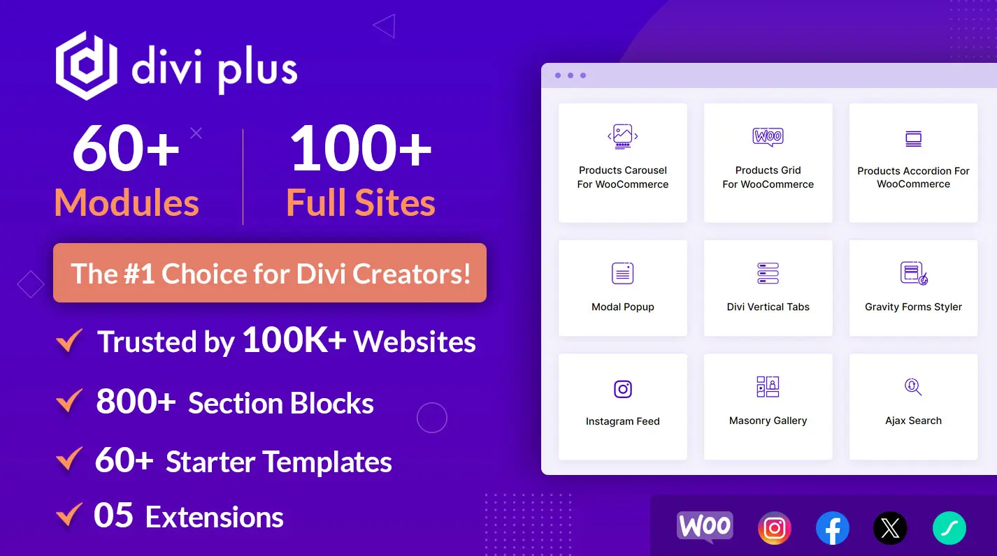
Divi Plus is a premium plugin for Divi that provides 70 modules to enhance a website’s design, performance and functionality. You can use those modules to enhance your photography website as well. Not only enhance but build one of the best sites for photographers or photography.
Using the modules available with this plugin, you can,
- Create masonry image galleries.
- Add client testimonials on a slider.
- Add client logos on a slider.
- Beautify your blog page.
- List pricing of your services.
- Use FAQPage Schema for FAQs.
- Showcase the timeline of your photography career.
And there are many, many resources that you can utilize, such as pre-built websites, templates and even design sections. Overall, it is a boost to the photography website design strategy.
Therefore, check out the plugin and seamlessly build your good photography website with the utmost satisfaction.





0 Comments