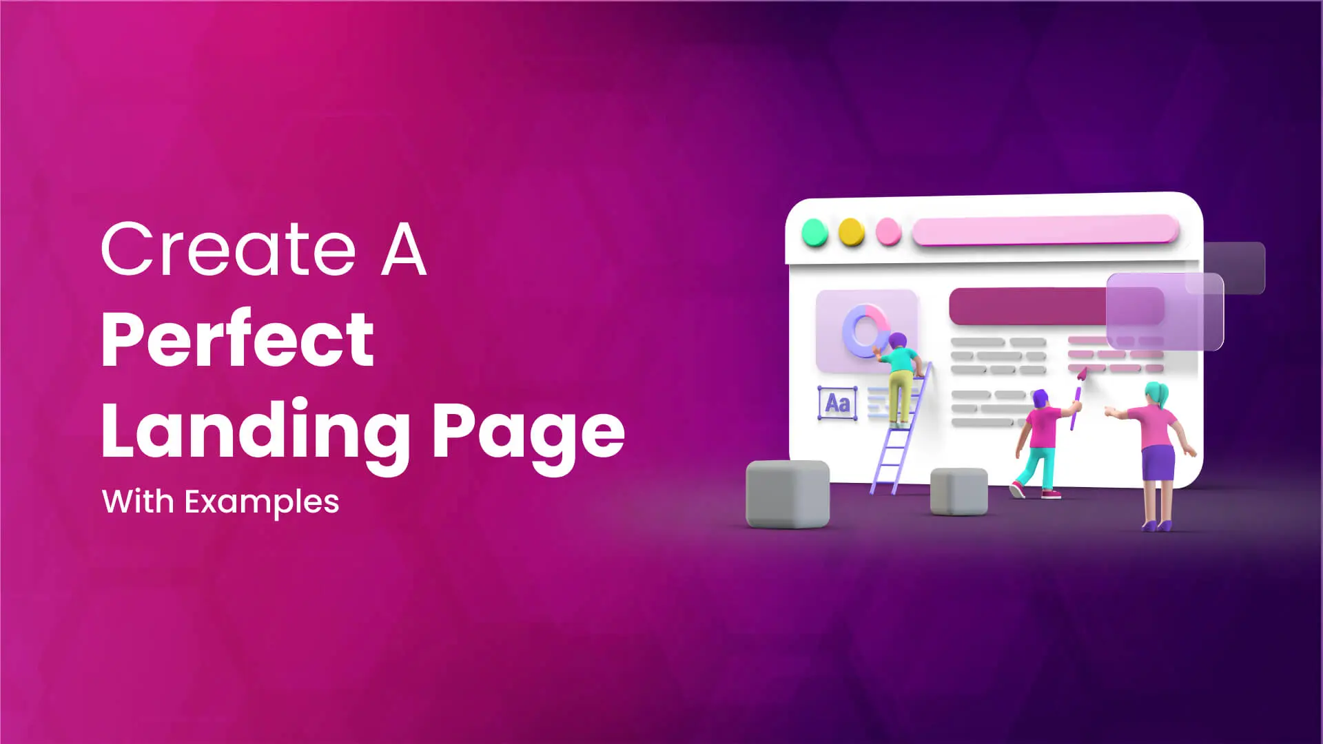
A well-constructed Landing Page can exponentially increase your leads & as well as sales. Having a website is a necessity nowadays no matter what niche your business is. But some users may have a troublesome time on the website given that there is a lot of information, pages, so here comes the savior, A Landing Page. Instead of directing all users to the website, you can lead them to your impeccable landing page where you can make them submit the details you require from them. As that’s what the final goal is. If needed, you can later take them to the website to showcase detailed information. Well, that’s a wholly optional choice though.
Everything is not what it seems, creating a Landing Page may look like an easy task but it’s actually not. A perfect landing page should follow some guidelines. If you’re looking for some ideas on how to begin with your next landing page then let’s catch a look at a few:
1. Short & Uncluttered:
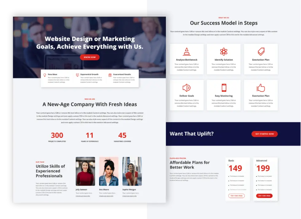
A landing page is used for one goal and one goal alone – to convert a cold user into a potential customer or to encourage a site visitor to take up an action. We understand that you’d want to describe your business properly however a landing page isn’t the exact right place to showcase all that you offer. A landing page should only cover an overview/summary of your business so that it doesn’t make the page duller and the user won’t have to read an essay.
2. Set Your Goal & Define it Clearly:

The most important thing while building a page is to set up your goal first. What precisely you need from the user. Most of the landing pages are built to convert visitors into leads (to get user’s contact information) so the form needs to be properly placed as it is the highlight, plus make sure there isn’t too much of it as shorter forms manage to get filled out more than the long ones – as they say, Less is better.
3. Hero Section:
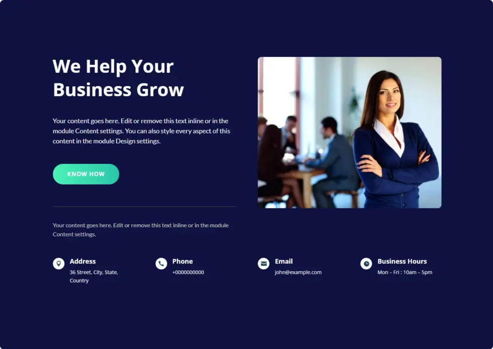
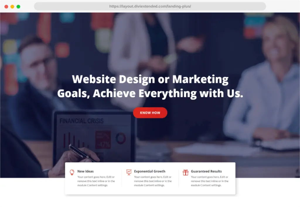
It’s the first thing users see the second they land on your landing page and it’s your first opportunity to communicate exactly what your page is all about. A hero image, text, and navigation elements on the landing page at the top can add more value to the website. Hero header makes the design look more realistic & admirable but at the same time, it should be simple and specifically targeted. If you wish to create a more innovative website for your business just go for a hero section.
4. Alluring Design:
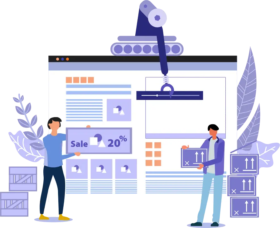
Another significant point, The design of a website is what pushes our first impression 92% of the time. Visitors subconsciously decide whether they want to stick around or not in a flash. While the design trends are changing every month yet that shouldn’t influence your landing page. On the off chance, the niche of your business permits then keep easy to eyes color scheme and layout structure. Use white spaces as much as you can and create the page in a step-wise journey so that the user doesn’t get confused about why they are here. Additionally, using high-quality images on your landing pages is one of the simplest ways to keep users stuck like glue.
5. Compelling Content:
How you tell your story is important to make your way to conversion. Utilize appealing & captivating content and avoid too much information about your business. Preferably, make it about the visitor. Like how your services are ideal for them and how they can satisfy all their demands. Put some catchy headlines so that the first impression they get of the page is ‘This is what I have been looking for.’
6. Have an Offer:

Make them an appealing offer they can never refuse your conversion rates will be on the rise in no time. However, it depends on your business, but if it allows, attract users with some nice offers. It does not necessarily have to be huge, still, a good landing page must have a great offer and be able to justify why the offer is valuable in clear and concise terms. It is just something extra to encourage users to become potential leads by submitting their details.
7. Ask Relevant Information:

In case your final goal is to get the user’s information then you must ask limited, help visitors know exactly what you want them to do on the page and just what you need. Detailed information can be grabbed later when the lead gets converted. For an instance: if it is a landing page for a real estate business where you sell the old property then you may ask for the current address and contact number. The address is helpful to determine whether it is the right lead for you and with the contact info, you can discuss the details directly with the client.
8. Testimonials:
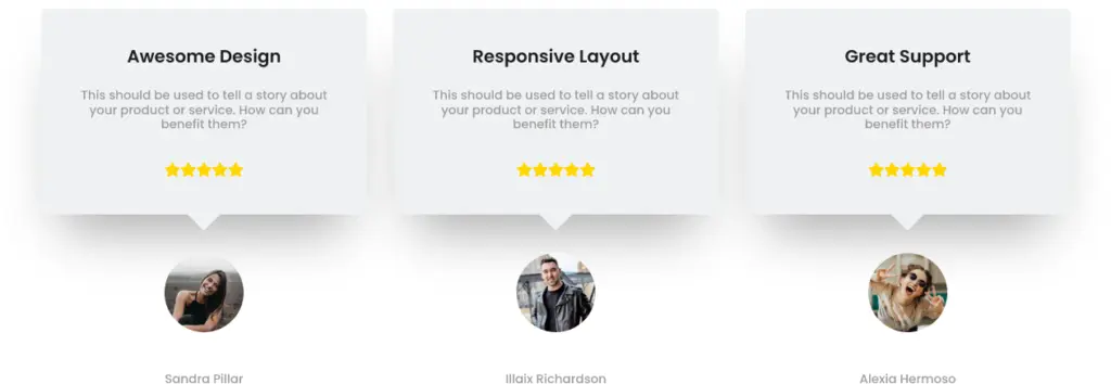
Every organization knows that testimonials are vital as 90% of people read an online review before buying. Users don’t go searching for testimonials. Rather, they need to see them when making a crucial decision. This means testimonials should be one of the very first things visitors see on your landing page. So, if you managed to collect feedback on your services in the past. Try not to stop for a second to show them off on your landing page. Testimonials are a great asset to gain users’ trust. I mean if you were looking for some sort of service, wouldn’t you be eager to know how other’s experiences went?
9. Mobile-Friendly:
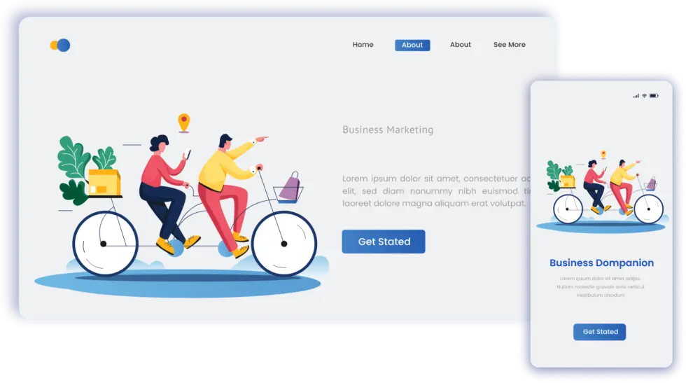
Conversions on mobile devices are invaluable for every business. If you’re wondering how to create a flawless landing page, you must assure that your landing page is functional and adaptable for all devices. I mean who doesn’t like a responsive landing page that performs adequately in all the devices like desktop, laptop, tablet, and mobiles which have a varying screen size, just the way water takes the shape of the vessel it is in.
10. A Powerful CTA:

The secret behind a converting landing page is the call-to-action button. The CTA must be a representative of precisely what your target audience will get and the experience they can anticipate. Just as you should keep a landing page centered on just one key value proposition, you should likewise design it to revolve around only one key CTA. The button should be striking as many calls to action are nothing but complex clutter for your site visitors. You also want the CTA button itself to be big and self-evident.
11. Less Loading Time:
Last but not the least, Slow page speed is a conversion killer. Google and other search engines ignore sites that load slowly but more importantly, so do the users – websites stop getting visitors, increase bounce rate, and no conversion. The majority of people aren’t going to wait more than 7 seconds max for your web page to load. If it takes longer, they’re gone, however, it’s a fixable issue. The solution to all of this is that by just improving your page speed, you can reduce the possibility of a bounce and missed conversions.
A landing page is all about converting more leads with a little effort, so here comes the best amongst the others Landing Plus a highly-converting & multi-purpose Divi layout pack for your unique business’s Landing Page.
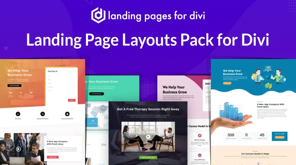
It not only looks good but also functions well. With all the latest & trendy features like 45+ Multipurpose Landing Page Layouts, Sort Out Blog Post Area, Testimonial, Staff Section, and many more, Landing Plus is the route to successful conversion. Moreover, the Divi layout pack gets updated regularly and will be loaded with more landing page layouts. Adding key information about your company goals, products, & services was never easy but with Landing Plus you get all the comfort you were longing for.


0 Comments