
Search Divi WooCommerce Extended Documentation
Search for answers or browse our knowledge base.
-
Getting Started
-
Modules
- DWE Mini Cart
- DWE Wishlists
- DWE Product Ajax Search
- DWE Woo Products
- DWE Woo Products Carousel
- DWE Woo Product Gallery
- DWE Woo Products Accordion
- DWE Woo Products Categories
- DWE Woo Brands Carousel
- DWE Woo Products Categories Carousel
- DWE Woo Products Ticker
- DWE Woo Products Hero Slider
- DWE Woo Products hotspot
- DWE Woo Brands Grid
- DWE Woo Categories Accordion
- DWE Woo Recently Viewed Products
- Show all articles ( 1 ) Collapse Articles
-
Extensions
-
Prebuilt Layouts
-
Developer Documentation
-
FAQs
- Responsive columns
- Remove add to cart text
- Mini cart in default Divi Header
- Mini Cart in custom Divi Header
- How to remove fading from out of stock product in DWE?
- How to display quickview and wishlist icons only on hover in DWE
- How to increase the size of search result box in DWE ajax search
- Menu items and category ordering/sorting
- How to align read more button in DWE Woo Product
- How to fix the "Add to Cart" button size changing on hover in WooCommerce?
Print
Responsive columns
You can define number of columns for mobile, tablets and desktop.
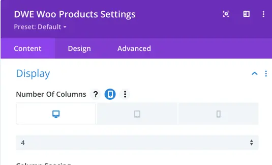
Here is the setting that you need to use.
In order to see this settings, hover next to the questions mark after the label and click on mobile icon.
Was this article helpful?
0 out Of 5 Stars
| 5 Stars | 0% | |
| 4 Stars | 0% | |
| 3 Stars | 0% | |
| 2 Stars | 0% | |
| 1 Stars | 0% |
5
Table of Contents