
Search Divi WooCommerce Extended Documentation
Search for answers or browse our knowledge base.
DWE Woo Products Hero Slider
The Woo Products Hero Slider module is a, responsive slider module built specifically for the Divi 5 framework. It allows you to create high-impact hero sections containing individual slides with rich text, call-to-action button, and side-by-side media.
How to Add Module on Page
- Open your page in the Divi 5 Visual Builder.
- Click on the gray (+) button to add a new module.
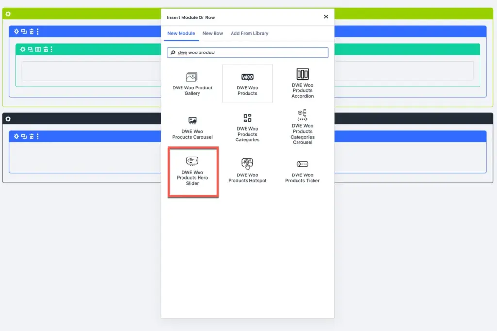
- Search for DWE Woo Products Hero Slider in the module library.
- Click on it to insert it into your layout.
- In the parent module, click + Add New Product Hero Slide under the Content tab to add individual product slides.
Content settings
Parent slider content settings
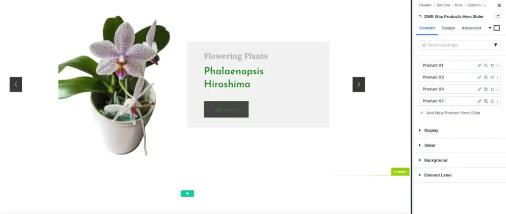
- Child items: Add, duplicate, delete, and re-order individual product slides (Product 01, Product 02, etc.).
- Display:
- Content position: Controls the position of text content relative to the product image. Options include:
- Left: Places text content on the left side and product image on the right.
- Right: Places text content on the right side and product image on the left.
- Alternate: Automatically alternates content positions between left and right for consecutive slides.
- Content position: Controls the position of text content relative to the product image. Options include:
- Background: Apply custom background colors, gradients, images, or videos to the entire slider container.
- Element label: Set a custom admin label for easy identification in the builder wireframe view.
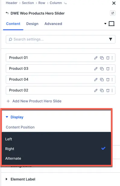
Individual slide (DWE Woo Product Hero Slide) content settings
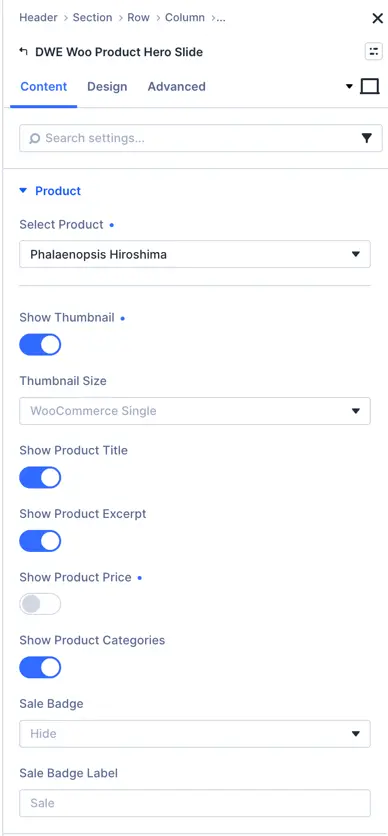
Under the Content tab of an individual slide, the Product toggle allows you to select a WooCommerce product and control which product details to display:
- Select product: Select the WooCommerce product you want to display in this slide.
- Show thumbnail: Toggle on or off to show or hide the product image/thumbnail.
- Thumbnail size: Choose the image size for the product thumbnail (e.g., WooCommerce Single, Full, Medium, etc.).
- Show product title: Enable or disable the display of the product title.
- Show product excerpt: Toggle to show or hide the short description/excerpt of the product.
- Show product price: Enable or disable the display of the product price.
- Show product categories: Toggle to show or hide the product category links.
- Sale badge: Choose whether to show or hide the sale badge on discounted products (e.g., Hide or Show).
- Sale badge label: Enter custom text to display inside the sale badge (e.g., Sale, OFF, Discount).
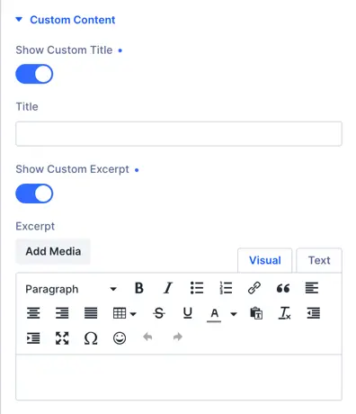
- Custom content overrides: Add custom title, custom excerpt, or custom button text if you want to override default product details.
- Background: Assign individual background colors, gradients, or images specifically for this slide.
Individual slide (DWE Woo Product Hero Slide) design settings
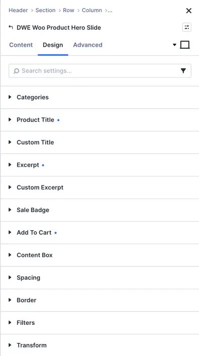
- Categories: Customize category text font, color, size, and spacing for this slide.
- Product title: Override title typography and styling specifically for this slide.
- Custom title: Override custom title styling for this slide.
- Excerpt: Adjust font styles and text color for this slide’s excerpt.
- Custom excerpt: Override custom excerpt typography for this slide.
- Sale badge: Apply specific sale badge color, font, and border styling for this slide.
- Add to cart: Complete button styling options for the Add to Cart button (button font, text color, background color, border width, border color, border radius, padding, icon, and hover effects).
- Content box: Customize inner content container spacing and background for this slide.
- Spacing: Adjust margins and paddings for elements within this slide.
- Border: Add custom borders, border width, color, and corner radius to the slide.
- Filters: Apply CSS visual filters (brightness, contrast, saturation, hue-rotate, blur).
- Transform: Apply 2D/3D transformations (scale, rotate, translate, skew) to the slide.
Slider settings
These settings are managed inside the parent Hero Slider module to control the Swiper slider logic:
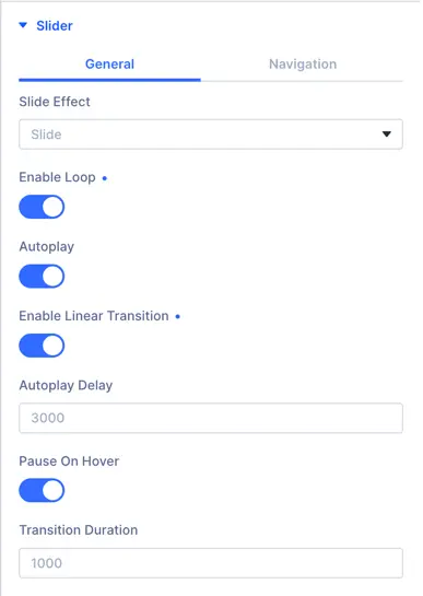
- Slide Effect: Select the transition effect between slides (Slide, Fade, Cube, Coverflow, or Flip).
- Slider Loop: Toggle ON to enable continuous loop scrolling.
- Autoplay & Autoplay Speed: Enable automatic slide transitions and define the delay speed in milliseconds (default: 3000).
- Pause on Hover: Pause the autoplay slider when a visitor hovers their mouse over it.
- Transition Duration: Set the speed of the slide transition animation in milliseconds.
- Slider Navigation (Arrows & Dots):
- Show Navigation Arrows: Toggle ON to show previous and next arrows. Custom icons can be selected.
- Arrows Position: Set the arrows to appear Inside or Outside the slide area.
- Show Control Dots: Toggle ON to show navigation pagination dots at the bottom.
- Control Dot Style: Choose from multiple dot shapes/styles.
- Enable Dynamic Dots: Condense pagination dots dynamically on smaller screens.
Design settings
Parent slider design settings
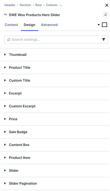
- Thumbnail: Customize product image appearance, including width, height, alignment, border radius, and box shadow.
- Product title: Control typography, font family, font size, weight, color, line height, and text shadow for product titles.
- Custom title: Style custom title text when a custom title override is applied.
- Excerpt: Customize font family, text color, size, and line height for product excerpt descriptions.
- Custom excerpt: Styling options for custom excerpt overrides.
- Price: Style product price text, including main price color, sale price color, font size, and font weight.
- Sale badge: Customize sale badge appearance (background color, text color, font, padding, and border radius).
- Content box: Style the container box holding product details (padding, background, border, and shadow).
- Product item: Overall design controls for individual product slide item wrappers.
- Slider:
- General:
- Slide effect: Choose slider animation effect (e.g., Slide or Fade).
- Enable loop: Toggle to allow continuous looping of slides.
- Autoplay: Turn automatic slide transitions on or off.
- Enable linear transition: Enable smooth linear transition animations between slides.
- Autoplay delay: Set duration in milliseconds (e.g., 3000 ms) before transitioning to the next slide.
- Pause on hover: Pause automatic sliding when hovering over the slider.
- Transition duration: Adjust speed of slide transition animation (e.g., 1000 ms).
- Navigation: Style navigation arrows (icon size, arrow color, background, hover states, and placement).
- General:
- Slider pagination: Customize pagination bullets/dots (dot size, active dot color, inactive dot color, and alignment).