Search Divi WooCommerce Extended Documentation
Search for answers or browse our knowledge base.
DWE Woo Categories Accordion
Overview of the Woo Categories Accordion module
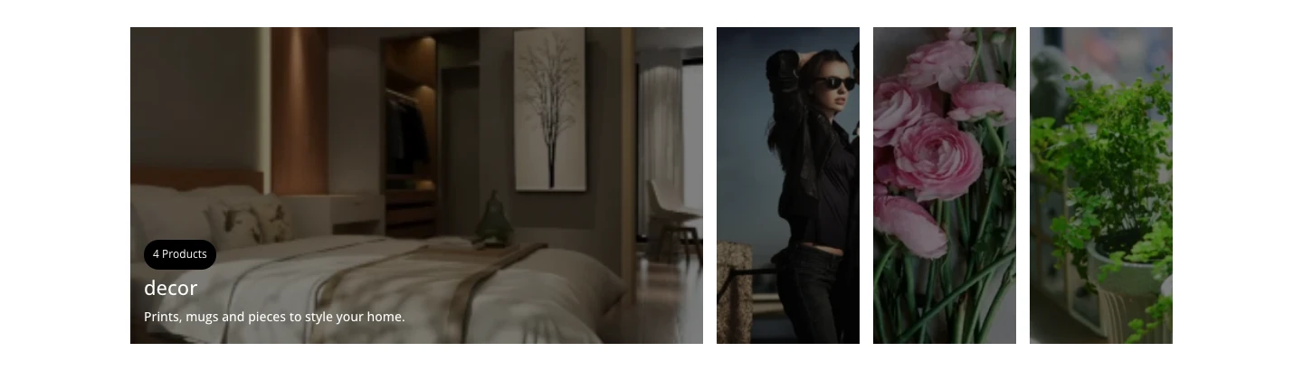
This page shows you how to add the Woo Categories Accordion module to your page and explains every setting in its Content, Design and Advanced tabs, with screenshots. The Woo Categories Accordion module shows your WooCommerce product categories as an image accordion. Each category is a panel with its image, name, product count and an optional description and Shop Now button; the panel expands when a visitor hovers over it or clicks it.
Requirements: Divi 5 and WooCommerce. This module is new in Divi WooCommerce Extended 2.3.0 and is available in the Divi 5 Visual Builder.
How to add the Woo Categories Accordion module to your page
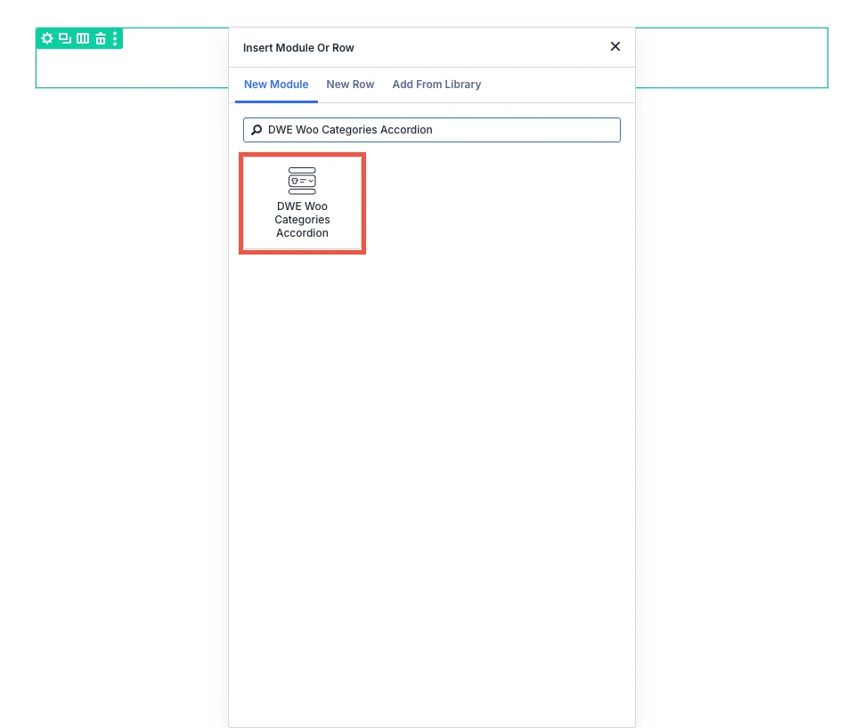
- Open your page in the Divi Visual Builder.
- Click the gray (+) icon inside a row to add a new module.
- Search for DWE Woo Categories Accordion in the module search box.
- Click the module to insert it. Its settings open on the right.
Content tab settings
The Content tab holds the module’s own settings, grouped in the toggles below. Background and Element Label are the standard Divi options.
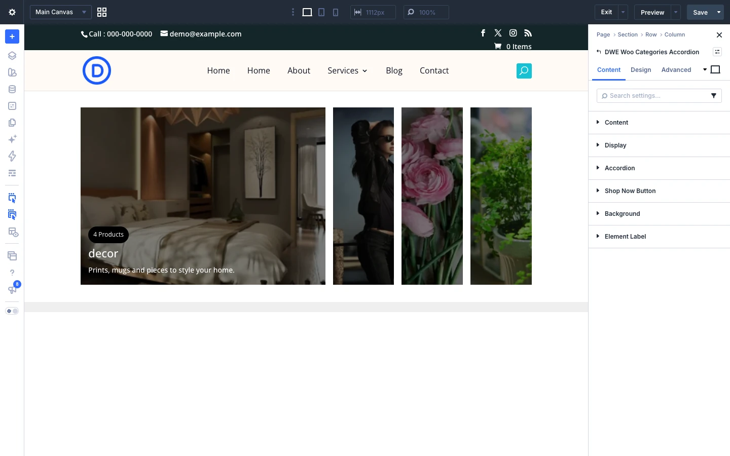
Content
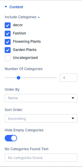
- Include Categories: Pick specific categories to show. Leave empty to show all of them.
- Number Of Categories: How many categories to display.
- Order By: Choose what categories are sorted by.
- Sort Order: Show categories in ascending or descending order.
- Hide Empty Categories: Hide categories that have no products.
- No Categories Found Text: Text shown when no categories match your settings.
Display
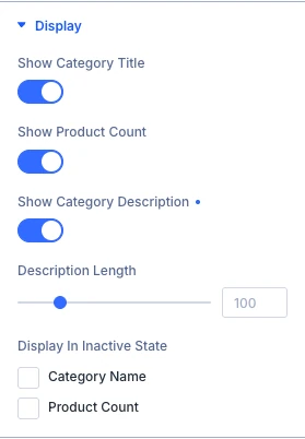
- Show Category Title: Show the category name on each accordion item.
- Show Product Count: Show how many products are in each category.
- Show Category Description: Show the category’s description text on each accordion item.
- Description Length: Move the slider or input the value to increase or decrease the length of description, select zero to remove length limit.
- Display In Inactive State: Choose which of these still show while an accordion item is collapsed (not expanded).
Accordion
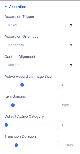
- Accordion Trigger: Select the accordion trigger.
- Accordion Orientation: Select the accordion orientation.
- Content Alignment: Select the vertical position of the title, count, description and button within each accordion item. Use the Text settings in the Design tab for horizontal alignment.
- Active Accordion Image Size: Move the slider or input the value to increase or decrease the size of the active (expanded) accordion item relative to the others.
- Item Spacing: Move the slider or input the value to increase or decrease the spacing between the accordion items.
- Default Active Category: Which accordion item is expanded by default, counting from 1.
- Transition Duration: Enter the transition duration.
Shop Now Button
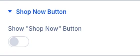
- Show “Shop Now” Button: Show a “Shop Now” button on each accordion item.
When you switch on the toggles above, these settings appear as well:
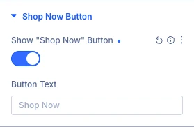
- Button Text: Text shown on the “Shop Now” button.
Design tab settings
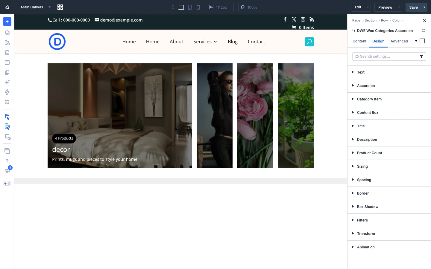
The Design tab lets you style each part of the module:
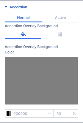
- Accordion: styling options for the accordion.
- Category Item: styling options for the category item.
- Content Box: styling options for the content box.
- Title: styling options for the title.
- Description: styling options for the description.
- Product Count: styling options for the product count.
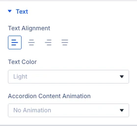
- Text, Sizing, Spacing, Border, Box Shadow, Filters, Transform, Animation: the standard Divi design options for the whole module.
Advanced tab settings
The Advanced tab has the standard Divi options: Attributes (add a CSS class or ID), CSS, HTML, Conditions, Interactions, Visibility, Transitions, Position and Scroll Effects.