
Search Divi WooCommerce Extended Documentation
Search for answers or browse our knowledge base.
DWE Woo Products hotspot
The Woo products hotspot module for the divi 5 builder allows you to showcase WooCommerce products visually by placing interactive hotspots (pointers) over a product. When visitors hover over or click a hotspot marker, it reveals a tooltip containing key product details like title, price, description, and an add-to-cart link.
How to add module on page
- Open your page in the divi 5 visual builder.
- Click on the gray (+) button to add a new module.
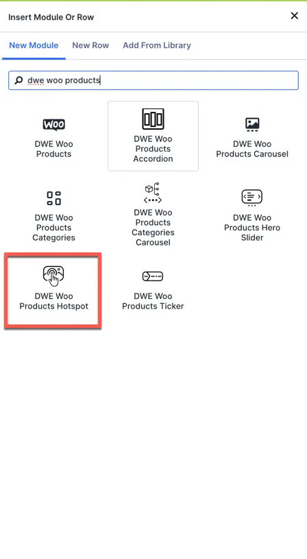
- Search for DWE Woo products hotspot and insert it.
- Upload your main background image (e.g., a room layout, flat lay, or group product photo) and begin adding individual hotspot markers.
Configurations and content settings
The Content settings tab features the parent image uploader, child item repeater, and tooltip element toggle parameters.
Hotspot content settings
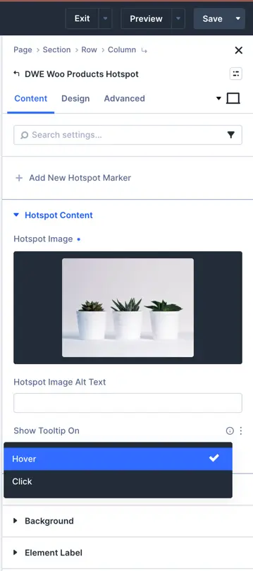
- Add new hotspot marker: Click this button to insert a new hotspot item repeater card over the layout.
- Hotspot image: Upload the main background graphic (e.g., room layout or catalog scene) on which hotspot markers are placed.
- Hotspot image alt text: Enter alternative description text for the background image for search engine optimization.
- Show tooltip on: Dropdown option to define the trigger condition:
- Hover: The tooltip box slides in when the visitor hovers their pointer over the marker.
- Click: The tooltip reveals only when a user clicks directly on the hotspot marker.
Tooltip content settings
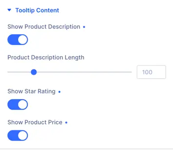
- Show product description: Toggle switch to display or hide the WooCommerce product’s short description text within the tooltip card.
- Product description length: Slider setting to set the maximum character limit for the displayed description text (default is set to
100). - Show star rating: Toggle to display WooCommerce average user rating stars inside the product tooltip.
- Show product price: Toggle to show or hide the active regular/sale pricing tags of the linked WooCommerce item.
Design and styling options
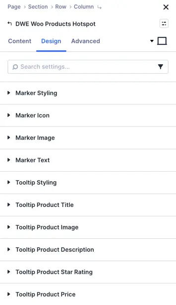
The Design tab allows full styling controls of the marker properties and tooltip children elements.
Marker styling settings
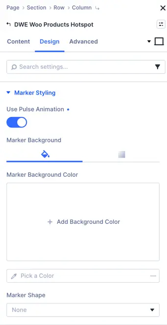
- Use pulse animation: Toggle ON or OFF to add a continuous wave pulsation effect to draw focus to the hotspots.
- Marker background color: Choose a solid color or gradient background fill parameters for the hotspot pointer dot.
- Marker shape: Select a custom wrapper outline shape for the hotspot marker (choose
Noneor specific styles from the dropdown).
Other styling options
The module features dedicated style toggles to customize individual layout blocks:
Frequently asked questions
Can I use custom icons for different markers in the same module?
Yes, you can edit each child hotspot marker item separately to assign a unique icon or custom image using the Marker icon or Marker image configuration options.
How can I adjust the size of the product rating stars?
Navigate to the Design > Tooltip product star rating options inside the module settings to scale the size and configure spacing for the rating stars.