
Search Divi WooCommerce Extended Documentation
Search for answers or browse our knowledge base.
Recently Purchased Popup
Overview of the Recently Purchased Popup extension
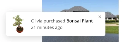
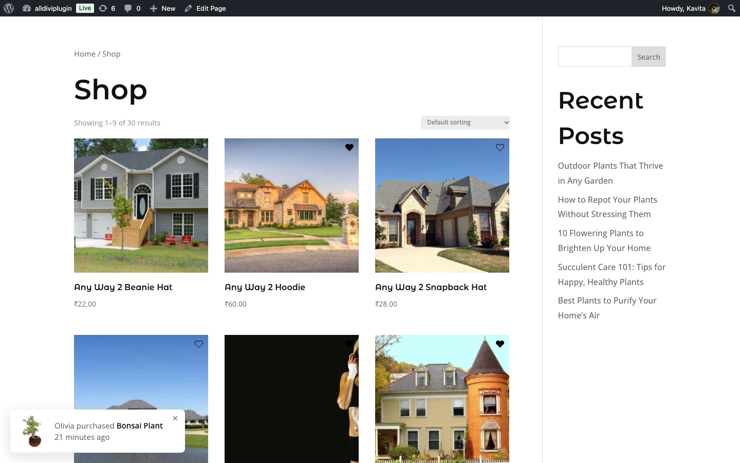
The Recently Purchased Popup shows a small notification on your store, such as “Olivia purchased Bonsai Plant 21 minutes ago”. It uses real orders from your WooCommerce store to build trust and show visitors what other customers are buying. Each notification shows the product image, the customer’s first name, the product name and how long ago it was bought, and links to the product page.
This page explains how to turn the popup on and every setting in its General, Display and Style tabs. The extension is new in Divi WooCommerce Extended 2.3.0 and needs WooCommerce.
How to turn on the Recently Purchased Popup
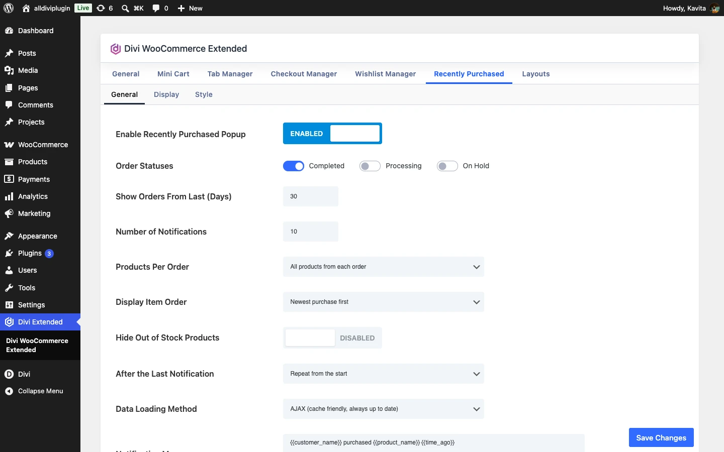
- In your WordPress dashboard, go to Divi Extended → Divi WooCommerce Extended.
- Open the Recently Purchased tab.
- In the General sub-tab, switch on Enable Recently Purchased Popup. The Display and Style sub-tabs appear.
- Adjust the settings and click Save Changes.
General settings
The General sub-tab controls which orders are used and what the notification says.
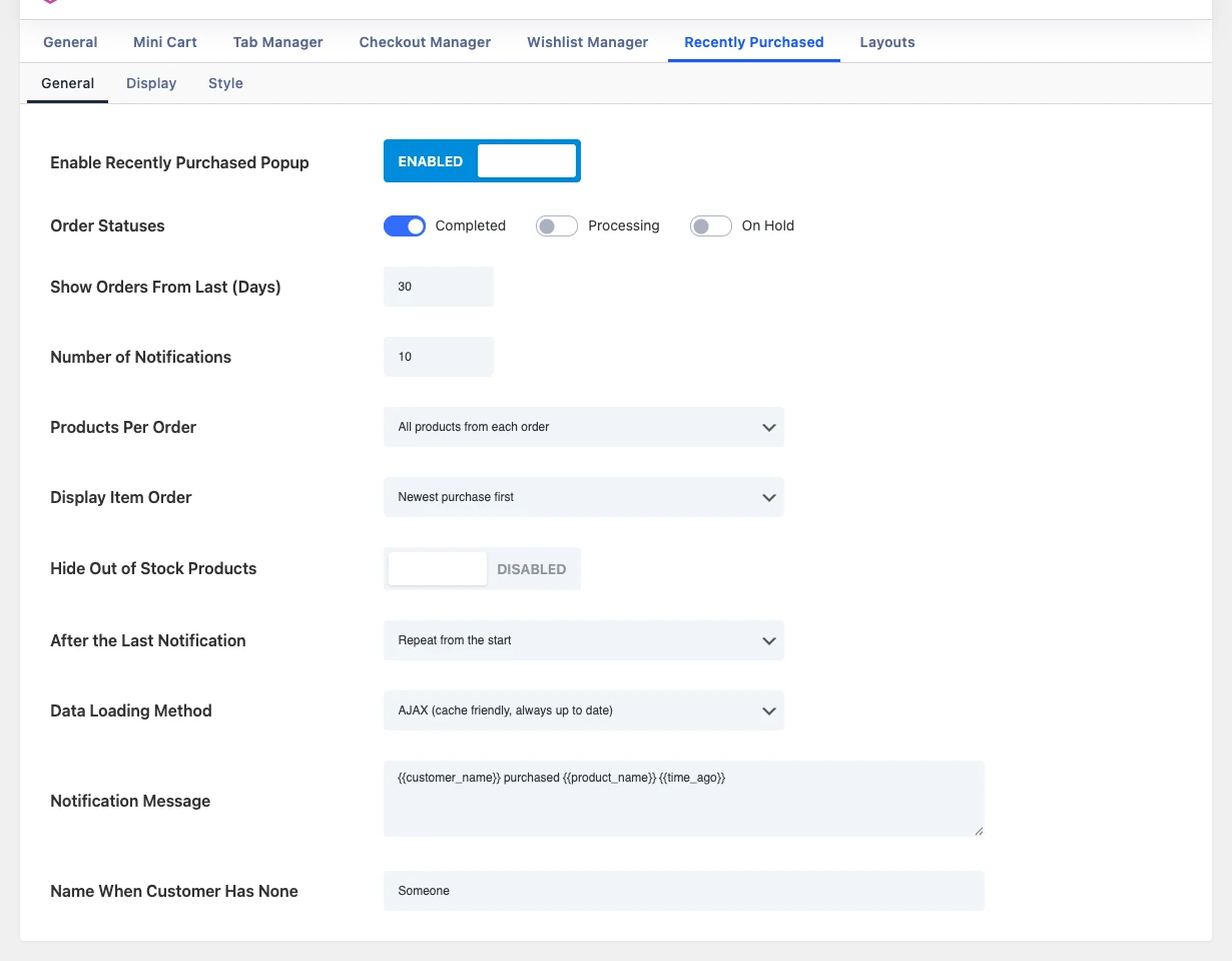
- Enable Recently Purchased Popup: Enable to show a small popup on your store that tells visitors about products other customers recently purchased.
- Order Statuses: Only orders with the selected statuses are shown in the popup. Choices: Completed, Processing, On Hold.
- Show Orders From Last (Days): Only orders placed within this many days are shown. Allowed range is 1 to 365.
- Number of Notifications: The maximum number of recent purchases to show in one go. Allowed range is 1 to 50.
- Products Per Order: Choose how orders with several products are shown. “All products” gives one notification for every product in the order, so one order with 3 products shows 3 notifications. “One product” shows only the first product of each order, so every notification comes from a different order. The Number of Notifications limit applies to both. Choices: All products from each order, One product from each order.
- Display Item Order: The order the notifications are shown in. “Newest purchase first” follows the order dates. “Random order” mixes the list again on every page load, so visitors do not always see the same sequence. Choices: Newest purchase first, Random order.
- Hide Out of Stock Products: Leave out products that are currently out of stock, so the popup never advertises something customers cannot buy.
- After the Last Notification: Choose what happens once every notification has been shown. Choices: Repeat from the start, Stop showing notifications.
- Data Loading Method: AJAX loads the purchases after the page loads and works with page caching. Inline data is added to the page itself, so a page cache may show outdated purchases until it is cleared. Choices: AJAX (cache friendly, always up to date), Inline data (in the page, can be outdated with page cache).
- Notification Message: Text shown in the popup. HTML tags such as strong, em, u, small, span, a and br are allowed. Available placeholders:
{{customer_name}},{{product_name}},{{product_price}},{{quantity}}and{{time_ago}}. - Name When Customer Has None: Used for
{{customer_name}}when an order has no billing first name. Only the first name is ever shown.
Message placeholders
Use these placeholders in Notification Message. They are replaced with the details of each order:
{{customer_name}}: the customer’s billing first name (the last name is never shown). If the order has no first name, the Name When Customer Has None text is used.{{product_name}}: the product name, linked to the product page.{{product_price}}: the product price.{{quantity}}: how many of the product were bought.{{time_ago}}: how long ago the order was placed, for example “21 minutes ago”.
For example: <strong>{{customer_name}}</strong> bought {{quantity}} × {{product_name}} {{time_ago}}
Display settings
The Display sub-tab controls where, when and for whom the popup appears.
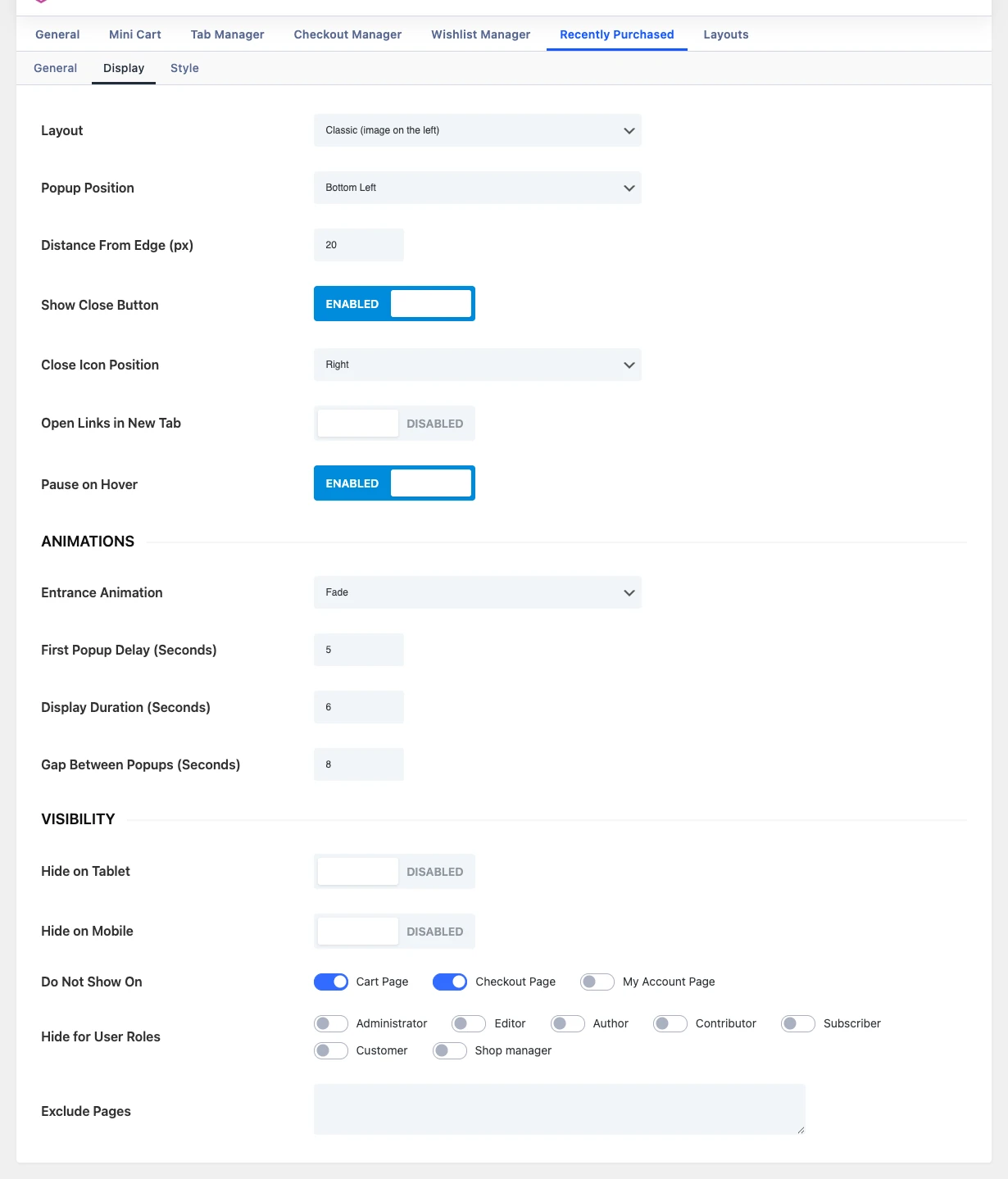
- Layout: Choose how the image and message are arranged in the popup. Choices: Classic (image on the left), Reverse (image on the right), Card (image on top).
- Popup Position: Select the corner of the screen where the popup appears. Choices: Bottom Left, Bottom Right, Top Left, Top Right.
- Distance From Edge (px): How far the popup sits from the screen edges, in pixels.
- Show Close Button: Let visitors close the popup. It stays closed on that page and appears again when they open another page.
- Close Icon Position: Which top corner of the popup the close icon sits in. When it sits on top of the product image, it gets a small round background so it stays easy to see. Choices: Right, Left.
- Open Links in New Tab: Open the product links in the popup (image and message) in a new browser tab.
- Pause on Hover: Keep the popup on screen while the visitor points at it. The display time starts again when they move away.
- Entrance Animation: How the popup appears and disappears. Choices: Fade, Zoom, Pop (bounce in), Flip Horizontal, Flip Vertical, Rotate, Slide From Left, Slide From Right, Slide From Top, Slide From Bottom.
- First Popup Delay (Seconds): How long to wait after the page loads before the first popup appears.
- Display Duration (Seconds): How long each popup stays on screen.
- Gap Between Popups (Seconds): The pause between one popup disappearing and the next one appearing.
- Hide on Tablet: Hide the popup on screens between 768px and 980px wide.
- Hide on Mobile: Hide the popup on screens 767px wide or narrower.
- Do Not Show On: The popup is not shown on the selected pages. Choices: Cart Page, Checkout Page, My Account Page.
- Hide for User Roles: The popup is not shown to logged in users with the selected roles, for example Administrator and Shop manager, so you are not shown your own store popups. Visitors who are not logged in always see it.
- Exclude Pages: Page, post or product IDs where the popup must not show, separated by commas, for example 12, 45, 301. You can find an ID in the address bar when you edit the page.
Style settings
The Style sub-tab controls how the popup looks.
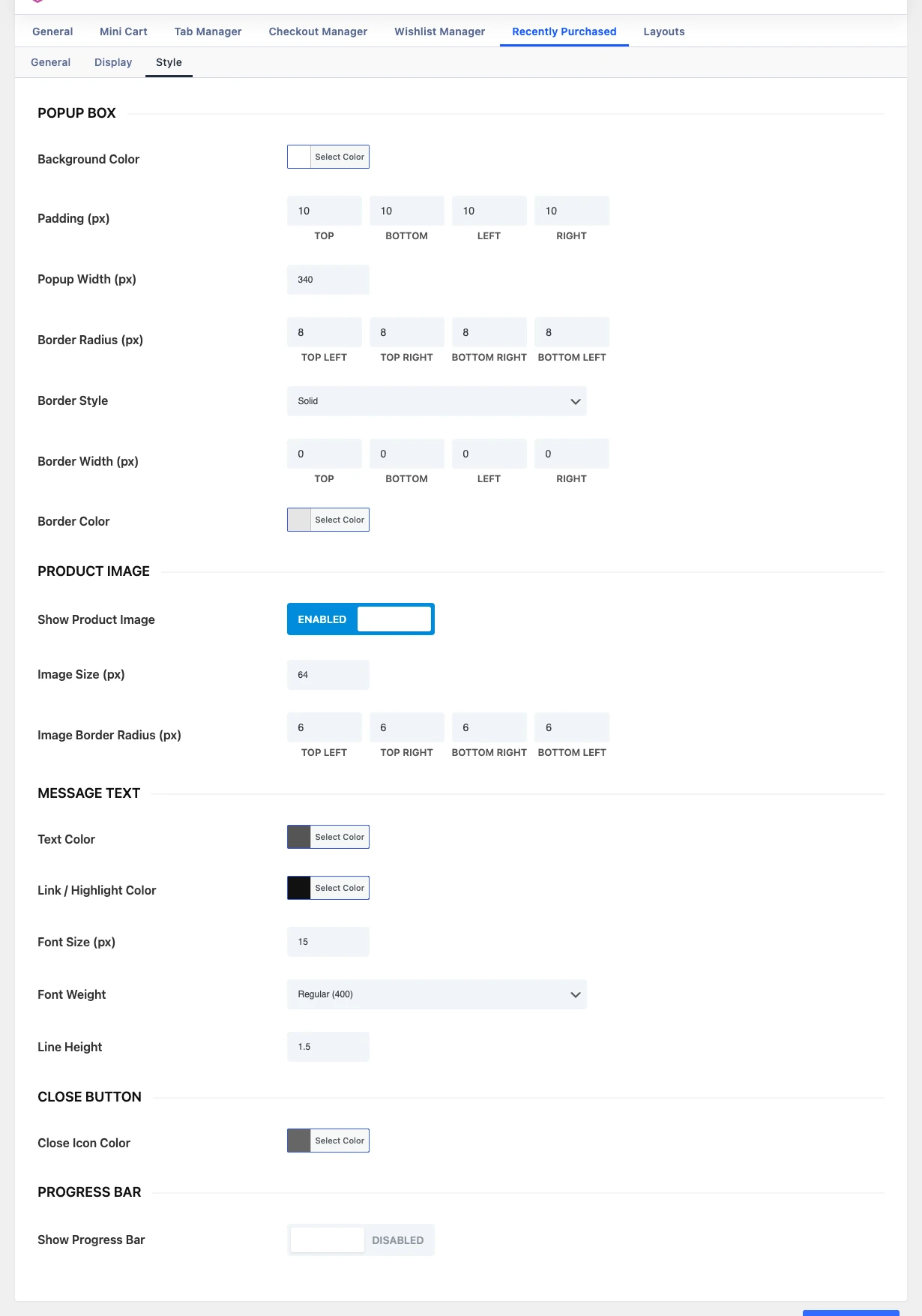
- Background Color: Background color of the popup.
- Padding (px): Space between the popup edge and its content, in pixels.
- Popup Width (px): Maximum width of the popup, in pixels. It never grows wider than the screen.
- Border Radius (px): Roundness of each popup corner, in pixels.
- Border Style: Line style of the popup border. It only shows when a Border Width is set. Choices: Solid, Dashed, Dotted, Double, Groove, Ridge, Inset, Outset.
- Border Width (px): Width of the popup border on each side, in pixels. Leave at 0 for no border.
- Border Color: Color of the popup border.
- Show Product Image: Show the product image in the popup. Turn off for a text-only popup.
- Image Size (px): Width and height of the product image, in pixels. The Card layout shows a full width image that is twice this tall.
- Image Border Radius (px): Roundness of each product image corner, in pixels.
- Text Color: Color of the notification message text.
- Link / Highlight Color: Color of the product name link and any bold text in the message.
- Font Size (px): Font size of the message text, in pixels.
- Font Weight: Weight of the message text. Bold tags in the message always stay bold. Choices: Light (300), Regular (400), Medium (500), Semi Bold (600), Bold (700).
- Line Height: Line height of the message text, as a multiple of the font size (for example 1.5).
- Close Icon Color: Color of the close (×) icon.
- Show Progress Bar: Show a thin bar on the popup that shrinks while the popup is on screen, showing how long is left before it hides.
- Progress Bar Color: Color of the progress bar.
- Progress Bar Height (px): Thickness of the progress bar, in pixels.
- Progress Bar Position: Which edge of the popup the progress bar runs along. Choices: Bottom edge, Top edge.
Troubleshooting: the popup does not appear
- Check that there are orders with one of the selected Order Statuses (Completed and Processing by default) placed within Show Orders From Last (Days).
- Wait for the First Popup Delay (5 seconds by default) after the page loads.
- Check that the page is not excluded in Do Not Show On (the Cart page is excluded by default) or Exclude Pages, and that your user role is not selected in Hide for User Roles.
- On a phone or tablet, check Hide on Mobile and Hide on Tablet.
- If a visitor closes the popup, it stays closed on that page and comes back on the next page.
- If After the Last Notification is set to Stop showing notifications, no more popups appear once the list has been shown.
- If you use Inline data with a caching plugin, clear the page cache to show new orders, or switch to AJAX.
Note: Only the customer’s first name is shown. No last name, email or address is ever shown in the popup.