
Search Divi Blog Extras Documentation
Search for answers or browse our knowledge base.
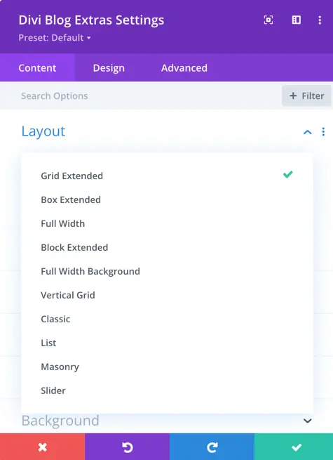
Layout selection
Divi Blog Extras is a responsive blog layouts extension for Divi. It comes with 12 layout designs. Below is the comprehensive documentation for each of the 12 layouts.
1. Grid Extended
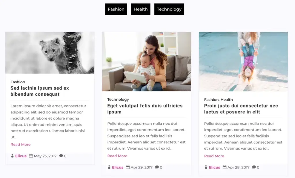
The Grid Extended layout displays blog posts in a card-grid interface.
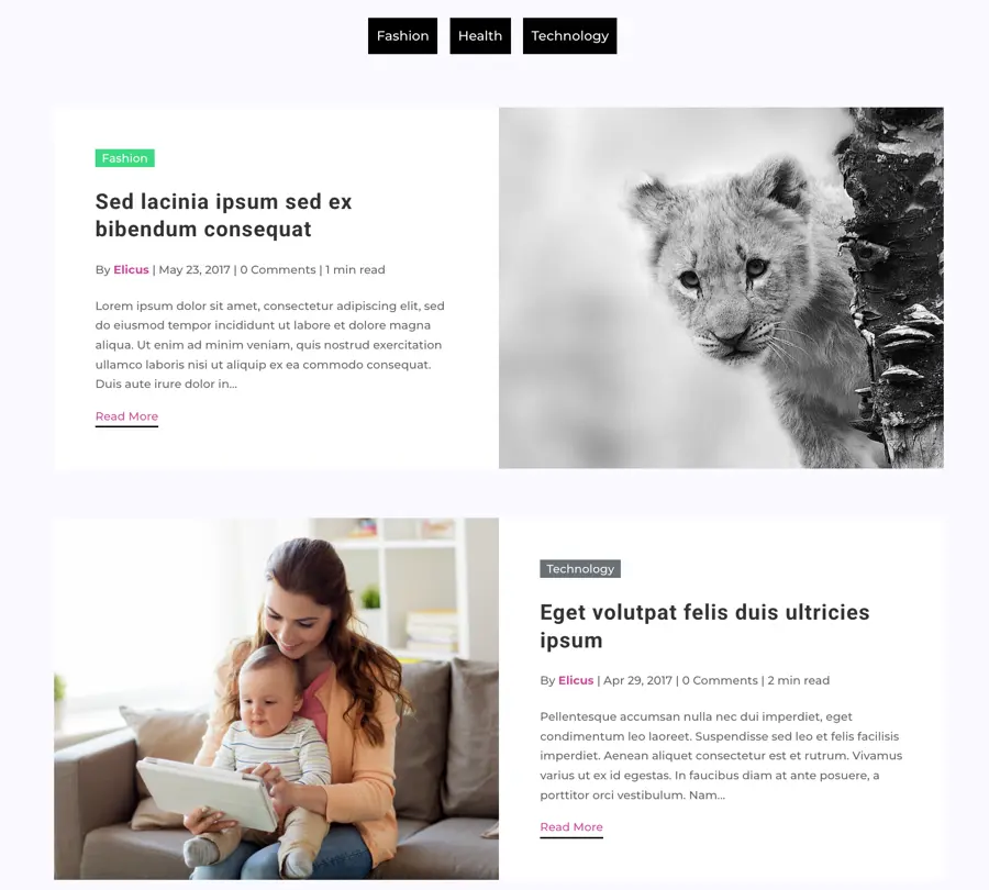
2. Box Extended
The Box Extended layout isolates all text elements inside a dedicated content container block and places the featured image completely outside this container. This creates a clean boundary between the visual asset and the editorial content of the card.
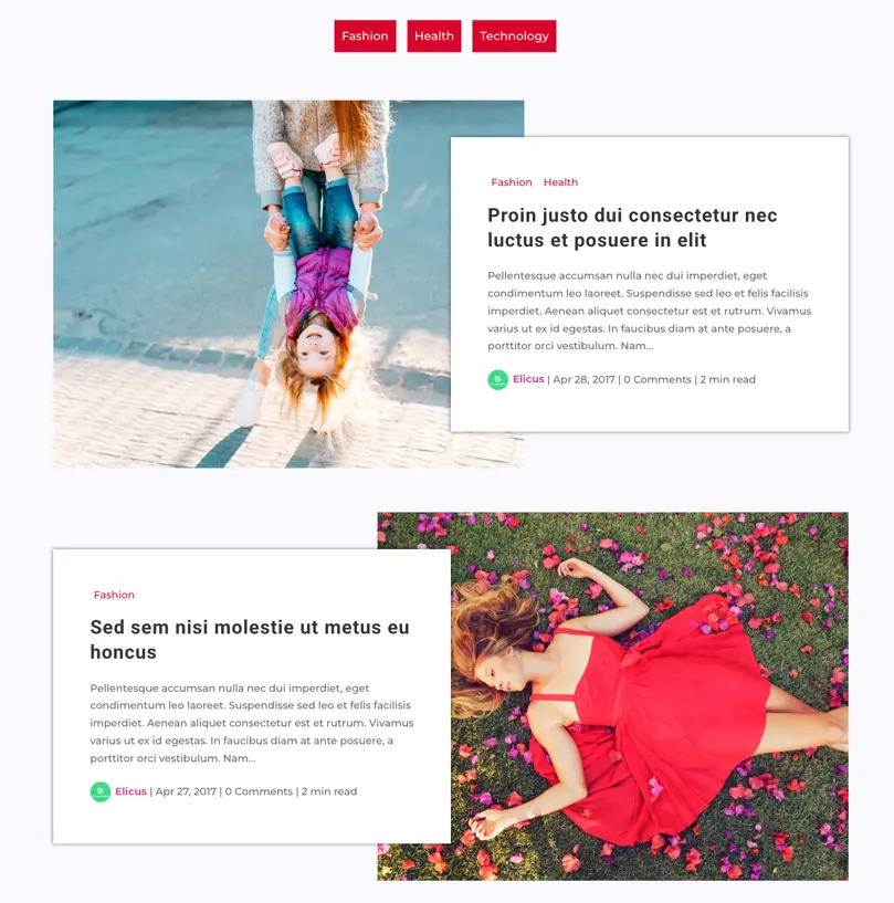
3. Full Width
The Full Width layout displays posts in a standard full-width horizontal feed. It is designed to capture the classic look of a daily journal or a traditional publication.
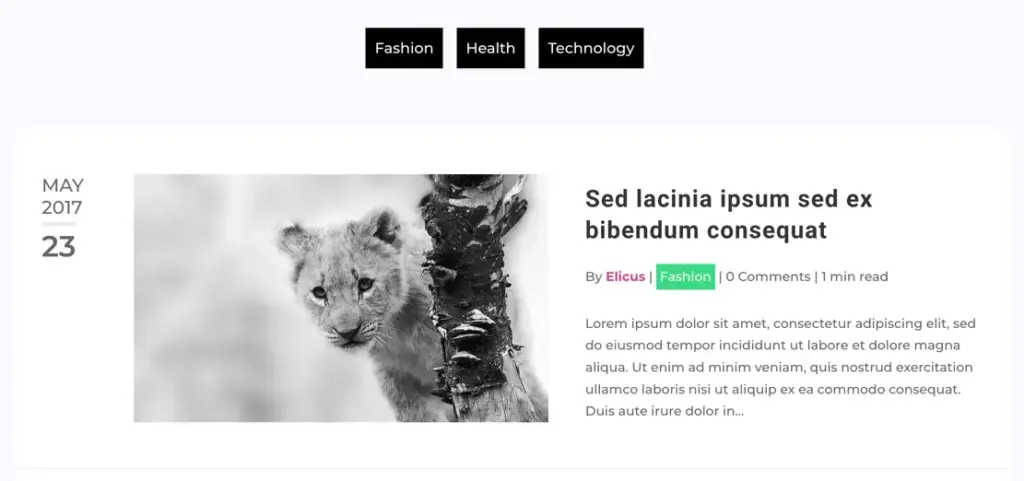
Unique Feature: Features a prominent, styled calendar date block placed at the start of the card content, rendering the Month, Year, and Day stacked vertically inside an italicized block format.
4. Block Extended
The Block Extended layout is a versatile layout that allows to customize the position of the featured image relative to the post details. It utilizes visual metadata icons to give your blog feed a polished, app-like appearance.
Unique Feature: The post metadata elements include integrated ETmodules icons for enhanced visual guidance:
Featured Image Position Variants:
- Top: The image displays traditionally at the top of the post card inside its media container.
- Background: The featured image acts as the background cover of the block. Content is overlaid on top of the image with a customizable color overlay.
- Alternate: Automatically alternates the layout of posts. Even items display the image at the Top, while odd items render the image in the Background.
5. Full Width Background
The Full Width Background layout renders the featured image as a full-size cover backdrop. The entire content of the card (metadata, title, excerpt, and CTA) floats on top of the featured image, creating a layout similar to premium hero headers.
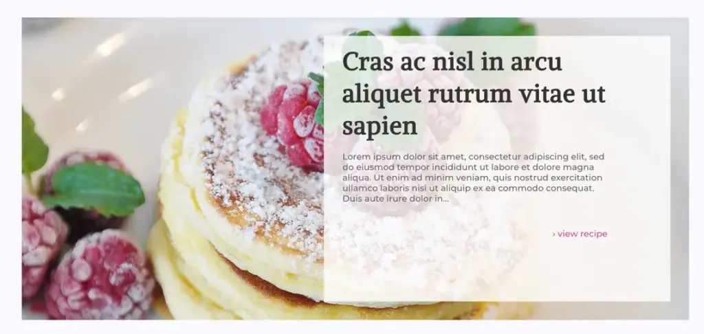
Unique Feature: Supports background overlay colors and hover icon overlays. If a post does not have a featured image, it gracefully falls back to a clean text-only card container to maintain visual hierarchy.
6. Vertical Grid
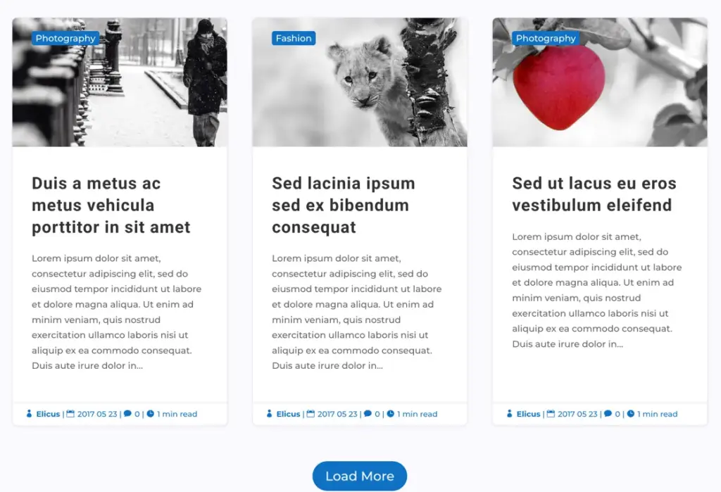
The Vertical Grid layout is a clean, vertically-stacked block grid layout. The image sits at the top, followed by the categories, the title, and the excerpt content, while the metadata row is neatly arranged in a footer block at the bottom of the card.
Unique Feature: Grouped metadata elements at the bottom utilize built-in ETmodules icons (profile, clock, chat bubble, and read-time icon) as visual indicators.
7. Magazine Grid
The Magazine Grid is an editorial style card layout designed for publication sites. It organizes the post details into structured zones, rendering tags directly on the cover media and providing clear separation for the post author.
Unique Features:
- Author Profile Block: Displays the author avatar image (36px) and author link in a row at the bottom.
- Bullet Meta Separators: Separates metadata values with elegant bullet characters.
8. Classic
The Classic layout mimics the traditional WordPress blog feed structure. It splits the post’s metadata into two different regions (top and bottom) to keep the heading section simple while offering interactive details at the bottom of the card.
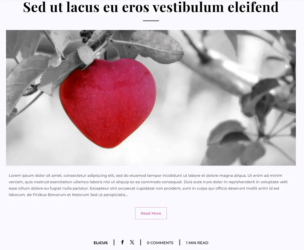
Unique Feature: Features built-in social sharing anchors for Facebook and Twitter sharing links inside the bottom metadata row, encouraging readers to share the post easily.
9. List
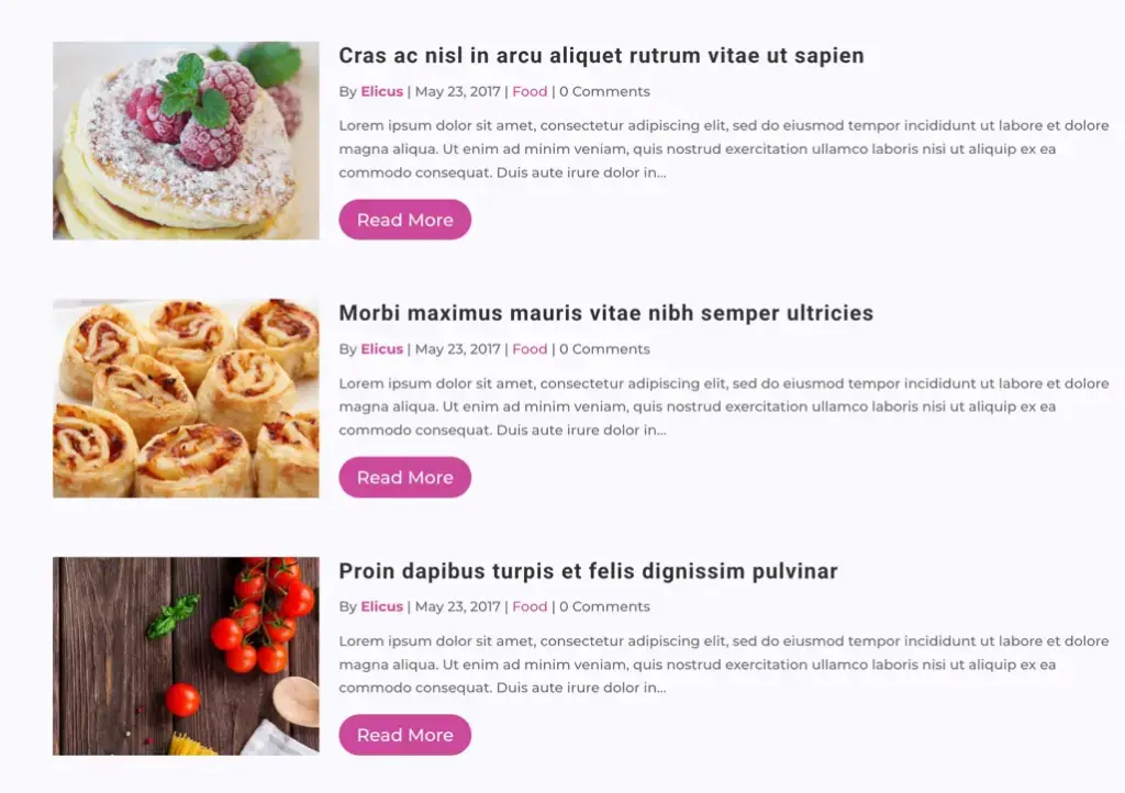
The List layout places the featured image and the post content container side-by-side in a horizontal row. This layout is excellent for directory listings or standard blog feeds where images are balanced equally with post text.
10. Masonry
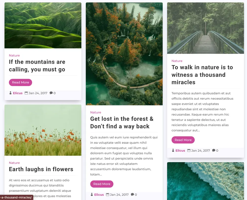
Masonry is a dedicated layout wrapper. Instead of equal-height grids that create gaps on asymmetrical text/image heights, Masonry aligns cards fluidly. Column layouts are computed automatically based on image height and text lengths.
11. Slider
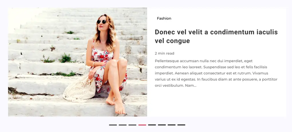
The Slider layout mode compiles posts inside a touch-enabled swipe slider carousel powered by the Swiper engine. Excellent for highlighting featured posts or building compact post lists.
Supported Card Layouts inside Slider:
- Background Cover: Slide features the post thumbnail as the full background image.
- Vertical Grid: Slides are styled using the Vertical Grid card structure.
- Grid Extended: Slides are styled using the Grid Extended card structure.
- Block Extended: Slides are styled using the Block Extended layout (with customizable image positions: top, background, or alternate).
Custom Slider Controls:
- Navigation Arrows: Toggle arrow visibility and customize the icons.
- Pagination Dots: Toggle bullet indicators, configure dot styles (active/inactive colors, custom shapes), and enable dynamic dot sizing on smaller screens.
- Slider Dynamics: Set autoplay speed, loop behavior, transition duration, transition effects (Slide, Fade, Coverflow, Flip, Cube), and pause-on-hover logic.
12. Timeline
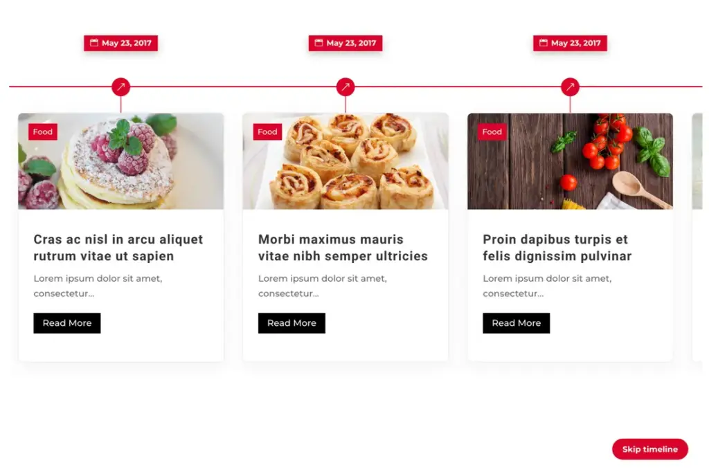
The Timeline layout displays blog posts in chronological order along a central spine line. Ideal for company history feeds, product updates, or storytelling blogs.
Timeline Options:
Timeline Skip Button: Toggles a floating helper button (default text: “Skip”) allowing users to jump directly to the beginning or end of the timeline layout.
Timeline Type: Choose between a vertical timeline track (scrolling vertically) and a horizontal timeline track (scrolling horizontally).
Timeline Arrangement (Vertical): Select posts alternate left and right sides of the spine track or posts stay on one side.
Timeline Vertical Side (Vertical Single): Set posts to appear on the left or right side of the spine.
Timeline Date Placement (Vertical Single): Choose the date renders on the opposite side of the spine or the date stacks directly inside the post card container.
Timeline Horizontal Side (Horizontal): Place post cards above or below the horizontal spine track.
Timeline Scroll Jack (Horizontal): Enable or disable scroll-jacking (horizontal mouse-wheel scrolls the timeline horizontally). If disabled, mouse wheel behaves normally, and horizontal scroll uses horizontal overflow scrollbar.
Timeline Spine Icon: Choose a custom icon symbol to serve as the timeline node points on the spine track.
13. Mosaic
The Mosaic layout displays blog posts in a dynamic, multi-sized tile pattern that gives your blog a modern magazine look.
14. Editorial Card
The Editorial Card layout showcases blog posts in a clean, publication-style magazine card format with elegant typography and image overlays.