
Search Divi WooCommerce Extended Documentation
Search for answers or browse our knowledge base.
DWE Woo Products Hero Slider Module
In this documentation guide, you will learn how to set up, configure, and customize the Woo Products Hero Slider module. This guide walks you through transforming static WooCommerce product displays into dynamic, full-width hero sliders to highlight featured items, sale products, or new arrivals with smooth transition effects.
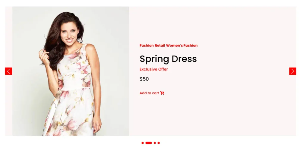
Step-by-step setup guide
- Open your page in the Visual Builder.
- Click the green (+) Add Module icon inside a row.
- Search for DWE Woo Products Hero Slider and insert it.
- In the Content Tab, select your product query source
- Adjust slider animation settings and toggle displayed elements (Title, Price, Button, Ratings).
- Customize typography, colors, and layouts in the Design Tab.
- Click Save and Exit to publish your changes.
Detailed settings reference
Content tab
1. Product query settings
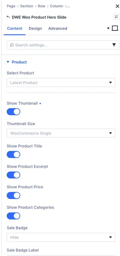
- Select Product:
- Control Type: Dropdown
- Description: Select the WooCommerce product you want to display in this hero slide. You can choose a specific product or select Latest Product to display dynamically.
- Show Thumbnail:
- Control Type: Toggle (ON / OFF)
- Description: Enable this toggle to display the main product image on the hero slide.
- Thumbnail Size:
- Control Type: Dropdown (e.g., WooCommerce Single, Full, Medium, Thumbnail)
- Description: Choose the image resolution/size for the product thumbnail.
- Show Product Title:
- Control Type: Toggle (ON / OFF)
- Description: Enable this toggle to display the title of the product.
- Show Product Excerpt:
- Control Type: Toggle (ON / OFF)
- Description: Enable this toggle to show the short product description/excerpt.
- Show Product Price:
- Control Type: Toggle (ON / OFF)
- Description: Enable this toggle to display the regular and sale price of the product.
- Show Product Categories:
- Control Type: Toggle (ON / OFF)
- Description: Enable this toggle to display the category names assigned to the product.
- Sale Badge:
- Control Type: Dropdown (Show / Hide)
- Description: Choose whether to display or hide the Sale badge on discounted products.
- Sale Badge Label:
- Control Type: Text Input Field
- Description: Enter custom text to display inside the sale badge (e.g., “Sale!”, “OFFER”, “-30%”).
2. Display options
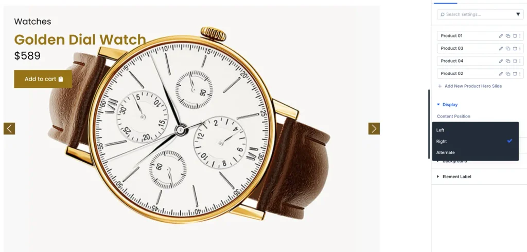
- Content Position:
- Control Type: Dropdown (Options: Left, Right, Alternate)
- Description: Choose the layout alignment/position of the product text content relative to the product image on the slide.
- Left: Places the product text content on the left side and the product thumbnail image on the right.
- Right: Places the product text content on the right side and the product thumbnail image on the left.
- Alternate: Automatically alternates the layout position of content and image between Left and Right for consecutive slides in the slider.
3. Slider settings
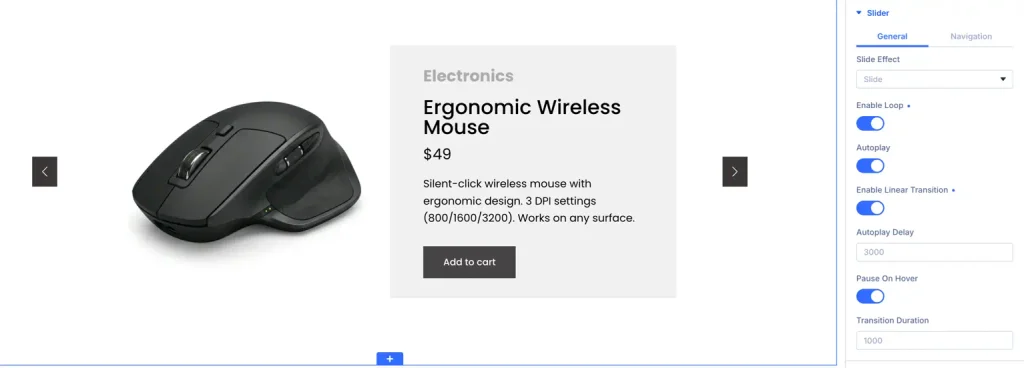
- Autoplay: Turn ON to automatically advance slides.
- Autoplay Speed (ms): Set delay between slide transitions (e.g., 3000 = 3 seconds).
- Pause on Hover: Turn ON to temporarily pause autoplay when a user moves their mouse over the slider.
- Infinite Loop: Enable continuous slide looping without stopping at the last slide.
- Transition Effect: Select slide transition animation (Slide, Fade, Coverflow, Flip, or Cube).
- Transition Speed (ms): Duration of the transition animation (e.g., 500
B. Design tab
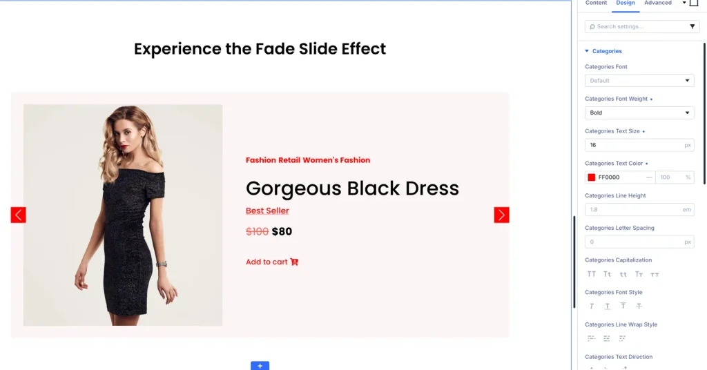
- Title Text: Customize font family, text weight, font size, line height, letter spacing, and hover color for product titles.
- Description Text: Adjust body typography, color, and line spacing.
- Price Text Styling: Set font styles, color, and size for regular price (with strike-through options for discounted prices).
- Button Styling: Custom button layout including background colors, gradient overlays, text color, padding, border radius, and hover transition effects.
- Arrow & Navigation Styling: Change arrow icons, background shape, icon color, background color on hover, and active pagination dot highlight colors.
- Spacing & Padding: Control inner padding for slides, content margins, and slide container height.