Search Divi Motion Extended Documentation
Search for answers or browse our knowledge base.
SVG Animator
This page shows you how to add the SVG Animator module to your page and explains every setting. The SVG Animator module animates an SVG icon. It can draw the lines of the icon, morph one shape into another, or move the icon along a path. Choose one of the 12 built-in icons or upload your own SVG file.
How to add the SVG Animator module
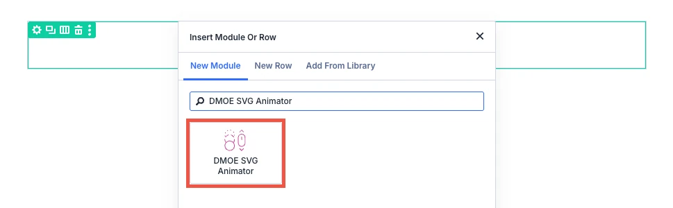
- Open your page in the Divi Visual Builder.
- Click the (+) icon inside a row to add a new module.
- Search for DMOE SVG Animator in the module search box.
- Click the module to insert it. Its settings open on the right.
Content tab
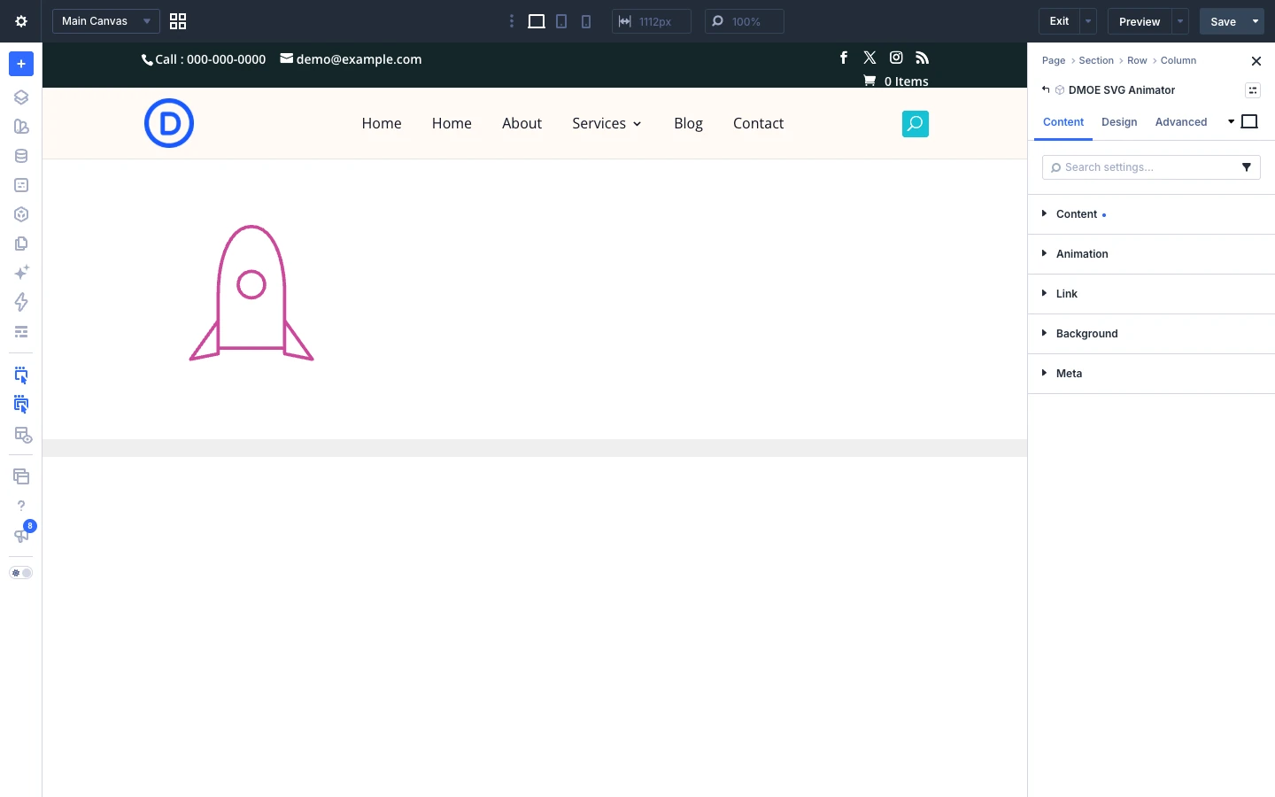
The Content tab holds the SVG and the animation settings. Some settings only show for one animation type or trigger.
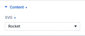
Content tab: Content
- SVG: The SVG shown — a built-in icon, or your own upload. Options: Star, Check, Arrow, Gear, Location pin, Heart, Cloud, Lightning bolt, Shopping cart, Rocket, Trophy, Calendar and Custom SVG.
- Custom SVG file: Upload an .svg file. Every shape it contains draws. Morph turns its first shape into the rest of the file, so upload 2 or more shapes for both ends to come from your own artwork — a single shape morphs into a plain circle.
- Accessible label: Read by screen readers in place of the visual SVG.
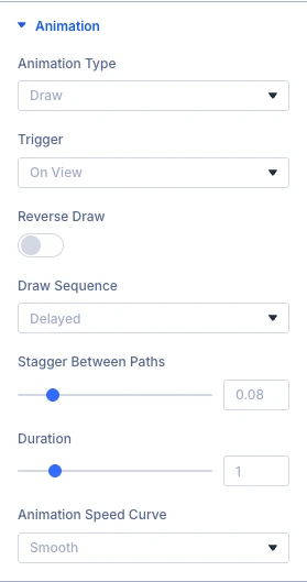
Content tab: Animation
- Animation type: The technique used to animate the SVG. Options: Draw, Morph and Motion path.
- Trigger: What starts the animation. Options: On view, On hover, On click and On scroll.
- Reverse draw: Draws from the end of each path instead of the start.
- Draw sequence: How multiple paths in the same SVG draw relative to each other. A single-path SVG looks the same either way. Options: Sync, Delayed and One by one.
- Stagger between paths: The delay between each path starting to draw.
- Path style: The built-in track the Path Object travels along. Options: Straight line, Gentle arc, S-curve, Zigzag, Wave and Loop.
- Auto-rotate to path: Turns the Path Object to face the direction of travel.
- Duration: How long the animation takes, in seconds.
- Animation speed curve: How the motion speeds up and slows down. Options: Constant speed, Smooth, Quick end, Quick start, Smooth both ends, Bounce and Springy.
- Start position: Scroll position where the animation begins.
- End position: Scroll position where the animation finishes.
- Scrub: Ties progress directly to scroll position instead of playing once.
- Replay on scroll back: Resets and replays when scrolling back past Start position.


The Link, Background and Meta groups are the standard Divi options.
Design tab
The Design tab sets the size, stroke and fill of the SVG and the color of the motion path track. The other groups (text, sizing, spacing, border, box shadow, filters, transform, animation) are the standard Divi design options.
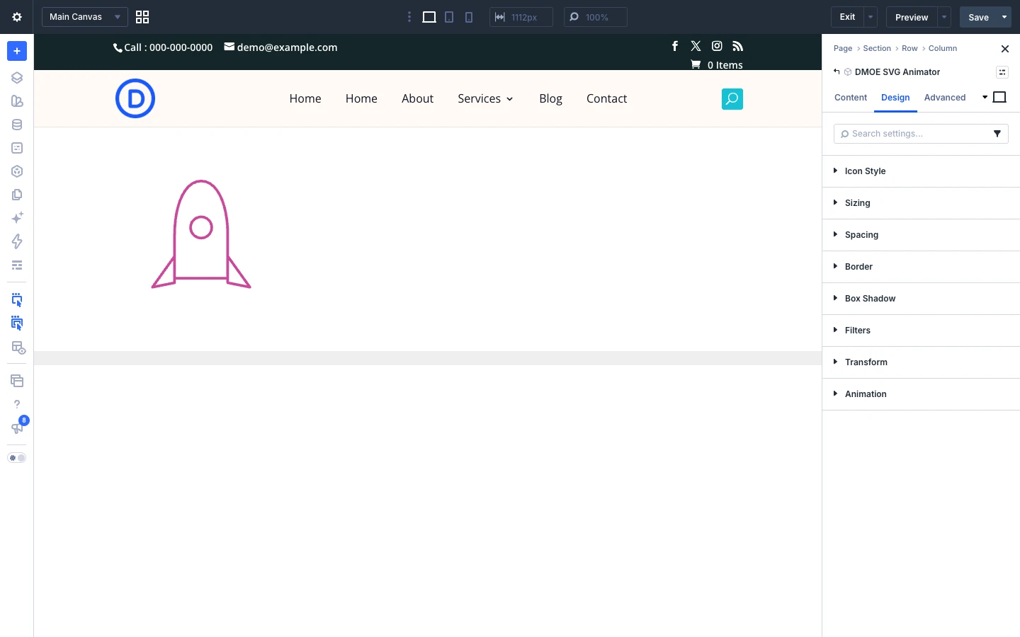
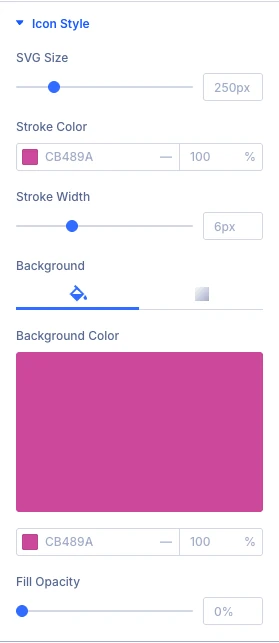
Design tab: Icon style
- SVG size: Width of the SVG on the page. Height follows automatically from its own aspect ratio.
- Stroke color: Overrides the SVG’s own stroke color, where it has one.
- Stroke width: Overrides the SVG’s own stroke width, where it has one.
- Fill opacity: Overrides the SVG’s own fill opacity, where it has one.
Use the standard Divi background settings to style the SVG.
Design tab: Motion path track
- Track color: Color of the dashed guide line and its start/end dots.
Advanced tab
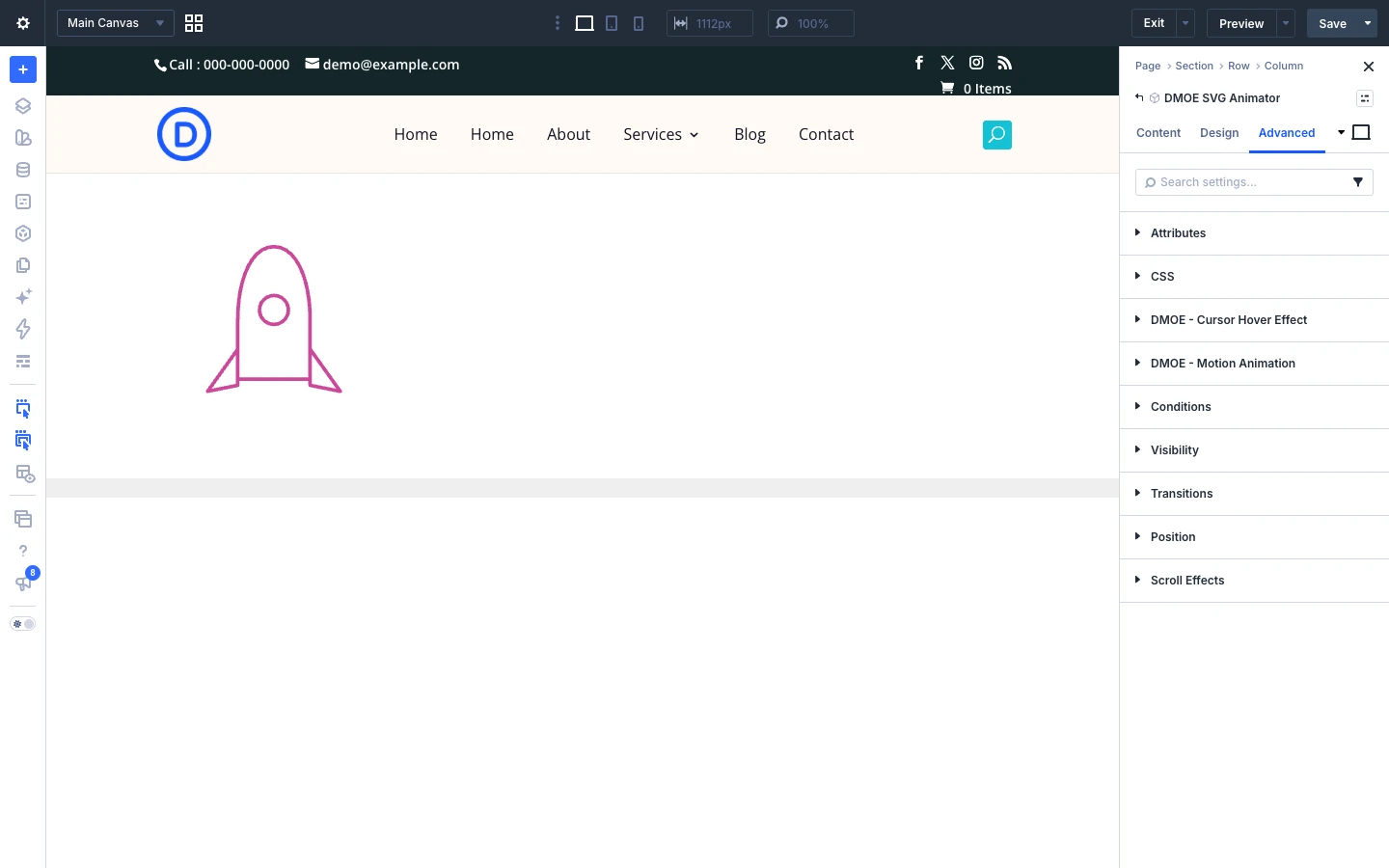
The Advanced tab has the standard Divi options: CSS ID and classes, custom CSS, attributes, conditions, visibility, transitions, position and scroll effects.