
Search Divi Motion Extended Documentation
Search for answers or browse our knowledge base.
Scroll Stack Cards
DMOE Scroll Stack Cards
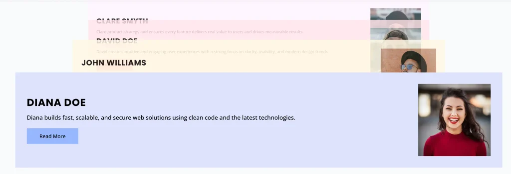
The DMOE Scroll Stack Cards module displays sticky stacking card sections where subsequent cards slide over and stack on top of previous cards as the user scrolls down the page. This documentation details all the configuration settings available under the Content, Design, and Advanced tabs of the module.
Add module on page
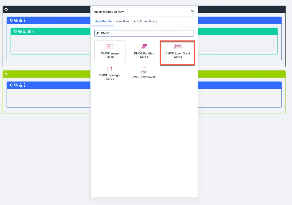
- Open your page in the Visual Builder.
- Click the green (+) Add Module icon inside a row.
- Search for DMOE Scroll Stack Cards and insert it.
Content Tab
1. DMOE Scroll Stack Cards Item
Click on an individual card item under the DMOE Scroll Stack Cards Item list to configure its content:
Content setting
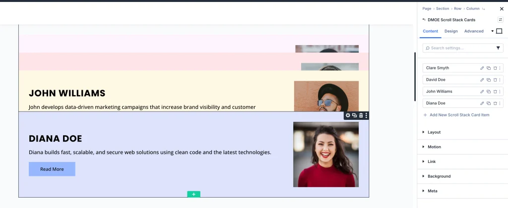
- Title:
- Control Type: Text Input Field
- Description: Enter the main headline title for the card (e.g., “Your Title Goes Here”).
- Card Image:
- Control Type: Media Library Picker (+ Add Image)
- Description: Upload or select a featured image for the card.
- Image ALT Text:
- Control Type: Text Input Field
- Description: Enter Alt Text for search engines and accessibility.
- Subtitle:
- Control Type: Text Input Field
- Description: Enter subtitle text for the card.
- Show Description:
- Control Type: Toggle (ON / OFF)
- Description: Enable or disable description text display.
- Description:
- Control Type: Rich Text Editor (Visual & Text tabs)
- Description: Add detailed body text for the card (visible when Show Description is ON).
- Show Icon:
- Control Type: Toggle (ON / OFF)
- Description: Enable or disable an icon.
- Select Icon:
- Control Type: Icon Grid Picker
- Description: Select an icon from the library (visible when Show Icon is ON).
Button Accordion
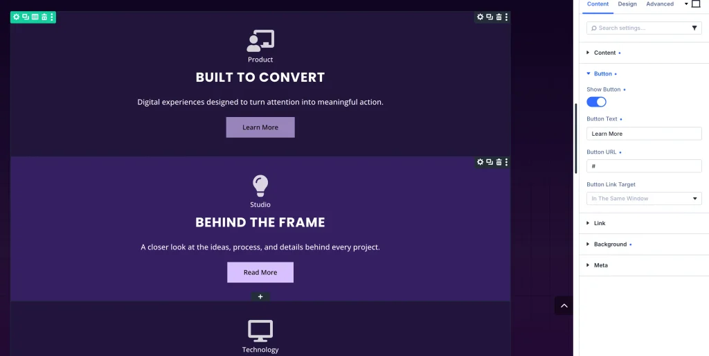
- Show Button:
- Control Type: Toggle (ON / OFF)
- Description: Enable or disable a Call-to-Action button on the item.
- Button Text:
- Control Type: Text Input Field
- Description: Enter button label text (e.g., “Read More”).
- Button URL:
- Control Type: Text Input Field
- Description: Set destination link URL for the button.
- Button Link Target:
- Control Type: Dropdown (In The Same Window, In A New Tab)
- Description: Choose whether clicking the button opens the link in the current window or a new tab.
2. Parent module settings
Under the Content tab of the main parent module, the following accordions are available:
Layout option
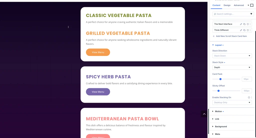
- Stack Direction:
- Control Type: Dropdown (Slide Across, etc.)
- Description: Select direction from which incoming stacked cards enter the screen.
- Stack Style:
- Control Type: Dropdown (Stack, Collapse, Depth)
- Description: Choose visual stacking behavior when cards stack over each other.
- Card Peek:
- Control Type: Range Slider (e.g.,
55px) - Description: Set top/bottom visible margin showing the edge of underlying buried cards.
- Control Type: Range Slider (e.g.,
- Sticky Offset:
- Control Type: Range Slider (e.g.,
100px) - Description: Set viewport top offset distance where cards lock and start stacking.
- Control Type: Range Slider (e.g.,
- Enable Stacking On:
- Control Type: Dropdown (Desktop Only, Desktop & Tablet, All Devices)
- Description: Select viewports where scroll stacking animation is active.
Motion setting
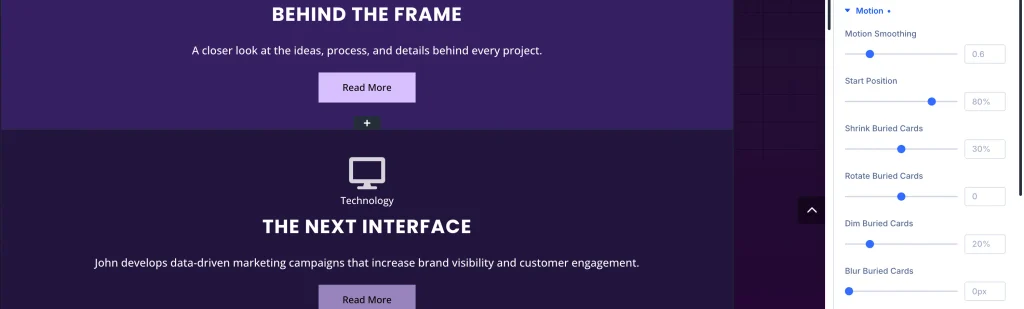
- Motion Smoothing:
- Control Type: Range Slider (e.g., 0.6)
- Description: Control smoothness and momentum of card stacking animation.
- Start Position:
- Control Type: Range Slider (e.g., 80%)
- Description: Set viewport scroll percentage where stacking motion activates.
- Shrink Buried Cards:
- Control Type: Range Slider (e.g., 30%)
- Description: Scale down percentage for covered background cards under the stack.
- Rotate Buried Cards:
- Control Type: Range Slider (e.g.,
0) - Description: Apply subtle rotation angle to buried cards in the stack.
- Control Type: Range Slider (e.g.,
- Dim Buried Cards:
- Control Type: Range Slider (e.g., 20%)
- Description: Dim opacity of underlying cards as new cards stack over them.
- Blur Buried Cards:
- Control Type: Range Slider (e.g., 0px)
- Description: Apply background blur filter to buried stack layers.
- Snap To Cards:
- Control Type: Toggle (ON / OFF)
- Description: Enable smooth magnetic scroll snapping to each card.
Design Tab
Card and image styling
- Card Accordion: Customize card text alignment, margin, and padding.
- Image Accordion: Set Image Position, Image Width (e.g.,
200px), Image Height (e.g.,200px), and Image Fit (Crop to Fill, etc.).
Typography option
Under Title Text, Subtitle Text, and Description Text accordions, customize font family, font weight, text size, color, line height, and letter spacing.
Advanced Tab
Configure custom CSS ID & Classes, element-level Custom CSS, and responsive Visibility rules.