
Search Divi Motion Extended Documentation
Search for answers or browse our knowledge base.
Parallax Cards
DMOE Parallax Cards
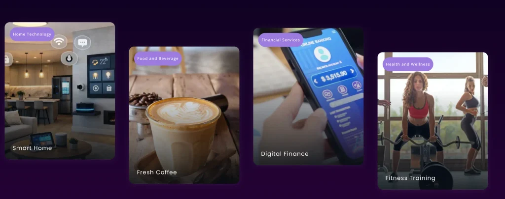
The DMOE Parallax Cards module displays interactive multi-column content cards with independent scroll parallax speeds, image motion effects, badge overlays, and customizable card layout patterns. This documentation details all the configuration settings available under the Content, Design, and Advanced tabs of the module.
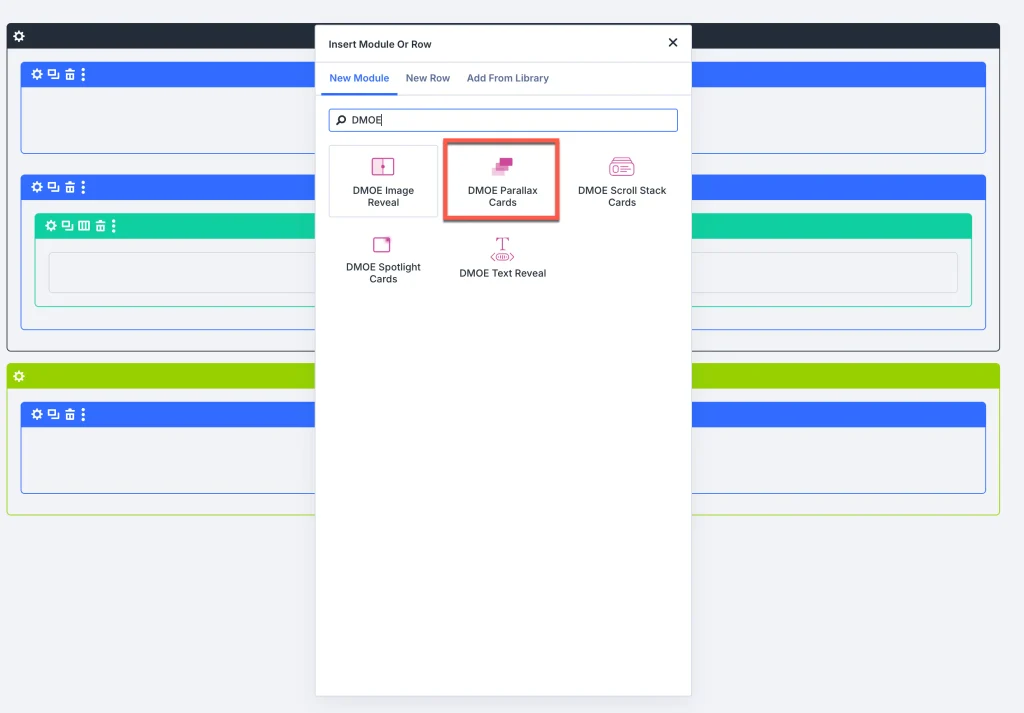
Add module on page
- Open your page in the Visual Builder.
- Click the green (+) Add Module icon inside a row.
- Search for DMOE Parallax Cards and insert it.
Content Tab
1. DMOE Parallax cards item
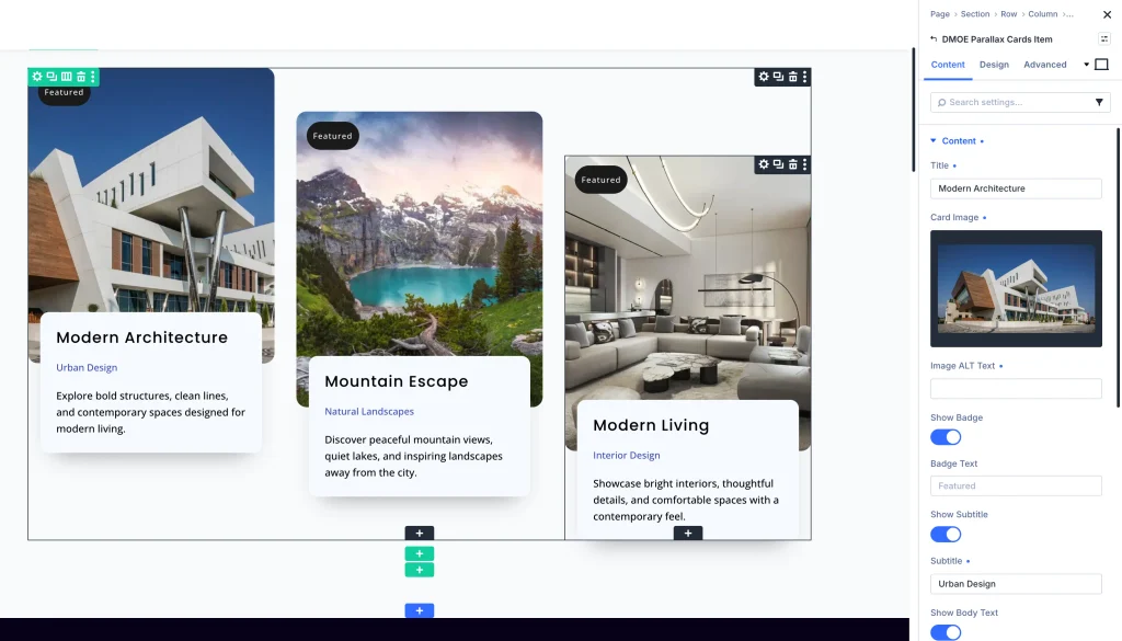
Click on an individual card item under the DMOE Parallax Cards Item list to configure its content:
Content option
- Title:
- Control Type: Text Input Field
- Description: Enter the main headline title for the card (e.g., “Your Title Goes Here”).
- Card Image:
- Control Type: Media Library Picker (+ Add Image)
- Description: Upload or select a featured image for the card.
- Image ALT Text:
- Control Type: Text Input Field
- Description: Enter descriptive Alt Text for search engines and accessibility.
- Show Badge:
- Control Type: Toggle (ON / OFF)
- Description: Enable or disable a highlight badge overlay on the card.
- Badge Text:
- Control Type: Text Input Field
- Description: Enter custom text for the badge (e.g., “Featured”). Visible when Show Badge is ON.
- Show Subtitle:
- Control Type: Toggle (ON / OFF)
- Description: Enable or disable subtitle display.
- Subtitle:
- Control Type: Text Input Field
- Description: Enter subtitle text for the card (e.g., “Your Subtitle Here”). Visible when Show Subtitle is ON.
- Show Body Text:
- Control Type: Toggle (ON / OFF)
- Description: Enable or disable description body text display.
- Body Text:
- Control Type: Rich Text Editor (Visual & Text tabs)
- Description: Add detailed body text for the card. Visible when Show Body Text is ON.
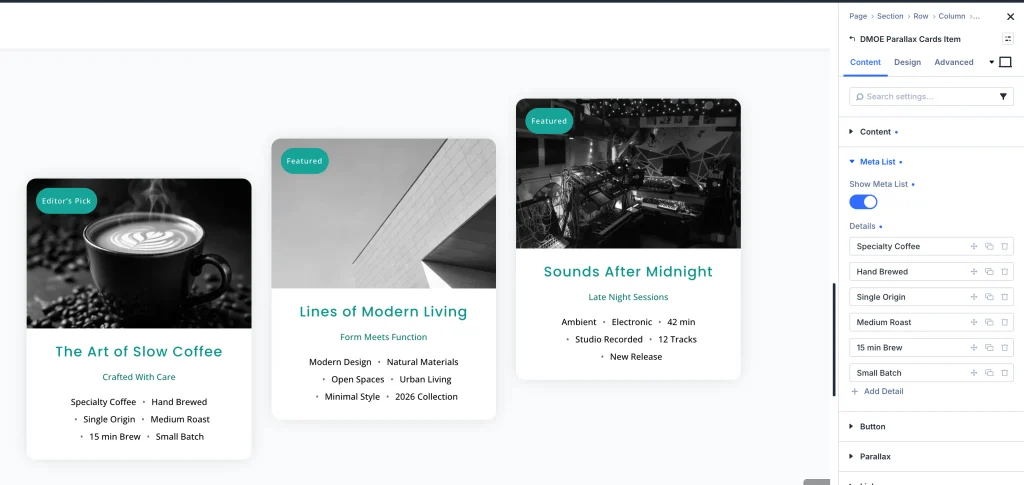
Meta list setting
- Show Meta List:
- Control Type: Toggle (ON / OFF)
- Description: Enable or disable additional metadata detail tags on the card.
- Details:
- Control Type: Item Repeater (+ Add Detail)
- Description: Add custom meta detail labels (e.g., Date, Author, Category).
Button setting
- Show Button:
- Control Type: Toggle (ON / OFF)
- Description: Enable or disable a Call-to-Action button on the card.
- Button Text:
- Control Type: Text Input Field
- Description: Enter label text for the button (e.g., “Read More”).
- Button URL:
- Control Type: Text Input Field
- Description: Set target link URL for the button.
- Button Link Target:
- Control Type: Dropdown (In The Same Window, In A New Tab)
- Description: Choose whether clicking the button opens the URL in the current window or a new tab.
Parallax Accordion
- Card Speed:
- Control Type: Range Slider (e.g.,
0.4) - Description: Set the individual scroll parallax movement speed for this specific card.
- Control Type: Range Slider (e.g.,
2. Parent module settings
Under the Content tab of the main parent module, the following accordions are available:
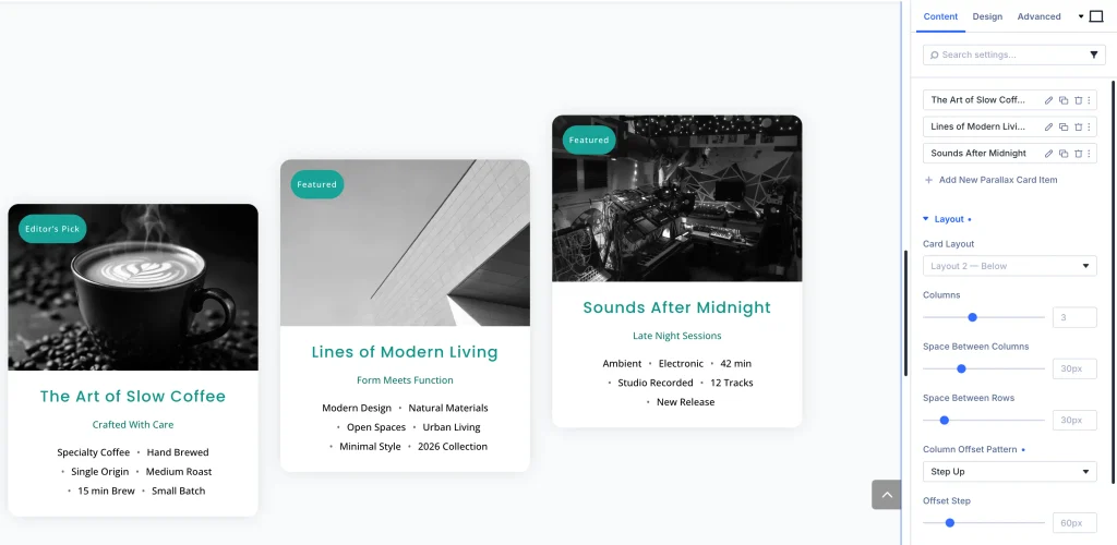
Layout option
- Card Layout:
- Control Type: Dropdown (Layout 1 – Overlay, Layout 2 – Below, Layout 3 – Offset Panel)
- Description: Choose structural layout arrangement for card content relative to card image.
- Columns:
- Control Type: Number Input Field (e.g.,
3) - Description: Set number of card columns per row.
- Control Type: Number Input Field (e.g.,
- Space Between Columns:
- Control Type: Range Slider (e.g.,
30px) - Description: Adjust horizontal spacing between adjacent card columns.
- Control Type: Range Slider (e.g.,
- Space Between Rows:
- Control Type: Range Slider (e.g.,
30px) - Description: Adjust vertical spacing between rows of cards.
- Control Type: Range Slider (e.g.,
- Column Offset Pattern:
- Control Type: Dropdown (None – Level, Alternate, Step Down, Step Up, Centre Out, Custom)
- Description: Set vertical staggered column offset pattern across adjacent card columns.
- Offset Step:
- Control Type: Range Slider (e.g.,
60px) - Description: Set pixel distance for staggered column displacement.
- Control Type: Range Slider (e.g.,
Parallax option
- Column Speed Pattern:
- Control Type: Dropdown (Alternate, etc.)
- Description: Select automated scroll parallax speed variation pattern across columns.
- Parallax Intensity:
- Control Type: Range Slider (e.g.,
60%) - Description: Adjust global strength of scroll parallax displacement.
- Control Type: Range Slider (e.g.,
- Allow Rows To Overlap:
- Control Type: Toggle (ON / OFF)
- Description: Allow vertically shifting cards to overlap adjacent rows.
- Enable Parallax On:
- Control Type: Checkboxes (Phone, Tablet, Desktop)
- Description: Select viewports where scroll parallax effect is active.
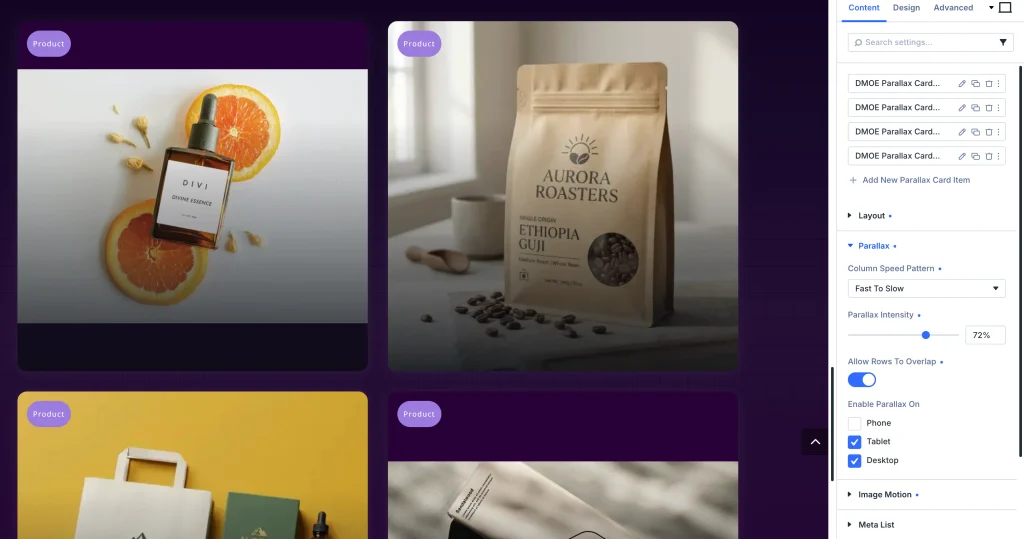
Image motion accordion
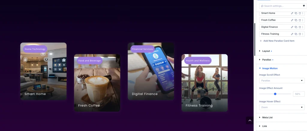
- Image Parallax Effect:
- Control Type: Dropdown (Parallax, None, Zoom Out)
- Description: Set internal image scroll motion inside the card frame.
- Image Effect Amount:
- Control Type: Range Slider (e.g.,
55%) - Description: Adjust image motion intensity.
- Control Type: Range Slider (e.g.,
- Image Hover Effect:
- Control Type: Dropdown (Zoom, None, Grey to Colour)
- Description: Choose hover animation for card images.
Meta list setting
- Meta Separator:
- Control Type: Dropdown (Dot, Bullet, Pipe, Dash, Slash, Custom Text, Icon, New Line)
- Description: Select separator symbol between meta list items.
- Separator Spacing:
- Control Type: Range Slider (e.g.,
8px) - Description: Adjust spacing around meta separators.
- Control Type: Range Slider (e.g.,
Design setting
Card and spacing setting
- Background: Set base card background color or gradient.
- Border & Border Radius: Set corner radius (e.g.,
14px) and border styling. - Box Shadow: Apply resting and hover depth shadows.
- Card Spacing: Adjust internal card margins and padding.
Image and content styling
- Image Fit and Shape: Choose Crop to Fill or custom image shapes.
- Card Content Gap: Adjust vertical gap between content elements (e.g.,
10px). - Content Background and Spacing: Customize background and padding for card content panels.
Typography option
Under Title Text, Subtitle Text, Body Text, and Meta Text accordions, customize font family, font weight, text size, color, line height, letter spacing, and capitalization.
Advanced Tab
Configure custom CSS ID & Classes, element-level Custom CSS (Card, Image, Title, Subtitle, Body, Meta, Button), and responsive Visibility rules.