
Search Divi Motion Extended Documentation
Search for answers or browse our knowledge base.
Cursor Hover Effect
DMOE Cursor Hover Effect
The DMOE Cursor Hover Effect extension automatically integrates an interactive cursor-following hover effect into the Advanced tab of all native Divi modules (such as Blurb, Button, Circle Counter, Accordion, etc.) as well as all DMOE Motion Extended modules. This documentation details how to enable and configure custom cursor text, dimensions, entrance animations, follow physics, blend modes, and styling options across your Divi elements.
How to access and enable the extension
The DMOE Cursor Hover Effect extension is globally integrated into the Divi Builder. You can enable and configure cursor hover effects on any Section, Row, Column, Native Divi Module (such as Blurb, Button, Circle Counter, etc.), or DMOE Module.
- Open the settings modal of any Divi element (Section, Row, Column, Native Divi Module, or DMOE Module).
- Navigate to the Advanced tab.
- Locate and expand the DMOE – Cursor Hover Effect accordion.
- Switch the Enable Cursor Hover Effect toggle to ON.
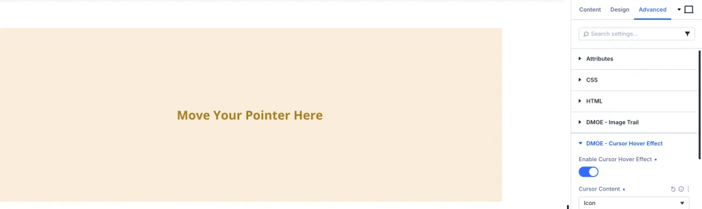
General settings
Once enabled under the Advanced tab > DMOE – Cursor Hover Effect accordion, the following configuration options become available:
- Enable Cursor Hover Effect:
- Control Type: Toggle (ON / OFF)
- Description: Enable or disable the interactive cursor hover follower on this specific module instance.
- Cursor Content:
- Control Type: Dropdown (Text, Icon, Image)
- Description: Select what type of content displays inside the floating cursor follower.
- Cursor Text:
- Control Type: Text Input Field
- Description: Enter custom label text to display inside the cursor (e.g., “View”, “Explore”, “Click”). Visible when Cursor Content is set to Text.
- Cursor Width & Cursor Height:
- Control Type: Range Sliders / Unit Input (e.g., 100px × 100px)
- Description: Define the width and height dimensions of the floating cursor bubble.
- Entrance Style:
- Control Type: Dropdown (Scale Up, Fade In, Rotate In, Curtain Out, Circle Reveal)
- Description: Select the entrance animation style when the user hovers over the module.
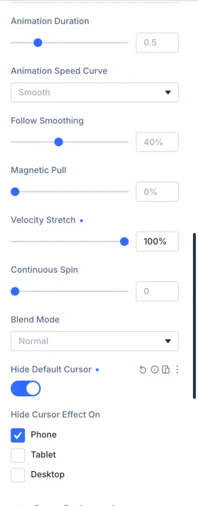
- Animation Duration:
- Control Type: Range Slider / Number Input (e.g.,
0.5s) - Description: Set the transition duration speed for the cursor entrance animation.
- Control Type: Range Slider / Number Input (e.g.,
- Animation Speed Curve:
- Control Type: Dropdown (Quick Start, Smooth, Constant Speed, Quick End, Smooth Both Ends, Bounce, Springy)
- Description: Choose the easing curve for cursor movement and scaling transitions.
- Follow Smoothing:
- Control Type: Range Slider (e.g., 40%)
- Description: Control the delay/smoothing lag of the cursor follower relative to mouse movement for fluid motion.
- Magnetic Pull:
- Control Type: Range Slider (e.g., 0%)
- Description: Set magnetic cursor attraction strength toward the center of the module.
- Velocity Stretch:
- Control Type: Range Slider (e.g., 0%)
- Description: Enable organic cursor stretching based on mouse movement velocity.
- Continuous Spin:
- Control Type: Number Input Field (e.g., 0)
- Description: Set rotation speed for continuous spinning animation.
- Blend Mode:
- Control Type: Dropdown (Screen, Normal, Difference, Exclusion, Multiply, Overlay)
- Description: Set CSS blend mode for creative visual interaction over underlying module content.
- Hide Default Cursor:
- Control Type: Toggle (ON / OFF)
- Description: Hide the standard OS mouse pointer while hovering over this module.
- Hide Cursor Effect On:
- Control Type: Checkboxes (Phone, Tablet, Desktop)
- Description: Select specific viewports where the cursor hover effect should be hidden.
Cursor styling
DMOE – Cursor Hover Effect allow complete visual customization of the cursor follower:
1. Cursor text
- Font and Font Weight: Choose font family and font weight (e.g., Bold, Regular).
- Text Size & Color: Set text size and color (e.g., #FFFFFF).
- Line Height & Letter Spacing: Adjust line height and letter spacing.
- Text Alignment & Capitalization: Set alignment and casing (Uppercase, Lowercase, Capitalize).
2. Cursor background
- Background Color: Set custom solid color or RGBA opacity for the cursor bubble (e.g., #000000).
3. Cursor border
- Border Radius: Set corner radius (e.g.,
50%for circular cursor or custom pixel rounding). - Border Width, Color & Style: Add solid, dashed, or dotted outline borders around the cursor.
4. Cursor box shadow
- Box Shadow: Select resting and hover depth shadows for 3D cursor elevation.