Search Divi Motion Extended Documentation
Search for answers or browse our knowledge base.
Horizontal Scroll Cards
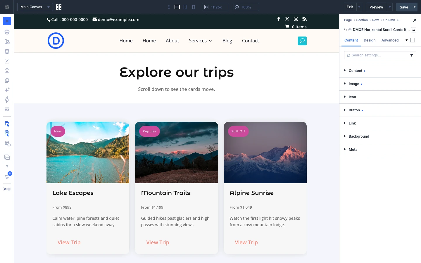
This page shows you how to add the Horizontal Scroll Cards module to your page and explains every setting. The Horizontal Scroll Cards module shows a row of cards that moves sideways. The row can move as visitors scroll down the page, when they drag it, or on its own in a loop. Each card can have an image, badge, subtitle, title, description, icon and button.
How to add the Horizontal Scroll Cards module
- Open your page in the Divi Visual Builder.
- Click the (+) icon inside a row to add a new module.
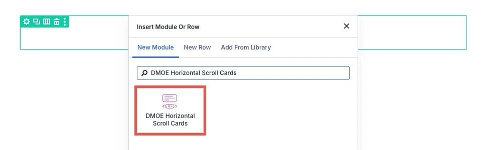
- Search for DMOE Horizontal Scroll Cards in the module search box.
- Click the module to insert it. Its settings open on the right.
Content tab
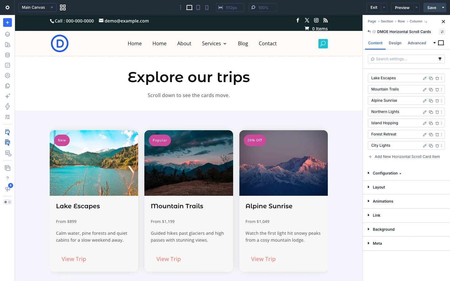
The Content tab of the main module holds the card items and the settings for the whole row: how it moves, how each card is laid out and the animations.
Content tab: Configuration
Choose how the row moves and how each card is put together. Some settings only show for one scroll mode or card layout; the help text says which.
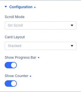
- Scroll mode: How the row moves. On scroll pins the section in place and the row travels as the page scrolls. On drag lets the visitor pull the row directly with their mouse or finger, with a snap on release. Options: On scroll, On drag and Auto scroll.
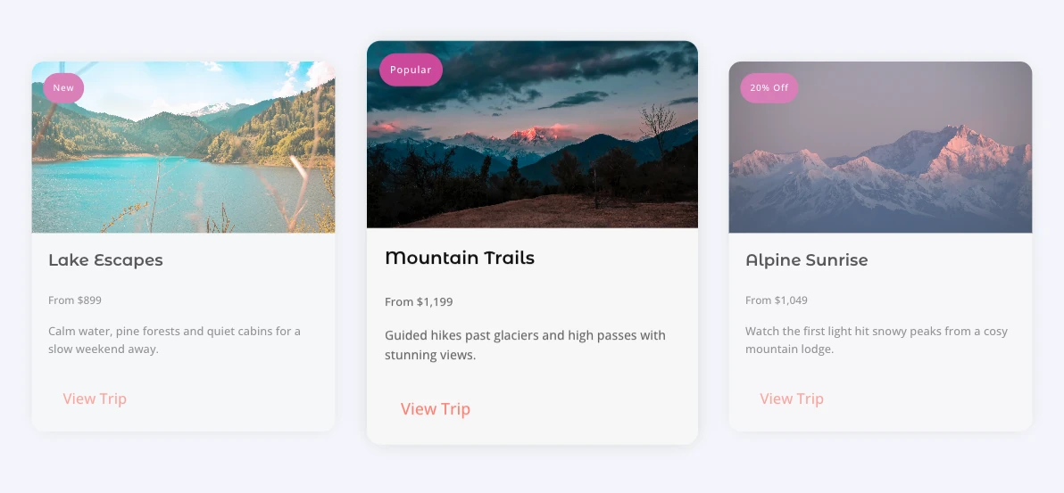
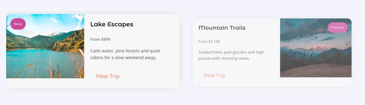
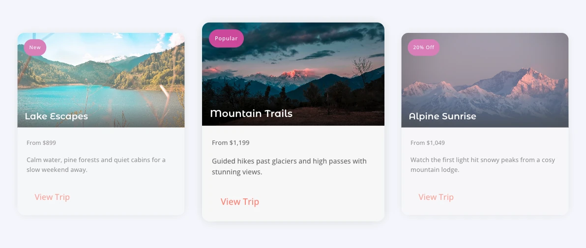
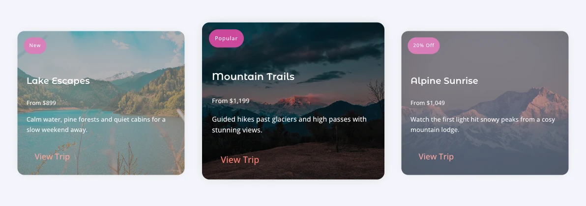
- Card layout: How one card is put together. Stacked places the image above the text, Split runs the image and text side by side and alternates which side the image sits on, Cover captions the title onto the image with the rest of the text below it, and Full bleed lets the image fill the whole card with everything overlaid on it. Options: Stacked, Split, Cover and Full bleed.
- Image position: Split layout only. Which side the image sits on, and the badge with it. Alternate switches it from card to card; Always left and Always right keep every card the same. Options: Alternate, Always left and Always right.
- Card height: Full bleed layout only. How tall each card is — the image fills it edge to edge.
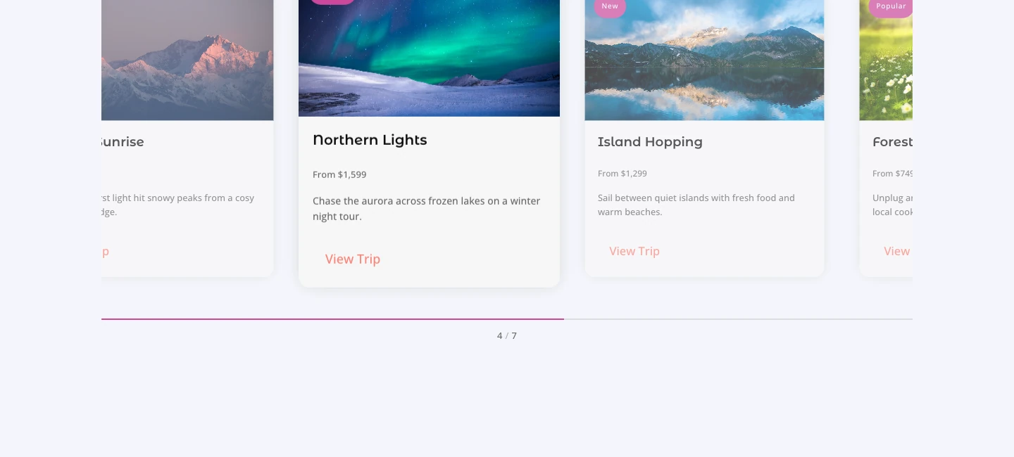
- Show progress bar: On scroll mode only. A thin bar that fills as the row travels, so the pin never feels indefinite.
- Show counter: On scroll mode only. A two-digit counter for whichever card is currently centred.
Content tab: Layout
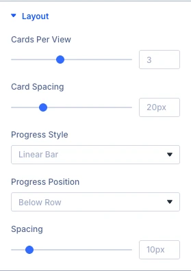
- Cards per view: How many cards sit fully visible at once. The next card is left peeking in at the edge as a hint there’s more to see.
- Card spacing: The gap left between cards.
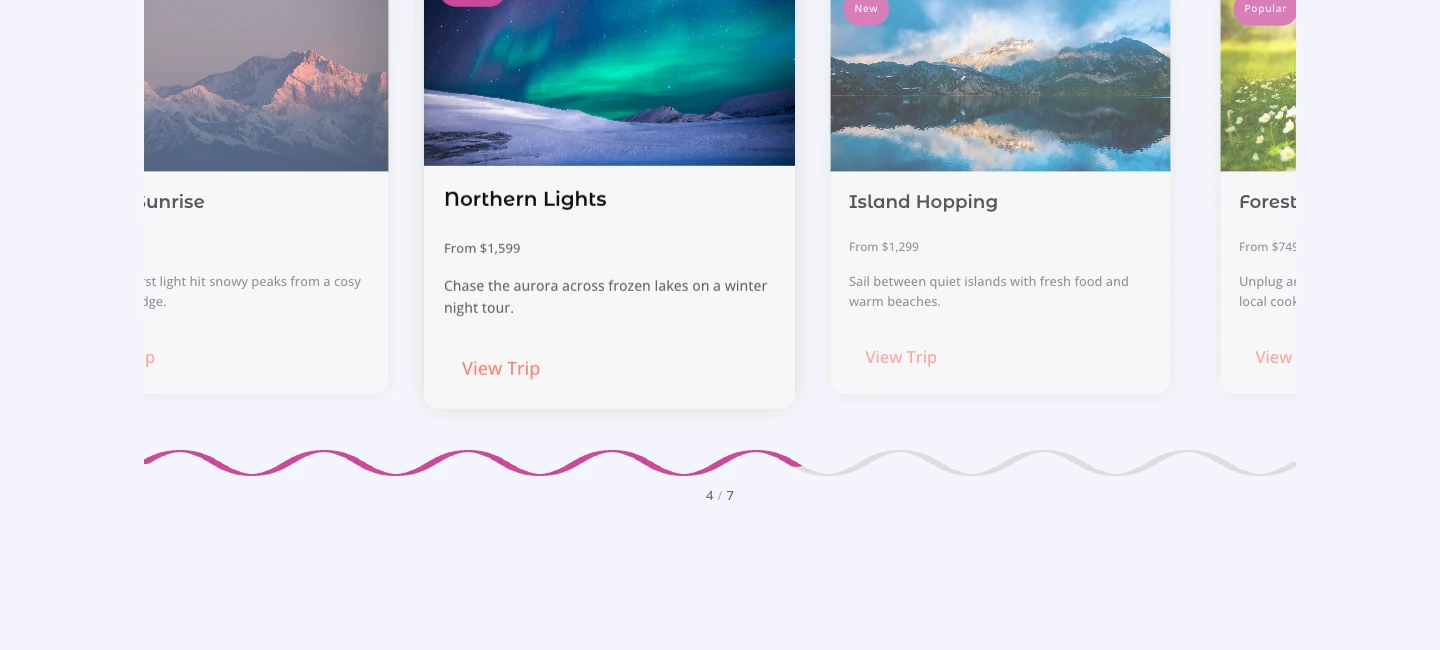
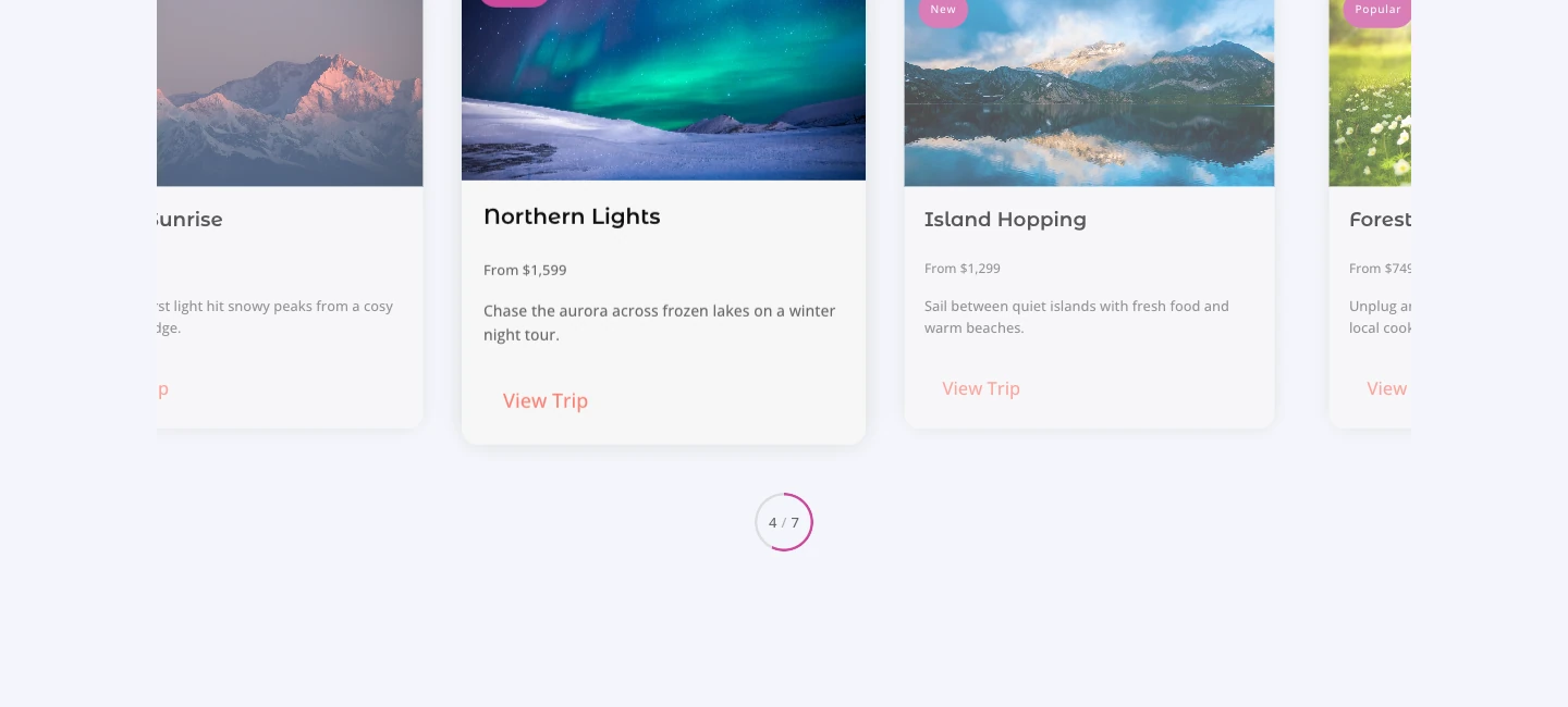
- Progress style: On scroll mode only. How the scroll progress is shown — a straight bar, a wavy line, or a ring with the counter inside it. The bar and the wavy line both span the full row; only the ring can be aligned. Options: Linear bar, Wavy line and Circular.
- Progress position: On scroll mode only. Where the progress bar and counter sit together, relative to the row. Options: Below row and Above row.
- Alignment: On scroll mode and Circular style only. The linear bar always spans the full row, so this only has room to matter for the ring. Options: Left, Center and Right.
- Spacing: On scroll mode only. The gap between the progress bar/ring and the row.
Content tab: Animations
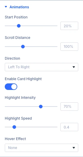
- Start position: On scroll mode only. How far down the screen the row has to scroll to before the pin engages and the scroll animation begins.
- Scroll distance: On scroll mode only. How much scrolling it takes to travel the whole row while the section is pinned. Below 100% the row finishes early and the pin releases before the section has fully passed; above 100% stretches the scroll out so the row moves more slowly.
- Direction: On scroll mode only. Which way the row travels as the page scrolls down. Options: Left to right and Right to left.
- Momentum: On drag mode only. How far the row keeps coasting after the drag is released, before it settles on the nearest card.
- Snap to card: On drag mode only. Settle on the nearest card once the drag ends, instead of stopping wherever the release happened.
- Autoplay: On drag mode only. Gently advance the row on its own when nobody is interacting with it. Any drag cancels it immediately.
- Autoplay speed: On drag mode with Autoplay on only. How long the row pauses on each card before advancing to the next.
- Speed: Auto scroll mode only. How long one full loop of the row takes. Lower is faster.
- Direction: Auto scroll mode only. Which way the row loops. Options: Left and Right.
- Pause on hover: Auto scroll mode only. Stop the loop while the pointer is anywhere over the row.
- Enable card highlight: Dim and shrink every card except the active one, and lift the active card toward the viewer. The active card is always whichever one currently sits nearest the row’s own centre.
- Highlight intensity: How strongly the active card stands out — scales the fade, shrink, lift and tilt on the rest of the row together, from barely-there to pronounced.
- Highlight speed: How quickly a card responds when it becomes active or stops being active.
- Hover effect: An extra touch on whichever single card the pointer is directly over, independent of Enable card highlight above. Zoom and Glow ring act on the whole card; Grey to colour acts on the image only. Options: None, Zoom, Glow ring and Grey to colour.
- Glow color: Hover effect: Glow ring only. The colour of the ring drawn around the card on hover.
- Glow ring size: Hover effect: Glow ring only. How thick the ring drawn around the card is.
Card item settings
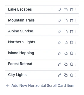
Each card is a separate item. Click + Add New Item in the Content tab to add a card, or click the gear icon next to a card to edit it. Drag the items to change their order.
Card item: Content
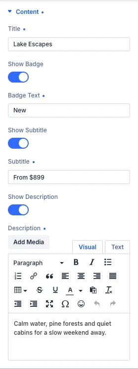
- Title: The main heading shown on this card. This is the only field every card must have.
- Show badge: Show a small tag on this card — a category, a status or a discount. Switching it off also takes its styling out of the Design tab.
- Badge text: A short tag — a category, a status or a discount, such as New or 20% Off.
- Show subtitle: Show a short supporting line on this card. Switching it off also takes its styling out of the Design tab.
- Subtitle: A short supporting line — a price, a location, a client or a category.
- Show description: Show a longer description on this card. Switching it off also takes its styling out of the Design tab.
- Description: The longer description shown on this card.
Card item: Image
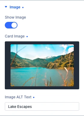
- Show image: Show a picture on this card. Switching it off also takes its styling out of the Design tab.
- Card image: The picture for this card.
- Image alt text: Describes the image for screen readers and search engines.
Card item: Icon
- Show icon: Show an icon on this card. Switching it off also takes its styling out of the Design tab.
- Select icon: The icon shown on this card.
Card item: Button
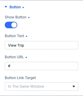
- Show button: Add a button to this card. If the whole card already links somewhere through the Link accordion, a button is only worth adding when it goes somewhere different.
- Button text: The text shown on this card’s button.
- Button URL: Where this card’s button goes when clicked.
- Button link target: Whether the button’s link opens in a new tab. Options: In the same window and In the new tab.
The card item also has its own Design tab, so you can style one card differently from the rest: badge, icon, title text, subtitle text and body text, plus the standard Divi sizing, spacing, border, box shadow, filters, transform and animation settings.
The Link, Background and Meta groups are the standard Divi options.
Design tab
The Design tab styles every card in the row: the card box, image, badge, icon, content area, text and the progress bar and counter. The other groups (text, sizing, spacing, border, box shadow, filters, transform, animation) are the standard Divi design options.
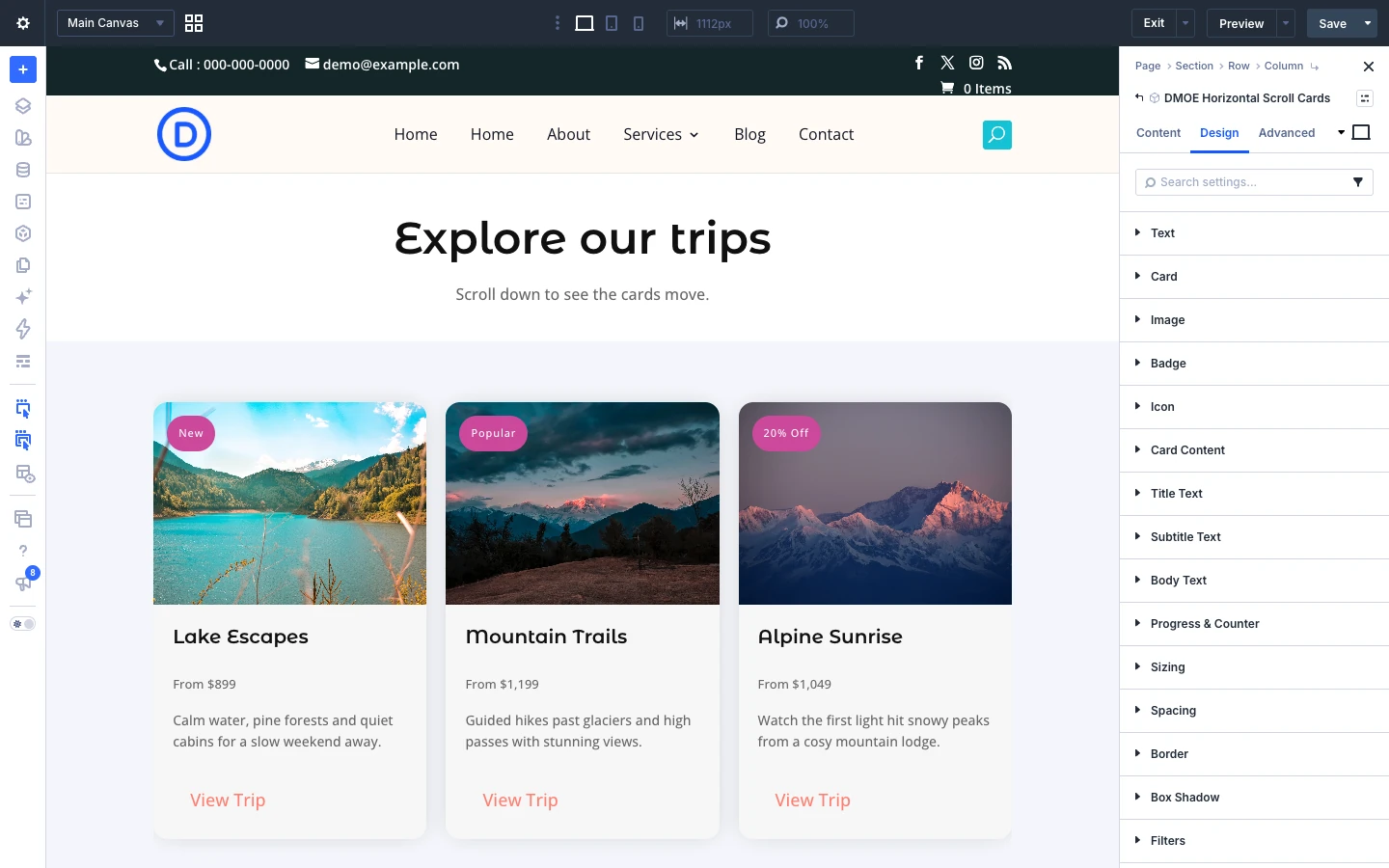
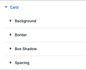
Design tab: Card
Use the standard Divi background, border, box shadow and spacing settings to style the card box.
Design tab: Image
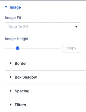
- Image fit: How the image fills its frame. Crop keeps its proportions and trims the overflow; Fit shows all of it and may leave gaps; Stretch distorts it to fill. Options: Crop to fill, Fit inside and Stretch.
- Image height: How tall a card’s image is. A fixed height stops one tall image deciding the height of every card in the row, and it is what makes Image fit matter. Set it to 0 to let the image keep its own proportions.
Use the standard Divi border, box shadow, spacing and filters settings to style the card image.
Design tab: Badge
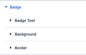
Use the standard Divi font, background and border settings to style the badge.
Design tab: Icon
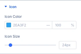
- Icon color: The colour of the icon shown on every card.
- Icon size: The size of the icon shown on every card.
Design tab: Card content
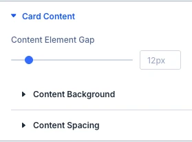
- Content element gap: The gap between the badge, subtitle, title and button. Switching any of them off closes its gap automatically.
Use the standard Divi background and spacing settings to style the content area.
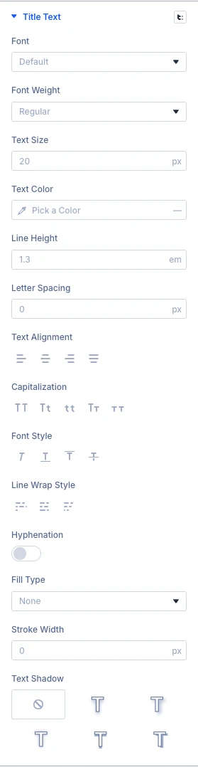
Design tab: Title text
Use the standard Divi font settings to style the card title.
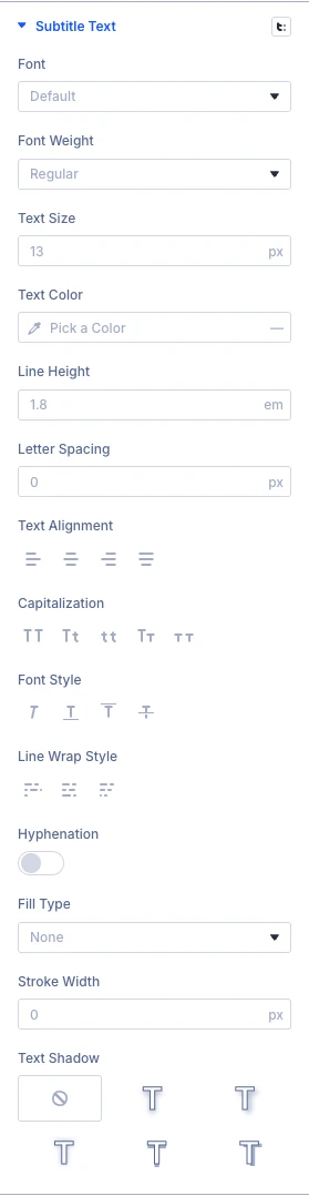
Design tab: Subtitle text
Use the standard Divi font settings to style the subtitle.
Design tab: Body text
Use the standard Divi body text font settings to style the description text.

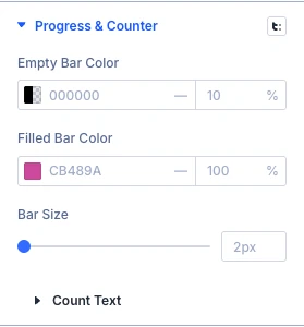
Design tab: Progress and counter
- Empty bar color: The colour of the unfilled part of the progress bar or ring. Shown only when Show progress bar is on.
- Filled bar color: The colour of the filled part of the progress bar or ring. Shown only when Show progress bar is on.
- Bar size: The thickness of the bar, or the ring’s stroke width. Shown only when Show progress bar is on.
Use the standard Divi font settings to style the counter.
Advanced tab
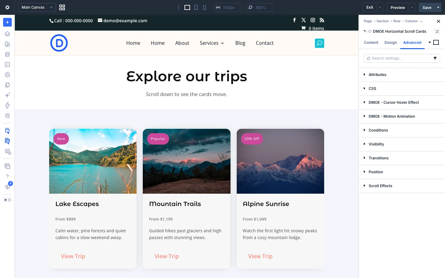
The Advanced tab has the standard Divi options: CSS ID and classes, custom CSS, attributes, conditions, visibility, transitions, position and scroll effects.