
Search Divi Motion Extended Documentation
Search for answers or browse our knowledge base.
Spotlight Cards
DMOE Spotlight Cards
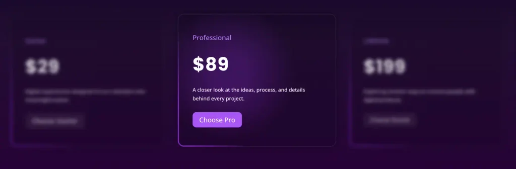
The DMOE Spotlight Cards module displays interactive content cards with cursor-following spotlight and card highlight effects. This documentation details all the configuration settings available under the Content, Design, and Advanced tabs of the module.
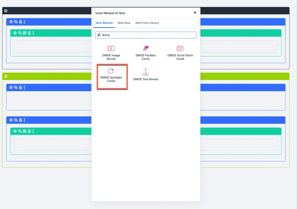
Step-by-step setup guide
- Open your page in the Visual Builder.
- Click the green (+) Add Module icon inside a row.
- Search for DMOE Spotlight Cards and insert it.
Content tab
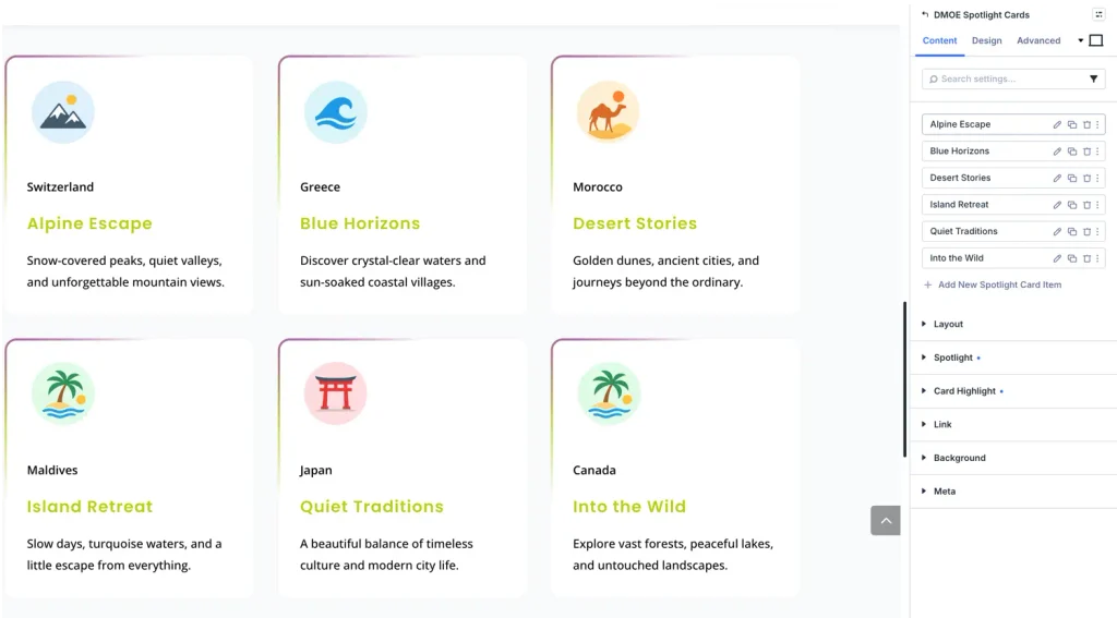
1. Spotlight cards item
Click on an individual card item under the DMOE Spotlight Cards Item list to configure its content:
Content setting
- Title:
- Control Type: Text Input Field
- Description: Enter the main headline title for the card (e.g., “Your Title Goes Here”).
- Card Image:
- Control Type: Media Library Picker (+ Add Image)
- Description: Select or upload a featured image for the card.
- Image ALT Text:
- Control Type: Text Input Field
- Description: Enter descriptive Alt Text for search engine optimization and accessibility.
- Show Subtitle:
- Control Type: Toggle (ON / OFF)
- Description: Enable or disable the card subtitle display.
- Subtitle:
- Control Type: Text Input Field
- Description: Enter subtitle text (e.g., “Your Subtitle Here”). Visible when Show Subtitle is ON.
- Show Description:
- Control Type: Toggle (ON / OFF)
- Description: Enable or disable description text display.
- Description:
- Control Type: Rich Text Editor (Visual & Text tabs)
- Description: Add descriptive body content for the card. Visible when Show Description is ON.
- Show Icon:
- Control Type: Toggle (ON / OFF)
- Description: Enable or disable an icon on the card.
- Select Icon:
- Control Type: Icon Grid Picker
- Description: Choose an icon from the library. Visible when Show Icon is ON.
Button setting
- Show Button:
- Control Type: Toggle (ON / OFF)
- Description: Enable or disable a Call-to-Action button on the card.
- Button Text:
- Control Type: Text Input Field
- Description: Enter label text for the button (e.g., “Read More”).
- Button URL:
- Control Type: Text Input Field
- Description: Set destination link URL for the button.
- Button Link Target:
- Control Type: Dropdown (In The Same Window, In A New Tab)
- Description: Choose whether clicking the button opens the link in the current tab or a new tab.
2. Parent module settings
Under the Content tab of the main parent module, the following accordions are available:
Layout
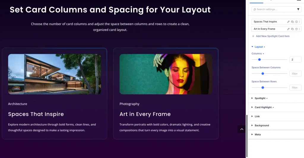
- Columns:
- Control Type: Number Input Field (e.g.,
3) - Description: Set the number of card columns to display per row.
- Control Type: Number Input Field (e.g.,
- Space Between Columns:
- Control Type: Range Slider (e.g., 30px)
- Description: Adjust horizontal spacing between adjacent card columns.
- Space Between Rows:
- Control Type: Range Slider (e.g., 30px)
- Description: Adjust vertical spacing between rows of cards.
Spotlight option
- Spotlight Effect:
- Control Type: Dropdown (Inner Glow, etc.)
- Description: Select the lighting style for the cursor-following spotlight effect.
- Spotlight Color:
- Control Type: Color Picker
- Description: Choose primary glow color for the spotlight beam (e.g., #28A3F2).
- Blend Two Colors:
- Control Type: Toggle (ON / OFF)
- Description: Enable to blend two gradient colors for the spotlight glow.
- Second Color:
- Control Type: Color Picker
- Description: Select secondary gradient color (e.g., #9B51E0). Visible when Blend Two Colors is ON.
- Glow Size:
- Control Type: Range Slider (e.g., 180px)
- Description: Adjust the radial beam diameter of the spotlight glow.
- Spotlight Brightness:
- Control Type: Range Slider (e.g., 25%)
- Description: Adjust brightness and opacity level of the spotlight light.
- Follow Smoothing:
- Control Type: Range Slider (e.g., 40%)
- Description: Control how smoothly the spotlight glides after cursor movement.
- Move When Not Hovered:
- Control Type: Toggle (ON / OFF)
- Description: Enable automatic idle spotlight movement when cursor leaves the card area.
- Idle Path & Speed:
- Control Type: Dropdown & Number Slider
- Description: Set the automated idle movement pattern and movement speed.
Card highlight
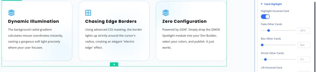
- Highlight Hovered Card:
- Control Type: Toggle (ON / OFF)
- Description: Enable focus emphasis on the currently hovered card relative to surrounding cards.
- Fade Other Cards:
- Control Type: Range Slider (e.g., 20%)
- Description: Dim opacity of non-hovered cards when one card is hovered.
- Blur Other Cards:
- Control Type: Range Slider (e.g., 0px)
- Description: Apply background blur to non-hovered cards.
- Shrink Other Cards:
- Control Type: Range Slider (e.g., 3%)
- Description: Scale down non-hovered cards slightly to focus attention on the active card.
- Lift Hovered Card:
- Control Type: Range Slider (e.g., 5px)
- Description: Elevate the hovered card upwards for a 3D lift effect.
- Highlight Speed:
- Control Type: Range Slider (e.g., 0.4)
- Description: Control transition speed for the card highlight effect.
Design and Advanced Tabs
Under the Design and Advanced tabs, customize typography for Title, Subtitle, Description, and Button, adjust background colors, border styles, corner radiuses, box shadows, custom CSS classes, and responsive visibility across devices.