
Search Divi Gallery Extended Documentation
Search for answers or browse our knowledge base.
Circle 3D Gallery
On this documentation page, you will find step-by-step instructions how to add, setup, and configure the Circle 3D Gallery module on your WordPress site. This guide covers image selection from the media library, 3D circular ring rotation triggers (scroll, drag, autoplay), card 3D flip effects, pop-up lightboxes, custom attachment links, overlay typography, and slider navigation controls.
To see the feature and all of its options, visit the Circle 3D Gallery.
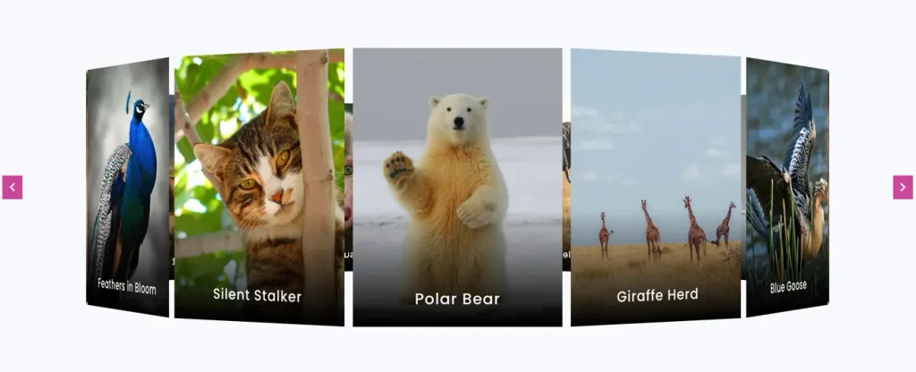
How to add module on page
- Open page in the Divi Visual Builder.
- Click on the gray (+) icon to insert a new module inside a row.
- Search for Circle 3D Gallery in the module library.
- Click the module icon to add it to your layout.
- In the module settings modal under the Content tab, select images from your WordPress Media Library to build the 3D gallery ring.
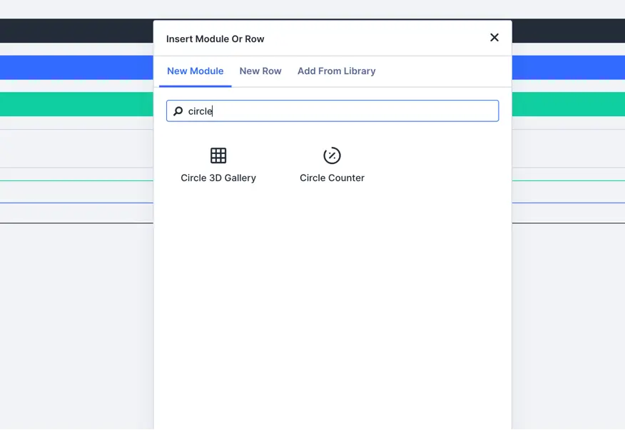
Configurations and content settings
Image selection
- Images: Select multiple images from the WordPress Media Library to include in the 3D circular ring.
- Image Size: Choose the registered image resolution to render (Thumbnail, Medium, Large, or Full Size). Default: Medium.
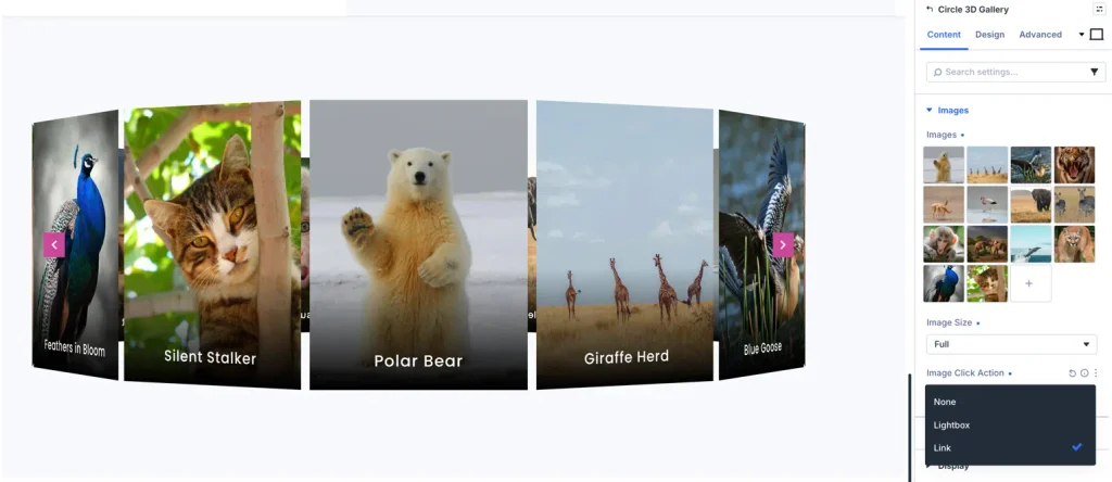
Click trigger actions
- Click Trigger: Choose the action triggered when a visitor clicks an image card:
- None: No click action occurs.
- Lightbox: Opens the high-resolution image in a responsive pop-up modal lightbox.
- Link: Navigates to a custom URL specified in the WordPress Media Library attachment meta field.
3D Ring and rotation logic
- Card Spacing: Define the physical distance and gap between adjacent image cards in the 3D ring (Default: 20px).
- Rotation Trigger: Select the interaction mode that drives the 3D cylindrical rotation:
- Scroll: Rotates the 3D ring dynamically as the visitor scrolls down or up the page.
- Drag: Enables mouse drag or touch swipe gestures to rotate the gallery manually.
- Autoplay: Automatically spins the 3D gallery continuously.
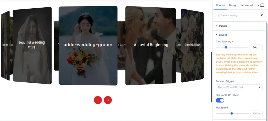
Card flip animation
- Flip Enabled: Toggle ON or OFF. When enabled, front-facing cards flip 180 degrees in 3D perspective to reveal back faces upon interaction.
- Flip Speed: Define the transition duration of the card flip animation in milliseconds (Default: 1500ms).
Title and caption options
Title settings
- Show Title: Toggle ON/OFF to display the attachment image title over the card item (Default: ON).
- Heading Level: Choose the HTML heading tag (H1 through H6). Default: H3.
- Title Typography: Customize font family, weight, style, color (Default: #ffffff), size (Default: 18px), line height, and text alignment (Default: Center).
Caption settings
- Show Caption: Toggle ON/OFF to display the WordPress media attachment caption text (Default: OFF).
- Caption Typography: Adjust font family, font weight, text color (Default: #ffffff), font size (Default: 12px), and alignment (Default: Center).
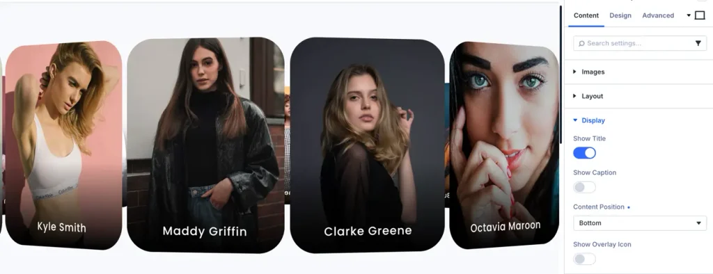
Overlay and hover icons
- Show Overlay Icon: Toggle ON/OFF to display an inline icon above the text content on hover (Default: OFF).
- Icon Styling: Select a custom icon from the font library, set the icon color (Default: #ffffff), size (Default: 32px), and alignment (Default: Center).
Slider navigation controls
- Show Navigation Arrows: Toggle ON/OFF to display Previous and Next navigation buttons (Default: OFF).
- Show Arrows on Hover: Toggle ON/OFF to make navigation arrows visible only when hovering over the gallery scene (Default: OFF).
- Arrows Position: Position navigation controls Inside or Outside the 3D gallery container (Default: Inside).
- Arrow Icons: Select custom icons for Previous and Next arrows.
Card styling and decoration options
- Card Width and Sizing: Define the width dimension of each individual 3D card element (Default: 300px).
- Borders and Radius: Set border styles and corner radii for the card elements (Default: 12px uniform radius).
- Box Shadow: Enable outer box shadows to enhance depth and spatial separation in the 3D scene.
Frequently asked questions (FAQs)
Q1: How do I add custom links to individual images in the 3D gallery?
A: Navigate to the WordPress Media Library, select the image, and enter your URL into the ‘Attachment Link’ meta field. In the module under Configurations > Click Trigger, select ‘Link’.
Q2: What happens when Lightbox is selected as the Click Trigger?
A: Clicking any card image opens the full-resolution attachment image in a responsive modal lightbox window overlaying the page.
Q3: How can I adjust the perspective depth and distance between cards?
A: Adjust card spacing in Configurations > Card Spacing (default: 20px) and card dimensions in Design > Card > Width (default: 300px).