
Search Divi Gallery Extended Documentation
Search for answers or browse our knowledge base.
Bento Gallery
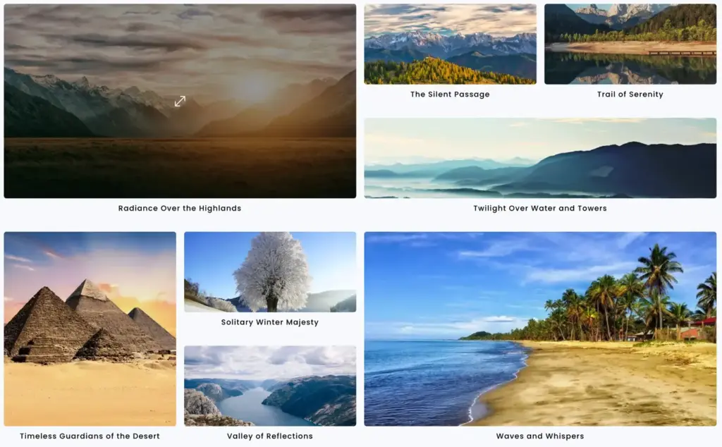
This guide shows you how to showcase images in a modern, asymmetric bento box layout, using Divi Gallery Extended. To see the feature and all of its options, visit the Bento Gallery page.
Adding module to a page
Follow these steps to insert the module:
- Open Divi Builder.
- Create or select an existing row.
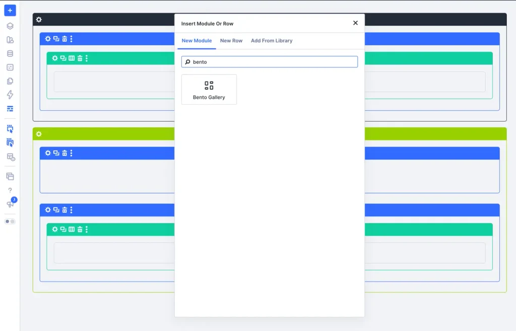
- Click Add New Module.
- Search for Bento Gallery and click to insert it.
Content settings
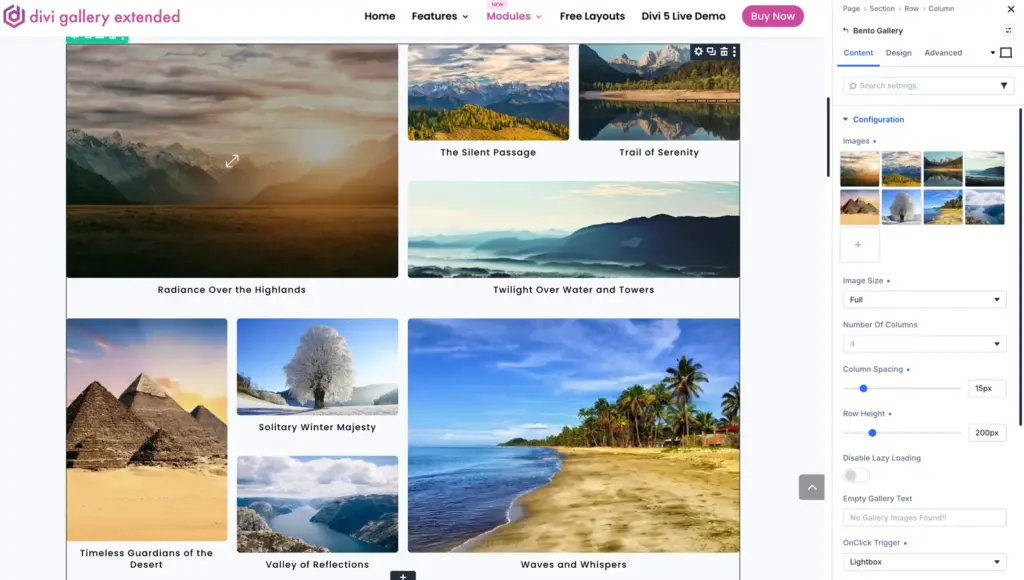
Select your images, column counts, row height, and click behaviors under the Configuration settings group:
- Images: Click the + button to upload or select multiple images from your WordPress Media Library to include in the bento layout grid. You can also reorder or delete existing thumbnails.
- Image Size: Choose the image resolution size (e.g., Full, Large, Medium, or Thumbnail) to load from WordPress for optimal visual quality and page performance.
- Number Of Columns: Set the number of grid columns (e.g., 4) to define the base column structure of the bento grid.
- Column Spacing: Adjust the slider or type a pixel value (e.g., 15px) to set the horizontal gap spacing between bento image cards.
- Row Height: Adjust the slider or type a pixel value (e.g., 200px) to define the base row height for the bento tiles.
- Disable Lazy Loading: Toggle this switch ON if you want all bento gallery images to load immediately on page load, or leave it OFF to enable browser lazy loading.
- Empty Gallery Text: Enter a custom fallback message (e.g., “No Gallery Images Found!!”) to display when no images exist in the gallery.
- OnClick Trigger: Select what happens when a visitor clicks a bento image card (e.g., Lightbox to open a full-screen image preview modal, Redirect URL, or None).
Elements options
Control filter buttons, image titles, captions, and hover overlay behaviors under the Elements settings group:
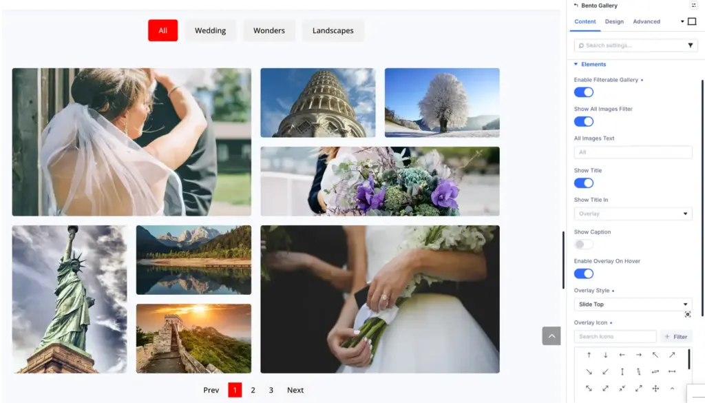
- Enable Filterable Gallery: Toggle this switch ON to display category filter buttons (e.g., All, Wedding, Landscapes) above your bento grid, allowing visitors to filter images by media category.
- Show All Images Filter: Toggle this switch ON to include a default reset button in the filter menu that displays all bento images when clicked.
- All Images Text: Enter a custom text label (e.g., “All” or “All Works”) for the main filter button that resets and shows all bento images.
- Show Title: Toggle this switch ON to display the image title text on your bento cards.
- Show Title In: Choose where the image title appears (e.g., set to Overlay to display the title over the image during hover, or select positions like below/above the image).
- Show Caption: Toggle this switch ON to display the WordPress media caption text for each bento item.
- Enable Overlay On Hover: Toggle this switch ON to display a semi-transparent background overlay layer and icon when hovering over a bento image tile.
- Overlay Style: Select the hover animation transition style for the overlay layer (e.g., Slide Top, Slide Bottom, Fade, or Zoom).
- Overlay Icon: Use the icon picker grid to select a custom icon (such as an arrow, search icon, or link icon) to display inside the hover overlay.
Pagination settings
Configure page navigation, bento image limits per page, and navigation text links under the Pagination settings group:

- Show Pagination: Toggle this switch ON to enable page navigation controls at the bottom of your bento gallery.
- Pagination Type Pagination: Select your preferred pagination style (e.g., set to Number Pagination to show numbered page buttons, or choose options like Load More Button).
- Images Per Page: Enter the maximum number of images (e.g., 8, 12, or 16) to display in the bento layout per page view before pagination triggers.
- Show Previous Next Links: Toggle this switch ON to display clickable “Previous” and “Next” text navigation links alongside page numbers.
- Next Link Text: Enter custom label text (e.g., “Next” or “Next Page »”) for the forward navigation button.
- Prev Link Text: Enter custom label text (e.g., “Prev” or “« Previous Page”) for the backward navigation button.
Design settings
Bento card and gap spacing
- Bento Grid Gap: Adjust horizontal and vertical spacing between individual bento tiles.
- Card Border Radius: Set rounded corners on bento cards for a modern container aesthetic.
- Card Background & Shadow: Customize card background colors, border styles, and drop shadows.
Overlay and hover effects
- Overlay Background: Choose gradient or solid overlay colors when hovering over a bento tile.
- Hover Scale Effect: Apply smooth zoom-in or tilt hover animations to bento cards.
- Overlay Icon: Customize icon type, size, and color for the hover overlay.
Filter buttons styling
- Button Colors: Set normal, hover, and active state background colors for category filter tabs.
- Button Borders: Customize border width, radius, and color for category buttons.
- Button Spacing & Margin: Adjust padding and margins around filter buttons.
Typography controls
- Title Typography: Set font family, size, weight, color, and text alignment for titles inside bento cards.
- Caption Typography: Set font styling for image captions.
Frequently asked questions
What makes a bento gallery different from a standard grid?
A bento gallery displays images in asymmetrical tile sizes (combining large hero cards with smaller supporting cards) reminiscent of a bento box layout, rather than a uniform grid of identical column widths.
Is the bento grid layout responsive on mobile devices?
The bento layout automatically reorganizes into a clean, touch-friendly vertical stack on tablet and mobile screens so images remain clear and legible.