Search Divi Gallery Extended Documentation
Search for answers or browse our knowledge base.
Module 3: Justified Gallery
Make your photo gallery look beautiful with Justified Gallery. You can choose how your pictures are shown, add filters, and customize buttons. It’s easy to make your gallery look just the way you want
Content
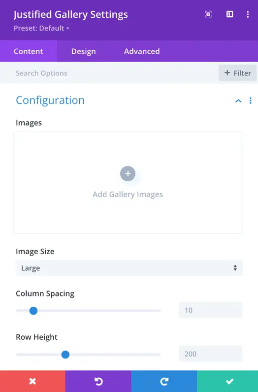
Configuration
Add Gallery Images
This is the option that allows you to add new images to the gallery.
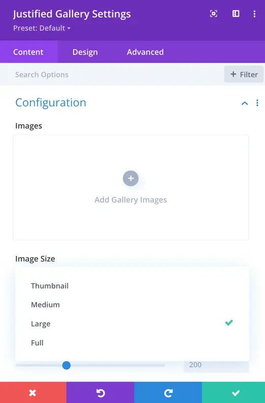
Images Size
This setting determines the size of the images in the gallery. You have 4 different options such as:
- Thumbnail: A small-sized version of the image.
- Medium: A moderate-sized version, larger than the thumbnail.
- Large: A larger version suitable for viewing in more detail.
- Full: The original size of the image.
Column Spacing
This setting controls the space between columns in the justified gallery.
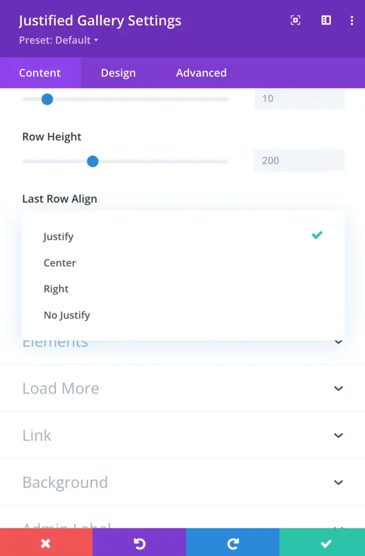
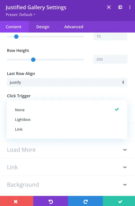
Row Height
This setting determines the height of each row in the justified gallery.
Last Row Align
This setting determines how the last row of images in the justified gallery will be aligned. Users typically have the following options:
- Justify: Aligns the last row similar to the preceding rows, distributing the images evenly across the row.
- Center: Centers the images in the last row.
- Right: Align the images to the right in the last row.
- No Justify: This does not apply justification to the last row, allowing the images to retain their original alignment.
Click Trigger
This setting specifies what action or event will be triggered when a user clicks on an image in the gallery. Options include:
- None: No action is triggered on click.
- Lightbox: Opens the clicked image in a lightbox.
- Link: Links the clicked image to a specified URL.
Elements
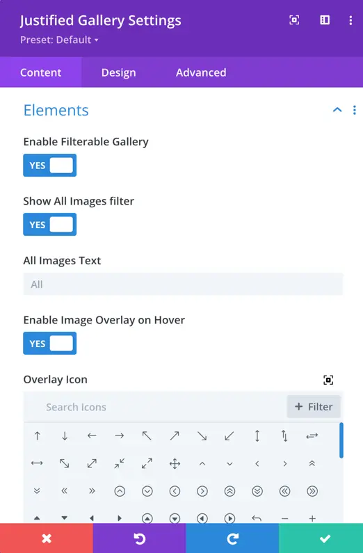
Enable Filterable Gallery
This toggle option allows users to enable or disable the filterable gallery feature. When enabled, users can filter images based on specific category.
Show All Images Filter
This setting provides an option to include a special filter for displaying all images collectively.
All Images Text
In this field, users can define the text that will be displayed for the “Show All Images” filter.
Enable Image Overlay on Hover
This toggle option allows users to enable or disable the image overlay effect when hovering over an image in the gallery.
Overlay Icon
Users can choose an overlay icon to be displayed on top of images when the hover effect is enabled.
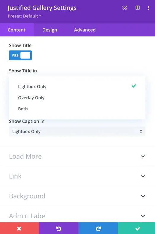
Show Title In
This setting determines where the title of each image is displayed. Users can toggle between the following options:
- Lightbox Only: Display the title only when viewing the image in the lightbox.
- Overlay Only: Display the title only when hovering over the image in the gallery.
- Both: Display the title in both the lightbox and on hover.
Show Caption In
Similar to the title setting, this setting determines where the caption of each image is displayed. Users can toggle between options like lightbox only, overlay only, or both.
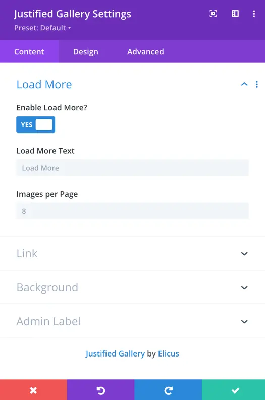
Load More
Enable Load More
This toggle option allows users to enable or disable the “Load More” functionality in the gallery.
Load More Text
In this field, users can insert the text that will be displayed on the button to trigger the loading of more images.
Images Per Page
This setting defines the default number of images displayed per page in the gallery. The default value is set to 8, meaning that when the gallery is initially loaded or when the “Load More” button is clicked, it will display the specified number of images.
Design
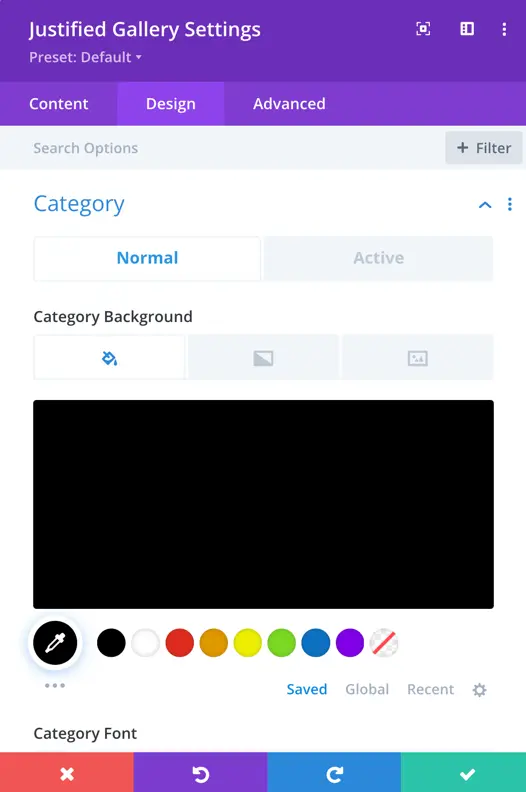
Category
Normal and Active
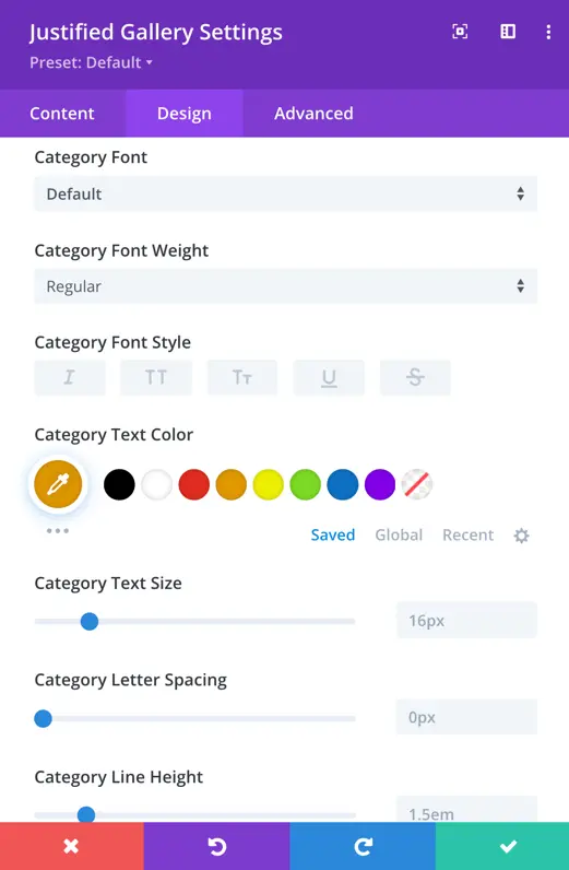
- Font: Choose the font style.
- Font Weight: Adjust text thickness.
- Font Style: Set text style (normal, italic, etc.).
- Text Color: Define the text color.
- Text Size: Set the font size.
- Letter Spacing: Adjust space between letters.
- Line Height: Set the height of each text line.
Users can customize the visual presentation for active category background as well using the settings, including Font, Font Weight, Font Style, Text Color, Text Size, Letter Spacing, and Line Height.
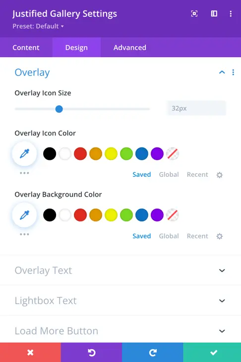
Overlay
Overlay Icon Size
Users can adjust the size of the overlay icon that appears on images. The default size is set to 32 pixels.
Overlay Icon Color
Users can choose the color for the overlay icon.
Overlay Background Color
Users can select the background color for the overlay. This color will be visible behind the overlay icon on images and can be customized to match the overall design.
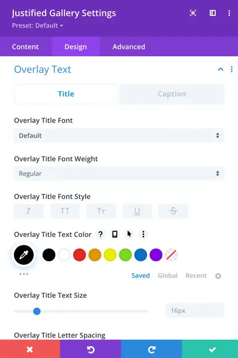
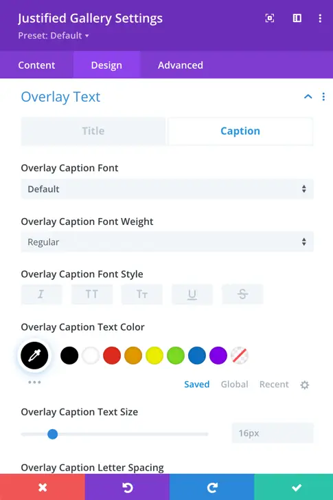
Overlay Text
Overlay Text (Title/Caption)
Users can customize the appearance of overlay text, including both title and caption.
Font
Set the font style for the overlay title and caption.
Font Weight
Adjust the thickness or boldness of the overlay text.
Font Style
Choose the style of the font for the overlay text (normal, italic, etc.).
Text Color
Define the color of the overlay text using a color picker or specific color code.
Size
Set the font size for the overlay title and caption.
Letter Spacing
Adjust the space between letters in the overlay text.
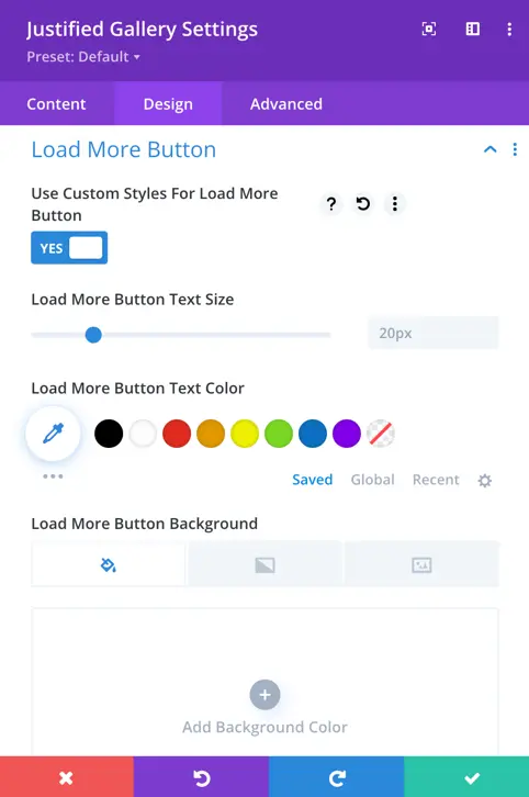
Load More Button
Use Custom Styles For Load More Button
Toggle option: Users can enable or disable custom styling for the “Load More” button.
Load More Button Text Size
Users can set the font size for the text on the “Load More” button.
Load More Button Text Color
Users can choose the color for the text on the “Load More” button.
Load More Button Background
Users can specify the background for the “Load More” button.
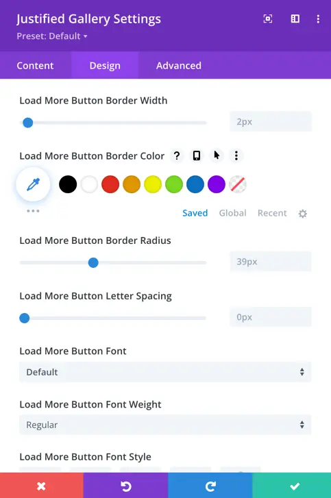
Border Width
Users can set the width of the border around the “Load More” button.
Border Color
Users can choose the color of the border around the “Load More” button.
Border Radius
Users can define the curvature of the button corners with the border-radius setting.
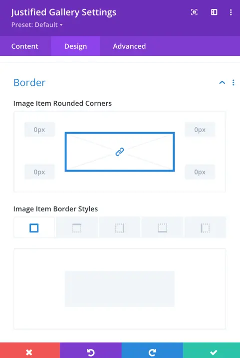
Border
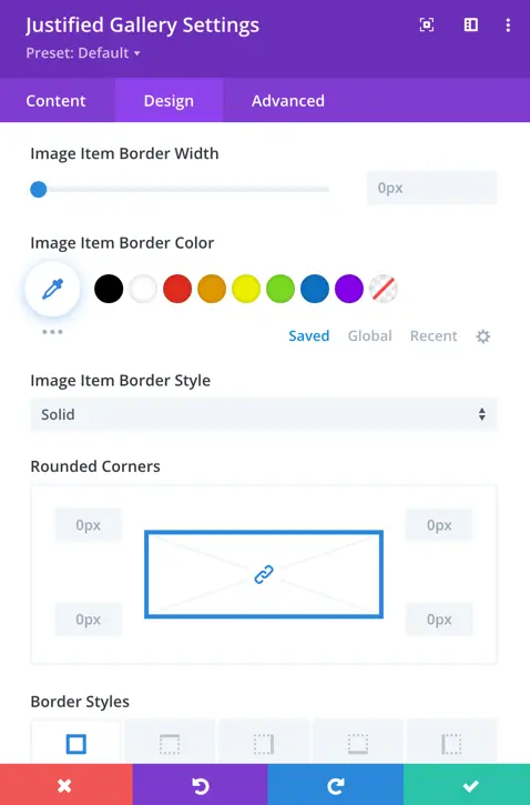
Image Item Rounded Corners
Users can specify the image item’s rounded corners.
Image Item Border Styles
Users can select the style of the border for each image item. Options include solid, dashed, dotted, etc.
Image Item Border Width
Users can set the width of the border around each image item.
Image Item Border Color
Users can choose the color of the border around each image item using a color picker or specific color code.
Image Item Border Style
Users can define the style of the border around each image item, such as solid, dashed, dotted, etc.