
Search All In One Carousel for Divi Documentation
Search for answers or browse our knowledge base.
DE Vertical Carousel
The Vertical Carousel module provides configuration settings and design controls for rendering vertical content sliders within Divi layouts. This document outlines the available module options, settings accordions, and child item configurations.
View Live Demo: To see the DE Vertical Carousel module in action, click here https://carousel.diviextended.com/vertical-carousel/

1. Parent module settings (Vertical Carousel)
The Vertical Carousel parent container module controls the overall slider wrapper, autoplay timings, vertical transition effects, container height, navigation arrows, and pagination indicators.
Content tab
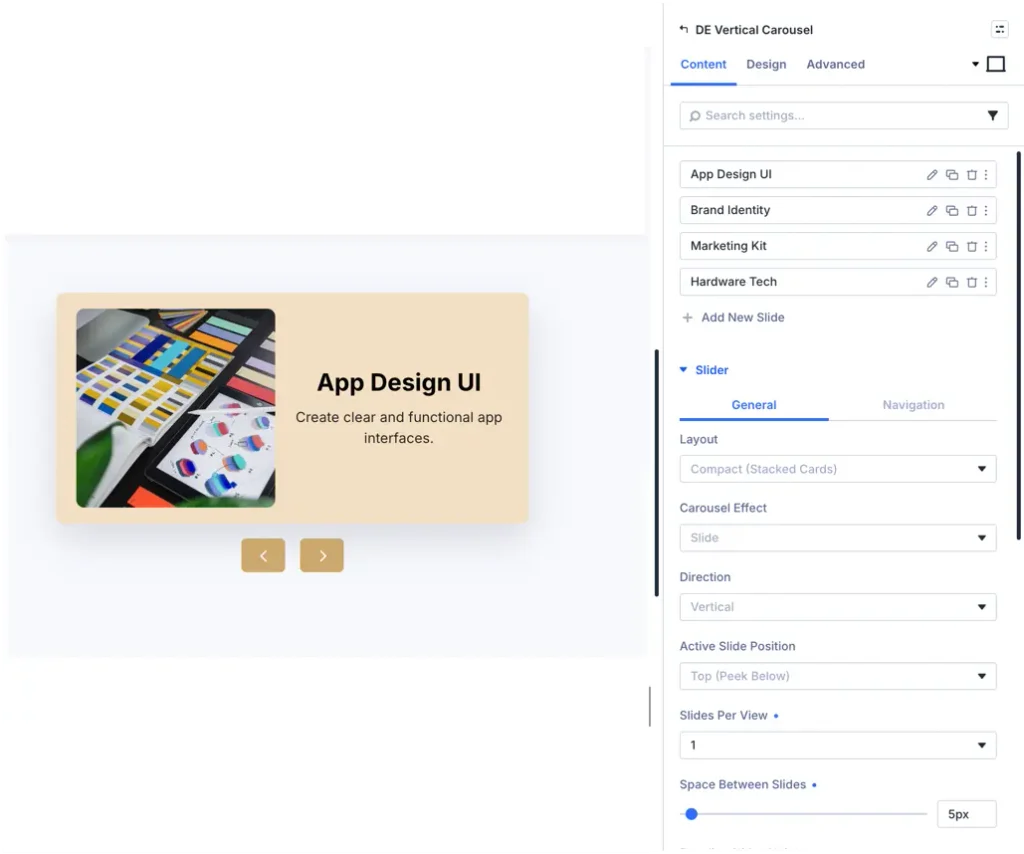
Carousel settings
- Slide direction: Selects the vertical sliding direction (Top to bottom or Bottom to top).
- Slides per view: Defines how many slide cards are visible simultaneously inside the vertical container height.
- Space between slides: Adjusts the vertical gap spacing between consecutive carousel slides.
- Autoplay: Enables or disables automatic vertical sliding transition.
- Autoplay speed: Sets the delay duration (in milliseconds) between automatic slide shifts.
- Pause on hover: Temporarily stops automatic scrolling when a site visitor hovers over the carousel.
- Infinite loop: Enables continuous looping so the carousel seamlessly restarts after reaching the final slide.
- Transition duration: Adjusts the slide animation speed (in milliseconds).
Navigation and pagination
- Show navigation arrows: Displays top and bottom vertical navigation arrow buttons.
- Arrow position: Selects navigation arrow placement (Inside carousel, Outside top and bottom, or Side aligned).
- Show pagination: Enables vertical pagination dots or fraction counters along the side of the carousel.
- Pagination type: Selects pagination style.
Carousel items accordion
- Carousel items: List of child Vertical Carousel Item modules added inside the slider.
Design tab
Container and height
- Carousel height: Defines the explicit height or responsive max-height of the vertical carousel viewport.
- Vertical alignment: Sets content vertical alignment (Top, Center, or Bottom) inside each slide.
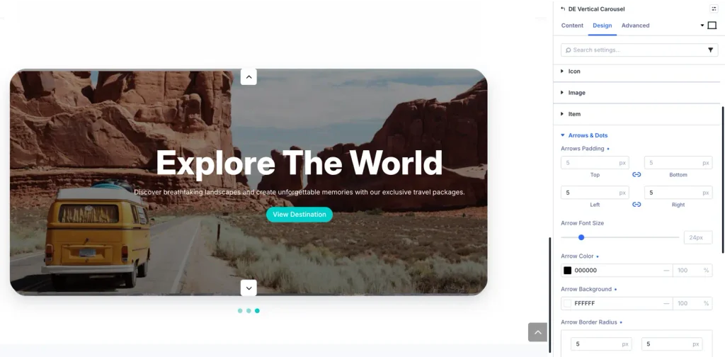
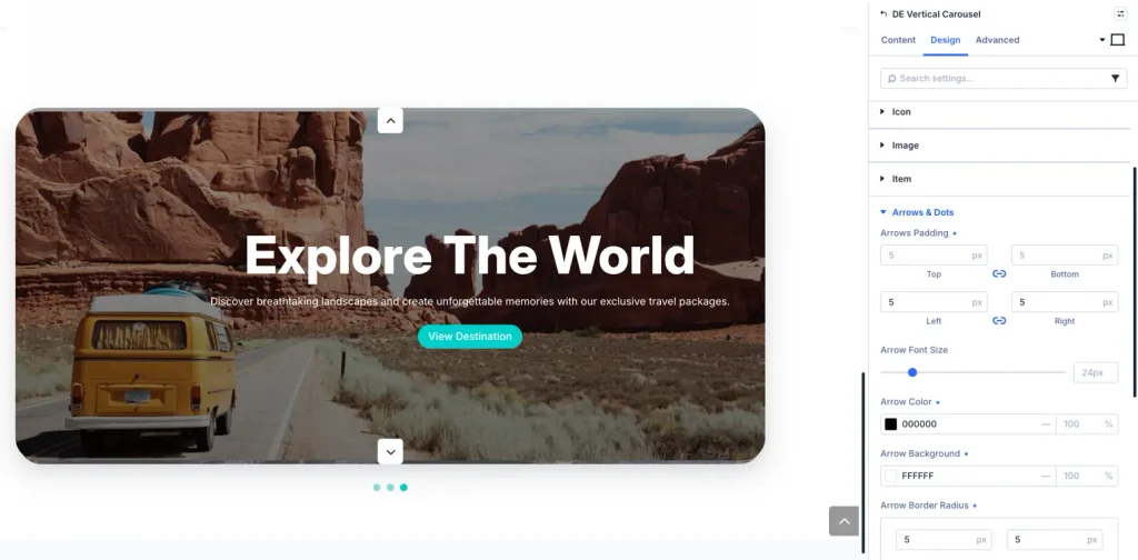
Arrow navigation
- Arrow icon: Custom icon selection for top (previous) and bottom (next) navigation buttons.
- Arrow size and color: Icon size, arrow color, hover color, and background fill color.
- Arrow border and shadow: Custom border radius, border width, border color, and box shadow.
Pagination
- Dot color: Normal state pagination dot color.
- Active dot color: Highlighted color for the currently active vertical slide dot.
- Dot size and spacing: Bullet size, active dot expansion, and vertical dot gap spacing.
2. Child item settings (Vertical Carousel Item)
The Vertical Carousel Item child module configures the individual content card displayed inside each vertical slide.
Content tab
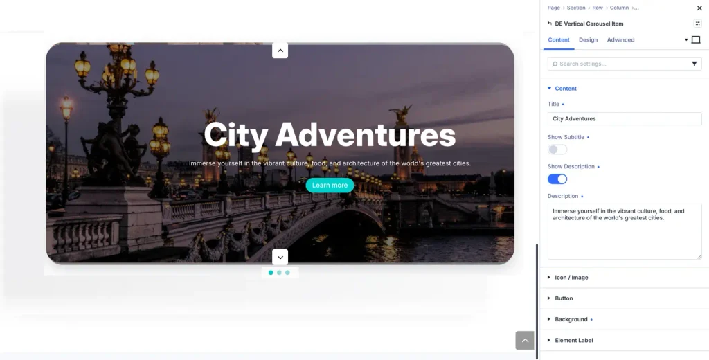
Content
- Content type: Selects the content layout format:
- Standard text (default): Title, subtitle, body description, and action button.
- Image slide: Full slide image with optional overlay text and button.
- Icon with text: Top or side icon header with title and description text.
- Library layout: Loads a saved layout directly from the Divi Library into the slide.
- Title and subtitle: Text input for slide heading and subheading.
- Description text: Rich text editor for body content and detailed text.
- Button text and URL: Call-to-action button text, destination link, and target window options (_self / _blank).
Design tab
Slide background and spacing accordion
- Background fill: Solid background color, gradient fill, or background image.
- Padding and margin: Internal content padding and external slide margin spacing.
- Border and box shadow: Corner border radius, border color, and drop shadow effects.
Typography
- Title text styling: Title font family, font weight, font size, text color, line height, and letter spacing.
- Subtitle text styling: Subtitle font family, size, color, and spacing.
- Body text styling: Description font family, size, text color, and line height.
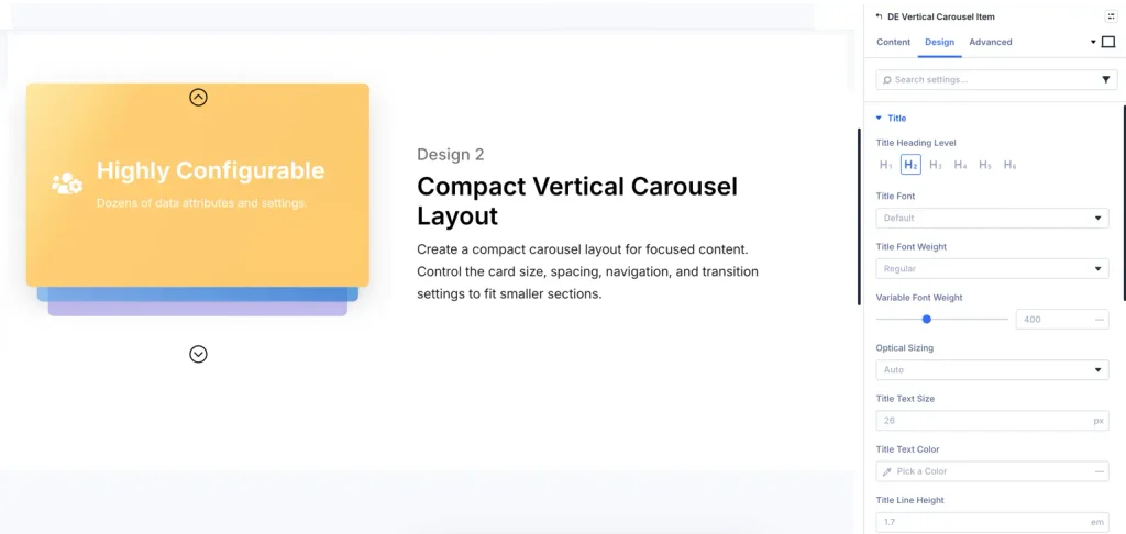
Button design
- Custom button styles: Button text color, background fill, hover color, hover background, border radius, and icon placement.
3. Advanced tab settings
- CSS ID and classes: Assign custom element ID and CSS classes for external stylesheet overrides.
- Custom CSS fields: Target specific sub-elements with element-level custom CSS rules.
- Display conditions and visibility: Configure Divi 5 display rules (conditions) and responsive visibility toggles (Show/Hide on Desktop, Tablet, Mobile).