Search All In One Carousel for Divi Documentation
Search for answers or browse our knowledge base.
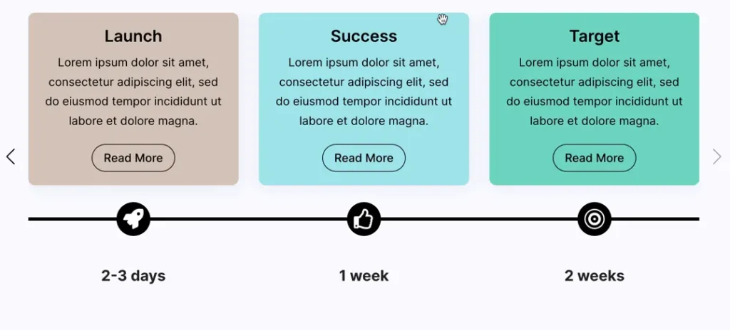
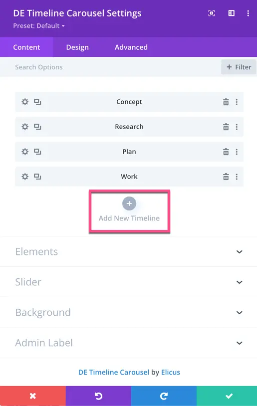
DE Timeline Carousel
Easily create engaging and responsive timelines on your Divi website using the Timeline Carousel module.
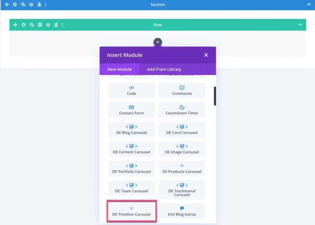
How To Add Module on Page
Once the plugin All In One Carousel for Divi is activated, it adds modules to the Divi builder. To insert the module, use the following steps.
- Create or edit a page that uses the Divi Builder.
- Create or edit a row.
- Create or edit a column.
- Go to the module options.
- Search for the module DE Timeline Carousel.
Add a new item to the Timeline Carousel
Under the Content tab, click on “Add New Timeline.” This will open a new setting window where you can input the details for the new timeline item.
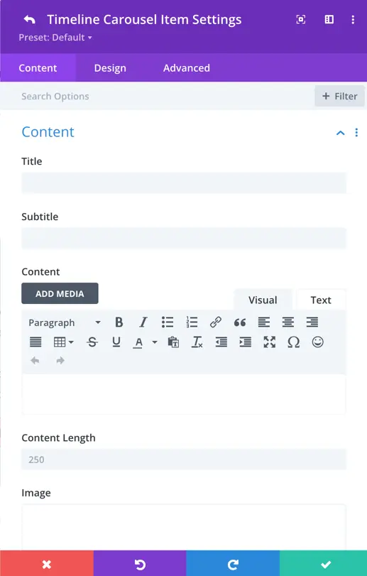
Content
Content
- Title: Enter the text for the title.
- Subtitle: Input text for the subtitle.
- Content: Provide the content for the timeline item. The default content length is 250 characters.
- Image: Here you can add an image for the timeline item.
- Image Alt Text: Enter alt text for the image.
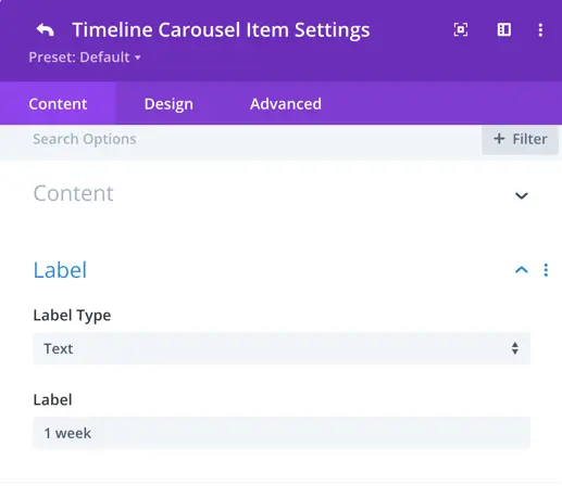
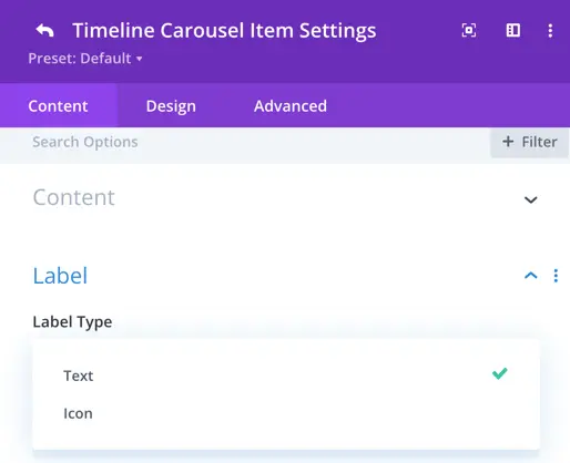
Label
Label for Timeline:
Choose the type of label for your timeline item. The type of label can be either text or an icon.
If you select text, you will have the option to enter your desired text in the “Label” field.
If you choose the icon option, you will be able to pick an icon to serve as the label for your timeline item.
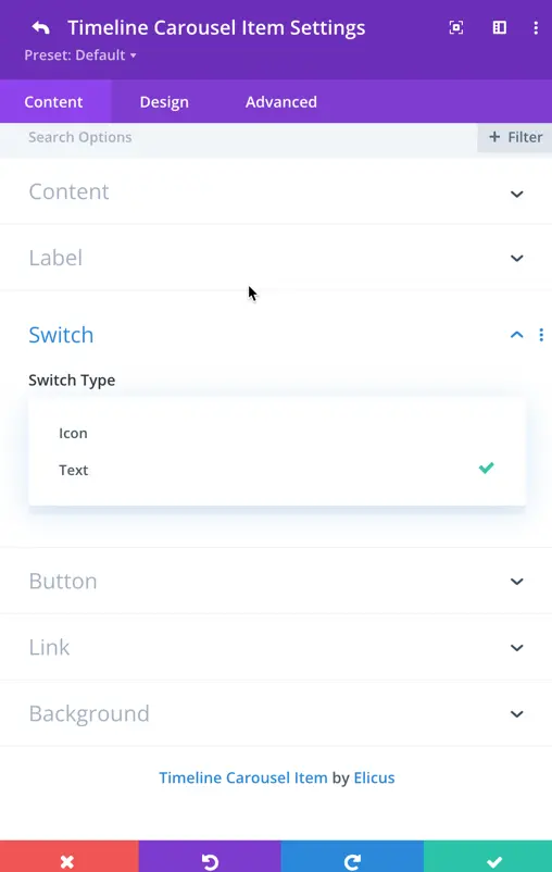
Switch
Here we have the option to select the switch type, which can either be text or an icon.
This choice allows you to determine whether you want textual indicators or icon-based indicators to switch between different items in the timeline.
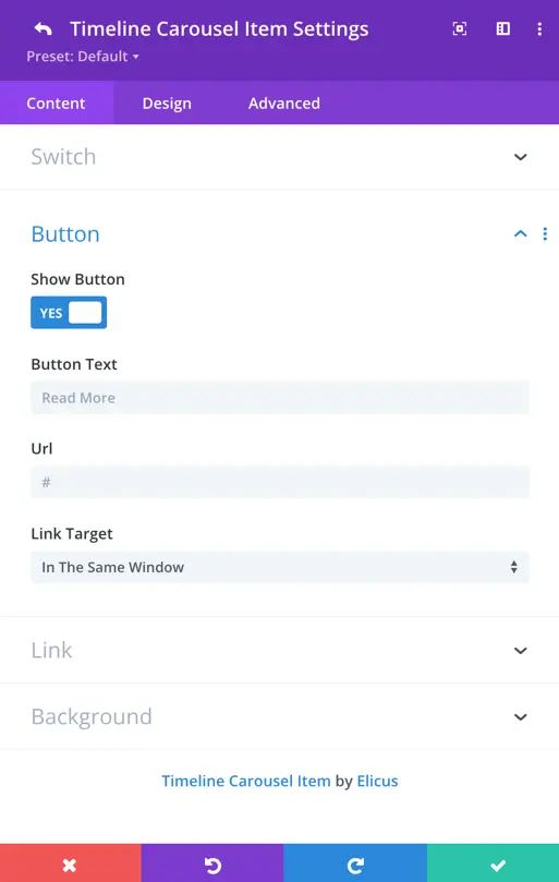
Button
Show Button: Here, you have the toggle option to display or not the button. If you choose to display the button, you get further settings as mentioned below.
- Button Text: Enter the desired text for the button.
- URL: Set the URL to which the button will link.
- Link Target: Choose whether the link should open in the same tab or a new tab.
Design
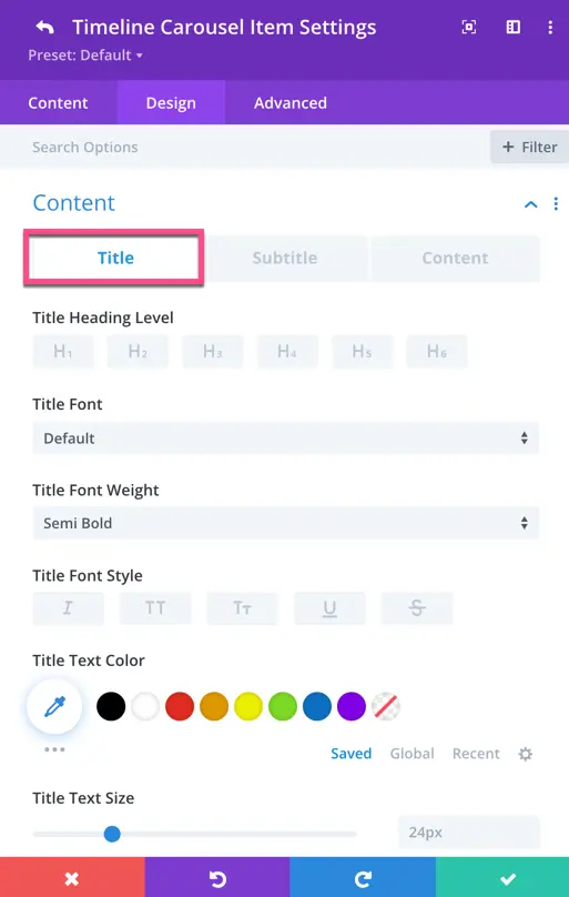
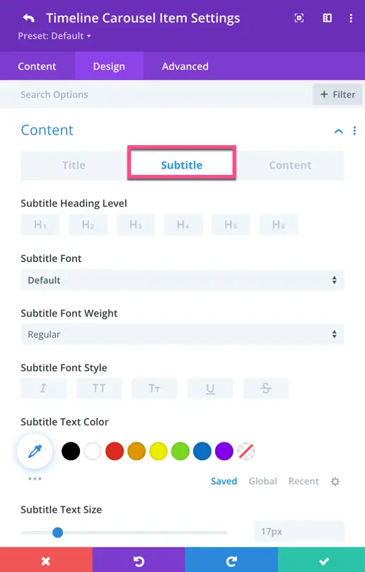
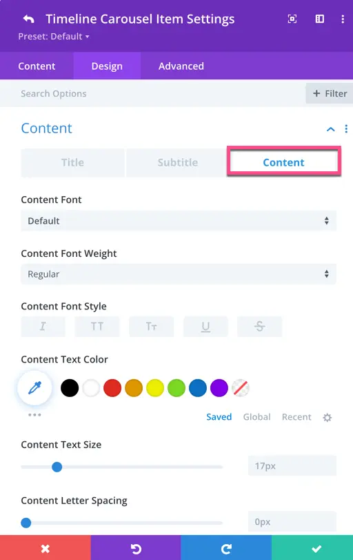
In the Timeline Carousel Item setting, you can style the title, subtitle, and content of each timeline item specifically.
Heading Level for Title and Subtitle
Choose the HTML heading level for the title and subtitle of each timeline item.
Font for Title, Subtitle, and Content
Select the font family for the title, subtitle, and content of each timeline item.
Font Weight
Adjust the thickness or boldness of the text for the title, subtitle, and content.
Font Style
Determine whether the text should appear in a normal, italic, or oblique style.
Text Color
Set the color of the text for the title, subtitle, and content.
Text Size
Specify the size of the text for the title, subtitle, and content.
Letter Spacing
Adjust the space between characters in the text.
Line Height
Set the height of each line of text.
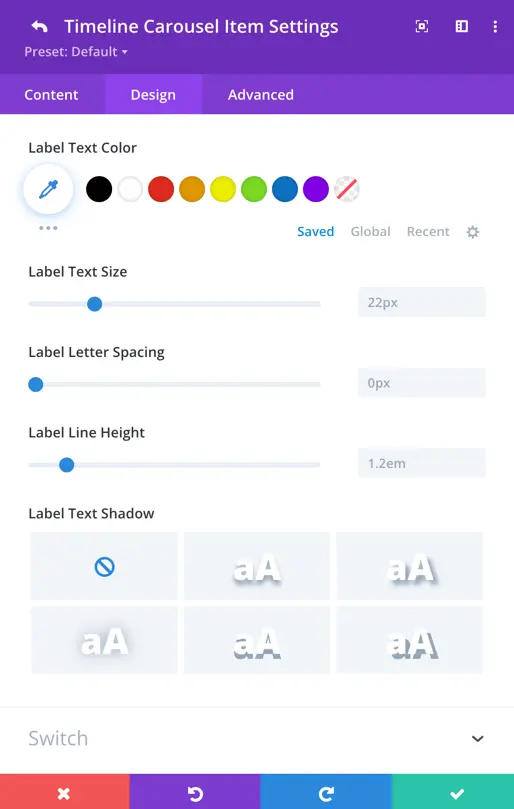
Text Shadow
Add a shadow effect to the text.
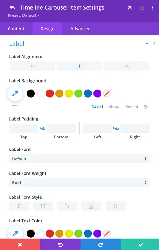
Label
The label refers to the descriptive text associated with each timeline item. In this section, you have control over various aspects of the label’s appearance.
Here, you can set the label alignment, define the label background, and customize the label text by choosing the color, adjusting the font size, setting letter spacing, defining line height, and applying a text-shadow.
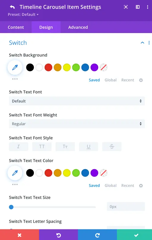
Switch
To style the switch in the timeline, you can find the settings in each timeline item. Here, you can customize the switch text according to your preference. If you have chosen switch content as an icon, you will also get additional settings for icon size and color.
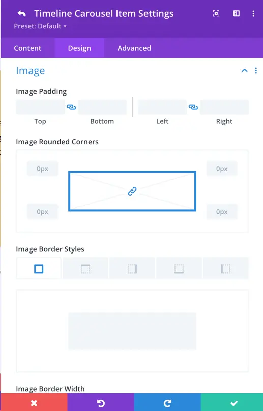
Image
Here you can set the padding for the image and other styles like rounded corners, border width, color, and style.
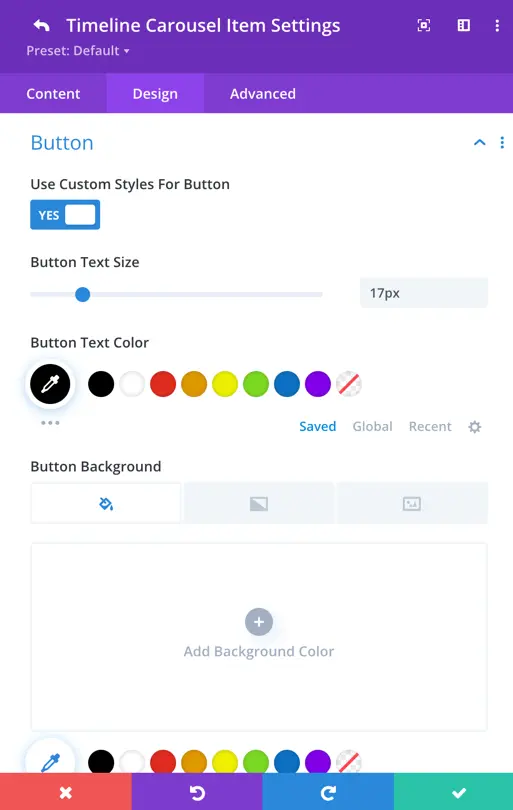
Button
You have the toggle option to enable the customization for the button. If you enable it, you get further settings to style the button.
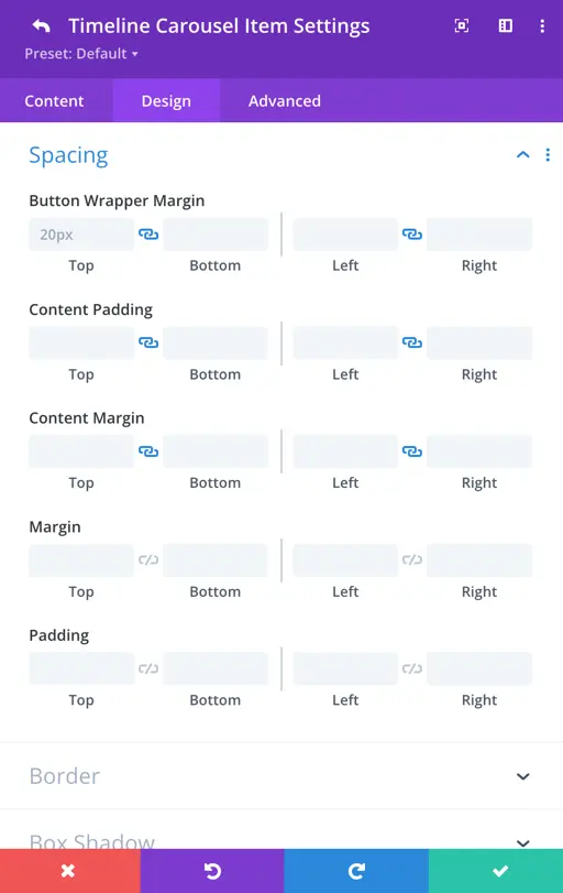
Spacing
In the spacing settings, you get all the native settings along with the button wrapper margin, content padding, and content margin.
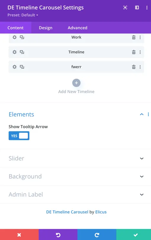
Elements
Show Tooltip Arrow
Enable or disable the tooltip arrow for each slide with the toggle option.
Slider
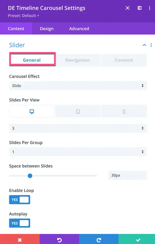
General
Customize the slider appearance with options like carousel effect (slide, cube, flip), slides per view for desktop, mobile, and tablets, slides per group, space between slides, enable loop, and autoplay.
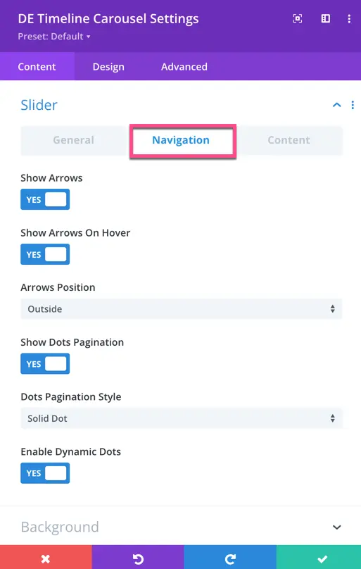
Navigation
Toggle options for showing arrows, arrows on hover, dots pagination, and enabling dynamic dots.
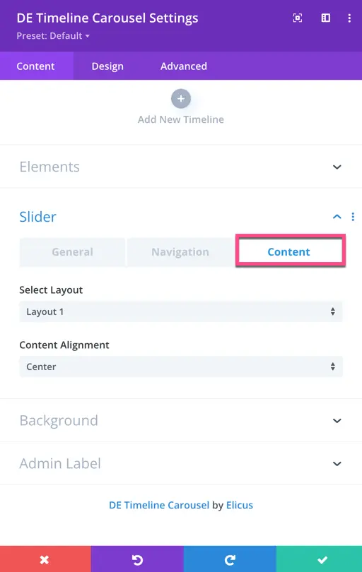
Content
Select the layout – Layout 1 displays all timelines on one side, while Layout 2 alternates their display.
Design
- Label, Switch, Title, Subtitle, and Content:
- These global settings apply to all timelines unless overridden in individual items.
- Configure typography, font weight, font style, text color, text size, letter spacing, line height, and text-shadow.
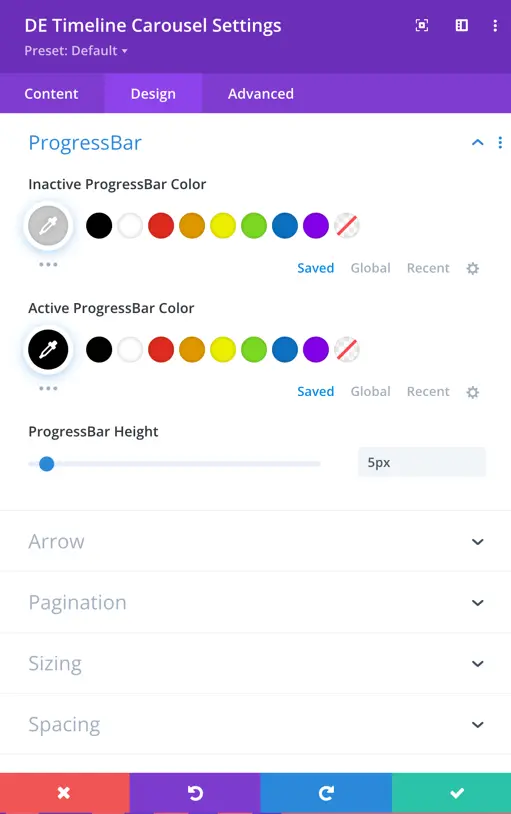
- Progress Bar:
- Inactive Progress Bar:
- Set the color for the inactive progress bar.
- Active Progress Bar:
- Define the color for the active progress bar.
- Inactive Progress Bar:
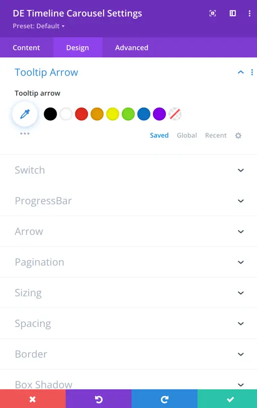
- Tooltip Arrow:
- Customize the appearance of the tooltip arrow.
- Set the color for the tooltip arrow.
- Adjust padding for the arrow.
- Configure background color and border.
- Customize the appearance of the tooltip arrow.
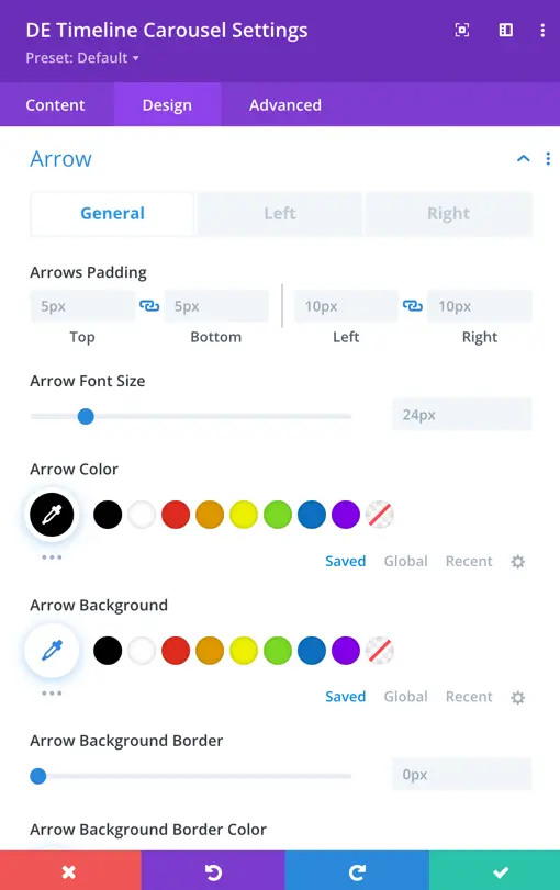
- Left and Right Arrow Icons:
- Choose icons for the left and right arrows.
- Customize the color, size, and other visual aspects of these icons.
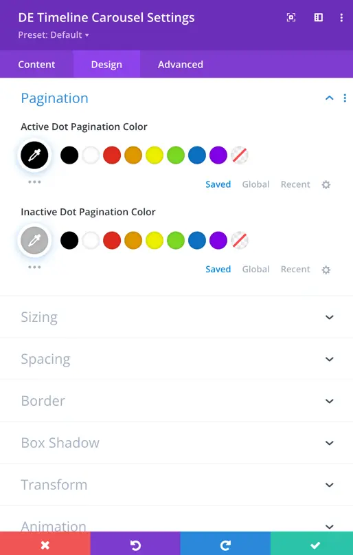
Pagination
Customize the active and inactive dot pagination colors.
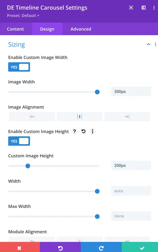
Sizing
Options for enabling custom image width, height, and alignment.
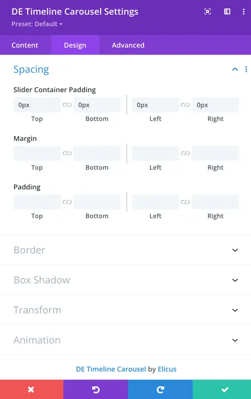
Spacing
Set padding and margin for the slider container, as well as padding for the module.