Search All In One Carousel for Divi Documentation
Search for answers or browse our knowledge base.
DE Blog Carousel
The Blog Carousel module in this All In One Carousel for Divi plugin presents your latest blog posts to visitors using the slider format. It offers an interactive way to display and navigate through your most recent content.
How To Add Module on Page
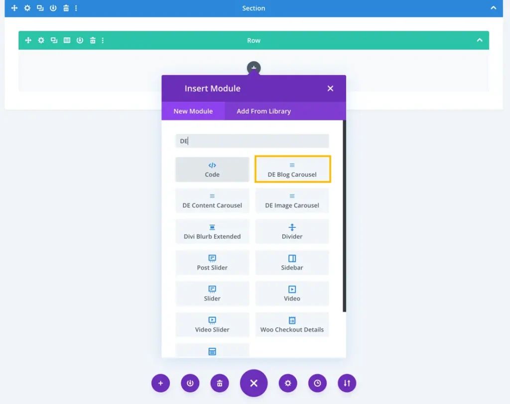
Once the plugin All In One Carousel for Divi is activated, it adds modules to the Divi builder. To insert the module, use the following steps.
- Create or edit a page that uses the Divi Builder.
- Create or edit a row.
- Create or edit a column.
- Go to the module options.
- Search for the module DE Blog Carousel.
Content
Content
In this section, you can select your preferred layout, define the number of posts to display, and specify the post offset number for your blog carousel.
- Layout: There are four available layouts.
- Number of Posts: This setting allows you to specify the quantity of blog posts to be displayed within the carousel. The default value is set to 10.
- Post Offset Number: You can set a post offset number to determine the starting point for displaying blog posts, skipping a specified number of posts before the carousel begins.
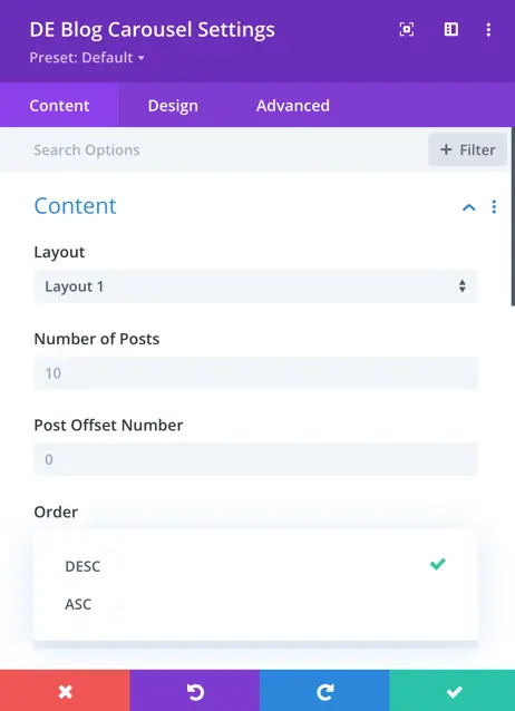
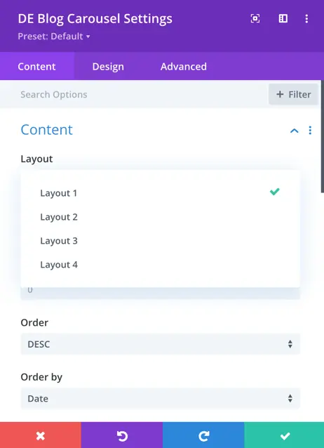
- Order: Here, you can choose the order in which blog posts appear, with options for ascending or descending order based on your preference.
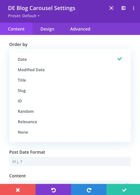
- Order By: This setting defines the criteria by which blog posts are ordered. You have various options, including date, modified date, title, slug, ID, random, relevance, and none.

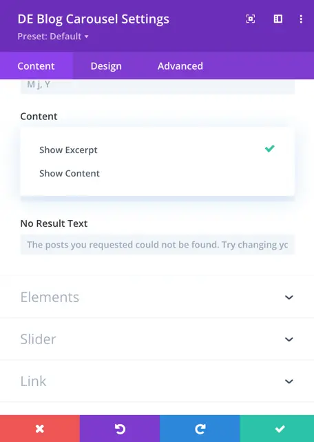
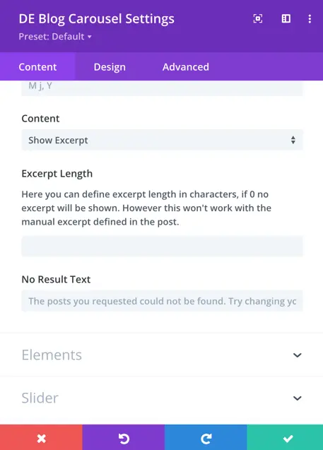
- Content: Within the “Content” section, you have the choice to display either the excerpt or full content of your blog posts in the carousel.
- Excerpt Length: In the case of using excerpts, you can specify the length of the excerpt by defining the number of characters or words that should be included in the summary.
- No Result Text: In case there are no blog posts to display, you can define custom text to inform visitors that no results are available.
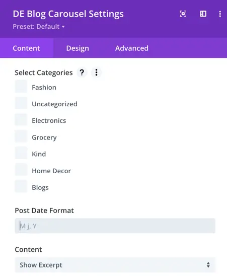
Select Categories: This allows you to choose specific categories of blog posts to include in the carousel.
Post Date Format: You can define the format in which the post dates are displayed.
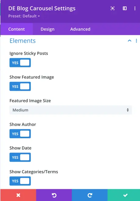
Elements
In the “Elements” section, you have control over essential content elements in your blog carousel. You can choose to exclude sticky posts, display featured images, customize image sizes, and showcase the author’s name, publication date, and categories or terms.
- Ignore Sticky Posts: This toggle allows you to exclude sticky posts from being displayed in the carousel, ensuring that only regular posts are showcased.
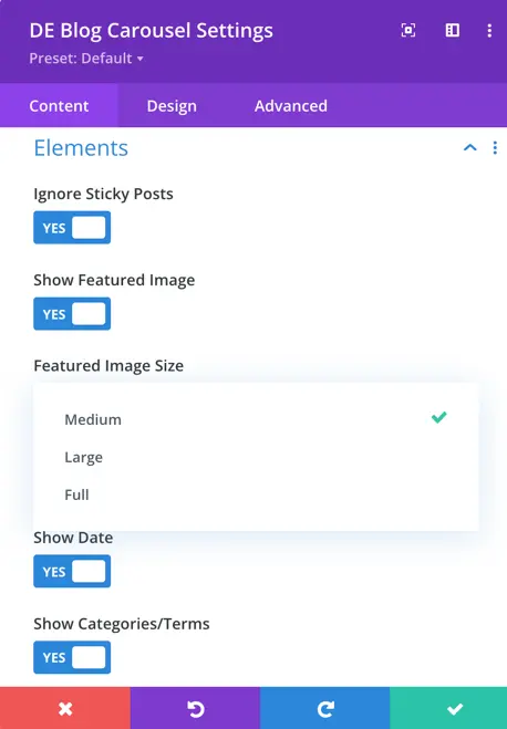
- Show Featured Image: Enabling this option displays the featured image associated with each blog post within the carousel.
- Image Size Option: This setting lets you define the size of the featured images.
- Show Author Toggle: You can activate this toggle to show the author’s name.
- Show Date: Enabling this option includes the publication date of each blog post.
- Show Categories/Terms: This toggle displays the categories or terms associated with each blog post in the carousel.
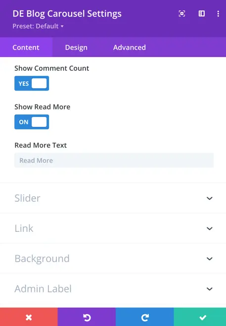
- Show Comment Count: This option, when enabled, displays the number of comments received on each blog post in the carousel.
- Show Read More: Enabling this setting adds a “Read More” link or button to the blog post summaries within the carousel.
- Read More Text: “Read More Text” allows you to specify the text that appears on the “Read More” link or button.
Slider
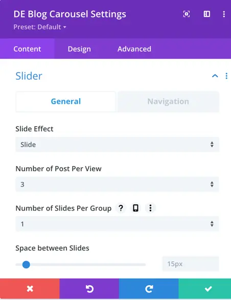
Customize your divi blog carousel with choices for slide effect, post count per view, slider groups, and spacing.
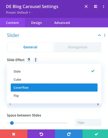
- Slide Effect: This setting allows you to choose the animation style used for transitioning between carousel slides. You have four options: slide, coverflow, cube, and flip.
- Number of Posts Per View: This determines the quantity of blog posts visible simultaneously in the carousel’s view.
- Number of Sliders Per Group: You can specify how many slides move at once during navigation in the carousel.
- Space Between Slides: This setting controls the gap or distance between individual slides in the carousel. The default space between slides is set to 15px.
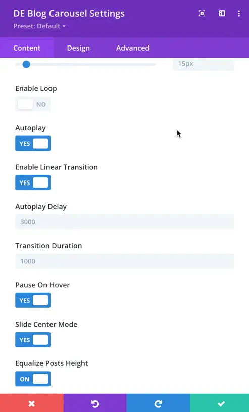
- Enable Loop Toggle: Enabling this option allows the carousel to loop back to the first slide after reaching the last one, providing continuous scrolling.
- Autoplay Toggle: When activated, the carousel automatically advances through the slides at regular intervals.
- Autoplay Delay: This setting defines the time interval between each automatic slide change during autoplay, allowing you to control the pace.
- Transition Duration: It specifies the time taken for one slide to smoothly transition to the next, affecting the speed and style of transitions.
- Pause on Hover Toggle: Enabling this option stops autoplay when a user hovers their cursor over the carousel.
- Slide Center Mode Toggle: This feature ensures that the current slide is centered in the view.
- Equalize Posts Height: Enabling this option makes all posts in the carousel the same height.
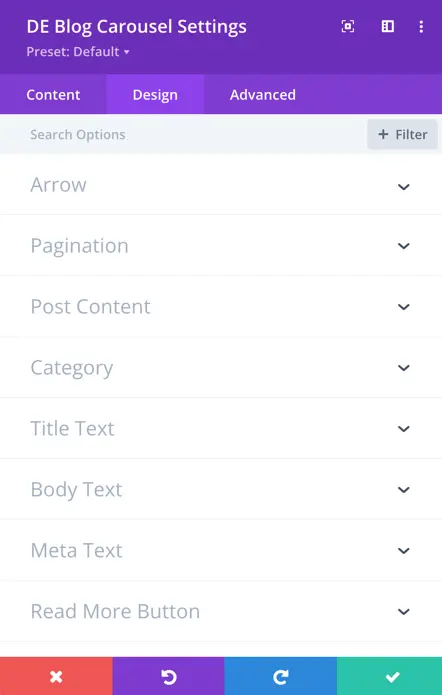
Design
In the ‘Blog Carousel Design’ tab, you can make your blog carousel look just the way you want it. You can change how the arrows, page indicators, post content, categories, text, buttons, spacing, size, shadows, and borders appear.
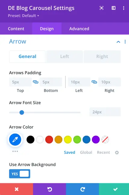
Arrow
- Arrows Padding: This setting allows you to define the spacing around the navigation arrows within the carousel.
- Arrow Font Size: You can specify the size of the font used for the arrow icons.
- Color: Customize the color of the navigation arrows.
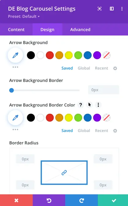
- Use Arrow Background Toggle: This toggle, when activated, allows you to set a background for the arrows.
- Arrow Background: When the “Use Arrow Background” toggle is enabled, you can define a background color or image for the navigation arrows.
- Arrow Background Border: This setting provides the option to set a border around the arrow backgrounds.
- Border Radius: Specify the border radius for the arrow backgrounds.
Pagination
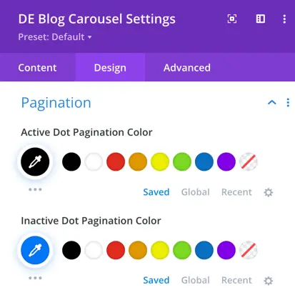
In the pagination design settings, you have the option to select colors for both the active dot pagination and the inactive dot pagination.
Post Content
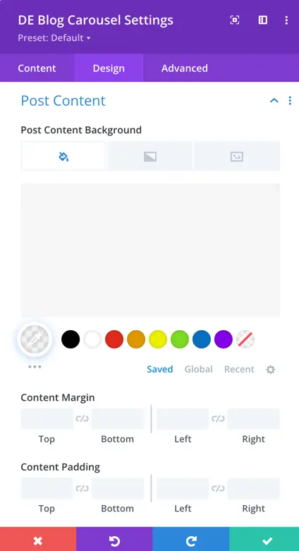
Post Content Background: This setting allows you to choose the background style for the post content within the carousel. You can opt for an image, set a solid background color, or even create a gradient background.
Content Margin: Content margin allows you to control the spacing around the post content, ensuring that it is properly spaced within the carousel.
Content Padding: Content padding determines the space between the post content and its container, enabling precise control over the content’s placement and appearance within the carousel.
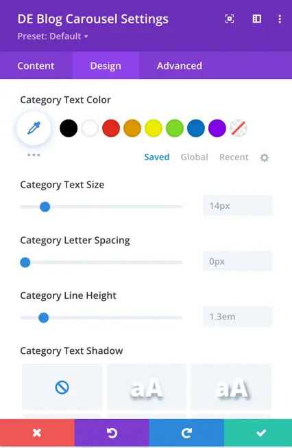
Category
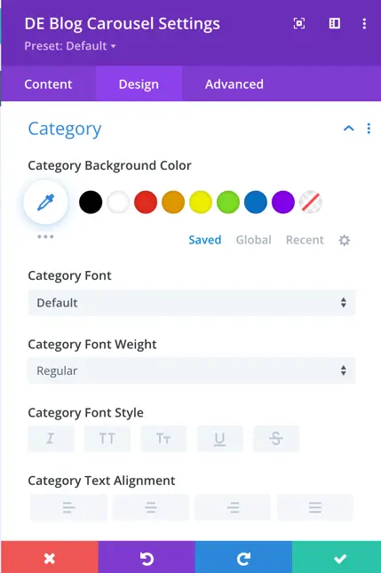
In the category design settings, you have the ability to customize the appearance of the category labels within the carousel. This includes setting the background color, font style, font weight, alignment, text color, size, letter spacing, line height, and even applying text-shadow.
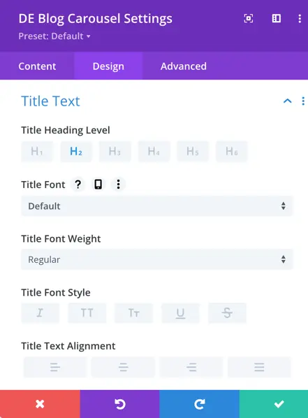
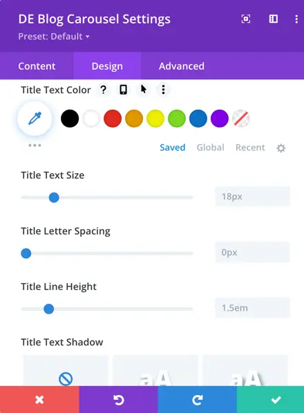
Title Text
In the “Title Text” design settings, you can precisely customize the appearance of the title text associated with each blog post in the carousel. This includes defining the heading level, font style, font weight, alignment, text color, size, letter spacing, line height, and text shadow.
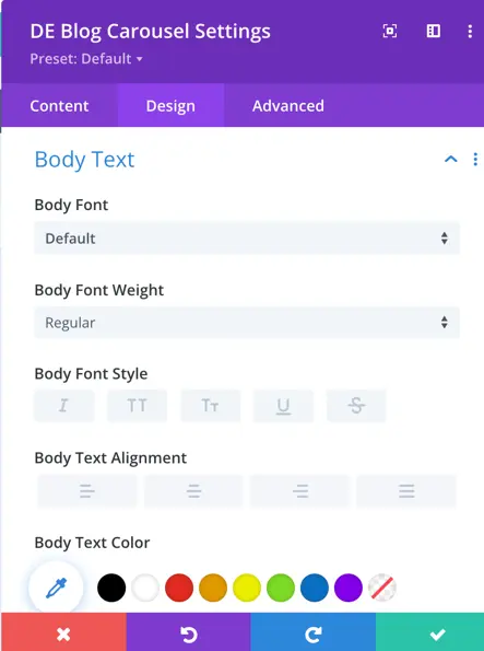
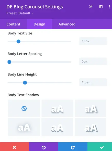
Body Text
In the “Body Text” design settings for the Divi Blog Carousel, you have the ability to customize the appearance of the main content text associated with each blog post. This includes defining the body font, font weight, font style, alignment, text color, size, letter spacing, line height, and text shadow.
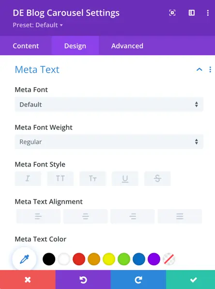
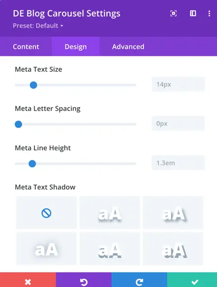
Meta Text
In the “Meta Text” design settings for the Divi Blog Carousel, you can customize the appearance of the metadata associated with each blog post, such as author and publication date. This includes setting the meta font, font weight, font style, alignment, text color, size, letter spacing, line height, and text shadow.
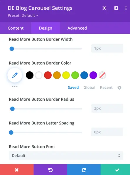
Read More Button
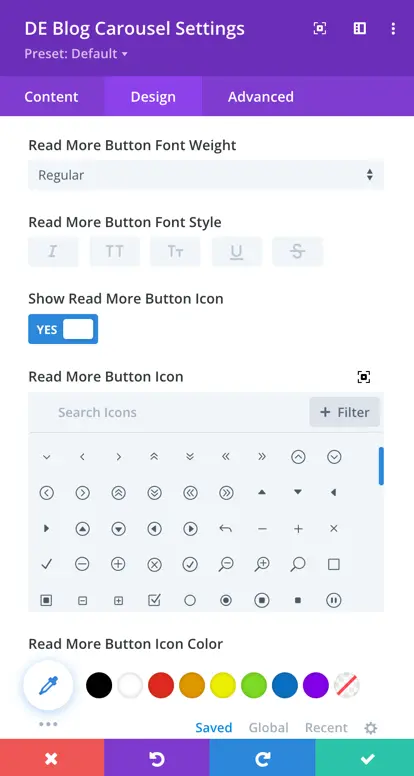
When you turn on the option to use custom styles for the “Read More” button, you can customize the button’s text in various ways.
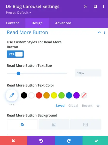
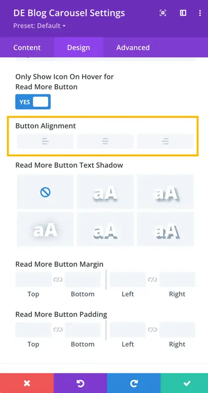
Here you have control over the button’s alignment and can adjust its margin and padding to ensure it fits your desired layout. Additionally, you can activate the toggle to show an icon with the “Read More” button, allowing you to select the icon.
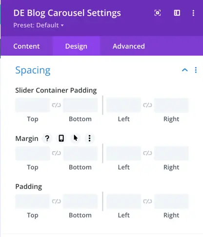
Spacing
Using the native spacing settings for margin and padding, you can configure the padding for the slider container within the spacing options.
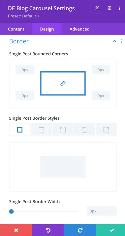
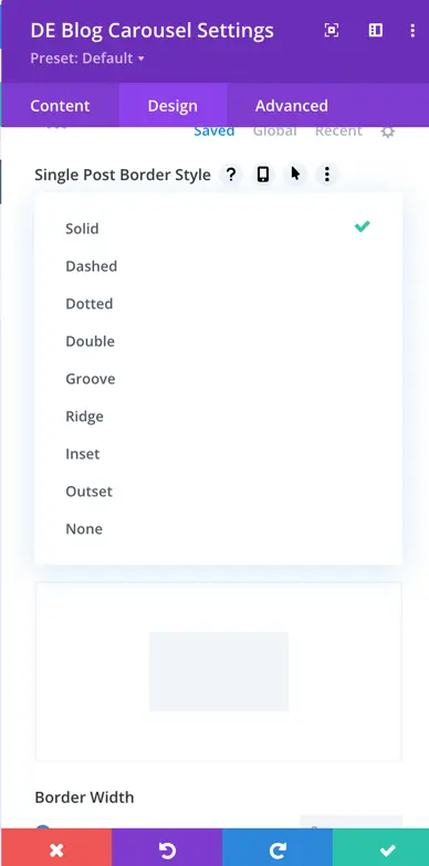
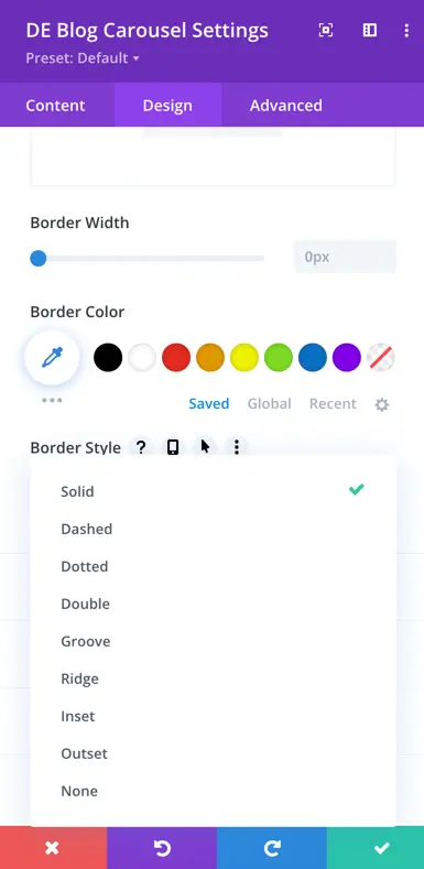
Border
In this section, you have the capability to establish border-related styles for individual blog posts within the carousel. You can define the single post border, including the border style, width, and color, and compare it with the border width and style for the entire blog carousel.
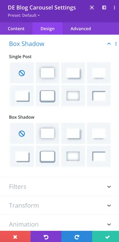
Box Shadow
Single Post:
In this section, you can define the box shadow for individual blog posts within the carousel. This allows you to add shadow effects to the individual posts.