
Search All In One Carousel for Divi Documentation
Search for answers or browse our knowledge base.
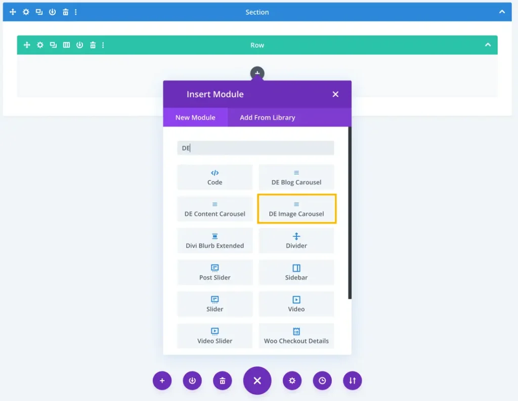
DE Image Carousel
With the DE Image Carousel module in this carousel plugin, you can enchant your visitors by showcasing captivating images in a stunning carousel.
How To Add Module on Page
- Create or edit a page that uses the Divi Builder.
- Create or edit a row.
- Create or edit a column.
- Go to the module options.
- Search for the module DE Image Carousel.
Content
In this section, you can add new images to your carousel by clicking the plus icon. Additionally, you have access to slider and background options for further customization.
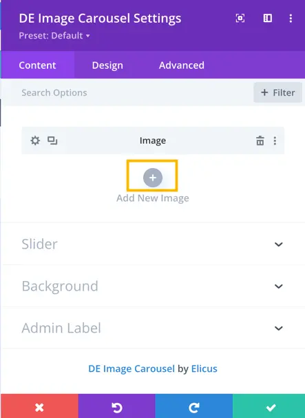
Once you’ve added a new image, you gain access to settings specifically for that added item.
Content
- Title: In this field, you can input the title for the content associated with the image in the carousel.
- Subtitle: In the subtitle field, you can provide additional information
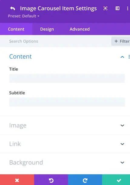
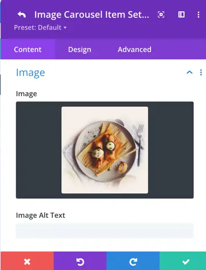
Image
When you add the image to your Image Carousel, you can also set the image’s alt text. This alt text provides a brief and descriptive label for the image.
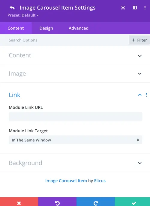
Link
Module Link URL
For each image in the carousel, you have an option to add a link.
Module Link Target
This setting allows you to specify whether the link should open in a new tab or in the same window.
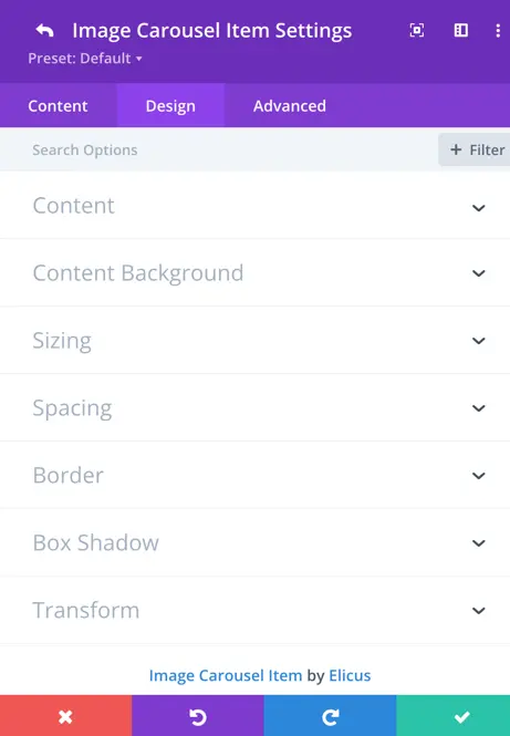
Design
In this section, you have access to design customization options specifically image items in your carousel.
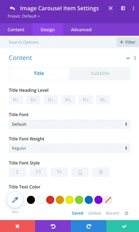
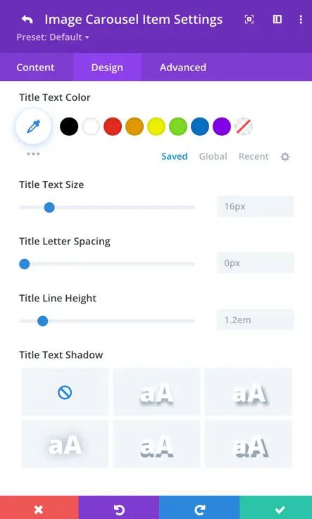
Title
In this part, you can adjust the title for each image in your carousel. You can change things like font, color, size, and more.
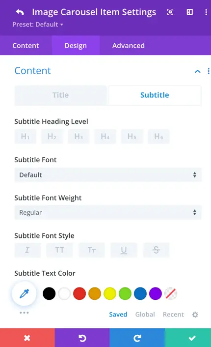
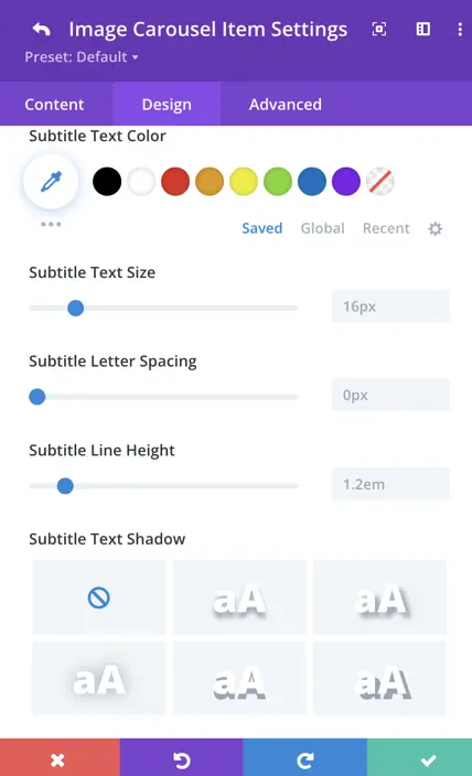
Subtitle
Likewise, you can customize the subtitle for each specific image in your carousel. Here, you can set the heading level, font, weight, style, text color, size, letter spacing, line height, and text-shadow.
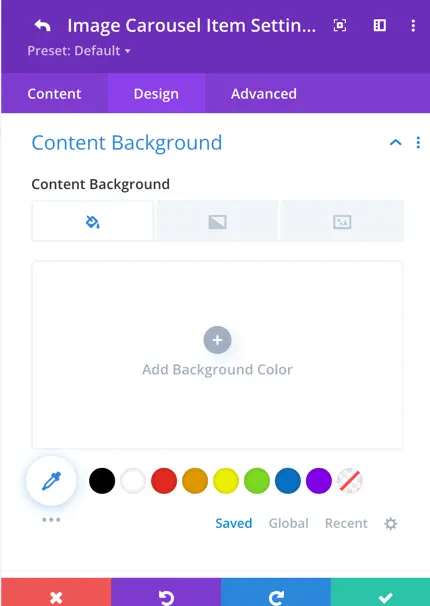
Content Background
Within this setting, you have the ability to define the content background for specific image items in your carousel. You can choose to set it as a background color, apply a gradient effect, or use an image as the background.
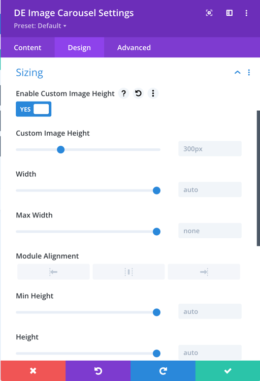
Sizing
Enable Custom Image Height: This toggle allows for custom image height settings.
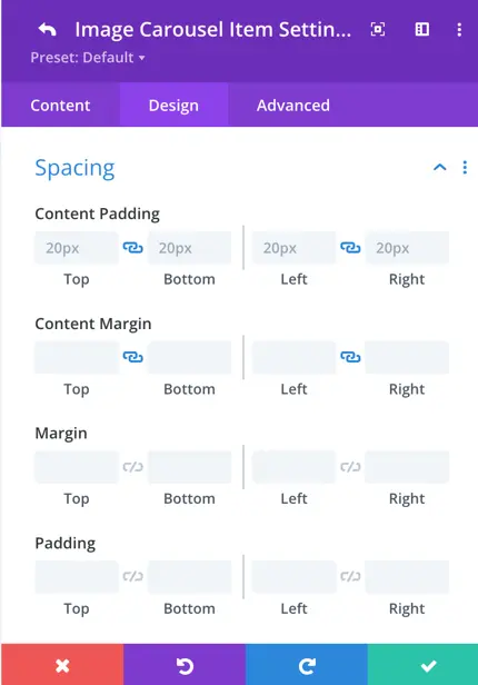
Spacing
Here, you can establish the content padding for individual image items in your carousel. The default padding value is set to 20 pixels, providing spacing around the content. Additionally, you can define margin settings to control the space around each specific image item.
Slider
General
In the Image Carousel slider settings, you can choose from four dynamic effects, control slide visibility, spacing, and grouping. Enable looping and autoplay for seamless scrolling, fine-tune transition and hover behavior, and even customize image heights. Open images in a lightbox for enhanced user engagement.
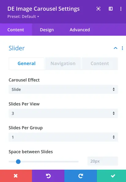
- Carousel Effect: Choose from four unique effects – slider, cube, coverflow, or flip – to determine how the images transition within the carousel.
- Slides Per View: This setting controls the number of slides that are visible at one time, with the default value set to 3.
- Slides Per Group: Define the number of slides that move as a group, affecting the scrolling behavior.
- Space Between Slides: Set the space or gap between individual slides.
- Enable Loop Toggle: Activate this toggle to enable continuous looping of the carousel.
- Autoplay: Toggle the autoplay feature to make the carousel automatically scroll.
- Autoplay Delay: Customize the delay in milliseconds between each slide transition during autoplay.
- Pause On Hover: When enabled, the carousel will pause scrolling when a visitor hovers over it.
- Transition Duration: Define the speed at which slide transitions occur.
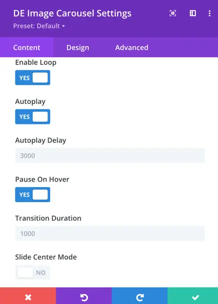
- Slide Center Mode: Activate this mode to ensure the active slide is centered within the carousel.
- Equalize Slides Height: Enable this feature to make all slides in the carousel the same height.
- Open Image in Lightbox Toggle: Activate this option to open carousel images in a lightbox for a more detailed view.
Navigation
Navigation settings provide control over how to display arrows, customize their appearance and behavior, use dots for pagination, and choose from various styles to match your design.
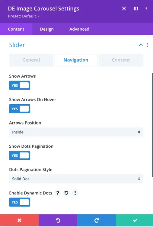
- Show Arrows: This toggle enables or disables the display of navigation arrows, allowing users to manually navigate through the carousel using left and right arrows.
- Arrow on Hover: When enabled, the navigation arrows are hidden by default and appear when the user hovers the cursor over the carousel.
- Show Dots Pagination: Enabling this option adds dot-style pagination indicators that correspond to each slide in the carousel.
- Dots Pagination Style: You can choose the style of the dot pagination, customizing its appearance to match your overall design.
- Enable Dynamic Dots: Dynamic dots automatically adjust in size and spacing to indicate which slide is currently active.
- Arrow Position: This setting empowers you to precisely position the navigation arrows as per your preference. You can choose from a range of options, including outside, inside, left, right, top, bottom, and center.
- You can select from a range of styles for the dot pagination indicators, including Solid Dot, Transparent Dot, Stretched Dot, Line, Rounded Line, and Squared Dot.
Content
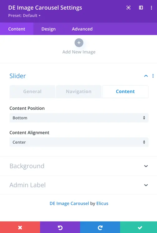
- You have the flexibility to select the content’s position and alignment within the carousel
- The “Content Position” setting offers several positioning options, including top, bottom, left, right, and overlay. These options allow you to determine where the content appears within the carousel.
- For “Content Alignment” within the top and bottom positions, you can choose from alignment options that include left, right, and center. This enables precise control over how your content is aligned within the carousel.