Search All In One Carousel for Divi Documentation
Search for answers or browse our knowledge base.
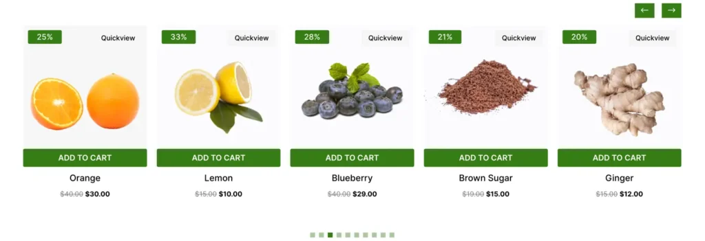
DE Products Carousel
Explore the Products Carousel – a powerful tool to make your online store look beautiful and make it easy for visitors to check out. For detailed settings, check the guide below.
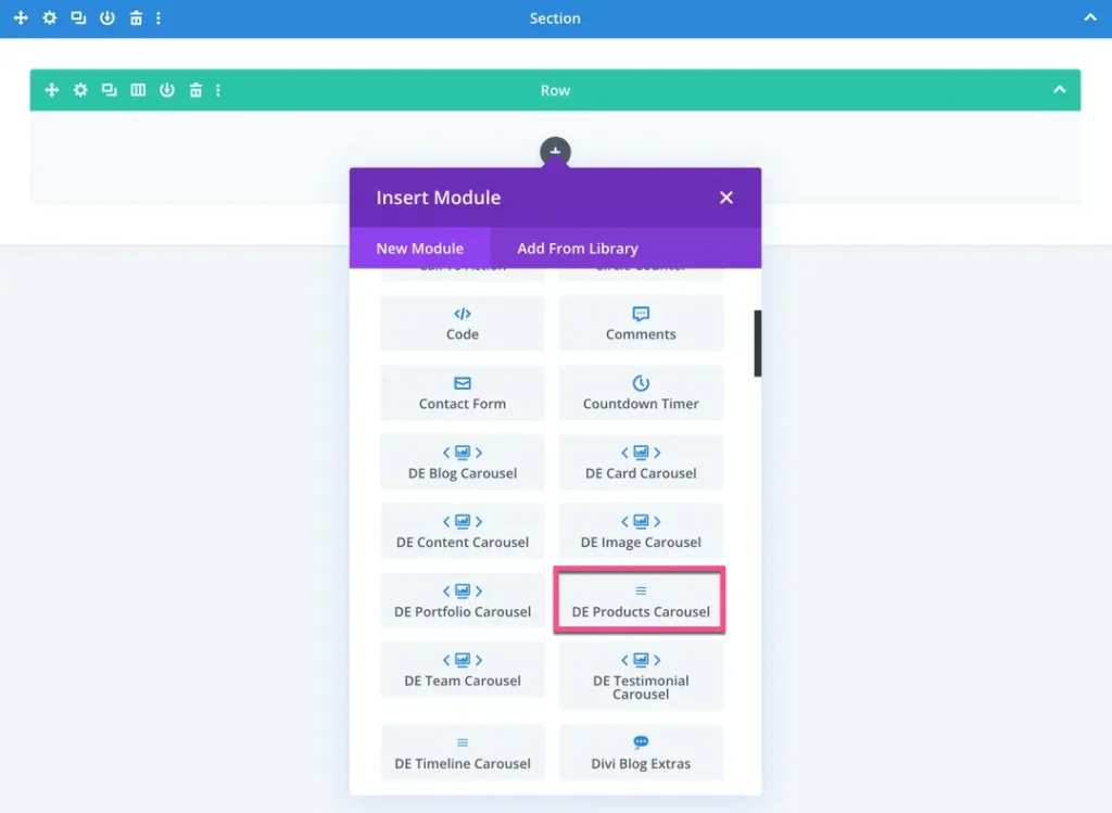
How To Add Module on Page
Once the All In One Carousel for Divi plugin is activated, it adds modules to the Divi builder. To insert the module, use the following steps.
- Create or edit a page that uses the Divi Builder.
- Create or edit a row.
- Create or edit a column.
- Go to the module options.
- Search for the module DE Products Carousel.
Content
Content
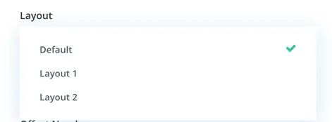
- Product View Type: You can customize how your products appear in the carousel by selecting from default, Layout 1, or Layout 2.
- Number of Products: Decide how many products you want to showcase at once by setting the maximum display count (usually 10 by default).
- Offset Number: Here, you can specify the number of products you would like to skip.
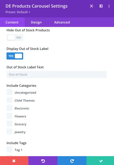
- Hide Out of Stock Products: Keep your carousel clutter-free by toggling the visibility of out-of-stock items.
- Display Out of Stock label: If you choose to display out-of-stock products, you can specify the label for items that are out of stock, keeping your customers informed.
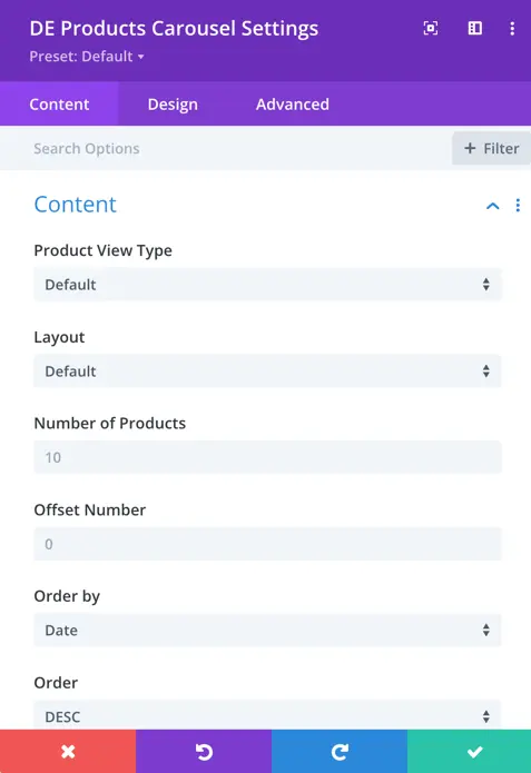
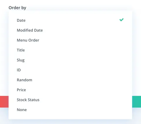
Order by: You have options to arrange your products by various criteria, including date, menu order, title, slug, ID, random, price, stock status, none, and modified date.
- Include Categories: Choose specific product categories that you want to feature in your carousel.
- Include Tags: Showcase products with specific tags that align with your customer preferences.
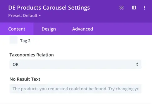
- Taxonomies Relation: Define how categories and tags are related to each other for inclusion, ensuring your carousel displays products just how you want them.
Display
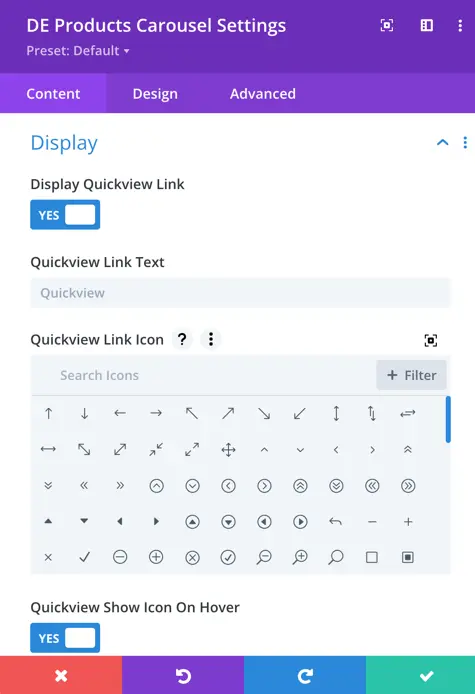
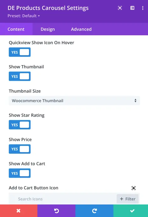
- Display Quick View Link: You can choose whether to display a quick view link. If you opt to show it, you can customize the text and icon for the link. You also have the option to show the icon only when hovering over it.
- Show Thumbnail: Decide whether you want to display thumbnails for your products. If you do, you can select between WooCommerce thumbnail or WooCommerce single size.
- Show Star Rating: You can decide whether to show star ratings for your products.
- Show Price: Choose whether you want to display the price of your products.
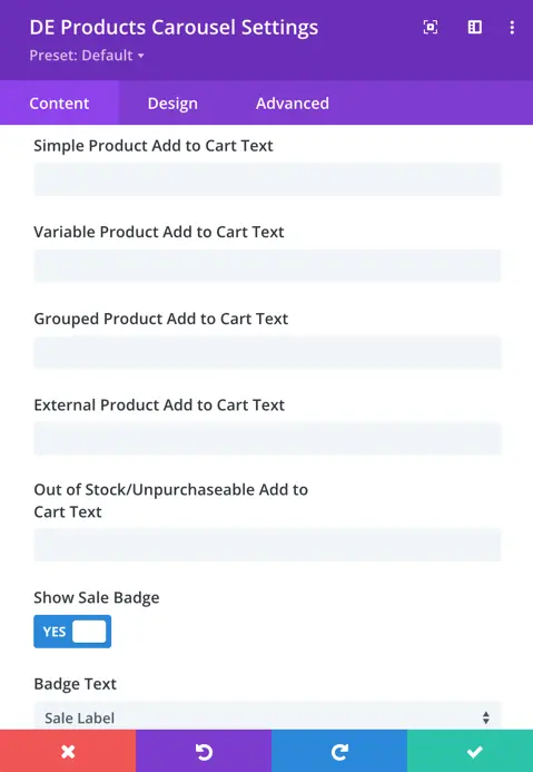
- Show Add to Cart: You have the option to display an ‘add to cart’ button for your products. If you choose to show it, you can customize the button icon and specify the text for adding different types of products to the cart (simple, variable, grouped, external, and out of stock/unpurchasable).
- Show Sale Badge: Decide whether you want to display a sale badge for discounted products. If you select ‘yes’, you can specify the text for the badge.
Slider
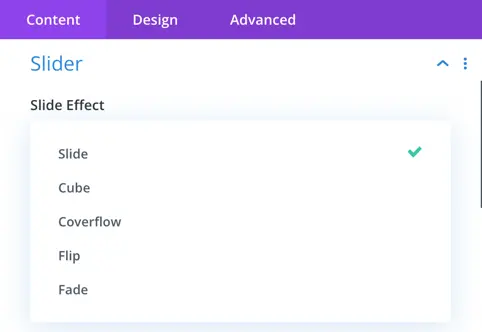
Slider Effects:
- Slider Effects: You can choose from various effects such as slide, cube, coverflow, flip, or fade to animate your slider transitions.
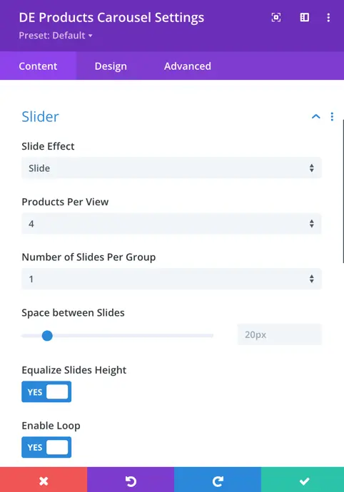
Slider Configuration:
- Products Per View: Decide how many products you want to be visible per view. By default, it’s set to 4.
- Number of Sliders Per Group: Determine the number of sliders you want to group together. By default, it’s set to 1.
- Space Between Sliders: Set the space between your sliders. The default value is 20px.
- Equalize Slides Height: Choose whether you want to equalize the height of your slides.
- Enable Loop: Decide whether you want to enable looping through your slides.
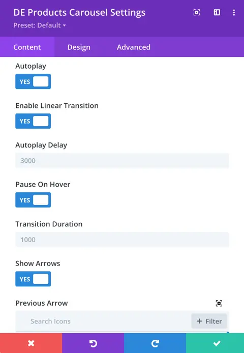
- Autoplay: Choose whether you want to enable autoplay for your slider.
- Enable Linear Transition: Determine if you want to enable linear transition between your slides.
- Autoplay Delay: Set the delay time for autoplay. The default value is 3000ms.
- Pause On Hover: Decide whether you want to pause autoplay when hovering over your slider.
- Transition Duration: Set the duration of the transition between your slides. The default value is 1000ms.
Arrow and pagination settings:
- Show Arrow Toggle: Choose whether you want to show navigation arrows for moving between your slides.
- Previous Arrow Icon: Select the icon for the previous arrow.
- Next Arrow Icon: Select the icon for the next arrow.
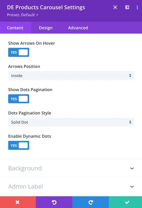
- Show Arrow on Hover Toggle: Determine whether you want to show navigation arrows only when hovering over your slider.
- Show Dots Pagination: Choose whether you want to show dots pagination for navigation.
- Dots Pagination Style: If dots pagination is enabled, select the style for the dots.
- Enable Dynamic Dots: Determine whether you want to enable dynamic dots pagination.
Design
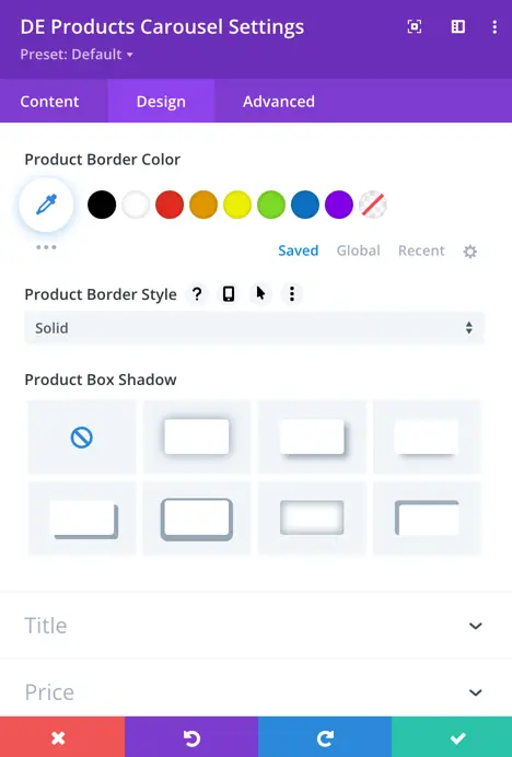
Product
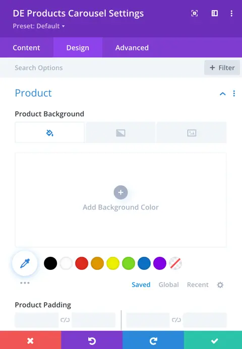
- Product Background: Choose the background style for your product:
- Options include:
- Background color
- Gradient
- Image
- Options include:
- Product Padding: Adjust the padding around your product elements.
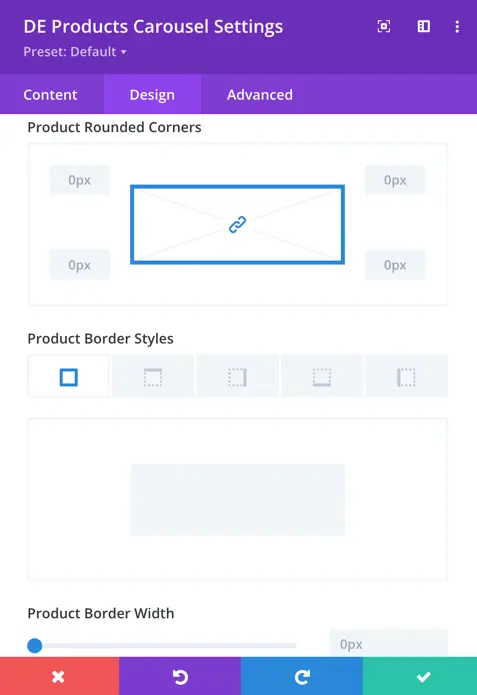
- Product Rounded Corners: Set the level of rounding for the corners of your product.
- Border Styles: Choose the style of border for your product.
- Border Width: Set the width of the border around your product.
- Border Color: Choose the color of the border around your product.
- Product Box Shadow: Add a shadow effect to your product for depth and dimension.
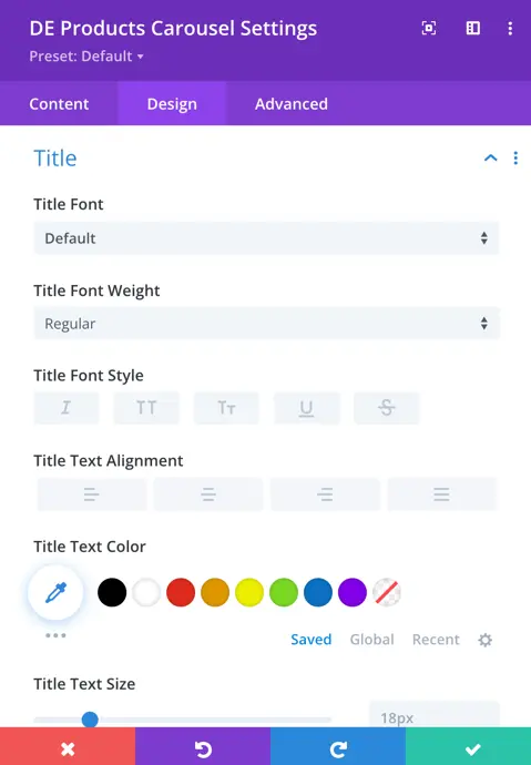
Title
Title font settings:
- Font: Choose the font style that best suits your title.
- Font Weight: Adjust how bold or light you want your title font to appear.
- Font Style: Customize the style of your title font to match your preferences.
- Text Alignment: Decide how you want your title text to be aligned on the page.
- Text Color: Pick the color that you think will make your title stand out the most.
- Text Size: Determine the size of your title text that looks just right for you.
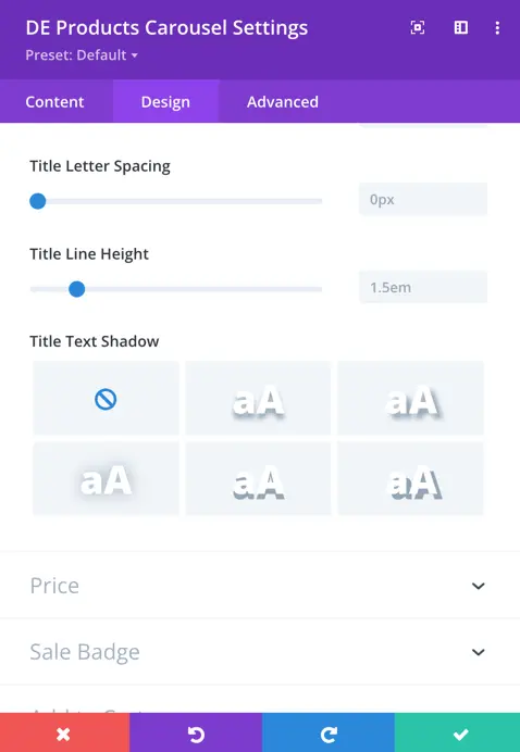
- Letter Spacing: Adjust the spacing between letters to achieve the desired look for your title.
- Line Height: Set the height between lines of text to ensure readability.
- Text Shadow: Add a subtle shadow effect to your title text to make it pop on the page.
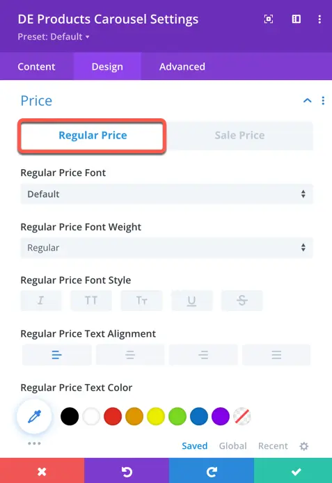
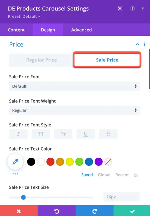
Price
Regular price & sale price
- Price Font: Choose the font style that best suits your regular or sale price.
- Font Weight: Adjust how bold or light you want your regular or sale price font to appear.
- Font Style: Customize the style of your regular or sale price font to match your preferences.
- Text Alignment: Decide how you want your regular or sale price text to be aligned on the page.
- Text Color: Pick the color that you think will make your regular or sale price stand out the most.
- Text Size: Determine the size of your regular or sale price text that looks just right for you.
- Letter Spacing: Adjust the spacing between letters to achieve the desired look for your regular or sale price.
- Line Height: Set the height between lines of text to ensure readability.
- Text Shadow: Add a subtle shadow effect to your regular or sale price text to make it pop on the page.
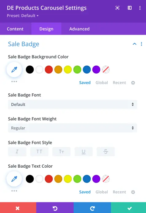
Sale Badge
- Background Color: Choose the background color for your sale badge.
- Font: Select the font style for your sale badge text.
- Font Weight: Adjust how bold or light you want your sale badge font to appear.
- Font Style: Customize the style of your sale badge font, such as italic or normal.
- Text Color: Pick the color for your sale badge text.
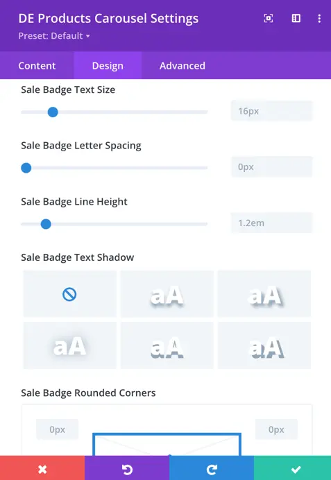
- Text Size: Determine the size of your sale badge text.
- Letter Spacing: Adjust the spacing between letters in your sale badge text.
- Line Height: Set the height between lines of text in your sale badge.
- Text Shadow: Add a shadow effect to your sale badge text for depth and emphasis.
- Rounded Corners: Determine the level of rounding for the corners of your sale badge.
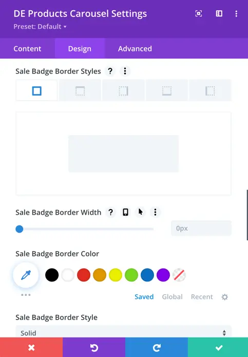
- Border Styles: Choose the style of border for your sale badge.
- Border Width: Set the width of the border around your sale badge.
- Border Color: Choose the color of the border around your sale badge.
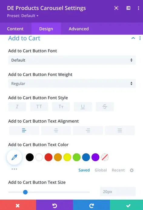
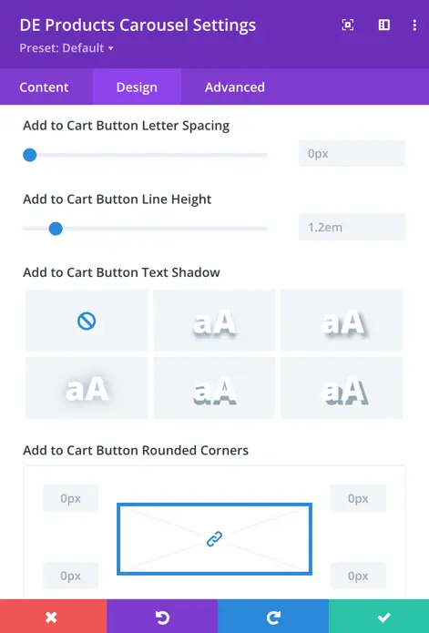
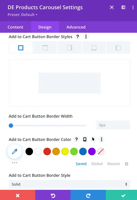
Add to Cart
Using the Add to cart button design settings You can style the “Add to Cart” button by selecting font style, weight, alignment, color, size, letter spacing, line height, text shadow, button rounded corners, border styles, width, color, and order style.
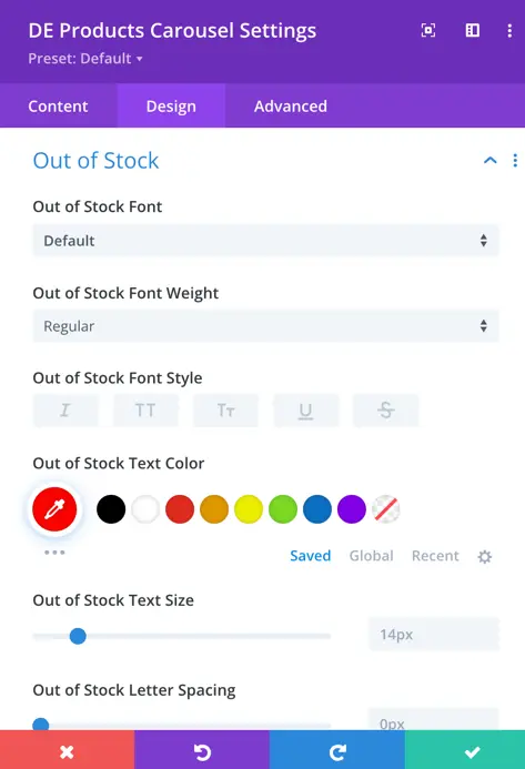
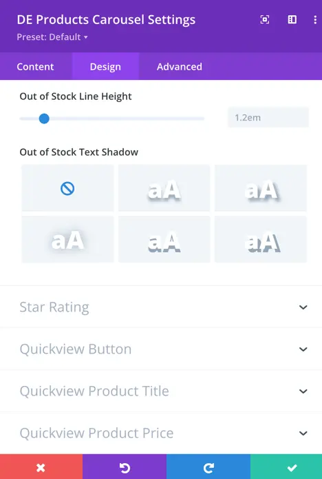
Out of Stock
Here, you can customize the font styling for the Out of Stock text, including font, style, color, size, spacing, line height, and text-shadow.
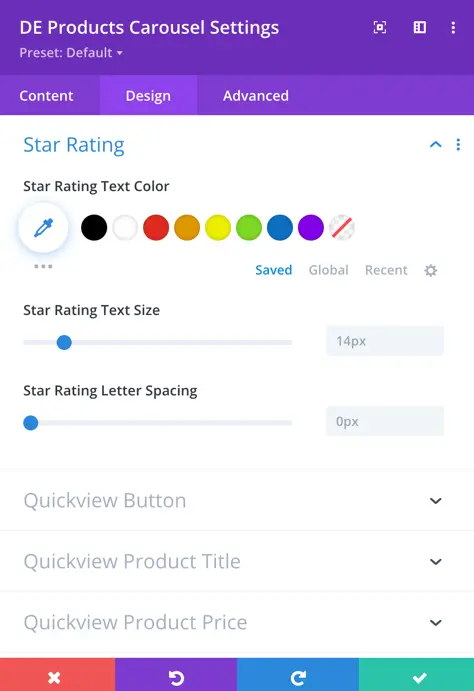
Star Rating
- Text Color: Choose a color for the text that accompanies the star rating to ensure it’s visible and complements your website’s design.
- Text Size: Determine the size of the text associated with the star rating.
- Letter Spacing: Adjust the spacing between letters in the text associated with the star rating to achieve the desired visual appearance and readability.
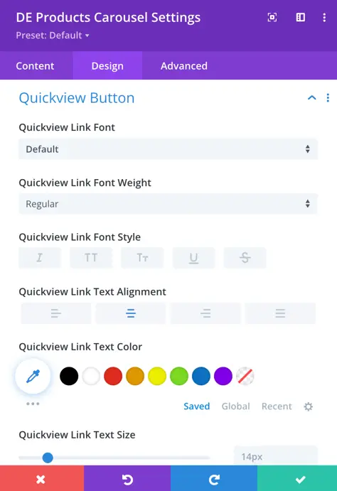
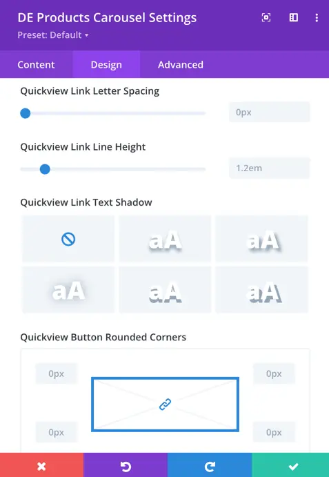
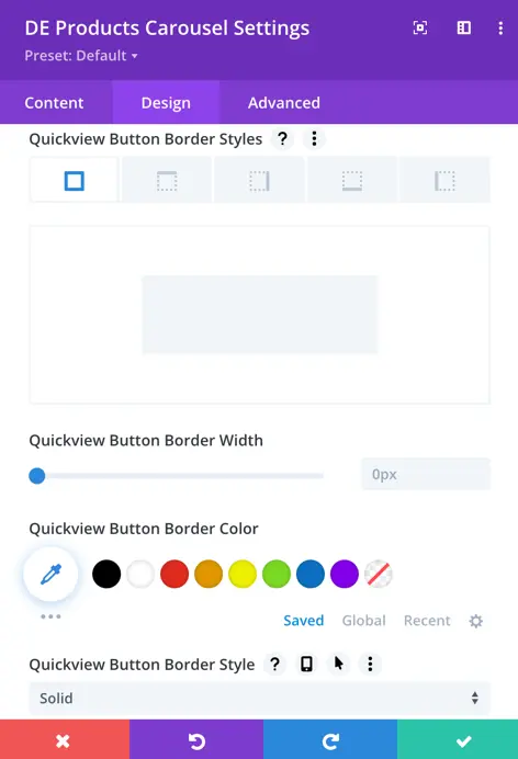
Quickview Button
Easily customize your Quickview button with options for font style, text alignment, text appearance, and button border style. Choose fonts that match your brand and make text easy to read. Align the text neatly within the button, and adjust its appearance to look just right. You can also tweak the button’s border to fit seamlessly into your website’s design.