Search All In One Carousel for Divi Documentation
Search for answers or browse our knowledge base.
DE Logo Carousel
With the DE Logo Carousel module, you can showcase your brand logos in a visually stunning carousel. Whether you’re highlighting partners, sponsors, or clients, this versatile tool enables you to create an engaging carousel that underscores your brand identity.
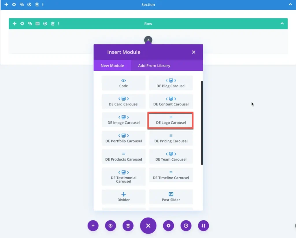
How To Add Module on Page
Once the plugin All In One Carousel for Divi is activated, it adds modules to the Divi builder. To insert the module, use the following steps.
- Create or edit a page that uses the Divi Builder.
- Create or edit a row.
- Create or edit a column.
- Go to the module options.
- Search for the module DE Logo Carousel.
Content
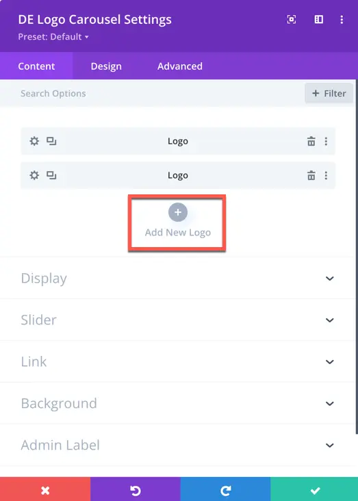
Add New Logo
In this section, you can add new logos to your carousel by clicking the plus icon. You can also access display, slider and background options for further content customization.
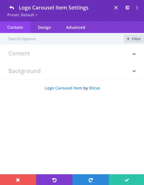
Once you’ve added a new logo, you gain access to settings specifically for that added item.
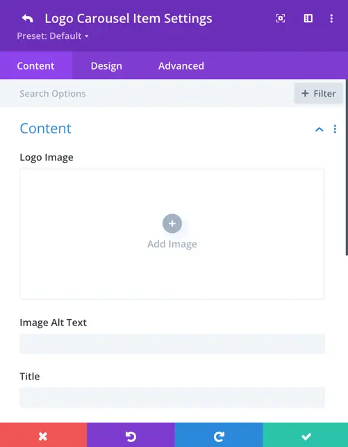
Content
Logo Image: Add the logo you want to display in the carousel.
Image Alt Text: Provide alternative text for the logo image for accessibility purposes.
Title: Add a title for the logo image.
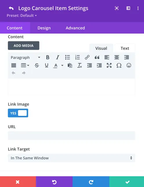
Content: Include additional content or description for the logo image, if necessary.
Link Image: Set to “Yes” if you want to link the image to a specific URL.
URL: Enter the URL you want the logo image to link to, if applicable.
Link Target: Specify whether the linked URL should open in the same tab or a new tab when clicked.
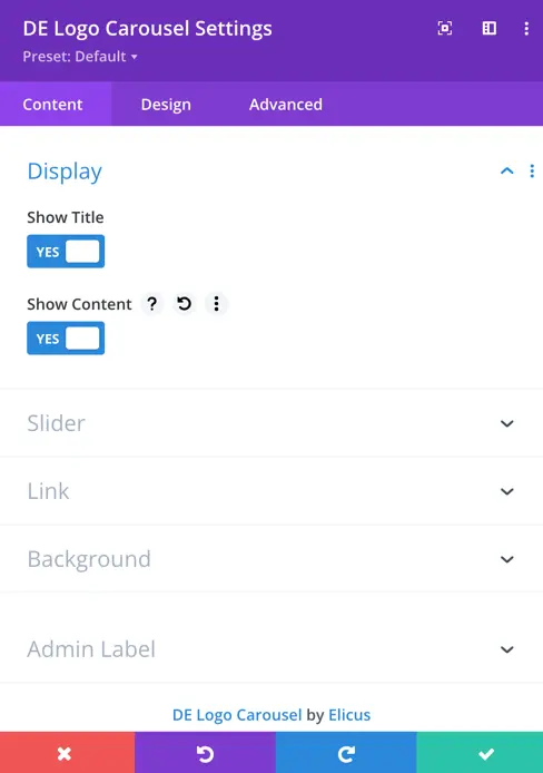
Display
Show Title: Enablt this option to display the title for each logo item.
Show Content: Enable this option to display additional content for each logo item.
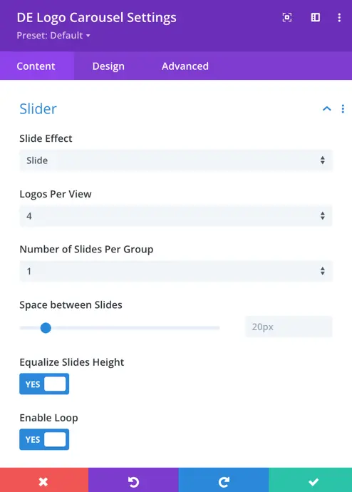
Slider
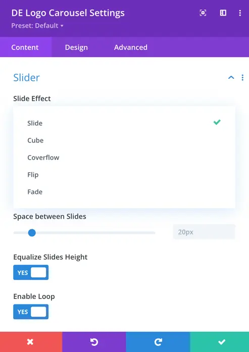
Slide Effect: Choose from 5 different slide effects, including slide, cube, coverflow, flip, and fade.
Logos Per View: Set the number of logos displayed per view. Default is set to 4.
Number of Slides Per Group: Specify the number of slides to display per group. Default is 1.
Space between Slides: Adjust the spacing between each slide.
Equalize Slides Height: Set as yes this option to enable equal heights for all slides.
Enable Loop: Enable this option to enable looping of the carousel.
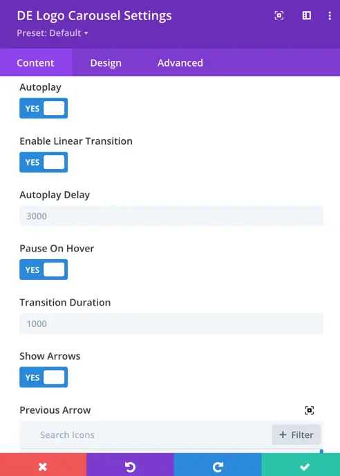
Autoplay: Enable this option to enable automatic slideshow playback.
Enable Linear Transition: Use this option to enable linear transitions between slides.
Autoplay Delay: Set the delay (in milliseconds) between automatic slide transitions. Default is 3000 milliseconds.
Pause on Hover: Use this option to pause the slideshow when hovering over it.
Transition Duration: Set the duration (in milliseconds) of slide transitions. Default is 1000 milliseconds.
Show Arrows: Set as yes to display navigation arrows.
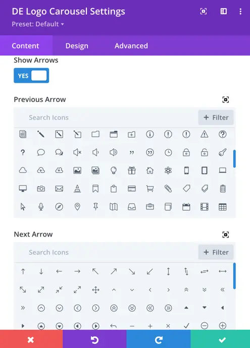
Previous Arrow: Select an icon for the previous arrow.
Next Arrow: Select an icon for the next arrow.
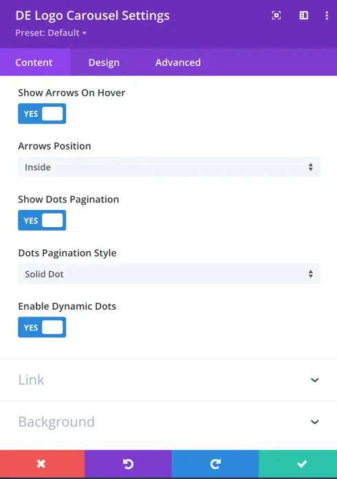
Show Arrows on Hover: Use this option to display navigation arrows on hover.
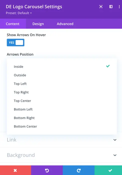
Arrow Positions: Choose the position of the arrows from options including inside, outside, top left, top right, center, bottom left, bottom right, and center.
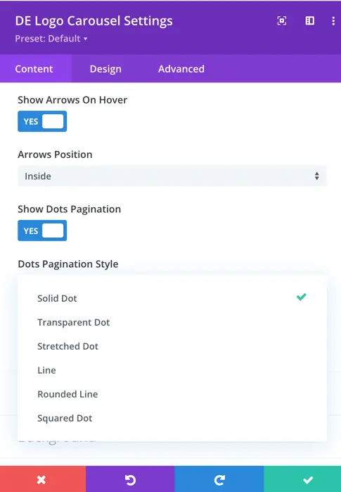
Show Dots Pagination: Set as yes to display pagination dots.
Dots Pagination Style: Choose a style for the pagination dots, including solid dot, transparent dot, stretched dot, line, rounded line, and squared dot.
Enable Dynamic Dots: Use this option to enable dynamic pagination dots.
Logo Item Design Options
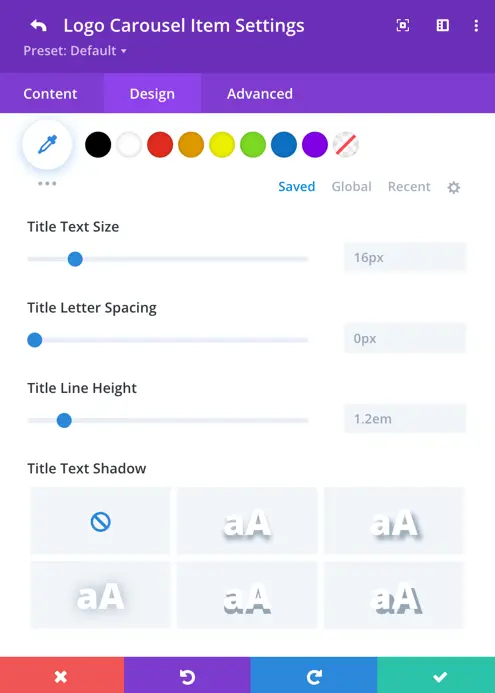
Title
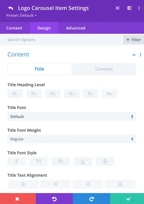
In this section, you can customize the appearance of each logo’s title individually. You have the flexibility to adjust the title heading level, font style, font weight, text alignment, text size, letter spacing, line height, and text shadow according to your preferences.
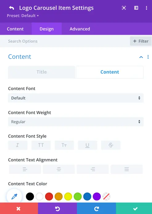
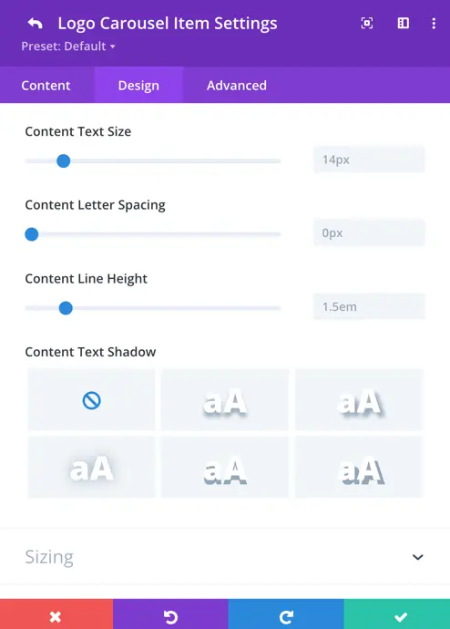
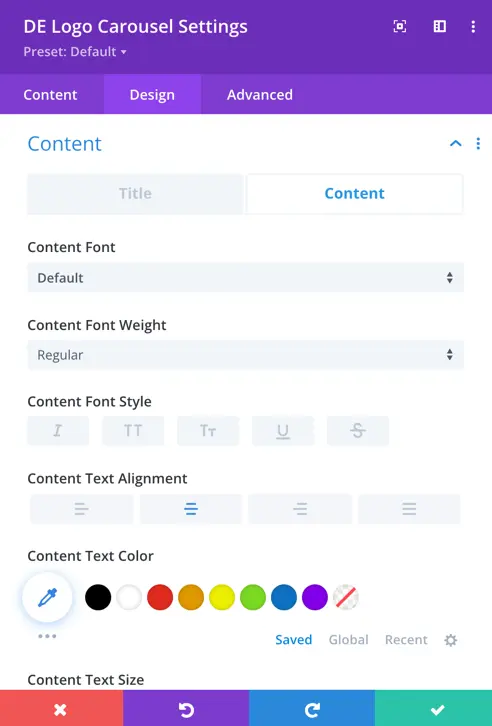
Content
In this section, you have the option to customize the font style, weight, font style, alignment, text color, text size, letter spacing, line height, and text shadow for each logo’s content individually.
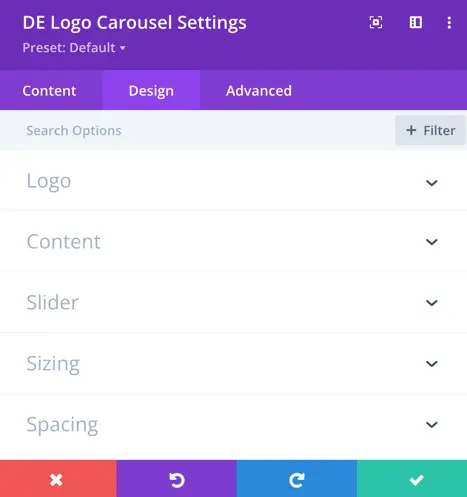
Designs
These are the global settings for the logo carousel, which apply to all logos displayed in the carousel. Here, you can customize the logo, content, and slider options.
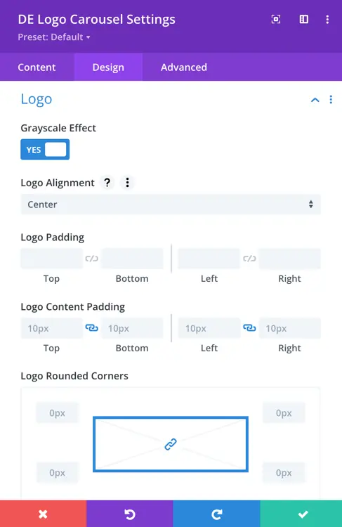
Logo
Grayscale Effect: Enable or disable the grayscale effect on logos within the carousel. When enabled, logos are displayed in shades of gray, creating a modern and uniform appearance.
Logo Alignment: Set the alignment of logos within the carousel, including options for left, center, or right alignment.
Logo Padding: Adjust the padding around each logo to control the spacing between logos within the carousel.
Logo Content Padding: Customize the padding around the logo content, such as the title and description, to ensure proper spacing and alignment.
Logo Rounded Corners: Apply rounded corners to the logos within the carousel for a softer and more polished look.
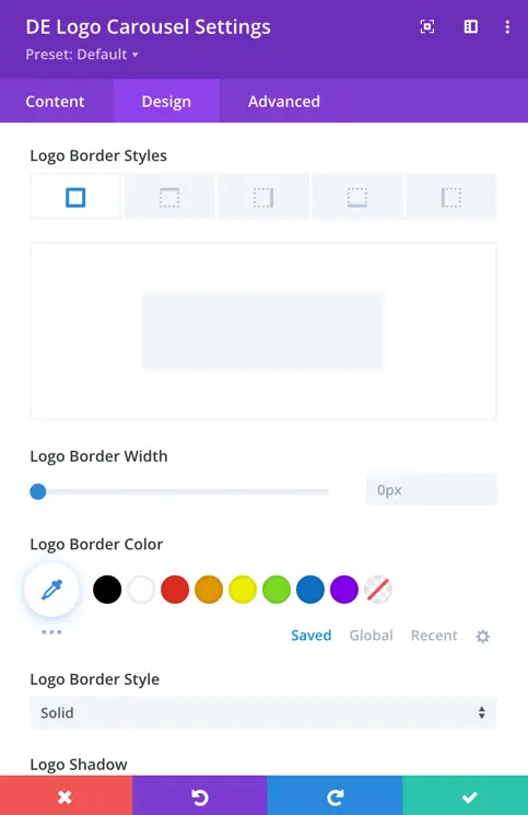
Logo Border Styles: Choose from various border styles, including solid, dashed, dotted, double, groove, inset, outset, or none, to customize the appearance of the logo borders.
Logo Border Width: Specify the width of the border around each logo within the carousel.
Logo Border Color: Select the color of the border surrounding each logo.
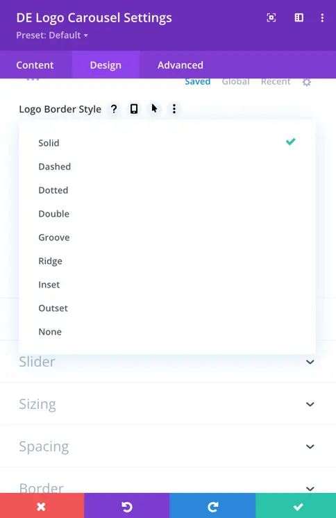
Logo Border Style: Further customize the style of the logo border by choosing from a variety of border styles to achieve the desired visual effect.
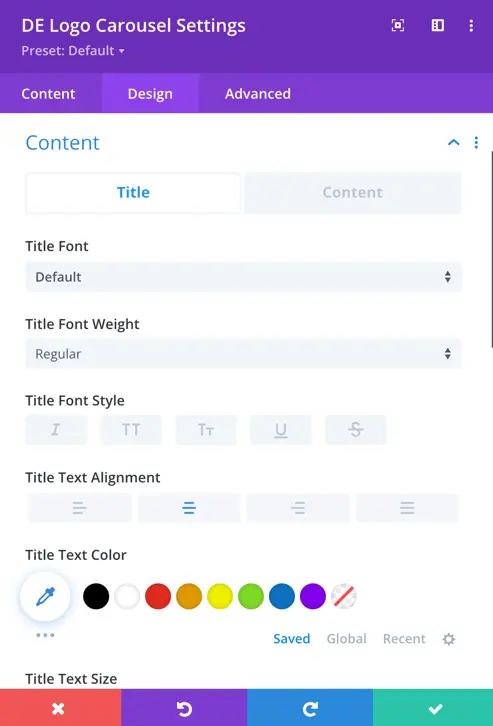
Title And Content
In the global content settings for the logo carousel, you can customize the appearance of all logo titles and content. Define the font, weight, style, alignment, and color to ensure consistency across your carousel.
Slider
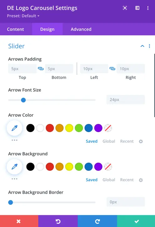
Arrow Padding: Adjust the spacing around the arrows to suit your design preferences.
Arrow Font Size: Customize the size of the font for the arrows according to your needs.
Arrow Color: Choose a color for the arrows that complements your carousel design.
Arrow Background: Decide whether you want to enable a background for the arrows or not.
Arrow Background Border: Add a border around the arrow background to enhance its visibility.
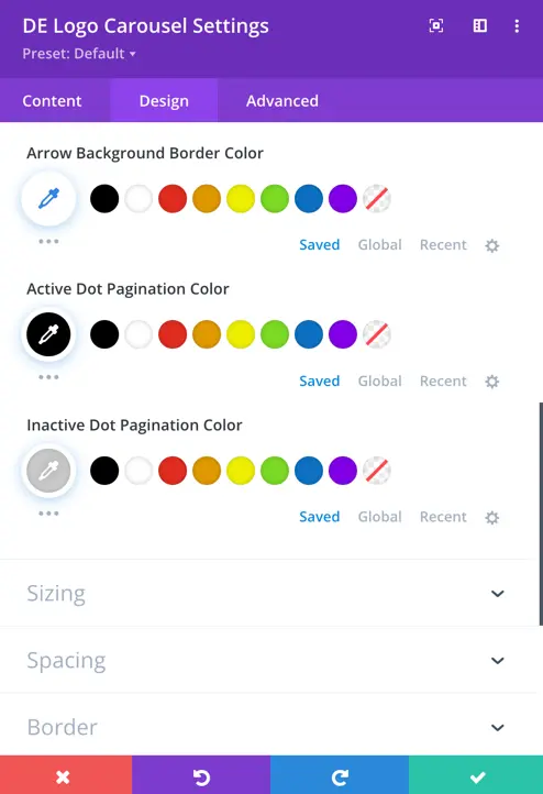
Arrow Background Border Color: Select the color of the border around the arrow background to match your design.
Active Dot Pagination Color: Define the color of the pagination dot when it’s active to ensure it stands out.
Inactive Dot Pagination Color: Specify the color of the pagination dots when they’re inactive.
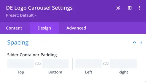
Spacing
Slider Container Padding: Adjust the padding around the slider container to control the spacing between the edges of the container and the carousel content.