
Search All In One Carousel for Divi Documentation
Search for answers or browse our knowledge base.
DE Content Carousel
The Content Carousel module in All in one carousel for divi plugin lets you create an interactive carousel for your Divi website. It makes your content more engaging and helps visitors quickly grasp your information.
How To Add Module on Page
Once the plugin All In One Carousel for Divi is activated, it adds modules to the Divi builder. To insert the module, use the following steps.
- Create or edit a page that uses the Divi Builder.
- Create or edit a row.
- Create or edit a column.
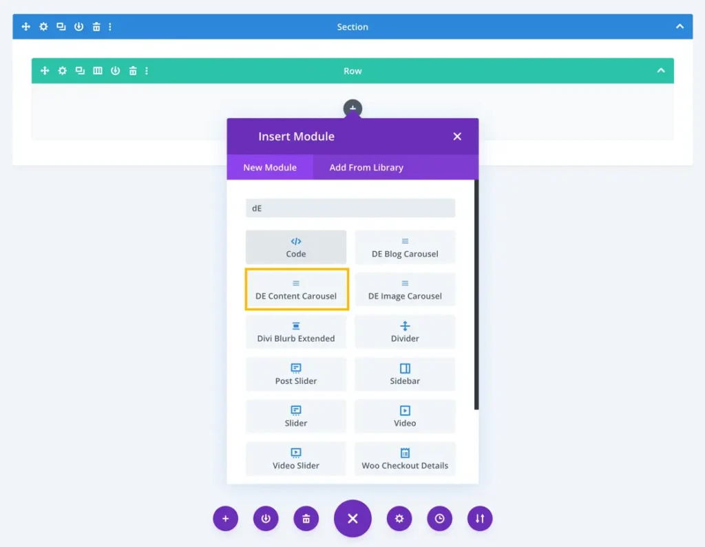
- Go to the module options.
- Search for the module DE Content Carousel.
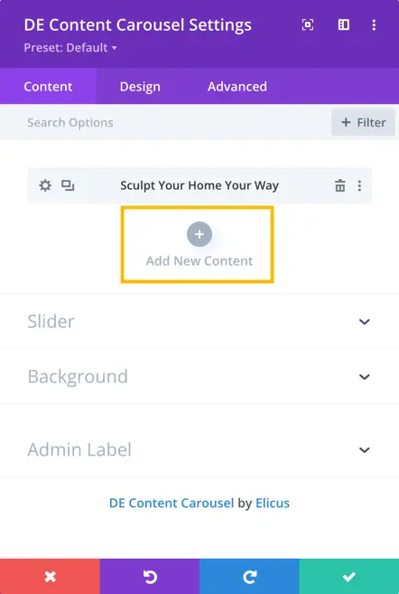
After adding the module, you will have the option to create new content slides.
Content Tab
Add New Content
To add a new content slide, simply click the “Add New Content” button.
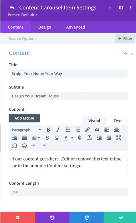
Clicking the button will open the content and design options for each slide. You can insert a title, subtitle, content, and customize the data for each slide.
Content
Title: Insert the title into the title field.
Subtitle: The Subtitle section enables you to include secondary titles for your content carousel slides.
Content: The Content section allows you to input the main content for your content carousel.
Content Length: You can adjust the number of characters or words displayed in the content for each slide. Set it to 0 to show nothing, By default, the value is set to 250.
Image
Image: The “Image” section allows you to include visually engaging images in your content carousel slides.
Image Alt Text: In the “Image Alt Text” section, you can provide alternative text for the images used in your content carousel slides.
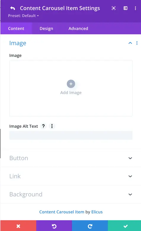
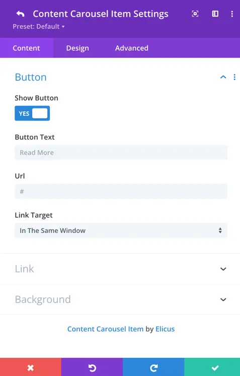
Button
Show Button: Toggle this option to show a button in your content carousel slides. Customize the button text, URL, and link target.
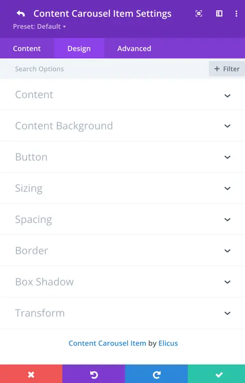
Design Tab
For each slide, you have the option to customize its design. These settings will override the global design, giving you precise control over the appearance of individual slides.
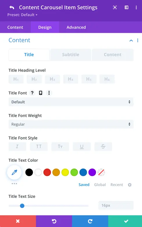
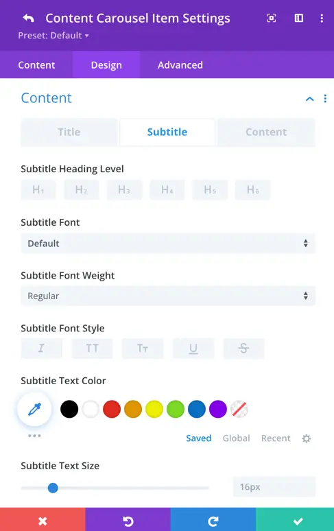
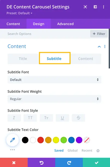
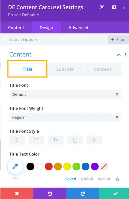
Title and Subtitle
For both the title and subtitle, you can select the heading level, font, weight, style, text color, size, line height, letter spacing, and text-shadow.
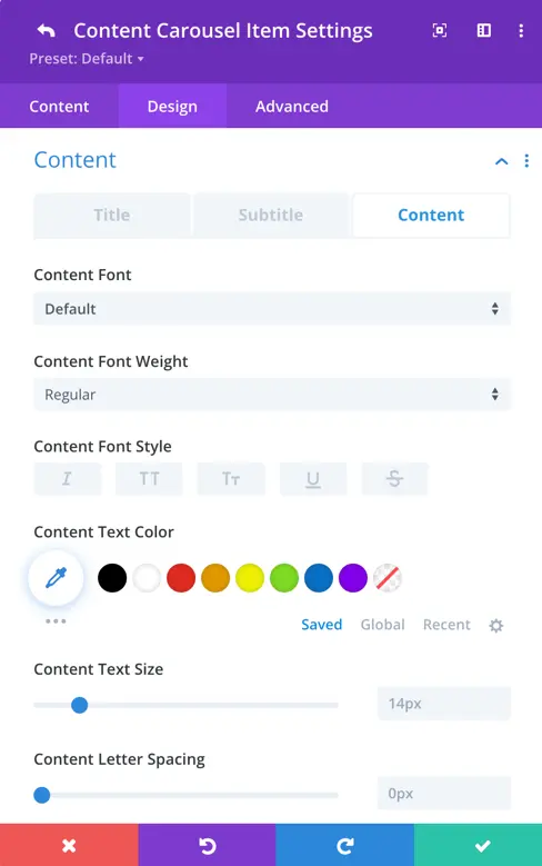
Content
Here, you can customize the content font, weight, style, text color, size, letter spacing, line height, and text shadow for the specific content carousel item.
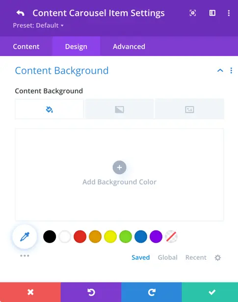
Content Background
For the content background, you have the option to apply color, image and gradients. This means you can choose a solid color, upload an image, and create a gradient effect to serve as the background for your content.
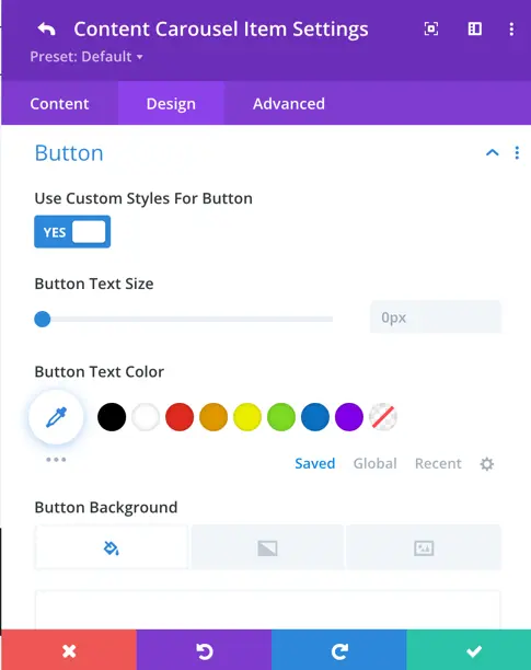
Button
Use Custom Styles For Button:
- Enable the toggle for custom button styles.
- Customize button text size, color, background, border, border color, radius, letter spacing, font, font weight, and font style.
- Choose to display a button icon and specify its color and placement (left or right).
- Toggle to show the icon on hover.
- Adjust button text shadow, padding, and margin.
Sizing: In this section, you can specify the width, maximum width, height, minimum height, maximum height, and module alignment.
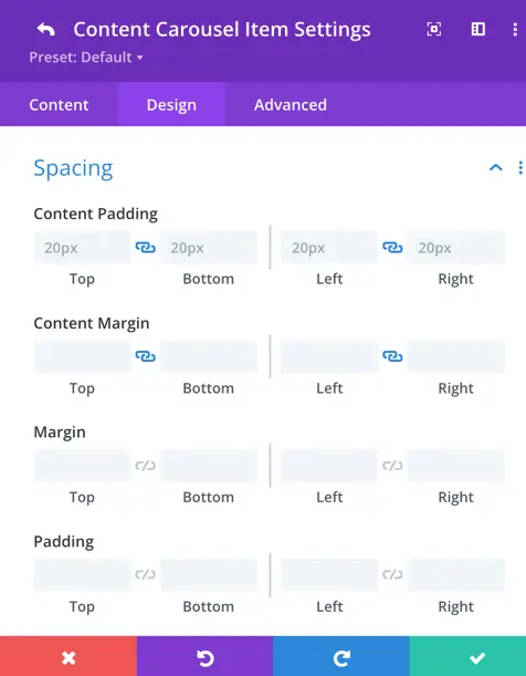
Spacing: In this section, you have access to all of Divi’s native spacing settings, including content padding and margin. By default, there’s a 20px content padding applied for a balanced layout.
Slider
General
Customize your carousel’s behavior and appearance with these general slider settings. Options include effects, slide count, spacing, autoplay, and more.
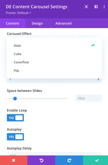
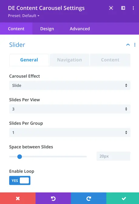
- Carousel Effect: This refers to the visual animation style applied to transitioning between carousel slides. In your case, it includes options such as slide, coverflow, cube, and flip.
- Slides Per View: It determines the number of slides that are visible within the carousel at one time.
- Slides Per Group: This sets the number of slides to move at once when navigating the carousel.
- Space Between Slides: It specifies the gap or distance between individual slides in the carousel.
- Enable Loop: Enabling this option allows the carousel to loop back to the beginning after reaching the last slide, creating a continuous effect.
- Autoplay: This feature automatically progresses through the slides at regular intervals.
- Autoplay Delay: It defines the time delay between each automatic slide change during autoplay.
- Pause on Hover: When enabled, the carousel stops automatically advancing when a user hovers their cursor over it.
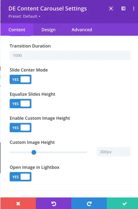
- Transition Duration: This determines how long it takes for one slide to transition to the next in seconds.
- Slide Center Mode: When activated, this feature ensures the current slide is centered in the view.
- Equalize Slide Height: It makes all slides in the carousel the same height.
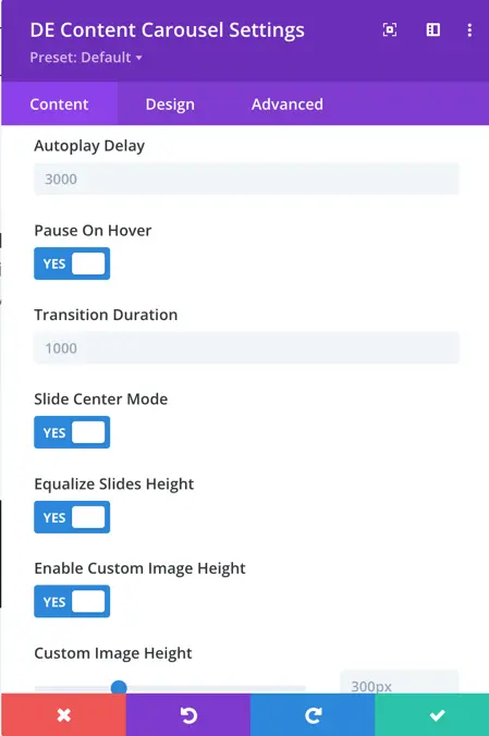
- Enable Custom Image Height: This setting allows you to define a custom height for images within the carousel.
- Open Image in Lightbox: Enabling this feature allows users to view carousel images in a lightbox when clicked.
Navigation
Navigation settings provide control over how to display arrows, customize their appearance and behavior, use dots for pagination, and choose from various styles to match your design.
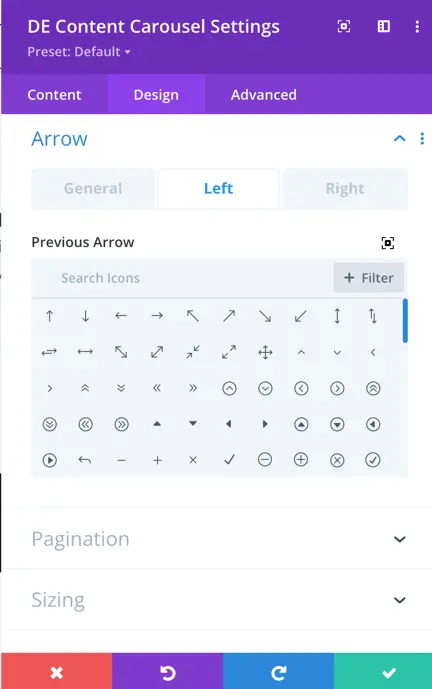
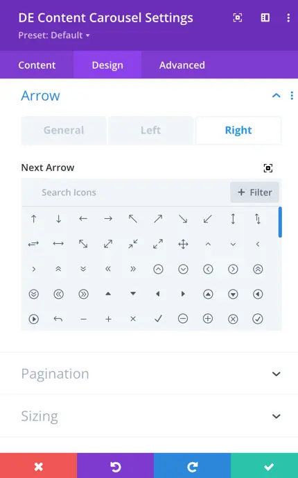
- Show Arrows: This toggle enables or disables the display of navigation arrows, allowing users to manually navigate through the carousel using left and right arrows.
- Arrow on Hover: When enabled, the navigation arrows are hidden by default and appear when the user hovers the cursor over the carousel.
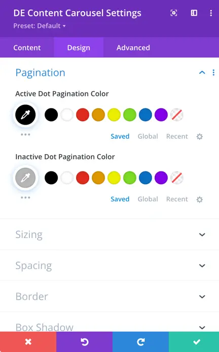
- Show Dots Pagination: Enabling this option adds dot-style pagination indicators that correspond to each slide in the carousel.
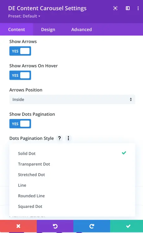
- Dots Pagination Style: You can choose the style of the dot pagination, customizing its appearance to match your overall design.
- Enable Dynamic Dots: Dynamic dots automatically adjust in size and spacing to indicate which slide is currently active.
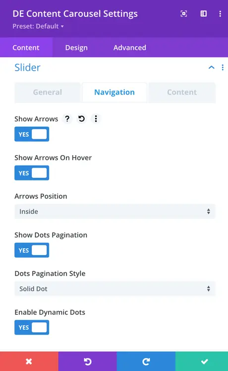
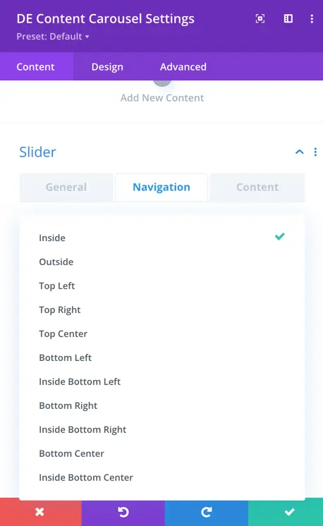
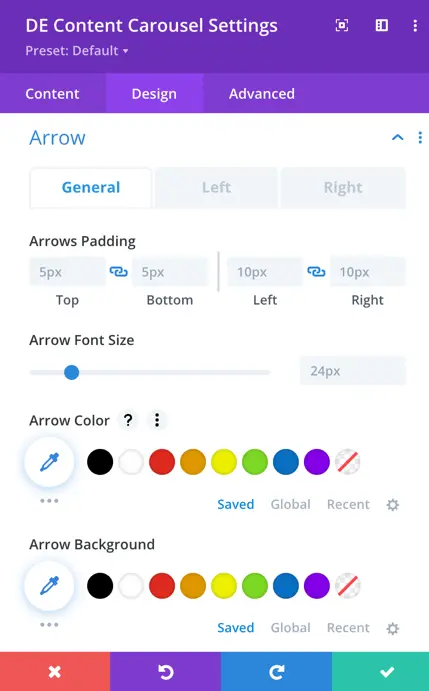
Arrow Position: This setting empowers you to precisely position the navigation arrows as per your preference. You can choose from a range of options, including outside, inside, left, right, top, bottom, and center.
You can select from a range of styles for the dot pagination indicators, including Solid Dot, Transparent Dot, Stretched Dot, Line, Rounded Line, and Squared Dot.
Content
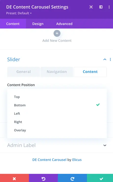
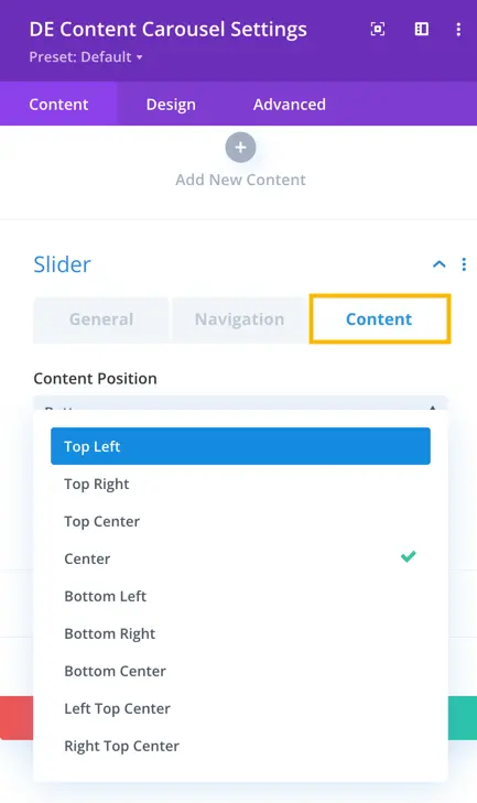
You have the flexibility to select the content’s position and alignment within the carousel.
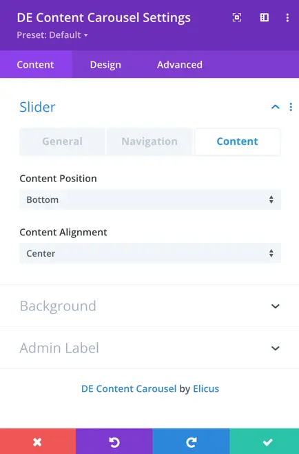
The “Content Position” setting offers several positioning options, including top, bottom, left, right, and overlay. These options allow you to determine where the content appears within the carousel.
For “Content Alignment” within the top and bottom positions, you can choose from alignment options that include left, right, and center. This enables precise control over how your content is aligned within the carousel.
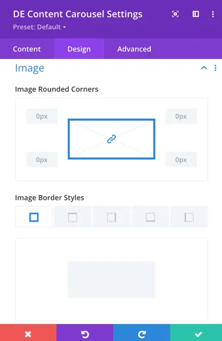
Design
Global Design Settings: In the “Design” section, you can configure global design settings that impact all content carousels. These settings allow you to customize the appearance of various elements, including content, images, content background, arrows, pagination, sizing, and spacing.
Override by Child Design: Please note if you’ve applied specific design customizations to individual carousel items, these child-level settings will take precedence over the global design settings, allowing for customized design when needed.