
Search All In One Carousel for Divi Documentation
Search for answers or browse our knowledge base.
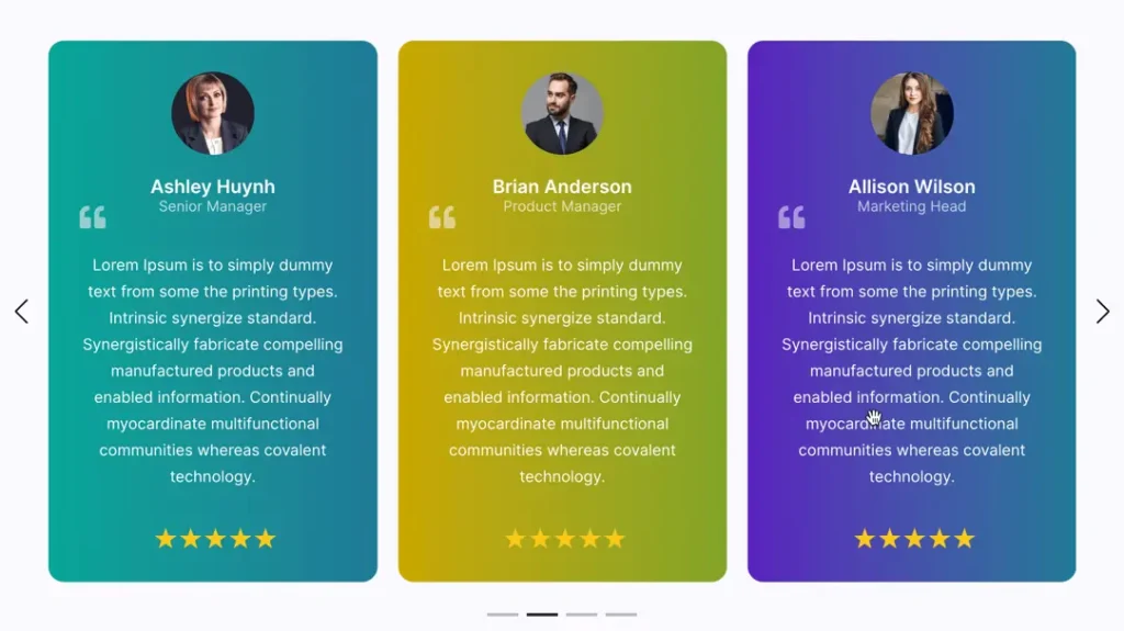
DE Testimonial Carousel
The Testimonial Carousel module in the All In One Carousel for Divi plugin is like a moving display for the nice things people say about your business. It’s like a slide show where visitors can see and read different testimonials from your happy customers.
How To Add Module on Page
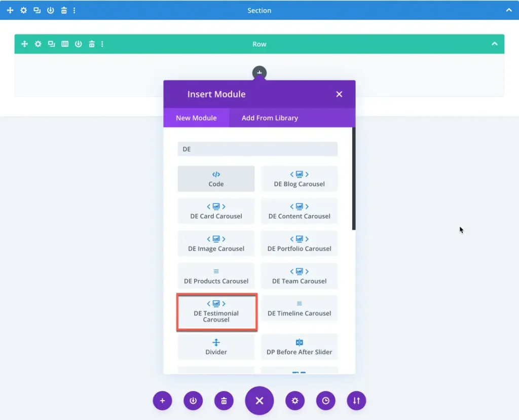
Once the plugin All In One Carousel for Divi is activated, it adds modules to the Divi builder. To insert the module, use the following steps.
- Create or edit a page that uses the Divi Builder.
- Create or edit a row.
- Create or edit a column.
- Go to the module options.
- Search for the module DE Testimonial Carousel.
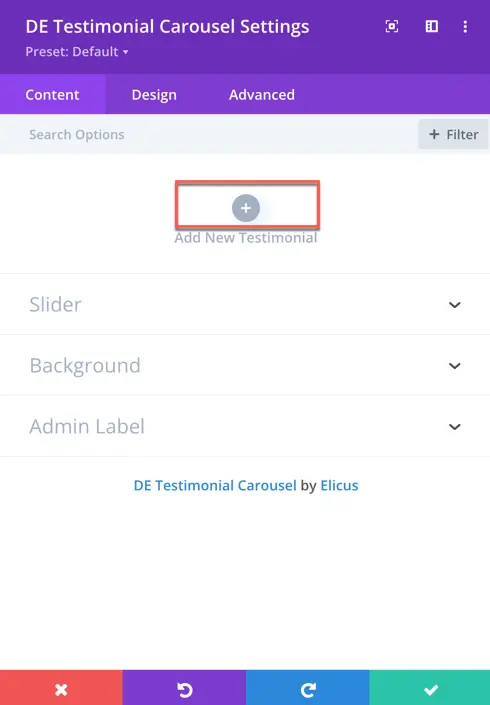
Content
Add New Testimonial
- Click this button to add a new testimonial to your carousel.
Content
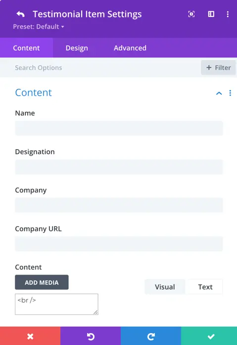
Name:
- The name of the individual providing the testimonial.
Designation:
- The job title of the individual providing the testimonial.
Company:
- The name of the company where the individual providing the testimonial is associated.
Company URL:
- The website address (URL) of the company associated with the testimonial author.
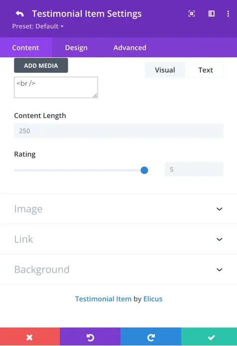
Content:
- The main text of the testimonial provided by the author.
Content-Length:
- Here you can define the length of the testimonial text.
Rating:
- A numerical representation of the satisfaction level expressed in the testimonial.
Image
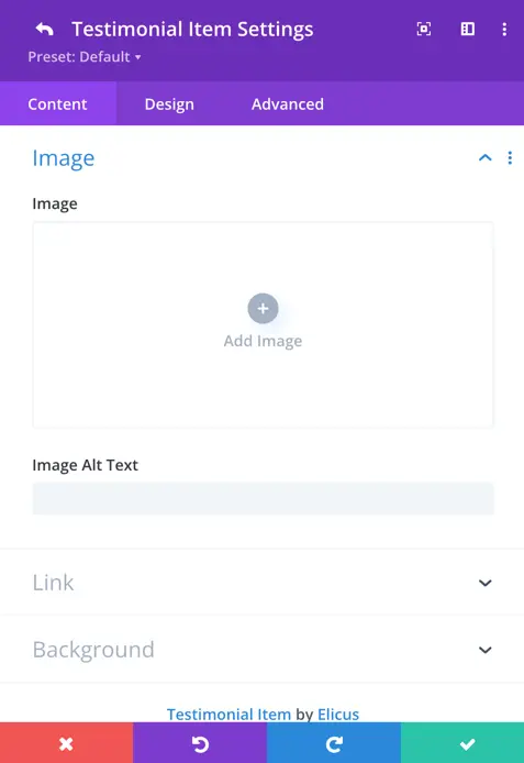
Image:
- Here add an image of the author.
Image Alt Text:
- Alternative text describing the content of the image.
Design Tab
Content
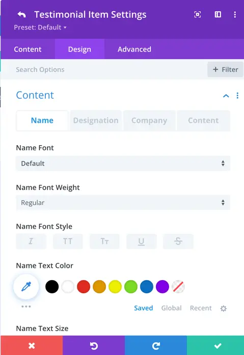
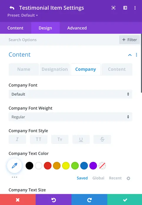
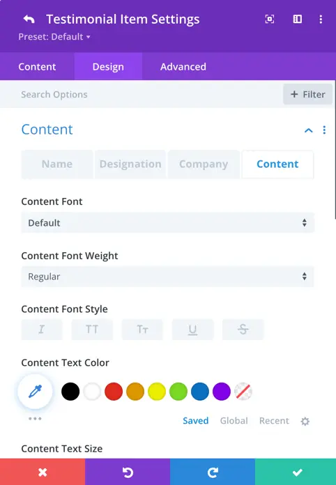
Customize the appearance of the testimonial content, including Name, Designation, Company, and Content.
- Adjust font properties, including weight, style, and size.
- Set the text color to suit your design preferences.
- Explore additional styling options for a personalized touch.
- Modify letter spacing and line height for precise text layout.
- Apply text shadow to enhance visibility and style.
Image
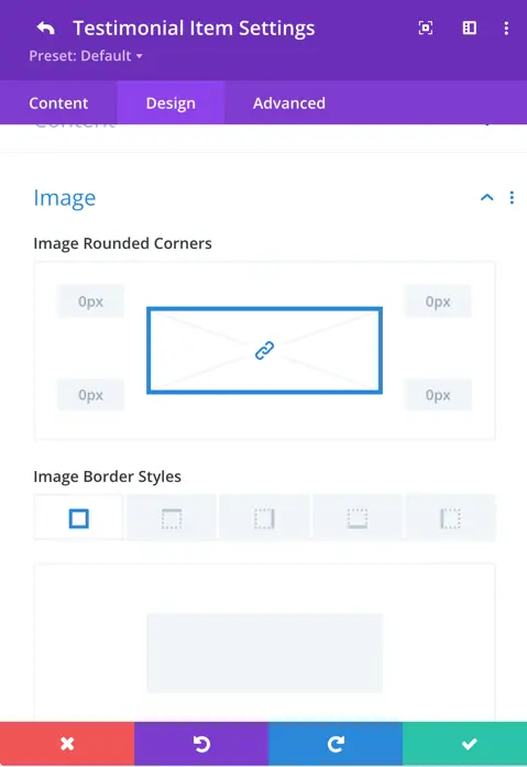
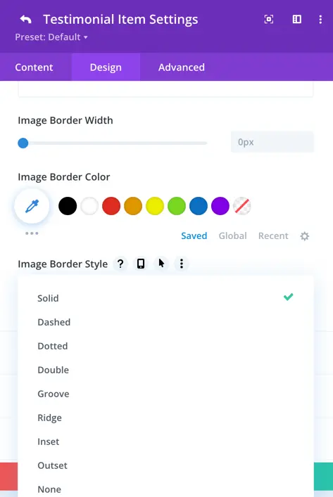
Image Rounded Corners:
- Here you can control the corner radius of the testimonial image.
Image Border Styles:
- Choose from various styles to define the border around the testimonial image.
Image Border Width:
- Set the width of the border surrounding the testimonial image.
Image Border Color:
- Specify the color of the border around the testimonial image.
Image Border Style:
- Select the desired style for the border, such as solid, dashed, or dotted.
Quote Icon
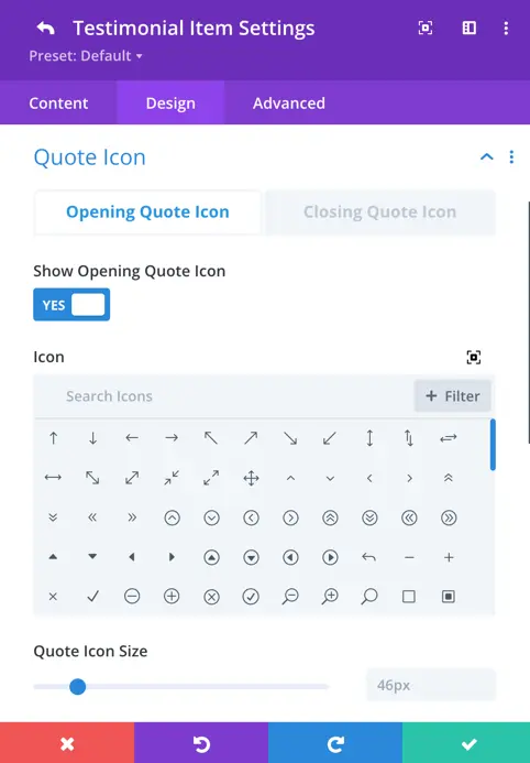
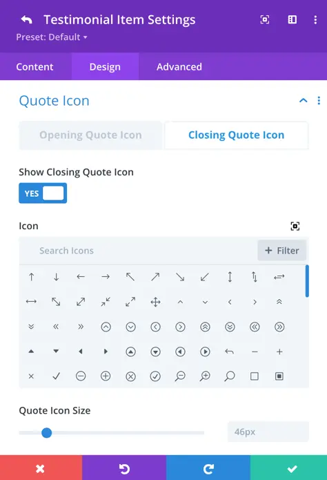
Setting for Opening Quote Icon and Closing Quote Icon:
- Customize the icons used at the beginning and end of the testimonial content.
Show Quote Icon toggle:
- Enable or disable the display of the quote icon in the testimonial.
Icon:
- Choose a specific icon to represent the quote in the testimonial.
Quote Icon Size:
- Adjust the size of the quote icon for optimal visibility.
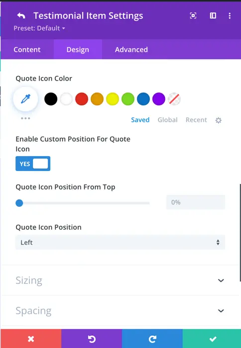
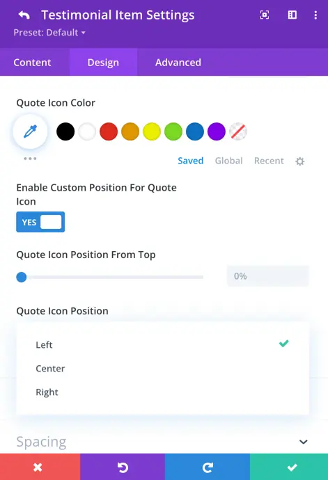
Enable Custom Position for Quote Icon Toggle:
- Toggle to customize the position of the quote icon.
Quote Icon Position Options:
- Choose from the available options: left, center, or right for the position of the quote icon.
Slider
General
Within the Testimonial Caroussel settings, you can customize the appearance and behavior of your carousel for an engaging user experience.
- Carousel Effect: Choose from four dynamic effects – slider, cube, coverflow, or flip – to determine how the cards transition within the carousel.
- Slides Per View: This setting controls the number of slides that are visible at one time, with the default value set to 3.
- Slides Per Group: Define the number of slides that move as a group, affecting the scrolling behavior.
- Space Between Cards: Set the space or gap between individual cards.
- Enable Loop Toggle: Activate this toggle to enable continuous looping of the carousel.
- Autoplay: Toggle the autoplay feature to make the carousel automatically scroll.
- Enable Linear Transition: Set as yes to enable linear transition.
- Autoplay Delay: Customize the delay in milliseconds between each card transition during autoplay.
- Pause On Hover: When enabled, the carousel will pause scrolling when a visitor hovers over it.
- Transition Duration: Define the speed at which card transitions occur.
Navigation
Navigation settings provide control over how to display arrows, customize their appearance and behavior, use dots for pagination, and choose from various styles to match your design.
- Show Arrows: This toggle enables or disables the display of navigation arrows, allowing users to manually navigate through the carousel using left and right arrows.
- Arrow On Hover: When enabled, the navigation arrows are hidden by default and appear when the user hovers the cursor over the carousel.
- Show Dots Pagination: Enabling this option adds dot-style pagination indicators that correspond to each slide in the carousel.
- Dots Pagination Style: You can choose the style of the dot pagination, customizing its appearance to match your overall design. You can select from a range of styles for the dot pagination indicators, including Solid Dot, Transparent Dot, Stretched Dot, Line, Rounded Line, Squared Dot, and Number Dot.
- Enable Dynamic Dots: Dynamic dots automatically adjust in size and spacing to indicate which slide is currently active.
Content
Select layout: 4 layout options are here to display your testimonial carousel.
Content Alignment: You can specify the alignment of the content within its position. Options include aligning it to the top left, top right, top center, center, bottom left, bottom right, bottom center, as well as options for corner alignments like left top and right top. Also, there’s a “center” option to centrally align the content both vertically and horizontally within the slider.
For Rating, Image, Designation, and Company elements there is a toggle setting. Simply set the toggle to “Yes” if you want to display the respective element; otherwise, set it to “No” to hide it. This allows for flexible customization based on your design preferences.