Search All In One Carousel for Divi Documentation
Search for answers or browse our knowledge base.
DE Team Carousel
Use the DE Team Carousel Module to show your team in a cool way with sliding effects. Display names, profiles, and social media icons beautifully.
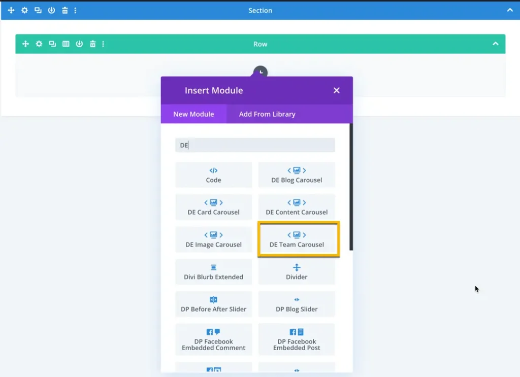
How To Add Module on Page
- Create or edit a page that uses the Divi Builder.
- Create or edit a row.
- Create or edit a column.
- Go to the module options.
- Search for the module DE Team Carousel.
How To Add Team Members
To add a team member, click on the ‘Add New Team Member’ button. Once clicked, you will be prompted with options to add the necessary information.
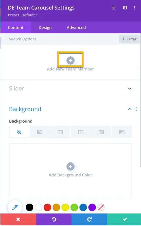
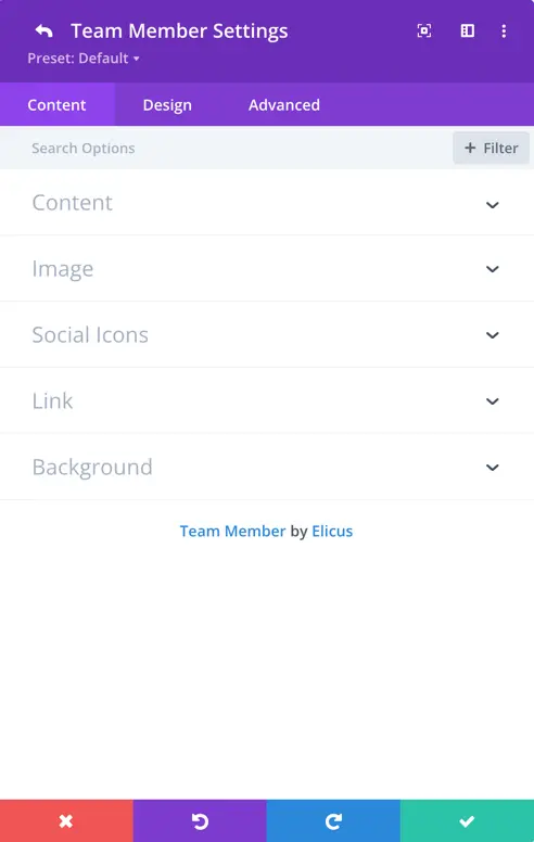
For a team member, you have options to add content, an image, social icons with links, and set a background.
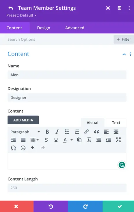
Content
In this section, you have the option to input the name, designation, and text for each team member. Additionally, you can customize the displayed content by adjusting the content length settings. This allows you to have control over the amount of information presented for each team member.
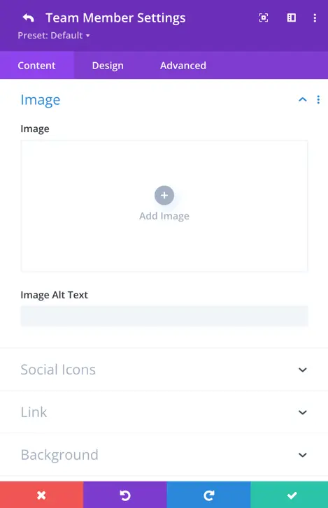
Image
In this section, you can upload and set the team member’s image. Additionally, you have the option to define the image alt text for accessibility purposes.
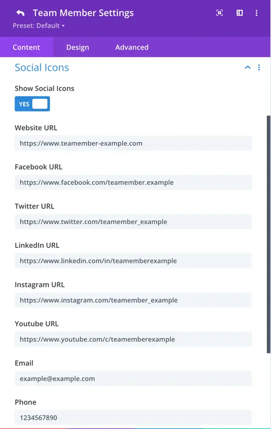
Social Icons
Here, you have a toggle to display social icons. When you enable this setting, you gain access to additional options, including fields for the team member’s website URL, Facebook URL, Twitter URL, LinkedIn URL, Instagram URL, YouTube URL, email, and phone number.
Slider
General
Within the Team Carousel settings, you can customize the appearance and behavior of your carousel for an engaging user experience.
- Carousel Effect: Choose from four dynamic effects – slider, cube, coverflow, or flip – to determine how the cards transition within the carousel.
- Slides Per View: This setting controls the number of slides that are visible at one time, with the default value set to 3.
- Slides Per Group: Define the number of slides that move as a group, affecting the scrolling behavior.
- Space Between Cards: Set the space or gap between individual cards.
- Enable Loop Toggle: Activate this toggle to enable continuous looping of the carousel.
- Autoplay: Toggle the autoplay feature to make the carousel automatically scroll.
- Enable Linear Transition: Set as yes to enable linear transition.
- Autoplay Delay: Customize the delay in milliseconds between each card transition during autoplay.
- Pause On Hover: When enabled, the carousel will pause scrolling when a visitor hovers over it.
- Transition Duration: Define the speed at which card transitions occur.
Navigation
Navigation settings provide control over how to display arrows, customize their appearance and behavior, use dots for pagination, and choose from various styles to match your design.
- Show Arrows: This toggle enables or disables the display of navigation arrows, allowing users to manually navigate through the carousel using left and right arrows.
- Arrow On Hover: When enabled, the navigation arrows are hidden by default and appear when the user hovers the cursor over the carousel.
- Show Dots Pagination: Enabling this option adds dot-style pagination indicators that correspond to each slide in the carousel.
- Dots Pagination Style: You can choose the style of the dot pagination, customizing its appearance to match your overall design. You can select from a range of styles for the dot pagination indicators, including Solid Dot, Transparent Dot, Stretched Dot, Line, Rounded Line, Squared Dot, and Number Dot.
- Enable Dynamic Dots: Dynamic dots automatically adjust in size and spacing to indicate which slide is currently active.
Content
Select layout: 4 layout options are here to display your team carousel.
Content Alignment: You can specify the alignment of the content within its position. Options include aligning it to the top left, top right, top center, center, bottom left, bottom right, bottom center, as well as options for corner alignments like left top and right top. Also, there’s a “center” option to centrally align the content both vertically and horizontally within the slider.
Design tab
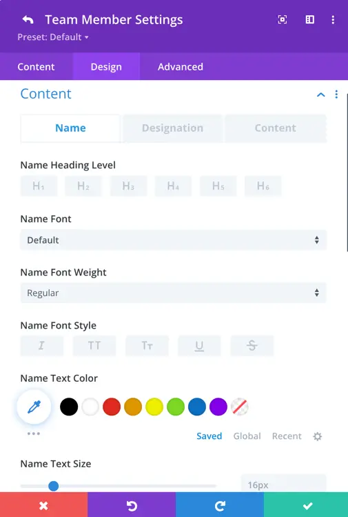
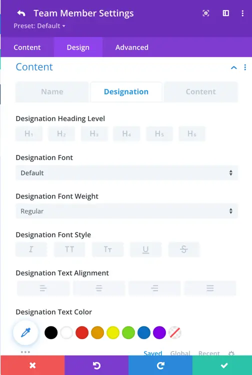
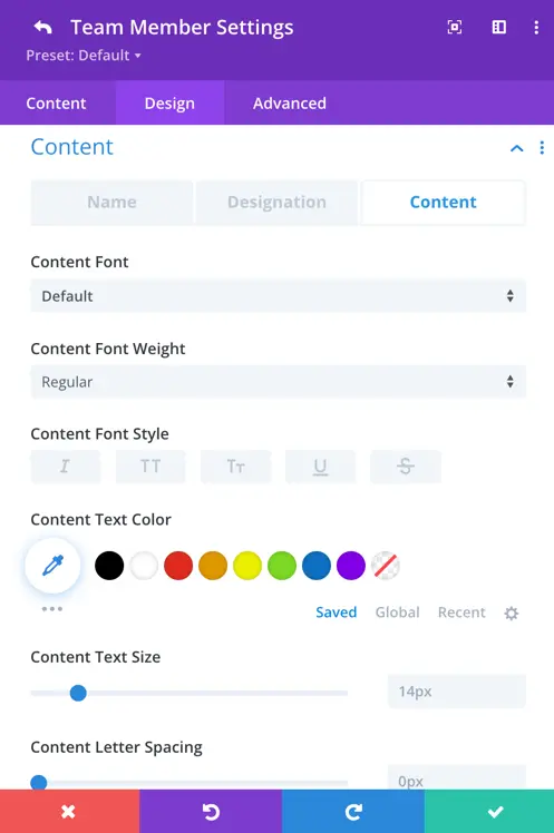
Here, you have the flexibility to customize the name text, designation text, and content text to align with your preferences. The customization options include:
- Setting the heading for name and designation.
- Choosing the font for each text element.
- Adjusting font weight and style.
- Selecting the text color.
- Defining the text size.