Search All In One Carousel for Divi Documentation
Search for answers or browse our knowledge base.
DE Pricing Carousel
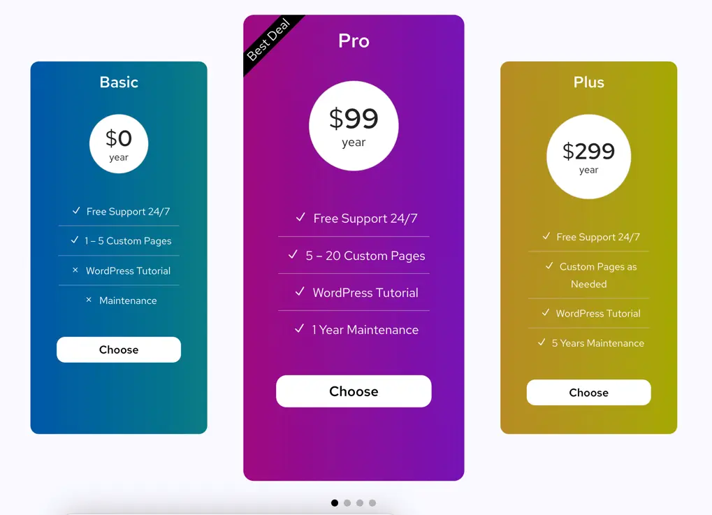
With the DE Pricing Carousel module, you can engage your audience by displaying your pricing plans in an interactive carousel format. Whether you’re showcasing different service tiers or highlighting various subscription options, this powerful tool enables you to present your pricing information in a visually appealing and user-friendly manner.
How To Add Module on Page
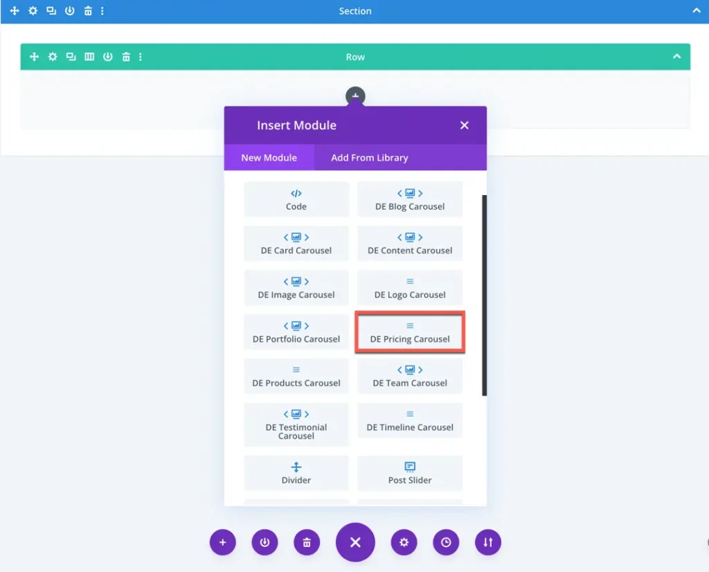
Once the plugin All In One Carousel for Divi is activated, it adds modules to the Divi builder. To insert the module, use the following steps.
- Create or edit a page that uses the Divi Builder.
- Create or edit a row.
- Create or edit a column.
- Go to the module options.
- Search for the module DE Pricing Carousel.
Content
Add New Pricing
Click on this option to add a new pricing into carousel.
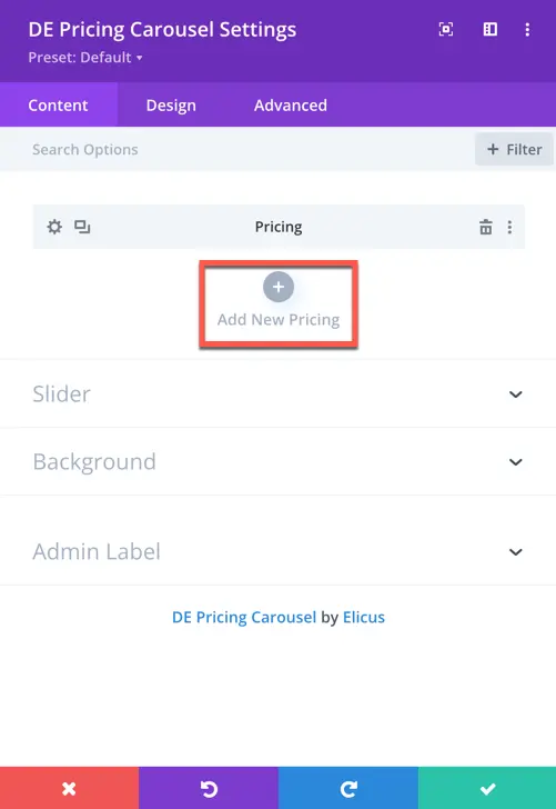
Once you’ve added a new pricing item, you gain access to settings specifically for that added item.
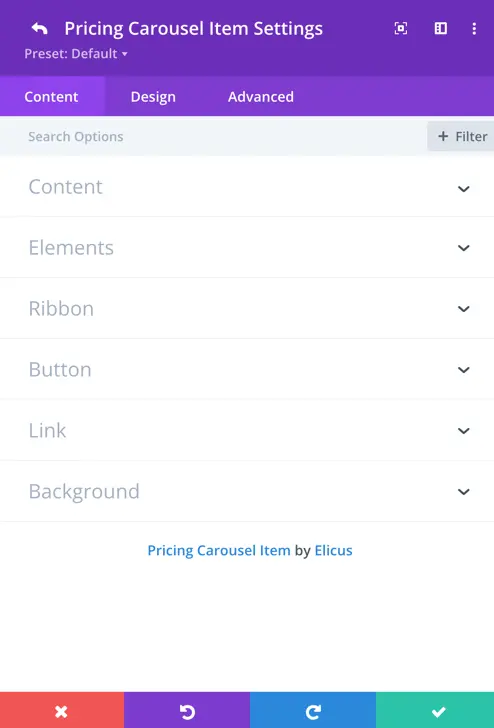
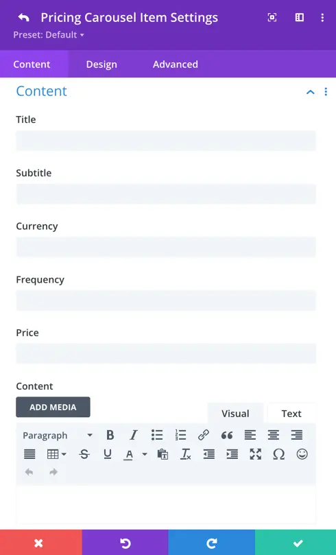
Content
Title: Enter the title for your pricing plan.
Subtitle: Provide a subtitle to accompany the title, adding further details or information.
Currency: Select the currency you want to display for the pricing.
Frequency: Specify the frequency of the pricing, such as monthly, annually, etc.
Price: Enter the price of the pricing plan.
Content: Add additional content or details about the pricing plan.
Elements
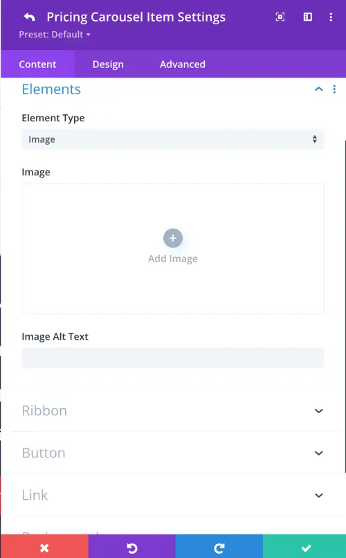
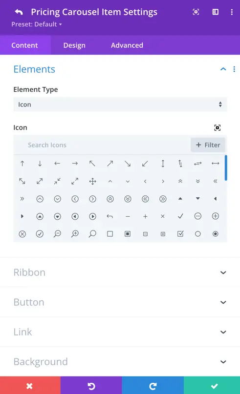
Element Type: Choose between “Icon” or “Image” to represent the element in your pricing table.
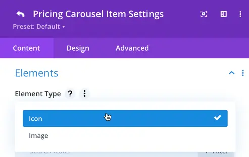
- If you select “Image,” you can upload an image and provide alt text.
- If you select “Icon,” you can choose an icon from the available options.
Ribbon
Ribbon Text: Specify the text to be displayed on the ribbon of your pricing table.

Button
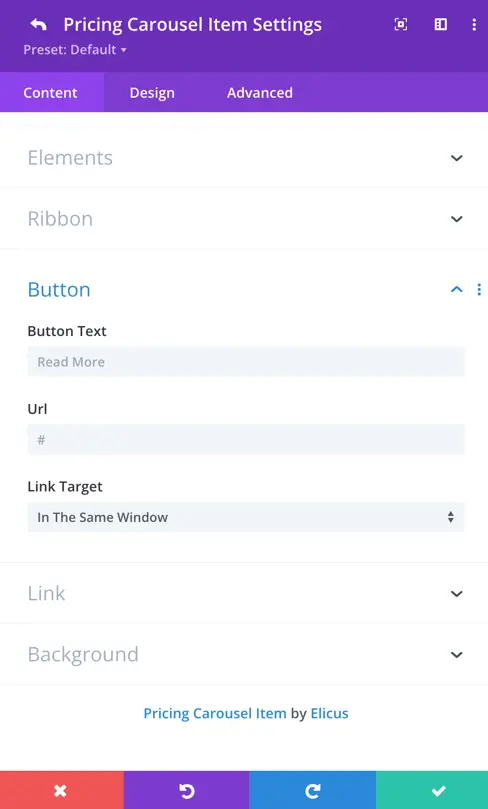
Button Text: Set the text for the button, which by default is “Read More”.
URL: Enter the URL to which the button should redirect when clicked.
Link Target: Specify whether the link should open in the same tab or a new tab when clicked.
Pricing Item Design Options
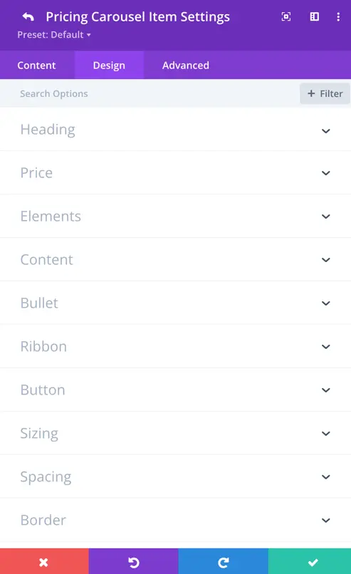
In this section, you can customize each pricing item individually, including its heading, price, element, content, bullet, ribbon, and button associated with a single pricing item.
Heading
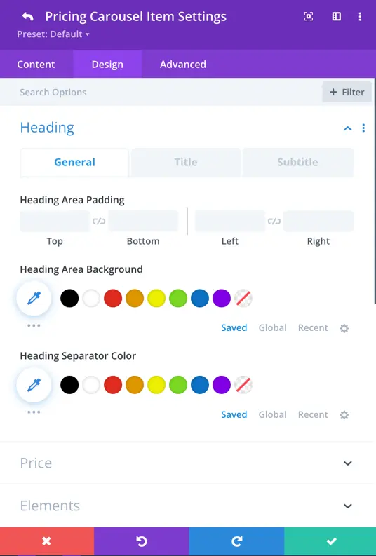
General
Heading Area Padding: Adjust the padding around the heading area to control the spacing between the heading and surrounding elements.
Heading Area Background: Choose the background color for the heading area.
Heading Separator Color: Set the color of the separator line between the heading and the rest of the pricing item.
Heading Title
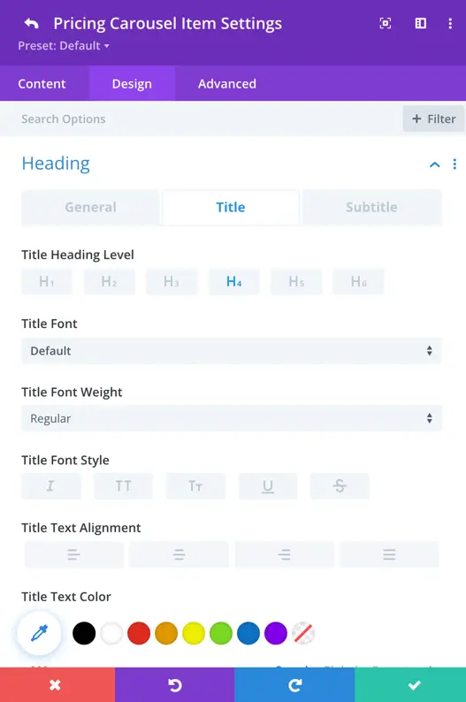
Title Heading Level: This setting determines the HTML heading level used for the title of the pricing item.
Title Styling Options: You can customize various aspects of the title’s appearance, including font style, font weight, text alignment, color, size, letter spacing, line height, and text shadow, ensuring it aligns with your branding and design preferences.
Subtitle
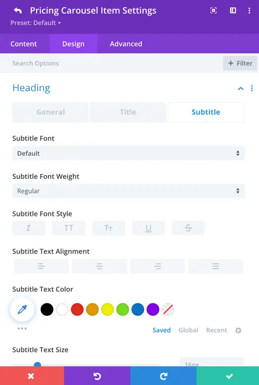
Here you can customize the subtitle content such as font style, font weight, font size, text alignment, color, letter spacing, line height, and text shadow to ensure that the subtitle complements your pricing items effectively.
Price
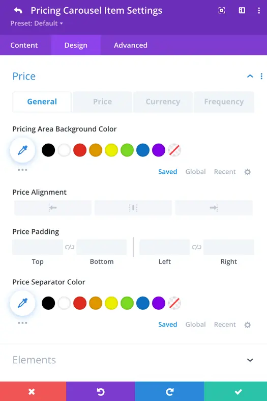
General
Pricing Area Background Color: Choose the background color for the pricing area to match your website’s design scheme.
Price Alignment: Align the pricing information within the pricing area.
Price Padding: Set the padding around the price to adjust its spacing within the pricing area.
Price Separator Color: Customize the color of the separator line between the price and the rest of the pricing item.
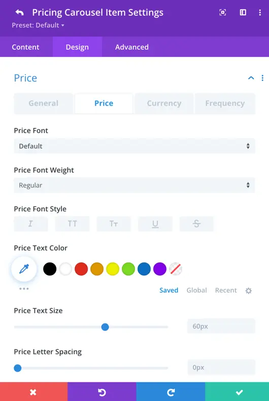
Price
This section allows you to customize the appearance of the price displayed for each pricing item. You can adjust settings such as font style, font weight, font size, text color, and alignment to ensure the price stands out and complements your overall design.
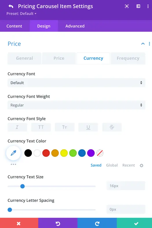
Currency
Here you can adjust the appearance of the currency symbol used for the prices, including font style, font weight, font size, and color.
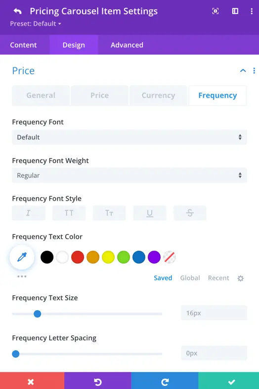
Frequency
Similarly, you can customize the frequency text displayed alongside the prices, with options to adjust font style, font weight, font size, text color, and alignment, ensuring consistency and clarity across your pricing table.
Elements
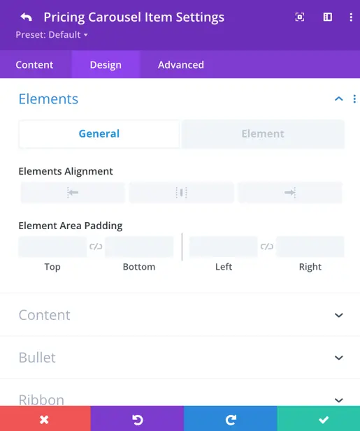
General
Elements Alignment: Determine the alignment of elements within the pricing table.
Elements Area Padding: Set the padding around the elements area for better spacing and alignment.
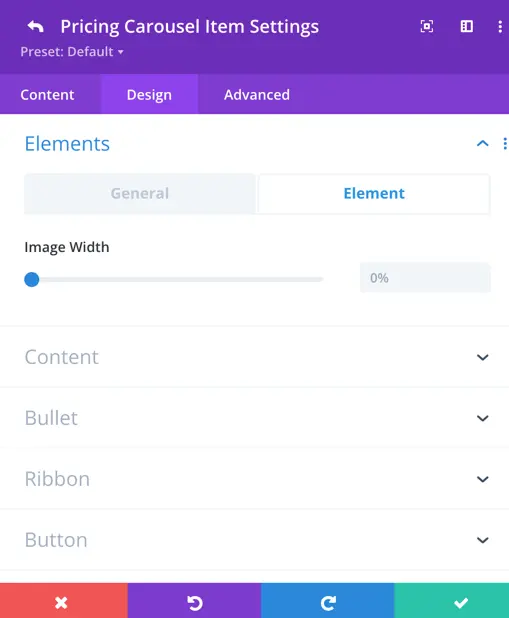
Element
Image Width: Specify the width of images displayed within the pricing table for consistent sizing.
Content
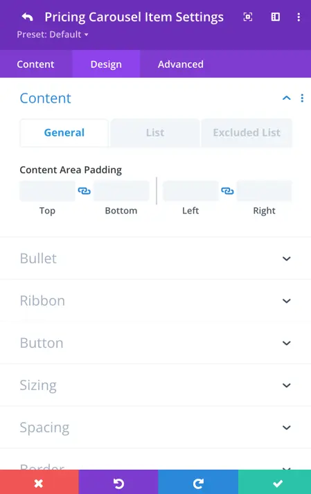
General
Content Area Padding: Adjust the padding around the content area within the pricing table for better spacing and alignment.
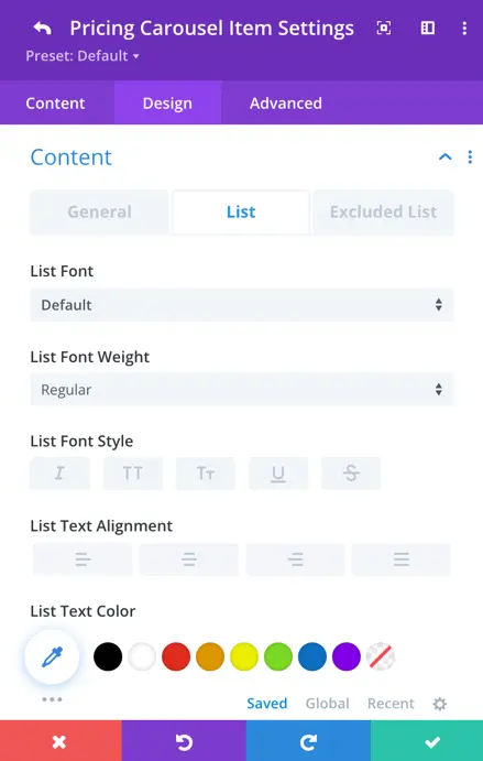
List
Here you can style the list font, font weight, font style, text alignment, and text color within the pricing table.
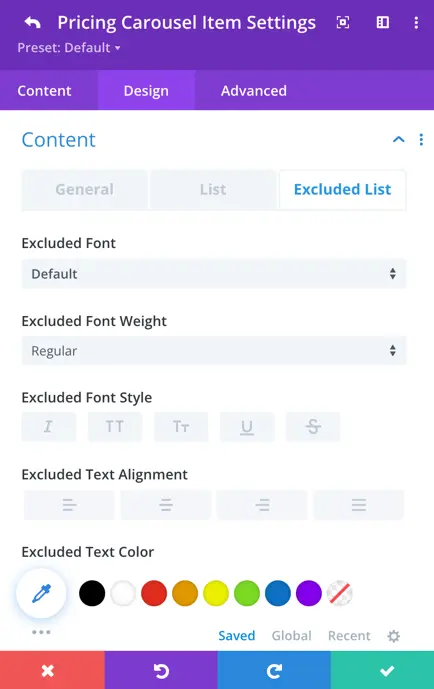
Excluded List
Here you can customize the font, weight, alignment, color, line height, and shadow for the excluded list in the pricing table.
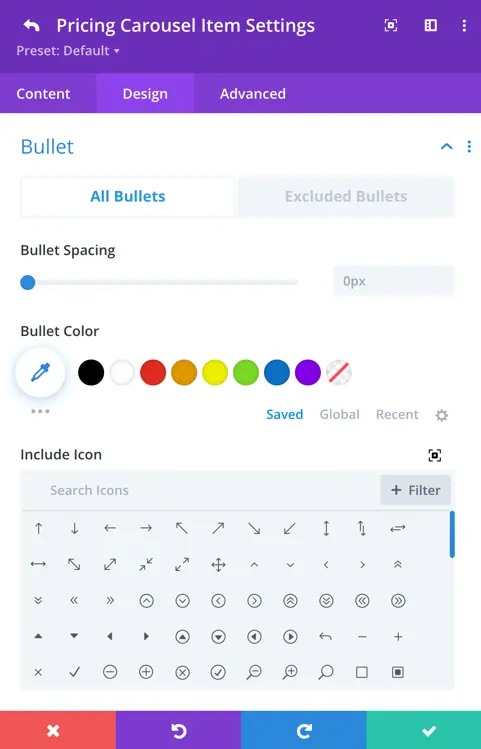
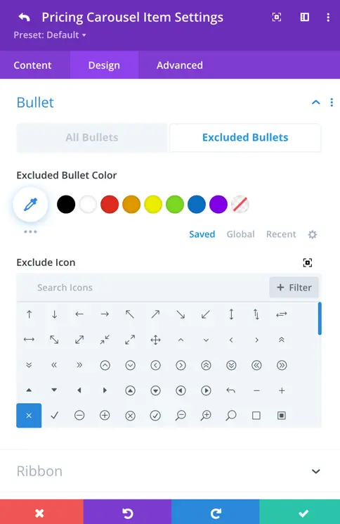
Bullet
All Bullets
- Bullet Spacing: Adjust the spacing between bullets for optimal readability.
- Bullet Color: Choose the color of the bullets to match your design scheme.
- Include Icon: Choose the icon for included bullets.
Excluded Bullets
- Excluded Bullet Color: Define the color of the bullets for excluded items.
- Exclude Icon: Choose the icon for excluded bullets.
Ribbon
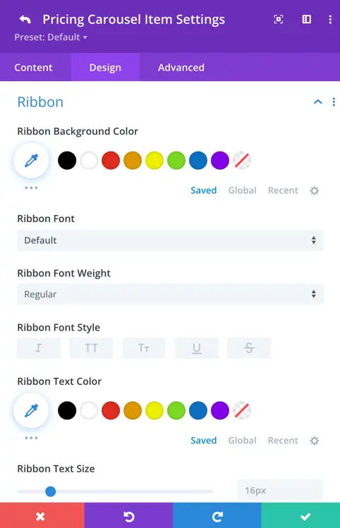
In the Ribbon section, you can adjust how the ribbon looks on specific pricing items. You have options to change its background color, pick a font style, make the text bold or italic, choose its color, and set the spacing between lines of text.
Button
When you enable “Use Custom Styles for Button,” you gain access to additional options for styling the button. These include setting the button’s text size, color, background color, border color, border radius, letter spacing, font style, font weight, and style.
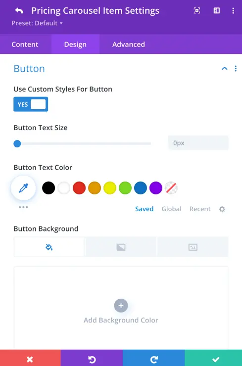
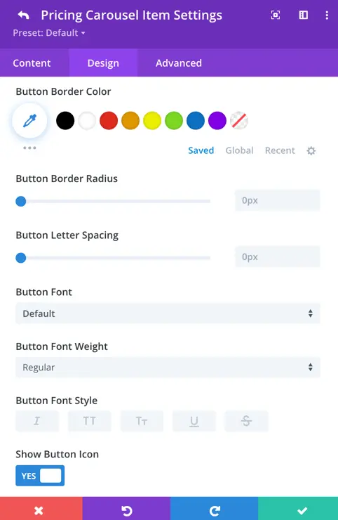
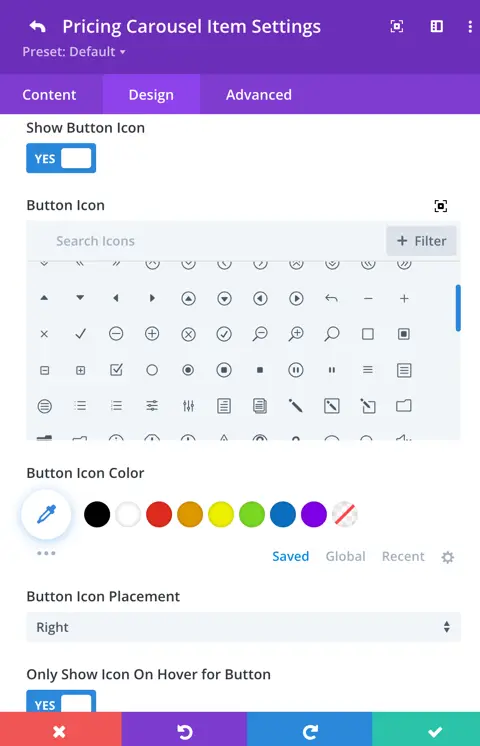
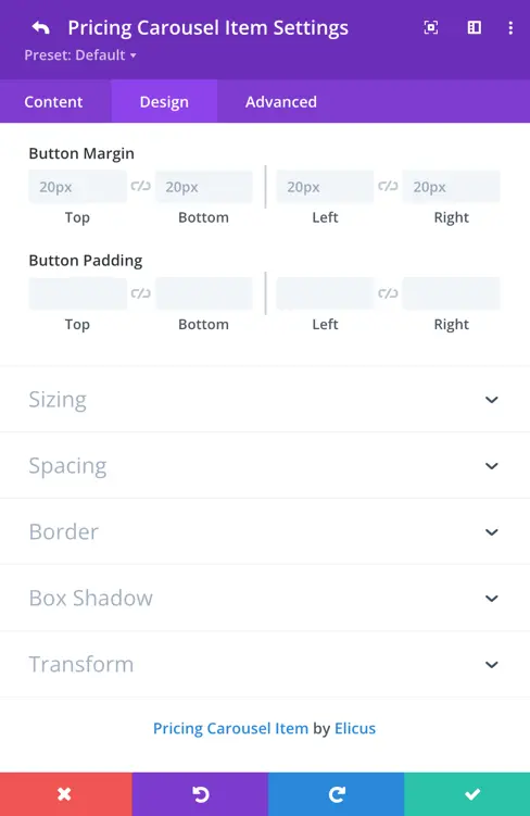
You can also choose to show a button icon, and if enabled, further customize aspects such as the icon itself, its placement, whether to show it only on hover, as well as the button’s margin and padding.
