
Search All In One Carousel for Divi Documentation
Search for answers or browse our knowledge base.
DE Portfolio Carousel
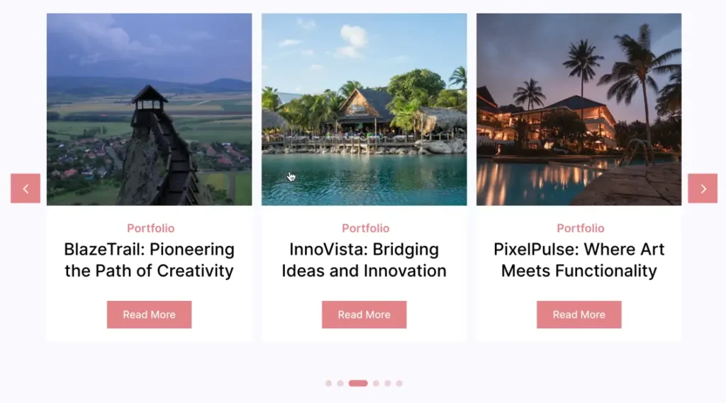
The Portfolio Carousel is a dynamic module that showcases content sourced directly from your projects. As you enter data into the projects section, it automatically populates the Portfolio Carousel with relevant content.
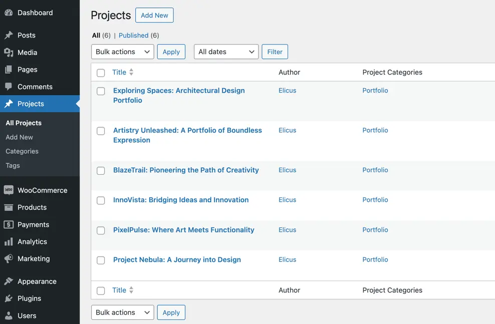
The Portfolio Carousel module in the All In One Carousel for Divi plugin lets you showcase your projects in a sliding format. It’s like a dynamic slideshow that makes it fun for visitors to explore and navigate through different pieces of your projects.
How To Add Module on Page
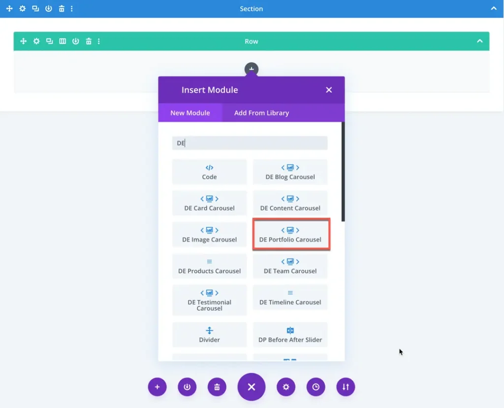
Once the plugin All In One Carousel for Divi is activated, it adds modules to the Divi builder. To insert the module, use the following steps.
- Create or edit a page that uses the Divi Builder.
- Create or edit a row.
- Create or edit a column.
- Go to the module options.
- Search for the module DE Portfolio Carousel.
The DE Portfolio Carousel Settings module provides various configuration options to customize the appearance and functionality of the portfolio carousel. Below are the settings available in the Content tab:
Content
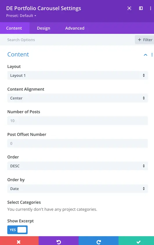
Layout
This option allows you to select the predefined layout for displaying portfolio items. You can choose from 4 different layout styles to match your design preference.
Content Alignment
This setting defines the alignment of the content within each portfolio item.
Number of Posts
This field specifies the total number of portfolio items to display in the carousel. The default value is set to 10, but you can adjust it based on your needs.
Post Offset Number
The Post Offset setting allows you to skip a specific number of posts from the beginning. For example, setting it to 2 will exclude the first two portfolio items and start displaying from the third post.
Order
This setting determines the order in which portfolio items appear in the carousel. You can choose between:
- DESC (Descending): Newer posts appear first.
- ASC (Ascending): Older posts appear first.
Order By
You can select the criteria for ordering the portfolio items. Available options include:
- Date: Orders posts based on the publication date.
- Title: Sorts posts alphabetically.
- Random: Displays posts in a random order.
Select Categories
If portfolio categories are created, this option allows you to filter posts based on selected categories.
Show Excerpt
This toggle option allows you to display an excerpt of the portfolio item. If set to YES, a short summary or description will be shown along with the portfolio item.
Elements
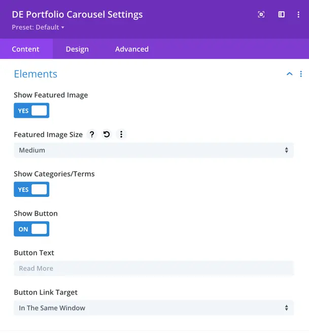
Show Featured Image
This toggle option enables or disables the display of the featured image for each portfolio item. If set to YES, the featured image will be visible in the portfolio carousel.
Featured Image Size
This dropdown allows you to choose the size of the featured image. The selected option in the image is Medium, Large,and Full.
Show Categories/Terms
This option lets you display the portfolio categories or taxonomy terms associated with each portfolio item. If enabled (YES), the category names will appear below the portfolio title.
Show Button
When this option is turned ON, a button is displayed for each portfolio item, allowing users to navigate to the full project or post.
Button Text
This field specifies the text displayed on the button. The default value is “Read More”, but it can be customized based on your preference.
Button Link Target
This setting determines how the button link will open. The available options include:
- In the Same Window: Clicking the button will open the linked page in the same browser window.
- In a New Tab: Opens the linked page in a new browser tab.
Slider
General
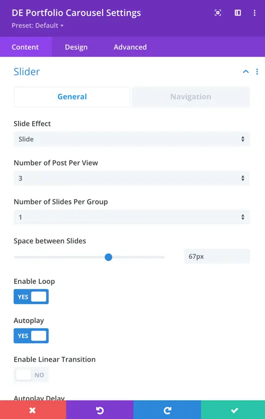
Within the Portfolio Carousel settings, you can customize the appearance and behavior of your carousel for an engaging user experience.
- Carousel Effect: Choose from four dynamic effects – slider, cube, coverflow, or flip – to determine how the cards transition within the carousel.
- Slides Per View: This setting controls the number of slides that are visible at one time, with the default value set to 3.
- Slides Per Group: Define the number of slides that move as a group, affecting the scrolling behavior.
- Space Between Cards: Set the space or gap between individual cards.
- Enable Loop Toggle: Activate this toggle to enable continuous looping of the carousel.
- Autoplay: Toggle the autoplay feature to make the carousel automatically scroll.
- Enable Linear Transition: Set as yes to enable linear transition.
- Autoplay Delay: Customize the delay in milliseconds between each card transition during autoplay.
- Pause On Hover: When enabled, the carousel will pause scrolling when a visitor hovers over it.
- Transition Duration: Define the speed at which card transitions occur.
Navigation
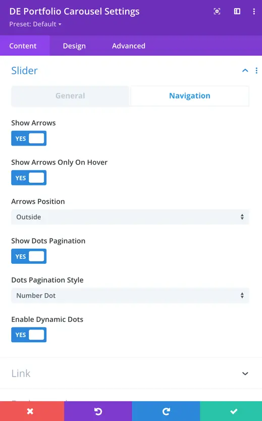
Navigation settings provide control over how to display arrows, customize their appearance and behavior, use dots for pagination, and choose from various styles to match your design.
- Show Arrows: This toggle enables or disables the display of navigation arrows, allowing users to manually navigate through the carousel using left and right arrows.
- Arrow On Hover: When enabled, the navigation arrows are hidden by default and appear when the user hovers the cursor over the carousel.
- Show Dots Pagination: Enabling this option adds dot-style pagination indicators that correspond to each slide in the carousel.
- Dots Pagination Style: You can choose the style of the dot pagination, customizing its appearance to match your overall design. You can select from a range of styles for the dot pagination indicators, including Solid Dot, Transparent Dot, Stretched Dot, Line, Rounded Line, Squared Dot, and Number Dot.
- Enable Dynamic Dots: Dynamic dots automatically adjust in size and spacing to indicate which slide is currently active.