
Search All In One Carousel for Divi Documentation
Search for answers or browse our knowledge base.
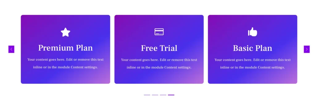
DE Flipbox Carousel
The DE Flipbox Carousel module allows you to create interactive flip boxes with engaging front and back content, customizable icons or images, and dynamic effects. It offers multiple layout options, including Flip and 3D Cube, along with advanced styling controls for individual flip boxes. The built-in carousel settings enhance user experience with smooth transitions, autoplay, and navigation controls.
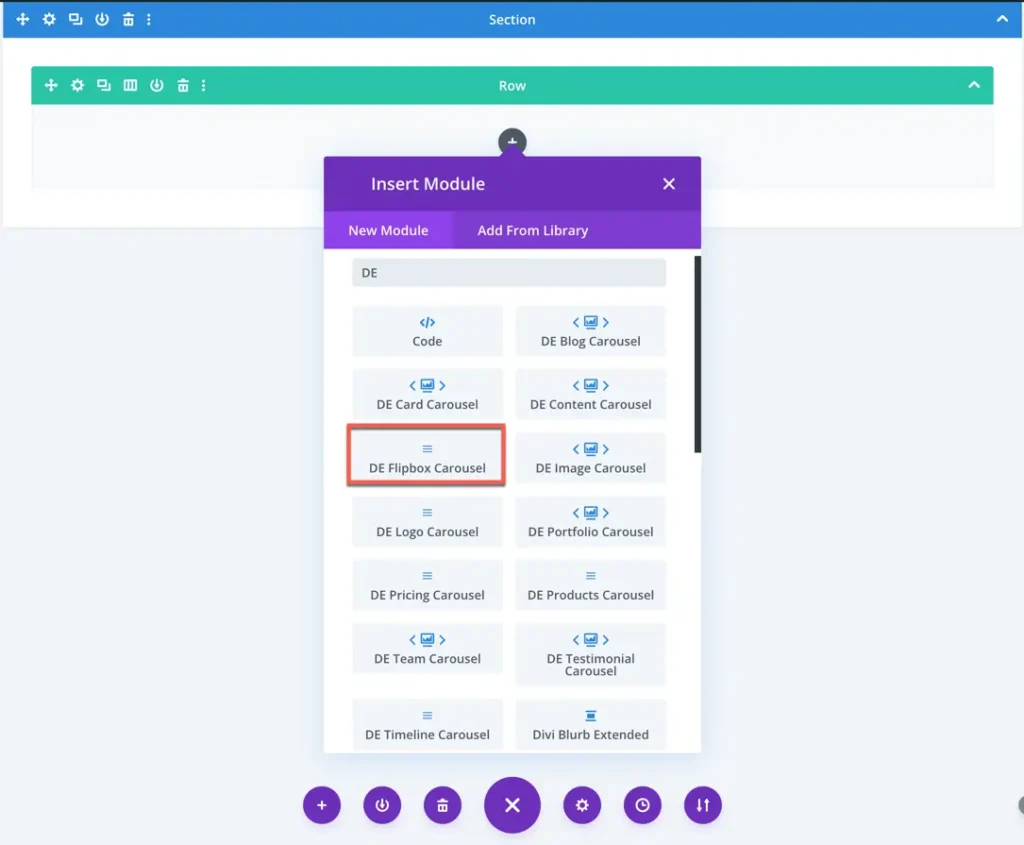
How To Add Module on Page
- Create or edit a page that uses the Divi Builder.
- Create or edit a row.
- Create or edit a column.
- Go to the module options.
- Search for the module DE Flipbox Carousel.
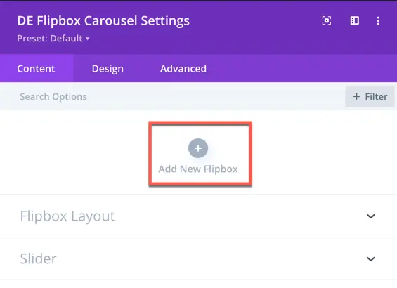
Adding a New Flipbox
Flipbox Content
Once a flipbox is added, you can configure the front and back content:
- Back Side: Enter a title and content.
- Front Side: Enter a title and content.
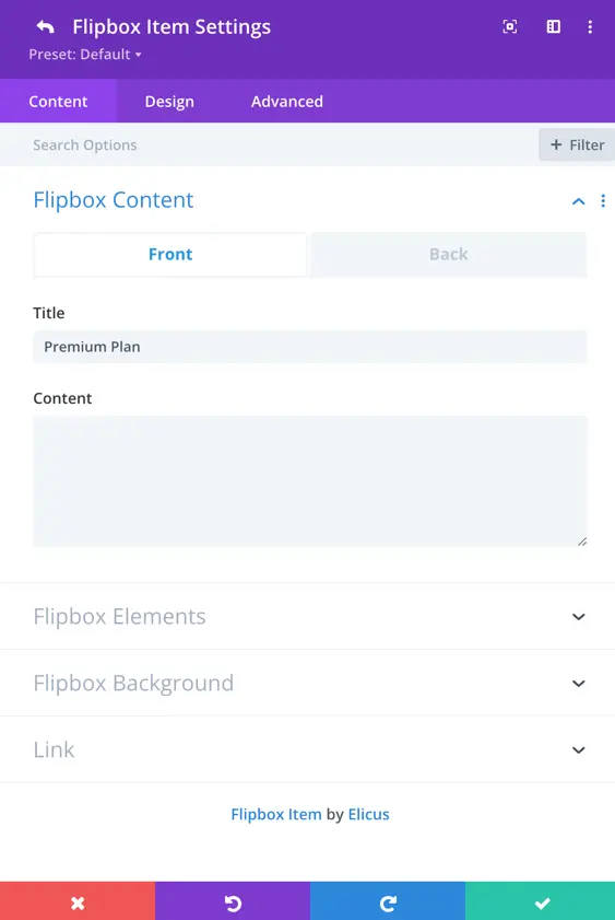
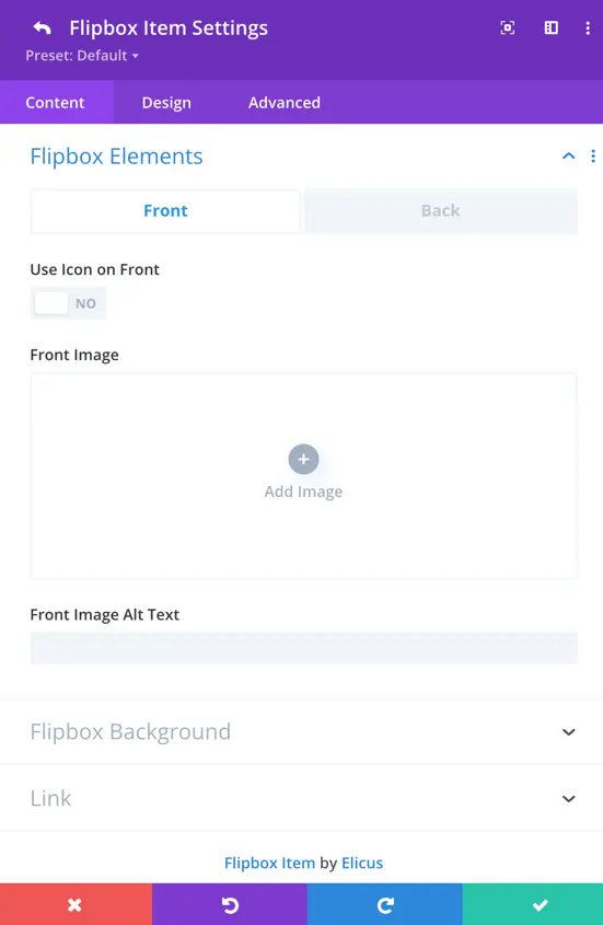
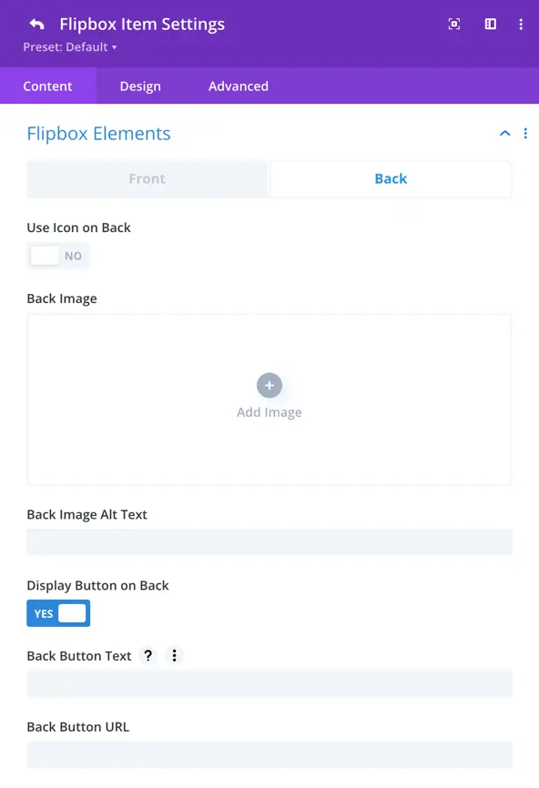
Flipbox Elements
- Choose Icon or Image for the front side.
- If you select an icon, the image option will be hidden.
- If you select an image, an Alt Text field will be available.
- The back side also allows similar settings with an optional Button.
- Enable the Display Button on Back toggle to access the button text and URL options.
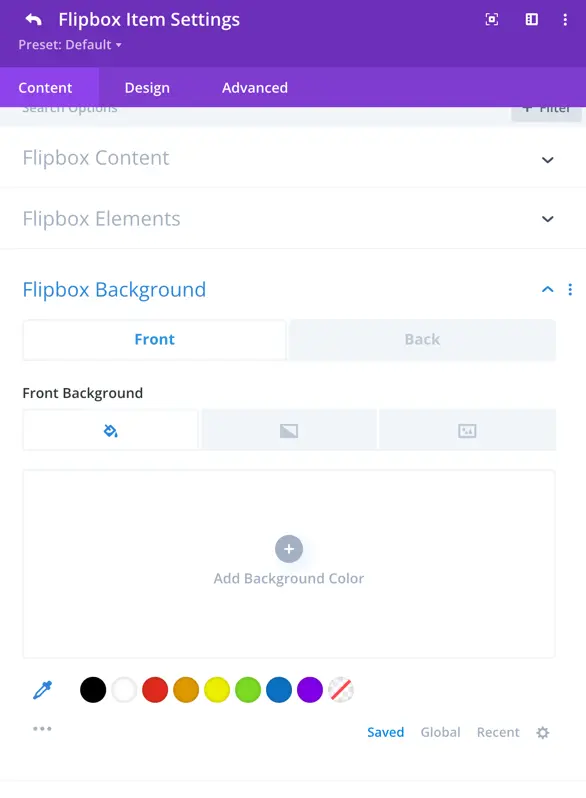
Flipbox Background
Set different background colors or images for the front and back sides.
Customization of a Single Flipbox Item
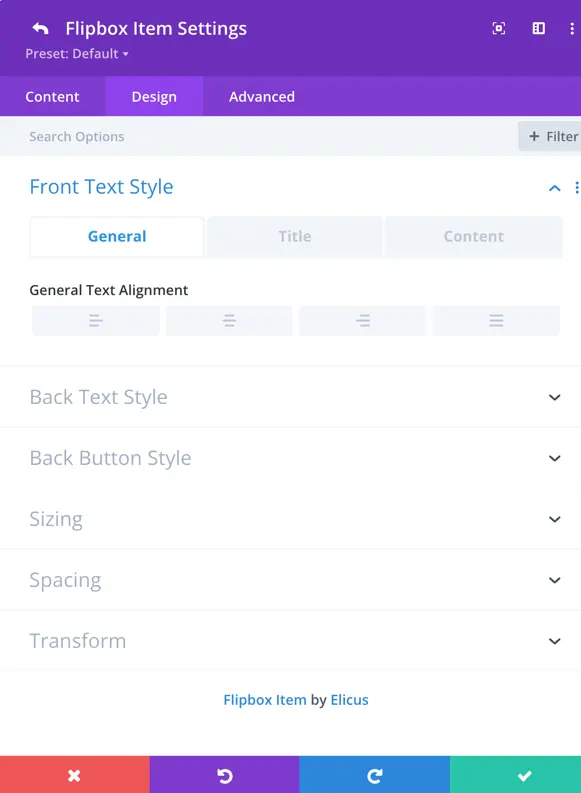
Text Styling
- Customize the front and back text styles, including font, size, and color.
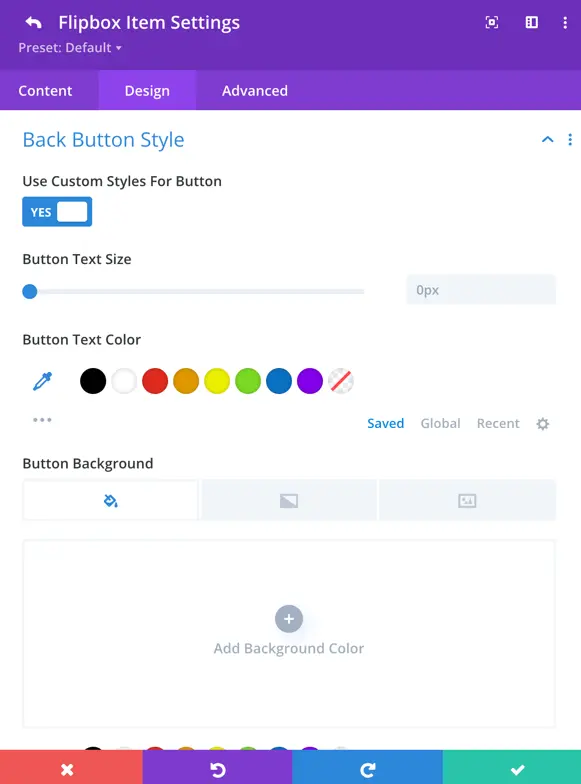
Back Button Styling
- If the back button is enabled, you can customize:
- Text size, color, and background
- Border width, color, and radius
- Letter spacing, font style, and button icon
- Icon color, text shadow, margin, and padding
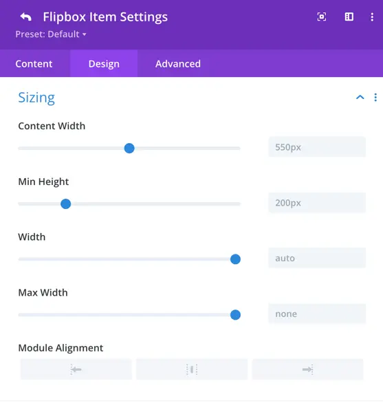
Sizing Options
Adjust content width, min-height, max-width, and module alignment.
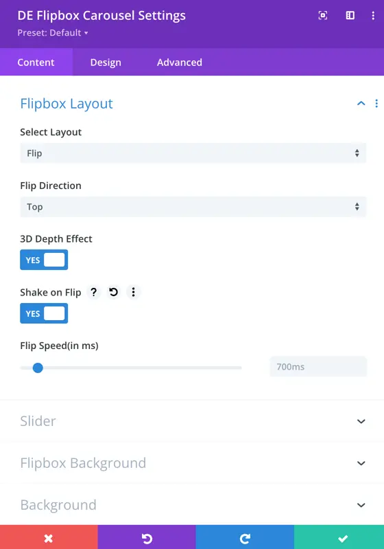
Flipbox Carousel Settings
Once flipboxes are added and customized, you can select the carousel layout. These are global settings applied to all flipboxes.
Layout Options
- Flip
- 3D Cube
Flip Direction: Choose from Top-Bottom, Left-Right, Diagonal Left, Diagonal Right, and their inverted versions.

Slider
Within the Flipbox Carousel settings, you can customize the appearance and behavior of your carousel for an engaging user experience.
- Slide Effect: Choose from three effects – Slide, coverflow and fade.
- Slides Per View: This setting controls the number of slides that are visible at one time, with the default value set to 3.
- Slides Per Group: Define the number of slides that move as a group, affecting the scrolling behavior.
- Space Between Cards: Set the space or gap between individual cards.
- Enable Loop Toggle: Activate this toggle to enable continuous looping of the carousel.
- Autoplay: Toggle the autoplay feature to make the carousel automatically scroll.
- Enable Linear Transition: Set as yes to enable linear transition.
- Autoplay Delay: Customize the delay in milliseconds between each card transition during autoplay.
- Transition Duration: Define the speed at which card transitions occur.
Navigation
Navigation settings provide control over how to display arrows, customize their appearance and behavior, use dots for pagination, and choose from various styles to match your design.
- Show Arrows: This toggle enables or disables the display of navigation arrows, allowing users to manually navigate through the carousel using left and right arrows.
- Arrow On Hover: When enabled, the navigation arrows are hidden by default and appear when the user hovers the cursor over the carousel.
- Show Dots Pagination: Enabling this option adds dot-style pagination indicators that correspond to each slide in the carousel.
- Dots Pagination Style: You can choose the style of the dot pagination, customizing its appearance to match your overall design. You can select from a range of styles for the dot pagination indicators, including Solid Dot, Transparent Dot, Stretched Dot, Line, Rounded Line, Squared Dot, and Number Dot.
- Enable Dynamic Dots: Dynamic dots automatically adjust in size and spacing to indicate which slide is currently active.