
Search All In One Carousel for Divi Documentation
Search for answers or browse our knowledge base.
DE Card Carousel
The Card Carousel presents your content with seamless slider effects, offering a visually stunning experience. This highly customizable carousel plugin is ideal for various business websites and blogs, providing an appealing and engaging display.
How To Add Module on Page
Once the plugin All In One Carousel for Divi is activated, it adds modules to the Divi builder. To insert the card carousel module, use the following steps.
- Create or edit a page that uses the Divi Builder.
- Create or edit a row.
- Create or edit a column.
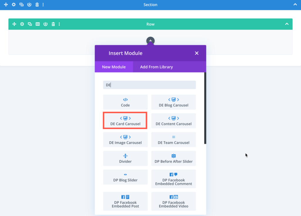
- Go to the module options.
- Search for the module DE Card Carousel.
Content
In this section, you can add a new cart to your carousel by clicking the plus icon. Additionally, you have access to slider and background options for further customization.
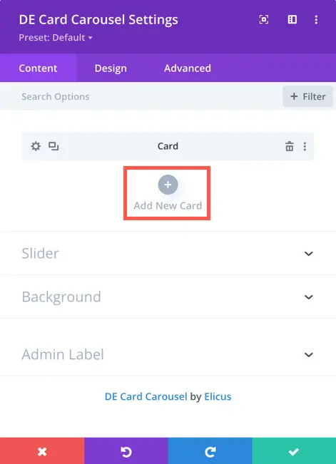
Once you’ve added a new card, you gain access to settings specifically for that added item.
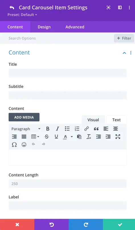
Content
- Title: Enter the content title for the carousel image.
- Subtitle: Add supplementary information in the subtitle field.
- Content: Input the main text content.
- Content-Length: Specify the character limit for the content; set to 0 for no content display.
- Label: Provide the label text for the item.
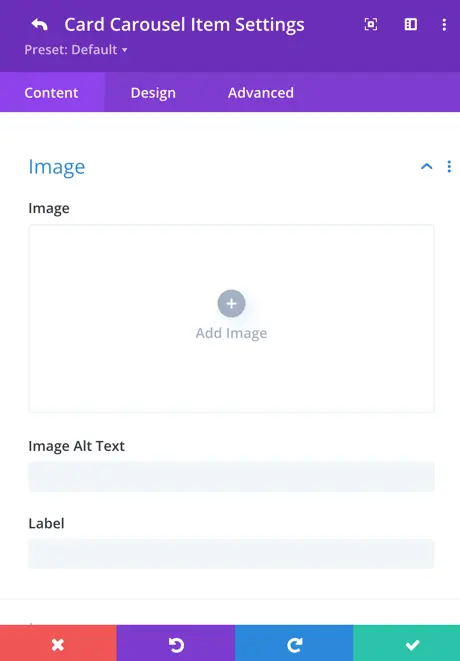
Image
Image: This setting allows you to upload or select an image to be displayed in the card.
Image Alt Text: Here you can specify the alternative text for the image, which is displayed if the image fails to load or for accessibility purposes.
Label: This setting allows you to add a label or text overlay on the image.
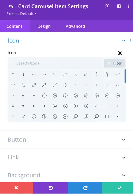
Icon
Here you can select the icon to be displayed on the card. You can choose from a variety of predefined icons.
Button
Button:
- Show Button: Toggle this option to display or hide the button on the card.
- Button Text: Enter the text you want to display on the button.
- URL: Specify the URL that the button should link to.
- Link Target: Choose whether the link should open in the same tab or a new tab/window.
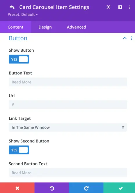
Second Button:
- Show Second Button: Toggle this option to display or hide a second button on the card.
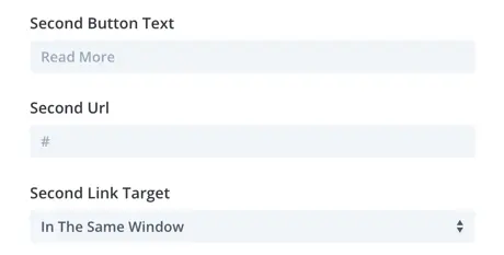
- Second Button Text: Enter the text you want to display on the second button.
- Second Button URL: Specify the URL that the second button should link to.
- Second Button Link Target: Choose whether the link should open in the same tab or a new tab/window.
Slider
General
Within the Card Carousel settings, you can customize the appearance and behavior of your carousel for an engaging user experience.
- Carousel Effect: Choose from four dynamic effects – slider, cube, coverflow, or flip – to determine how the cards transition within the carousel.
- Cards Per View: This setting controls the number of cards that are visible at one time, with the default value set to 3.
- Cards Per Group: Define the number of cards that move as a group, affecting the scrolling behavior.
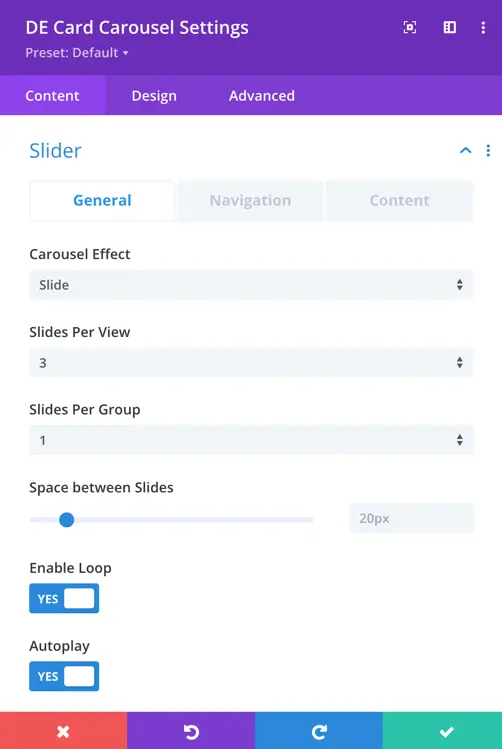
- Space Between Cards: Set the space or gap between individual cards.
- Enable Loop Toggle: Activate this toggle to enable continuous looping of the carousel.
- Autoplay: Toggle the autoplay feature to make the carousel automatically scroll.
- Enable Linear Transition: Set as yes to enable linear transition.
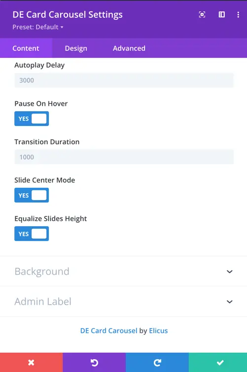
- Autoplay Delay: Customize the delay in milliseconds between each card transition during autoplay.
- Pause On Hover: When enabled, the carousel will pause scrolling when a visitor hovers over it.
- Transition Duration: Define the speed at which card transitions occur.
Navigation
Navigation settings provide control over how to display arrows, customize their appearance and behavior, use dots for pagination, and choose from various styles to match your design.
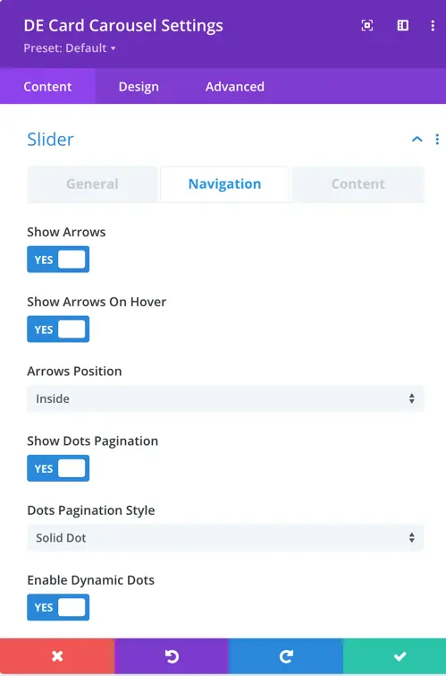
- Show Arrows: This toggle enables or disables the display of navigation arrows, allowing users to manually navigate through the carousel using left and right arrows.
- Arrow On Hover: When enabled, the navigation arrows are hidden by default and appear when the user hovers the cursor over the carousel.
- Show Dots Pagination: Enabling this option adds dot-style pagination indicators that correspond to each slide in the carousel.
- Dots Pagination Style: You can choose the style of the dot pagination, customizing its appearance to match your overall design. You can select from a range of styles for the dot pagination indicators, including Solid Dot, Transparent Dot, Stretched Dot, Line, Rounded Line, Squared Dot, and Number Dot.
- Enable Dynamic Dots: Dynamic dots automatically adjust in size and spacing to indicate which slide is currently active.
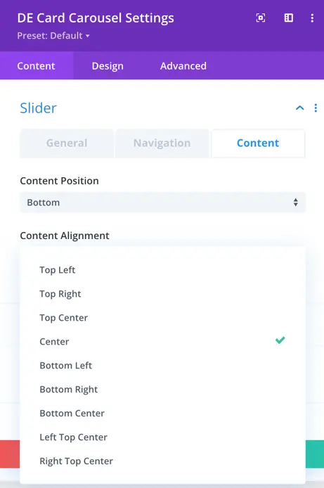
Content
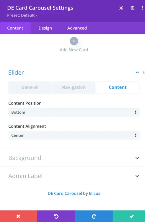
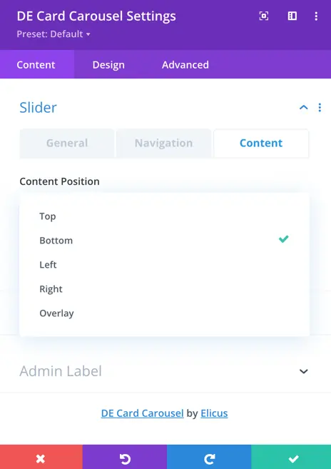
In the settings for content positioning and alignment within the slider, you have the option to control where the content appears and how it aligns with the slider images.
You can choose between several positions for the content: top, bottom, left, right, or overlay. If you select “top,” the content will be positioned at the top of the slider; if you choose “bottom,” it will be at the bottom, and so on.
Additionally, you can specify the alignment of the content within its position. Options include aligning it to the top left, top right, top center, center, bottom left, bottom right, bottom center, as well as options for corner alignments like left top and right top. Also, there’s a “center” option to centrally align the content both vertically and horizontally within the slider.
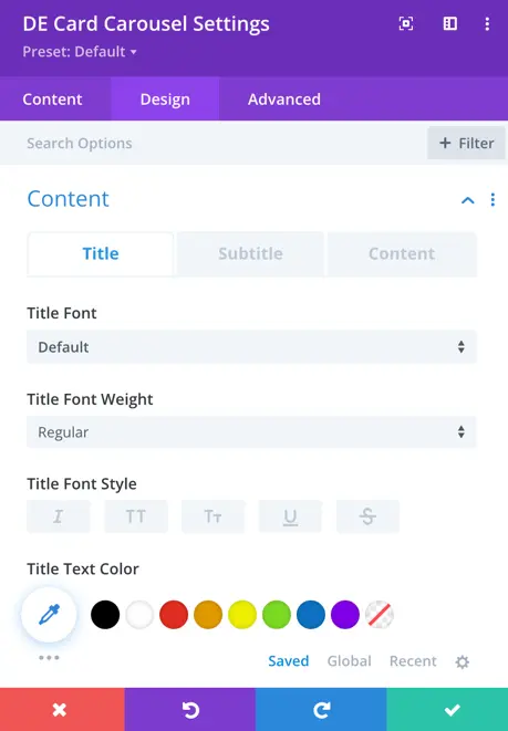
Design
In the “Design” section, you’ll find the global design settings that apply to all cards within the carousel. These settings ensure consistency across all cards in terms of their appearance and styling.
If you wish to customize each card individually, you can navigate to the associated design tab for each card. There, you’ll find specific styling options for that particular card. However, in the global settings, we define the overall appearance and styling that will be applied universally to all cards within the carousel.
The Title customization options allow you to modify the font, font weight, font style, text color, letter spacing, line height, and text shadow. These settings help create a distinct and readable heading for each card in the carousel.
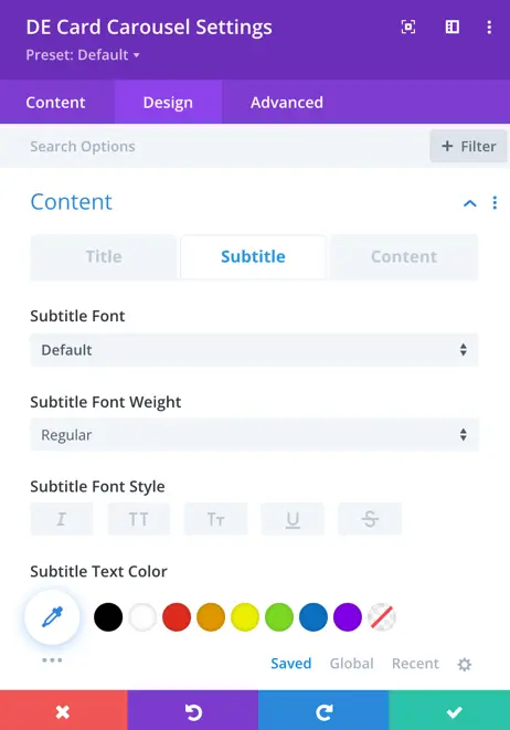
The Subtitle section provides the same styling options as the title. You can adjust the font type, weight, color, and spacing to ensure the subtitle complements the overall design of the carousel.
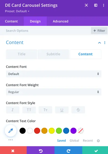
The Content settings offer the same customization features as the title and subtitle. These options help ensure readability and visual harmony across the carousel’s text elements.
The Image section allows you to adjust image padding, apply rounded corners, and customize the border style and width. These settings help maintain a clean and professional appearance for the images displayed in the carousel.
In the Label settings, you can modify the background color, margin, and padding to create a distinct visual separation from other elements. Additionally, you can customize the font, font weight, font style, text color, and size to enhance readability. The letter spacing, line height, and text shadow settings allow for further refinements. Rounded corners and border style adjustments help improve the label’s visual appeal.
The Icon settings enable customization of the font size and icon color, allowing you to ensure the icons blend seamlessly with the overall design of the carousel.
The Content Background section provides options to adjust the background color and styling, ensuring that the content stands out while maintaining a cohesive design with the rest of the carousel.
The Arrow settings allow you to control the arrow padding and background color, ensuring easy navigation while maintaining a visually appealing layout.