
Search Divi Gallery Extended Documentation
Search for answers or browse our knowledge base.
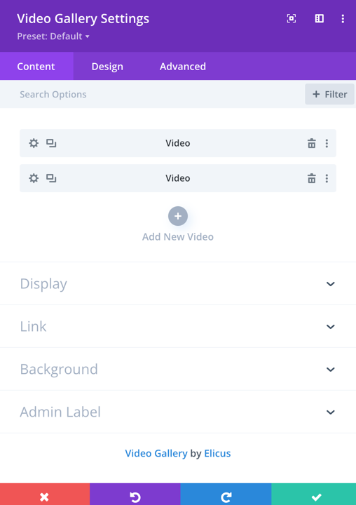
Video Gallery
The Divi video gallery module in Divi Gallery Extended allows you to showcase your video gallery with ease. In our documentation, we provide detailed information about the module, including a step-by-step guide to its settings and features.
Content
Add New Video
To add a new video, click on the ‘Add New Video‘ option.
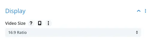
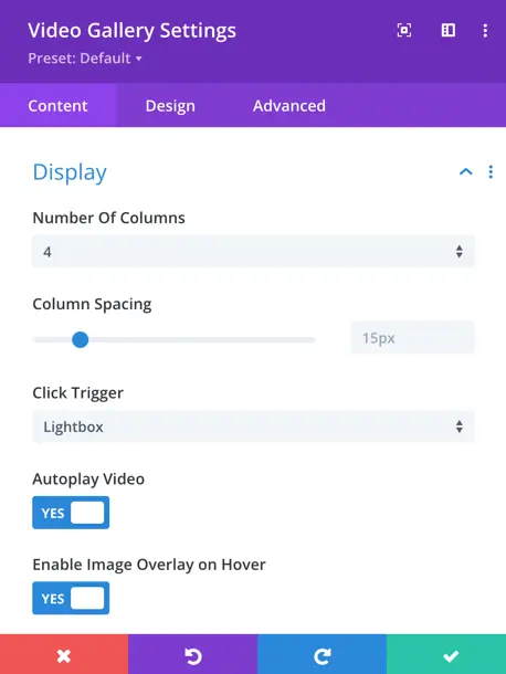
Display
In the Display settings, you can control the visual presentation of your video gallery. Here are the key settings:
- Video Size: Choose between 16:9 or auto sizing for the videos.
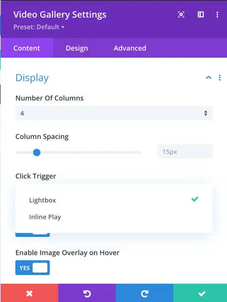
- Number of Columns: Set the number of columns for your video gallery. You can choose from up to 6 columns to organize your videos.
- Column Spacing: Define the spacing between columns in your video gallery.
- Click Trigger: Choose the click trigger for your videos. Options typically include “Lightbox” for displaying videos in a modal overlay and “Inline Play” for playing the video directly on the page.
- Autoplay Video: Enable or disable autoplay for your videos. When enabled, videos will start playing automatically when the page loads.
- Enable Image Overlay:This toggle allows you to enable or disable the image overlay feature. When set to “Yes,” an overlay will appear on the images based on your design preferences.
- Show Image Overlay on Hover: When enabled, this toggle ensures the overlay only appears when the user hovers over an image. If disabled, the overlay remains static and visible at all times (assuming the overlay is enabled).
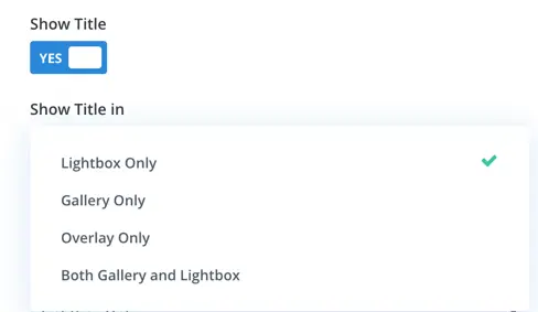
Show title
Choose when to display the title for each video in the gallery. Options include:
- Show Title in Lightbox Only: Display the title only when the video is viewed in the lightbox.
- Show Title in Gallery Only: Disply the title only in the gallery.
- Show Title in Overlay Only: Display the title only when hovering over the video thumbnail.
- Both Gallery and Lightbox: Display the title in both views.
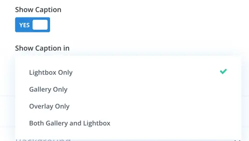
Show caption
Similar to the title settings, configure when to show the caption for each video. Options include:
- Show Caption In Lightbox Only: Display captions only in lightbox.
- Show Caption In Gallery Only: Display captions only in the gallery.
- Show Caption In Overlay Only: Show captions when hovering over thumbnails.
- Both Gallery And Lightbox: Show captions in both views.
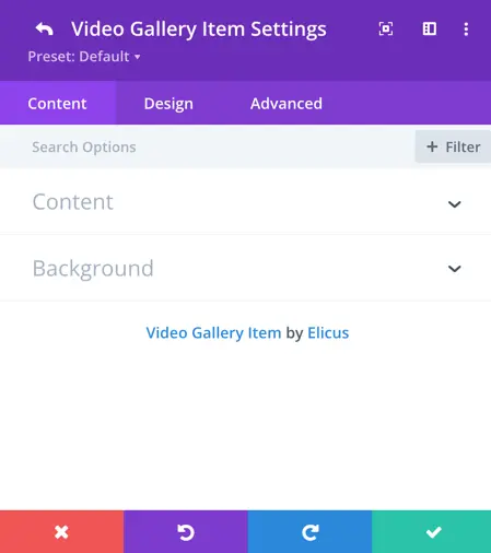
Video gallery item settings
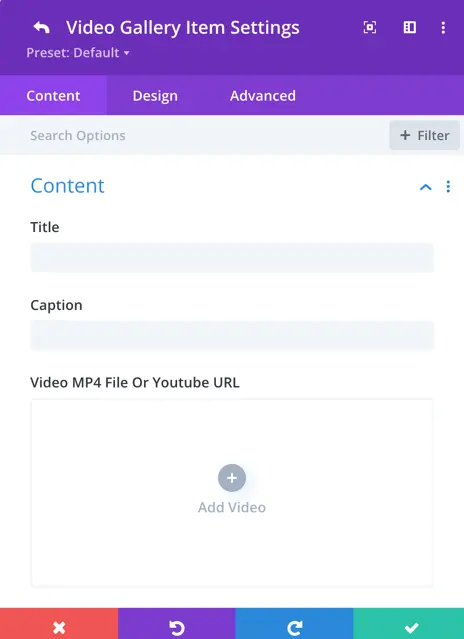
Once you click on the ‘Add New Video’ option, you will have the ‘Content,’ ‘Design,’ and ‘Advanced’ settings for individual video items. In the ‘Content’ tab, you will find options for configuring the video content and background.
- Title: This is the title of the video.
- Caption: You can add a descriptive caption or text related to the video.
How to add a video in the module
In the Video Gallery module settings, you have two options for adding a video: uploading it directly to your website or adding a video from a URL.
Video MP4 File or YouTube URL
This setting allows you to upload an MP4 video file directly or enter a YouTube URL to embed a video from YouTube. Additionally, you can use this option to display YouTube Shorts by entering the Shorts URL.
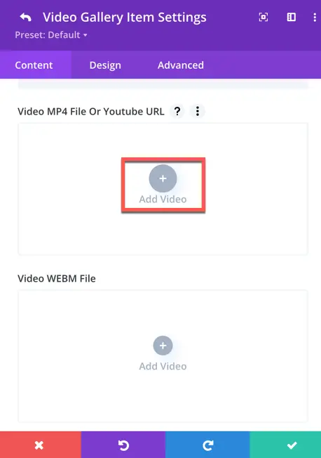
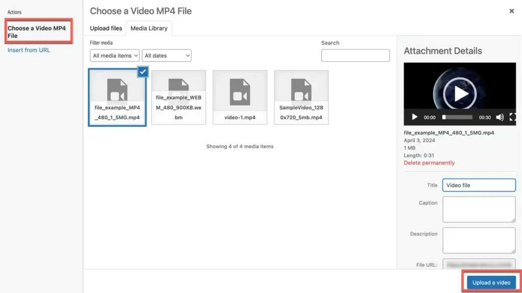
Choose a Video MP4 File
This option allows you to upload an MP4 video file directly from your device.
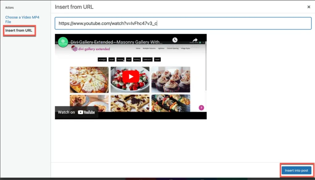
Insert From URL
With this option, you can add a video to your gallery by providing the URL of the video hosted online. This includes videos hosted on platforms like YouTube or Vimeo, allowing you to seamlessly integrate external video content into your gallery.
- Video WEBM File
- This setting is for uploading the WEBM version of your video.
- Having both MP4 and WEBM versions of your video ensures that visitors can view your content seamlessly regardless of their browser or device preferences.
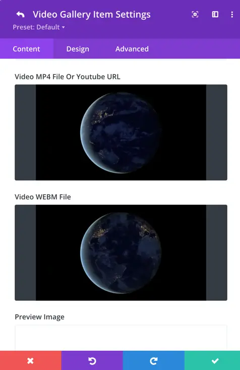
- Preview Image: Upload an image that will be used as a preview/thumbnail for the video.
- Generate From Video: You have the option to automatically generate a preview image from the video content when using Vimeo or YouTube links.
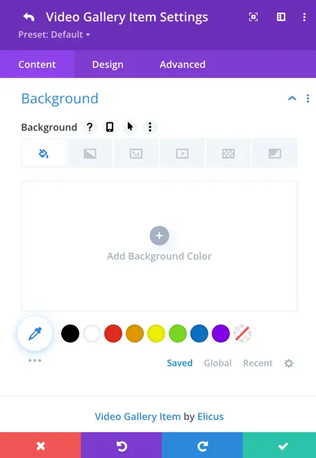
Background
In the Background settings, you can customize the background of the video module. Here are the available options:
- Background Color: Choose a background color for the video module.
- Background Image: Upload an image to be used as the background.
- Background Video: You have the option to use a background video.
- Background Gradient: Apply a gradient overlay to the background, customizing the colors and direction of the gradient.
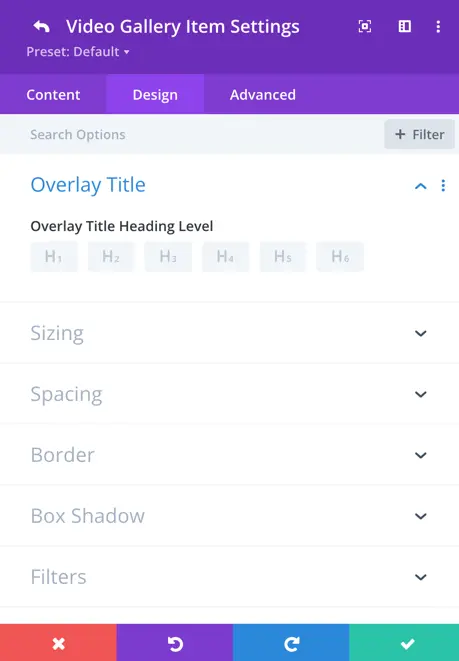
Overlay Title
In the Design tab, you will find the settings for customizing the overlay title. Here, you can define the overlay title’s styling and appearance. The available options typically include:
- Heading Level: Choose the HTML heading level for the overlay title. This could be options like H1, H2, H3, etc., which represent different heading levels in HTML.
Global design setting
Title & Caption container padding
- Allows you to adjust the padding (space inside the container) for the top, bottom, left, and right sides of the Title & Caption container.
- You can either set individual values for each side or link the padding values to apply the same spacing to all sides.
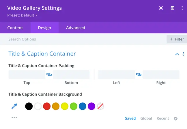
Title & Caption container background
- Enables you to set a background color for the Title & Caption container.
- Choose from the available color options, use the color picker for a custom color, or select “No Background” (indicated by the diagonal line).
Text setting
This Text Settings panel allows you to customize the appearance of your text for titles and captions. Here’s what each option does:
- Title/Caption Tabs:
- Switch between customizing the Title or the Caption text styles.
- Title Font:
- Choose the font for the title from the dropdown list.
- Title Font Weight:
- Select the font weight (e.g., Regular, Bold, etc.) to define how thick or thin the text appears.
- Title Font Style:
- Apply styling options such as italic, all caps, small caps, underline, and strikethrough.
- Title Text Alignment:
- Align the title text to the left, center, right, or justified.
- Title Text Color:
- Select a text color from the predefined palette, use the color picker for custom colors, or choose “No Color” for transparency.
- Title Text Size:
- Adjust the size of the title text using the slider or manually entering a value.
- Title Letter Spacing:
- Modify the space between letters in the title text.
- Title Line Height:
- Adjust the line height (spacing between lines of text) to improve readability or match your design preferences.
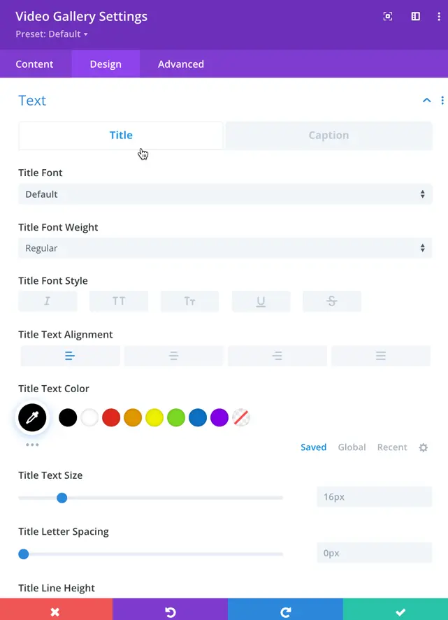
The same settings are available for captions as well, allowing you to customize them similarly to titles.
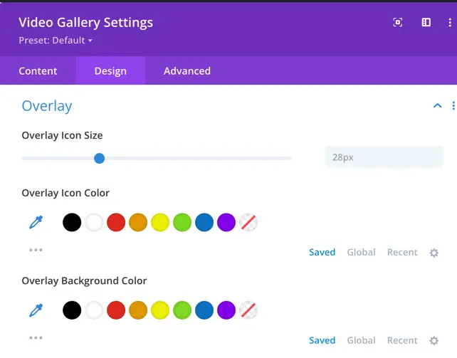
Overlay
- Overlay Icon Size:
- A slider control is present to adjust the size of the overlay icon.
- Overlay Icon Color:
- This section allows the user to select the color of the overlay icon.
- Overlay Background Color:
- This section allows users to choose the background color of the overlay.
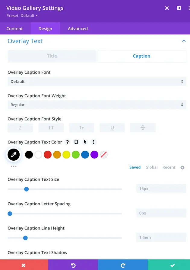
Overlay Text Settings
This Overlay Text Settings panel allows you to customize the appearance of text displayed on image overlays. Here’s what each option does:
- Overlay Title/Caption Tabs:
- Switch between customizing the Title or the Caption text styles for the overlay.
- Overlay Title Font:
- Select the font for the overlay title from the dropdown list.
- Overlay Title Font Weight:
- Choose the font weight (e.g., Regular, Bold) to adjust the thickness of the overlay title text.
- Overlay Title Font Style:
- Apply text styles such as:
- TT: Transform text to uppercase.
- U: Underline the text.
- Apply text styles such as:
- Overlay Title Text Color:
- Choose a text color for the overlay title using the palette or the color picker. You can also save custom colors for reuse.
- Overlay Title Text Size:
- Adjust the size of the overlay title text using the slider or by entering a specific value.
- Overlay Title Letter Spacing:
- Modify the spacing between letters in the overlay title text for better design alignment.
- Overlay Title Line Height:
- Adjust the spacing between lines in multi-line text to improve readability or match design aesthetics.
- Overlay Title Text Shadow:
- Add a shadow effect to the overlay title text, enhancing its visibility and style.
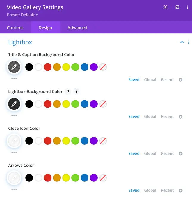
Lightbox settings
This Lightbox Settings panel allows you to customize the appearance of the lightbox elements in your design.
- Title & Caption Background Color:
- Set a background color for the title and caption displayed within the lightbox.
- Lightbox Background Color:
- Choose the background color for the lightbox itself, ensuring it matches your design preferences.
- Close Icon Color:
- Select the color for the close (X) icon to make it easily visible and match your theme.
- Arrows Color:
- Customize the color of the navigation arrows used to browse through images or content in the lightbox.
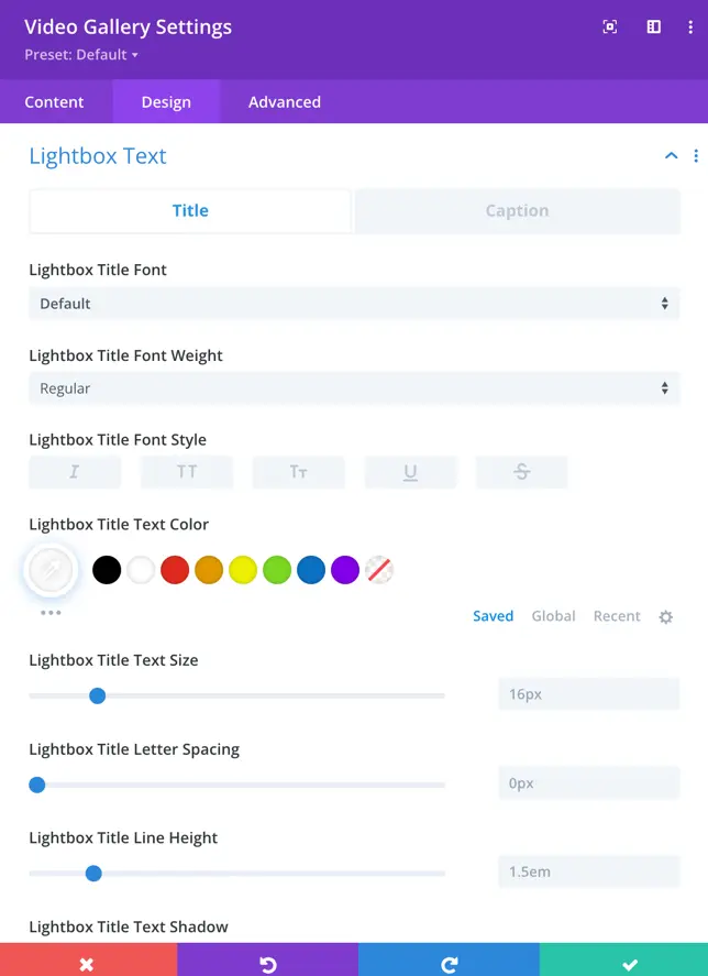
Lightbox text settings
This panel allows you to customize the appearance of the title and caption displayed within the lightbox for video galleries.
- Lightbox Title/Caption Tabs:
- Switch between editing the Title or Caption text displayed in the lightbox.
- Lightbox Title Font:
- Select the font style for the title text in the lightbox.
- Lightbox Title Font Weight:
- Choose the thickness of the title font (e.g., Regular, Bold, etc.).
- Lightbox Title Text Color:
- Choose a color for the title text in the lightbox.
- Lightbox Title Text Size:
- Adjust the size of the title text by entering a value or using a slider.
- Lightbox Title Letter Spacing:
- Modify the spacing between individual letters in the title text for design precision.
- Lightbox Title Line Height:
- Adjust the line height (spacing between lines of text) for multi-line titles.
- Lightbox Title Text Shadow:
- Add a shadow effect to the title text for enhanced visibility or stylistic emphasis.
These settings allow for detailed customization of the lightbox text to ensure it aligns with the gallery’s design.
How to display YouTube Shorts in the Builder
Note: To display a YouTube video, simply enter the video URL, e.g., https://www.youtube.com/watch?v=DDDDVVVVQJG.
To display a YouTube Short, you’ll need to adjust the Shorts URL slightly. For example, if your Shorts URL is:https://www.youtube.com/shorts/YWsP8-kMMMo
Change it to use the standard YouTube video syntax like this:https://www.youtube.com/watch?v=YWsP8-kMMMo
This means you take the video ID from the Shorts URL (YWsP8-kMMMo) and place it in the standard YouTube video syntax.
If you directly use the Shorts URL, it may display an error in the builder interface. However, this is only a visual issue in the builder. The Shorts will display correctly on the frontend after publishing, so there’s no need to modify the syntax unless preferred.