Search Divi Gallery Extended Documentation
Search for answers or browse our knowledge base.
Image Carousel
The Image Carousel module in Divi Gallery Extended lets you create beautiful, customizable image sliders for your Divi website.
With extensive options for layout, styling, and interactivity, you can showcase galleries in an engaging way across all devices.
This guide explains each setting step by step to help you make the most of the module’s features.
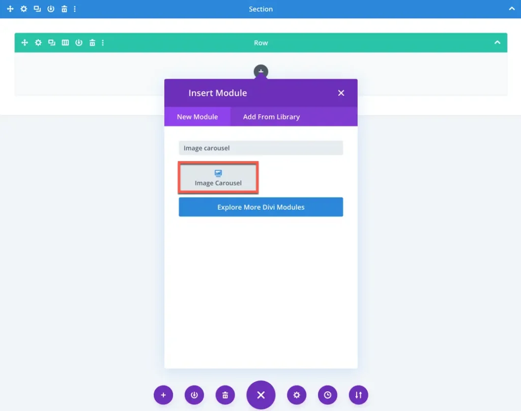
Add module on page
Once Divi Gallery Extended plugin is activated, it adds a number of modules to the Divi builder. To insert a module, use the following steps.
- Create or edit a page that uses the Divi Builder.
- Create or edit a row.
- Create or edit a column.
- Go to the module options.
- Choose Image Carousel module.
Content settings
The Content tab of the Image Carousel module allows you to configure which images are displayed and how they appear in the carousel. Below are the available settings and their functions:
Configuration
Number of images
Set the maximum number of gallery images to display in the carousel. Leave it blank to display all available images from the selected category or gallery.
Offset Number
Use this to skip a specific number of images from the beginning. For example, setting an offset of 2 will skip the first two images and show the rest.
Order by options
Choose how to order the images in the carousel. Options include: Date, Title, Slug, Id , Random, None, Modified date.
Order
Select whether to display the images in:
- Ascending
- Descending
Select categories
Choose one or more gallery categories to pull images from. Only images assigned to the selected categories will be displayed.
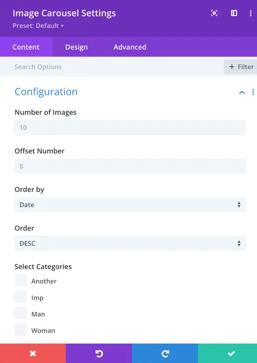
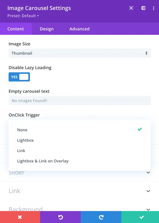
Image Size
Select the size at which the images should be displayed in the carousel. Options include:
Full (original size)
Thumbnail
Medium
Large
Disable lazy loading
Enable or disable lazy loading for carousel images:
Disabled – Loads all images at once, which may affect speed but can avoid loading issues on some setups.
Enabled (default) – Improves performance by loading images as they come into view.
Empty carousel text
Display a custom message if no images are found in the selected categories or filters. This is helpful for dynamic galleries where images might not always be available.
On Click Trigger
Define what happens when a user clicks on a carousel image:
- None – No action.
- Lightbox – Opens the image in a lightbox popup.
- Link – Redirects to a custom link if one is set for the image.
- Lightbox and Link on Overlay – Opens lightbox on image click and displays a link icon overlay that redirects to the link.
Elements settings
These settings control which content elements (like titles and captions) are displayed and where they appear.
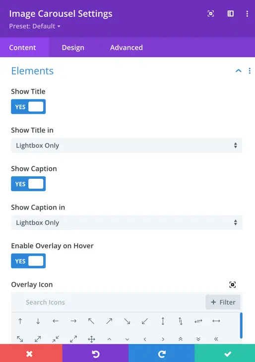
Show title
Toggle On/Off – Enable this to display the image title.
Show Title In
Select where the title should be shown:
Both Gallery and Lightbox – Title will be visible in both gallery and lightbox views.
Lightbox Only – Title will appear only when the image is opened in lightbox.
Gallery – Title appears below or above the image in the gallery.
Overlay – Title appears when hovering over the image.
Show caption
Toggle On/Off – Enable this to display the image caption.
Show caption in
Choose where the caption should appear:
- Lightbox Only
- Gallery
- Overlay
- Both Gallery and Lightbox
Enable overlay on hover
Toggle On/Off – When enabled, an overlay appears when a user hovers over an image.
If enabled, an additional option appears:
Choose overlay icon
Select an icon to display on hover (e.g., magnifying glass, plus icon, etc.)
Slider settings
These settings manage the functionality and behavior of the carousel slider.
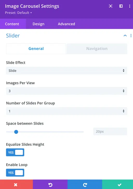
Slide effect
Choose how the slides transition:
- Cube
- Coverflow
- Fade
- Flip
Each option provides a different animation style between images.
Images per view
Set how many images are visible in the carousel at once.
For example, setting it to 3 will show 3 images side by side.
Number of slides per group
Define how many slides should move together when navigation occurs.
Useful for creating grouped slide transitions.
Space between slides
Set the gap (in pixels) between each image/slide in the carousel.
Equalize slides height
Toggle On/Off – Makes all slides the same height based on the tallest image.
Enable loop
Toggle On/Off – When enabled, the carousel loops infinitely.
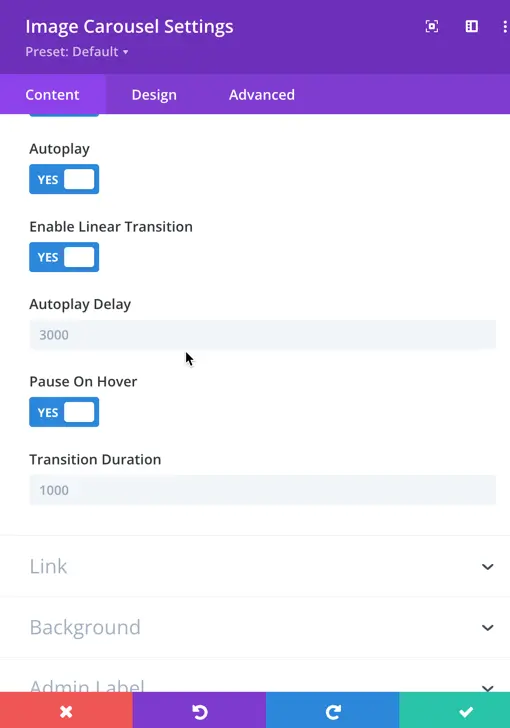
Autoplay
Toggle On/Off – Automatically moves slides after a set interval.
Enable linear transition
Toggle On/Off – Allows smooth, continuous linear scrolling rather than stepped transitions.
Autoplay delay
Set the delay (in milliseconds) between slide transitions.
Example: 3000 = 3 seconds.
Pause on Hover
Toggle On/Off – Pauses autoplay when the user hovers over the carousel.
Transition duration
Set the speed of the slide transition (in milliseconds).
Example: 500 = half a second.
Navigation settings
These settings define how users navigate through the carousel.
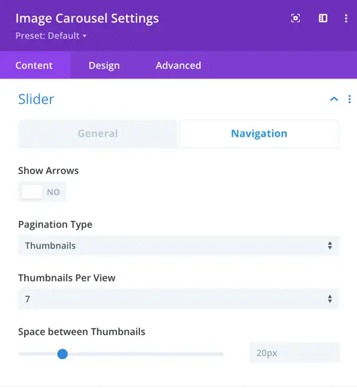
Show arrows
Toggle On/Off – Show next/previous arrows on the carousel for manual navigation.
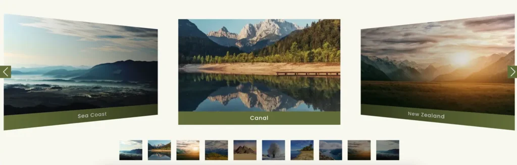
Pagination type
Choose how to indicate and navigate through multiple slides:
- Thumbnails – Small preview images below the carousel.
- Dots – Small circular indicators.
- None – No pagination.
If Thumbnails is selected, the following options appear:
Thumbnails per view
Set how many thumbnails to display at once under the main carousel.
Space between thumbnails
Define the spacing (in pixels) between each thumbnail for better layout control.
Style Customization Settings
These settings allow you to control the appearance of image titles, captions, and the images themselves within the carousel.
Title and caption container
This section allows styling for the box that contains the image title and caption.
Title and caption container padding
Set the internal spacing (padding) inside the title and caption box.
You can define padding for top, bottom, left, and right independently or together.
Title and caption container background
Choose a background color or gradient for the container that holds the title and caption.
This helps improve readability and aesthetic when overlaying text on images.
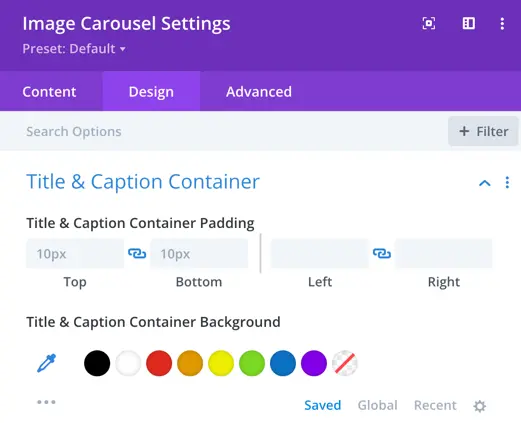
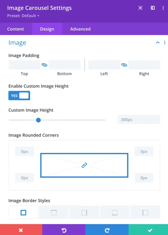
Image Styling
These settings control the layout and visual style of the images themselves.
Image Padding
Set space around the image inside its frame. Helps create spacing between images and other elements in the carousel.
Enable custom image height
Toggle On/Off – When enabled, you can define a fixed height for all images to maintain uniformity.
Custom image height
Set a specific height (in pixels, %, em, etc.) for each image in the carousel.
Example: 300px or 50vh.
Image rounded corners
Define how rounded the image corners should be.
Example values: 0px for sharp corners, 10px for subtle rounding, 50% for circular appearance (if square image).
Image border styles
Customize the border around each image:
- Border Width – Set thickness of the border.
- Border Color – Choose any color for the border.
- Border Style – Choose from
solid,dashed,dotted,double, etc.
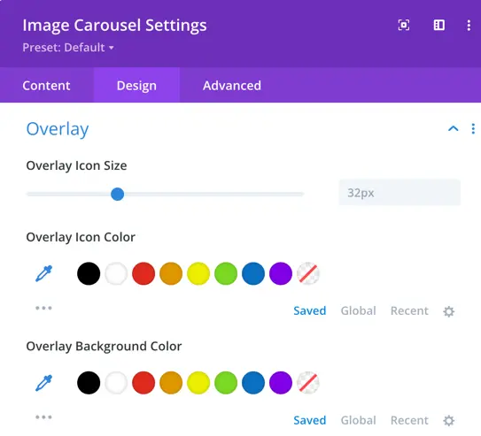
Overlay settings
These settings allow you to customize the appearance of the hover overlay that appears on images.
Overlay icon size
Set the size of the icon that appears when a user hovers over an image (e.g., magnifying glass, link icon).
Overlay icon color
Choose the color of the overlay icon to match your website’s style.
Overlay background color
Select the background color of the overlay that appears when hovering over an image.
Using semi-transparent colors (e.g., rgba(0,0,0,0.5)) can improve readability while keeping the image visible.
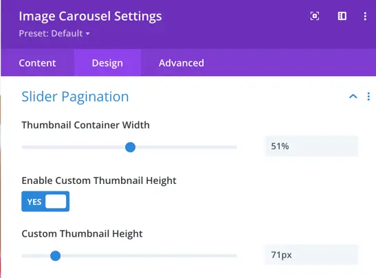
Slider pagination settings (Thumbnails Style)
These options apply when pagination type is set to Thumbnails in the Navigation settings.
Thumbnail container width
Define the total width for the thumbnail navigation section below the carousel. This helps you control layout spacing and alignment on different screen sizes.
Enable custom thumbnail teight
Toggle On/Off – When enabled, you can set a fixed height for each thumbnail to maintain consistency.
Custom thumbnail height
Set a specific height for the thumbnail images.
Example: 80px or 5rem.