Search Divi WooCommerce Extended Documentation
Search for answers or browse our knowledge base.
DWE Woo Products Accordion
Enhance the look of your online shop with the Divi WooCommerce Extended Products Accordion module. This handy feature lets you create attractive accordion-style displays for your WooCommerce products. You can showcase your featured products, items on sale, best sellers, and top-rated items with smooth animations, making your store unique and eye-catching.

Content
Content
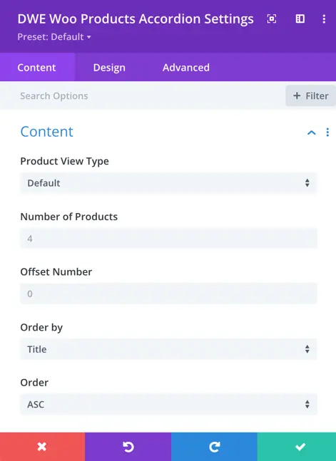
Product View Type: Select the which type of product view you like to display
Number of Products:: Specify the maximum number of products to display in the product view.
Offset Number: Enter the number of products you would like to skip.
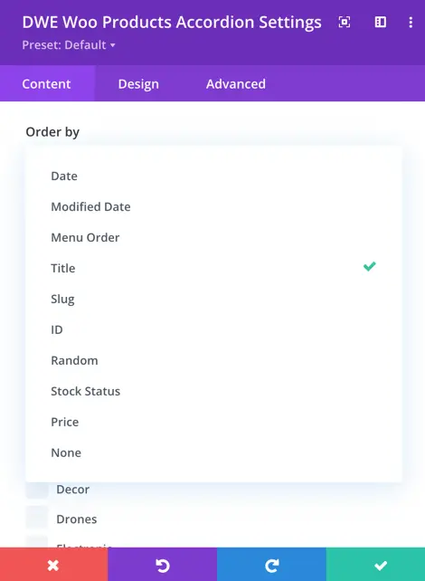
Order by: Choose the criteria for ordering the displayed products, such as date, modified date, menu order, title, slug, ID, random, or stock status.
Order: Define the order in which the products are displayed, either in ascending (Asc) or descending (Desc) order based on the selected criteria.
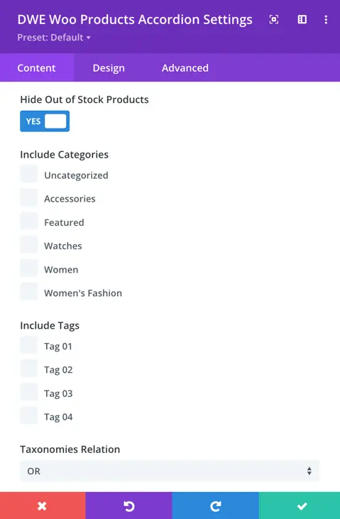
Hide Out of Stock Products: Enable this option to hide products that are out of stock.
Include Categories: Select the categories of products to include in the view.
Include Tags: Choose the tags of products to include in the view.
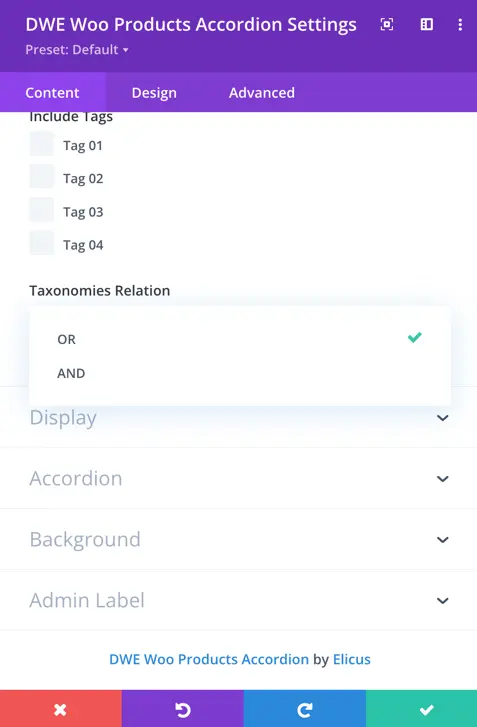
Taxonomies Relation: Specify the relation between categories and tags when both are selected, either ‘or’ (display products from either selected categories or tags) or ‘and’ (display products that belong to both selected categories and tags).
Display
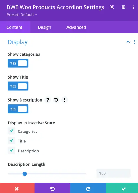
Show Categories: Display the product categories on your page.
Show Title: Display the product title on your page.
Show Description: Display the product description on your page.
Display in Inactive State: Here, you can choose whether to display the title, category, and description in the default state.
Show Rating: Set as yes to display the product rating on your page.
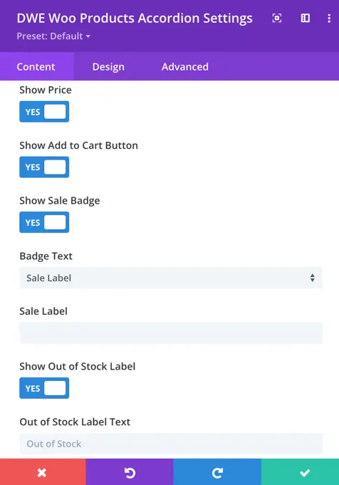
Show Price: Enable this option to display product price on your page.
Show Add to Cart Button: Show the “Add to Cart” button for each product on your page.
Show Sale Badge: Display a badge indicating if a product is on sale on your page.
Badge Text: Choose between displaying a label or the sale percentage on the sale badge on your page.
Show Out of Stock Label: Display a label for out-of-stock products on your page.
Out of Stock Label Text: Enter the text to display for out-of-stock products on your page.
Accordion
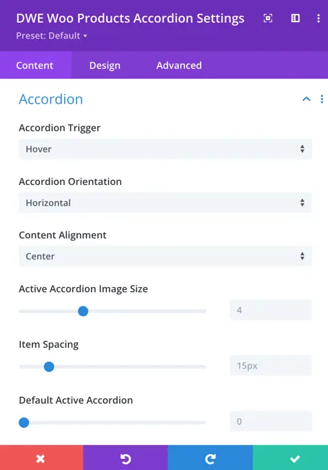
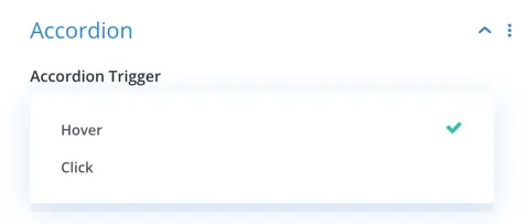
Accordion Trigger: Choose whether the accordion triggers expand when hovered over or clicked on.
Accordion Orientation: Select between horizontal and vertical orientation for the accordion layout.
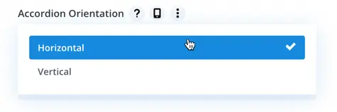
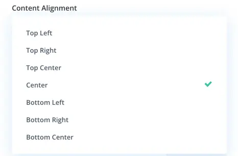
Content Alignment: Align the content within the accordion items to the top left, top right, top center, center, bottom left, bottom right, or bottom center.
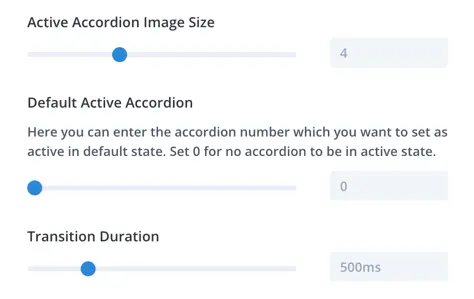
Active Accordion Image Size: Define the size of the image displayed in the active accordion panel.
Default Active Accordion: Set the default accordion to be active on page load.
Transition Duration: Adjust the duration of the transition effect when expanding or collapsing accordion panels.
Design
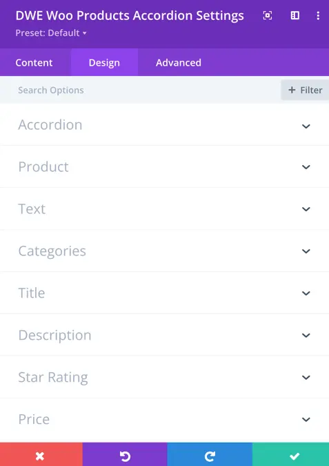
Customize the appearance of various elements within the accordion, including product details, text, categories, title, description, star rating, and price.
Accordion
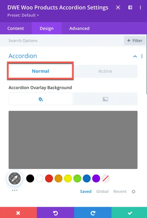
- Accordion Overlay Background (Normal State): Choose the background style for the accordion overlay in its normal state. Options include color and gradient.
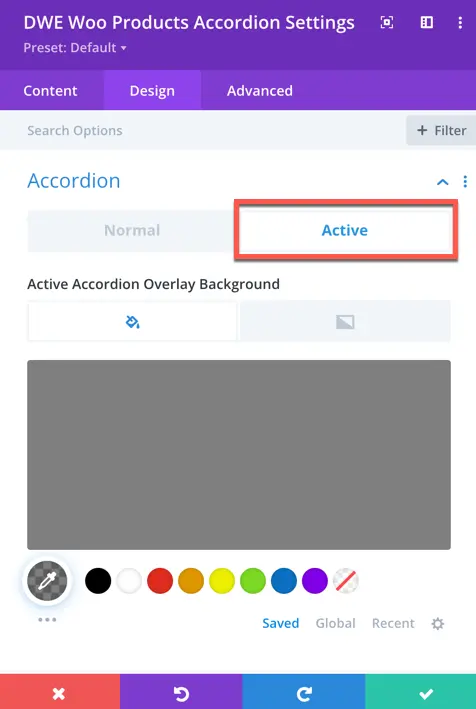
- Accordion Overlay Background (Active State): Select the background style for the accordion overlay when it’s in the active state. Options include color and gradient.
Product
Product Padding: Set the padding within each product.
Rounded Corners: Customize the rounded corners of the product box.
Border Styles: Choose the style of the border surrounding the product.
Border Width: Define the thickness of the border.
Border Color: Select the color of the border.
Border Style: Specify the style of the border.
Product Box Shadow: Apply a shadow effect to the product box for depth and dimension.
Text
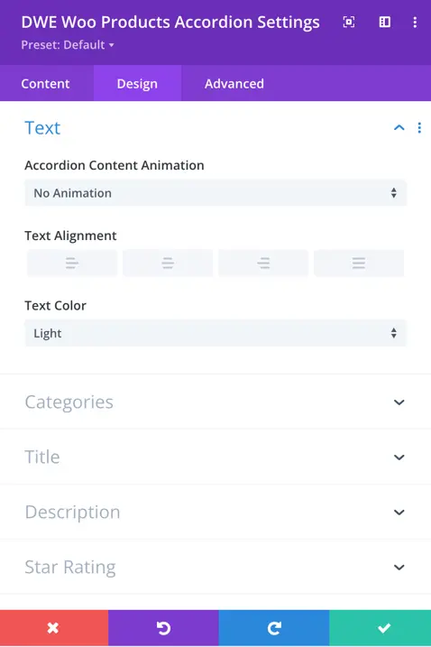
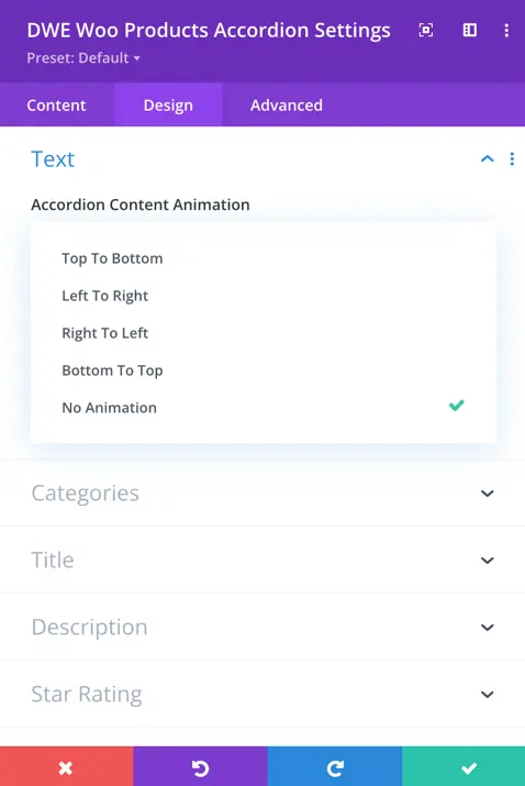
Accordion Content Animation: Choose the animation direction for the accordion content.
Text Alignment: Set the alignment of the text within the accordion.
Text Color: Select between light and dark text color options.
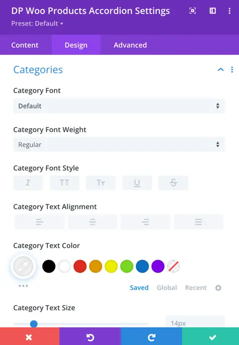
Categories
Customize the category font, including font weight, style, text alignment, and color.
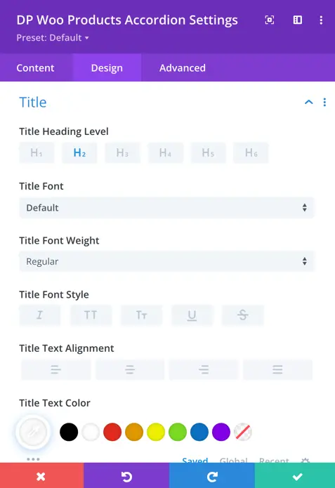
Title
Set the title heading level and customize font properties such as style, alignment, color, size, length, spacing, and text shadow.
Description
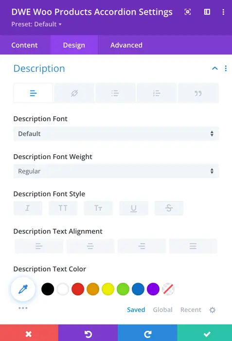
Description Font
Style the description text with options for font, weight, alignment, text color, letter spacing, line height, and text shadow.
Description Link
Customize the link font properties including font, weight, alignment, text color, letter spacing, line height, and text shadow.
Description Unordered List Font
Customize the font properties of unordered lists within the description, including font, weight, alignment, text color, letter spacing, line height, and text shadow.
Description Ordered List Font
Adjust the font properties of ordered lists within the description, such as font, weight, alignment, text color, letter spacing, line height, and text shadow.
Description Blockquote Font
Customize the font properties of blockquotes within the description, including font, weight, alignment, text color, letter spacing, line height, and text shadow.
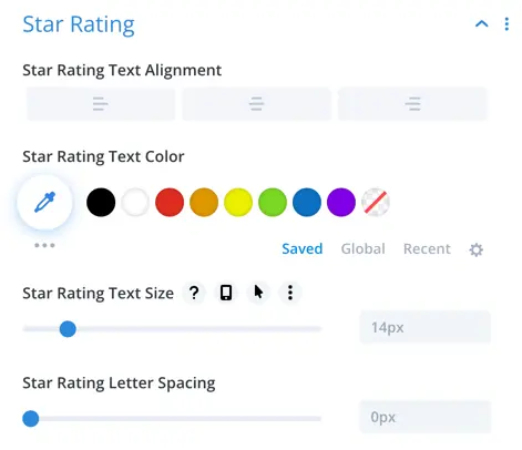
Star Rating
Adjust the styling of star ratings, including size, color, spacing, and alignment.
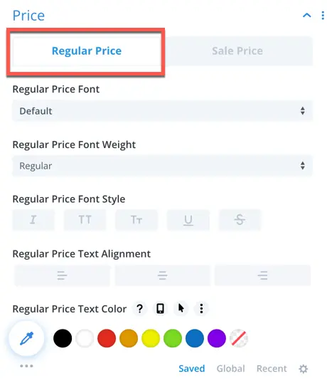
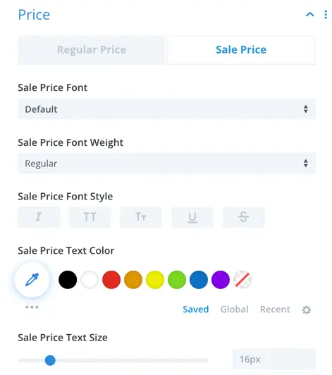
Price
Customize the appearance of regular and sale prices, including font style, size, color, alignment, and text decoration.
Sale Badge
Adjust the style of the sale badge, including text color, background color, border width, color and style.
Out of Stock
Customize the out-of-stock label’s appearance, including text color, background color, border radius, padding, and margin.
Add to cart button
Style the add-to-cart button with options for text color, background color, border radius, padding, margin, font size, font weight, alignment, and more.
