Search Divi WooCommerce Extended Documentation
Search for answers or browse our knowledge base.
DWE Woo Product Gallery
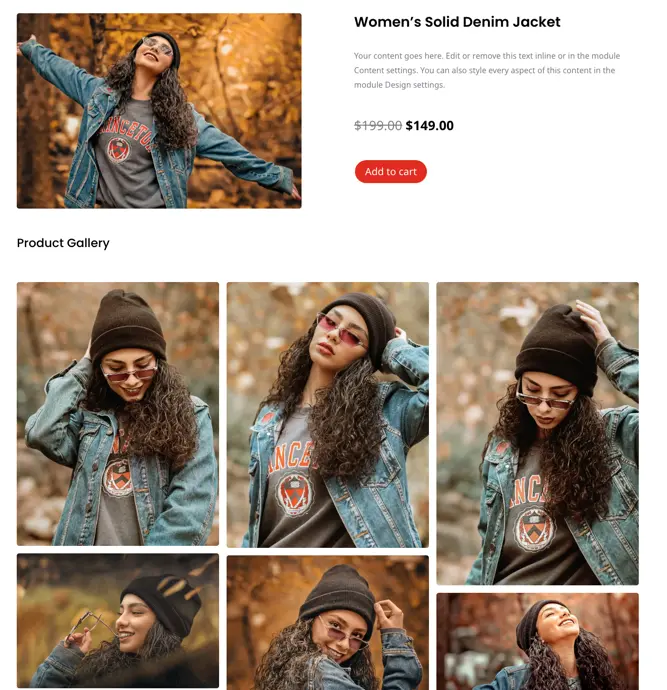
Easily enhance your WooCommerce product showcases with the DWE Woo Product Gallery module. With simple customization options, create stunning galleries tailored to your preferences, offering up to 10 columns and a range of stylish designs.
Content
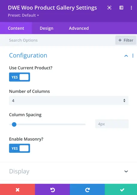
Configuration
- Use Current Product: Here you can choose to display current product gallery or else select the product.
- Number of Columns: Specify the number of columns for displaying products.
- Column Spacing: Adjust the spacing between columns.
- Enable Masonry: Toggle to enable or disable the masonry layout for products.
Display
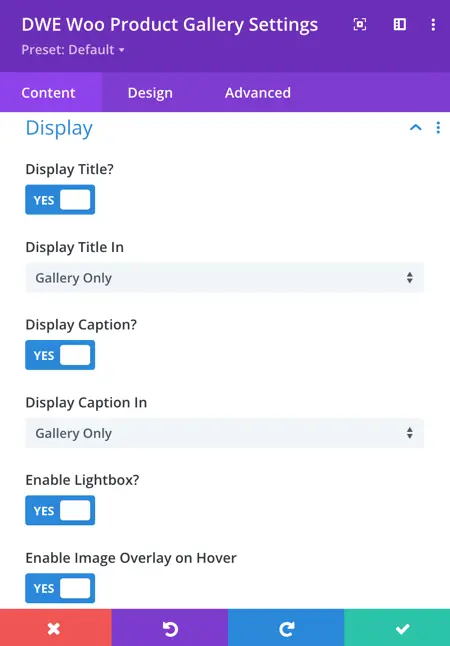
Enable Title: Toggle to enable or disable the display of the title.
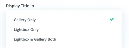
Display Title In:
- Gallery Only: Display the title only in the gallery.
- Lightbox Only: Display the title only in the lightbox.
- Lightbox and Gallery: Display the title in both the lightbox and the gallery.
Display Caption:
- Enable Caption: Toggle to enable or disable the display of the caption.
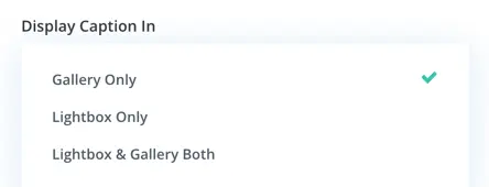
Display Caption In:
- Gallery Only: Display the caption only in the gallery.
- Lightbox Only: Display the caption only in the lightbox.
- Lightbox and Gallery: Display the caption in both the lightbox and the gallery.
Enable Lightbox: Toggle to enable or disable the lightbox feature.
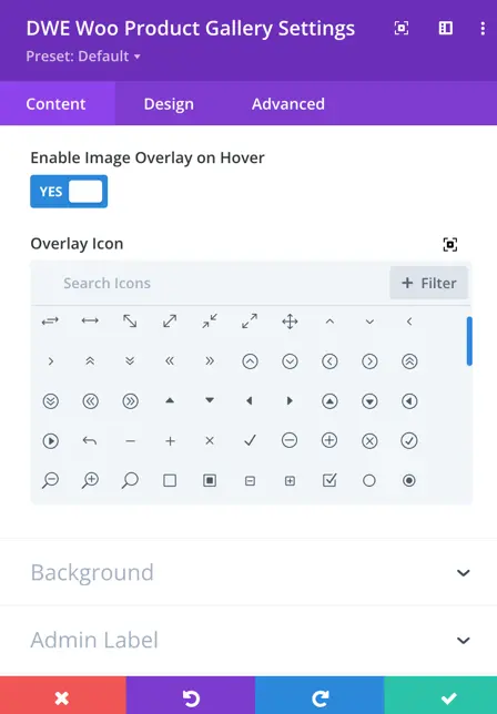
Enable Image Overlay On Hover: Toggle to enable or disable the image overlay effect.
Overlay Icon: Select the icon to use for the overlay.
Design
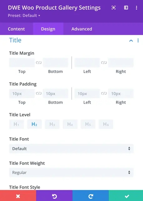
Title
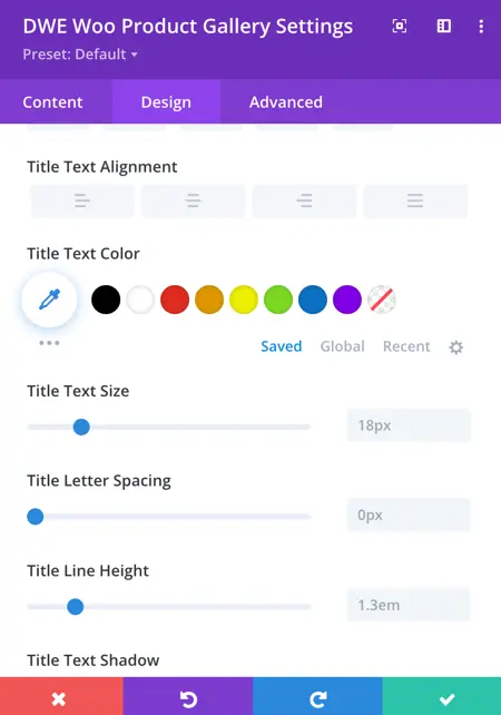
In the customization options for the product title, you can adjust the margin and padding around the title. You can also specify the HTML heading level for the title and choose the font style for the title text, including font style, alignment, color, text size, line height, letter spacing, and text shadow.
Caption
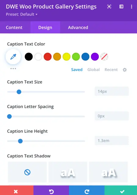
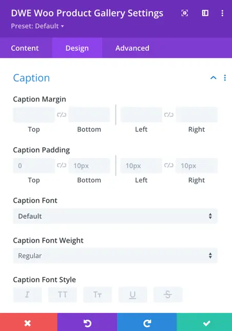
For the product caption, you have style options available. These include caption margin, padding, and font styling such as font type, style, alignment, size, letter spacing, and text shadow.
Gallery Item
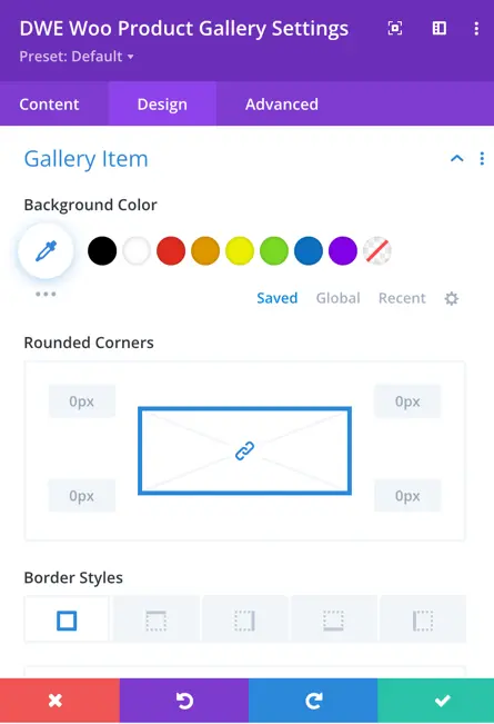
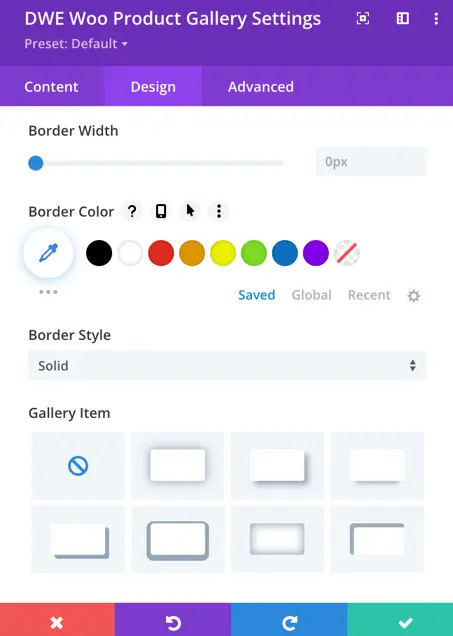
- Background Color: You can adjust the background color of each gallery item to match your design scheme.
- Rounded Corners: Define the roundness of the corners for each gallery item according to your preference.
- Border Styles: Choose from various styles for the border of each gallery item to enhance its appearance.
- Border Width: Specify the width of the border surrounding each gallery item based on your design needs.
- Border Color: Set the color of the border surrounding each gallery item to complement your overall design.
- Border Style: Choose the style of the border surrounding each gallery item that suits your aesthetic preferences.
- Gallery Item Shadow: Customize the shadow effect for each gallery item to add depth and dimension to your gallery display.
Lightbox
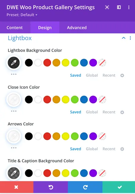
- Lightbox Background Color: Define the background color of the lightbox overlay.
- Close Icon Color: Choose the color of the close icon displayed in the lightbox.
- Arrows Color: Customize the color of the arrows used for navigation within the lightbox to match your design theme.
- Title & Caption Background Color: Set the background color for the title and caption displayed in the lightbox for better readability and visual consistency.
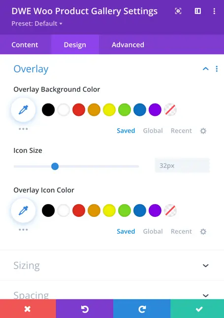
Overlay
- Overlay Background Color: Adjust the background color of the overlay that appears when hovering over gallery items.
- Icon Size: Specify the size of the overlay icon.
- Overlay Icon Color: Here you can customize the color of the overlay icon to make it stand out or blend in seamlessly with the background color.
