Search Divi WooCommerce Extended Documentation
Search for answers or browse our knowledge base.
DWE Mini Cart
How to Add Mini Cart to Your WooCommerce Website
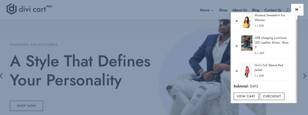
Mini Cart Module
You can insert the module anywhere on the site you want.
To use the module with Default Divi Header or Divi Custom Header move to the specific document by clicking on the below links:
Mini Cart in default Divi Header
Mini Cart in custom Divi Header
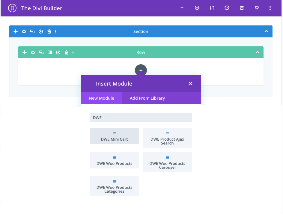
To use the module except header part, insert the DWE Mini Cart module on the page like the any other module you add in Divi and customize it further as per your need.
Content Tab
Mini Cart
Mini Cart Icon Type: In this, you have 2 icon type options Divi’s Native icon and another one is custom.
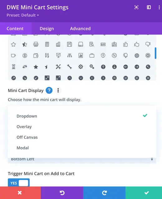
Mini Cart Display: Here you get four options for how you want to display mini cart.
- Dropdown
- Overlay
- Off Canvas
- Modal
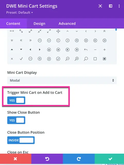
Trigger Mini Cart on Add to Cart: By enabling this setting you can trigger the mini cart when a product is added to the cart.
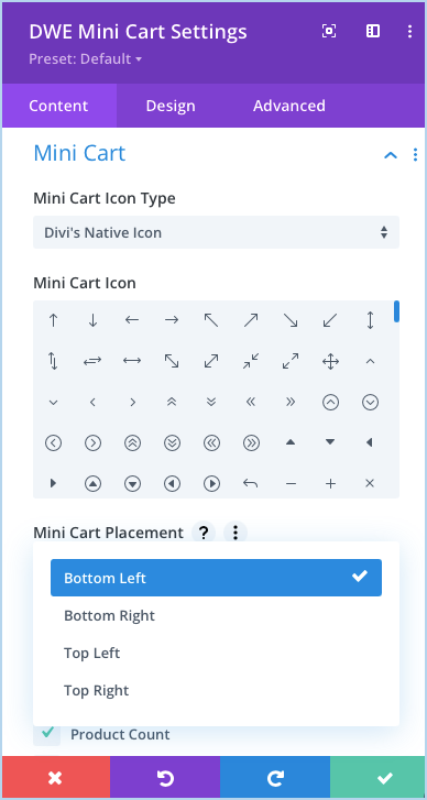
Mini Cart Placement: Here you can choose whether the mini cart should open. 4 options are listed here that is Bottom Left, Bottom Right, Top Left, and Top Right.
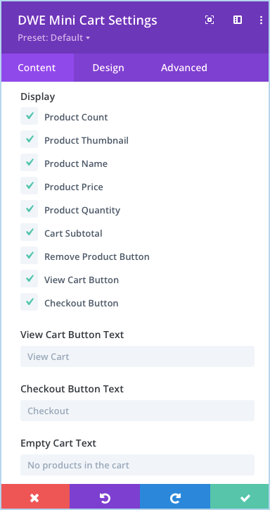
Display: Here we can choose the element you want to display in the mini cart. Customization of the element can be done in the design tab. These elements are:
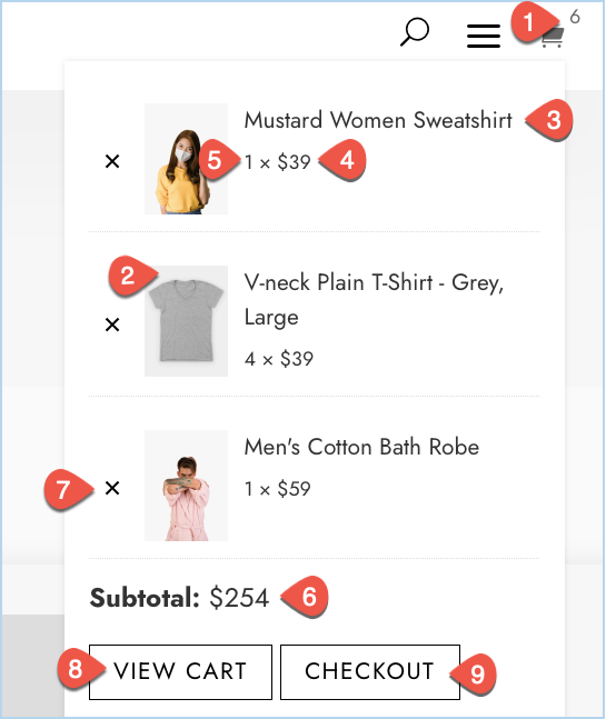
- Product Count
- Product Thumbnail
- Product Name
- Product Price
- Product Quantity
- Cart Subtotal
- Remove Product Button
- View Cart Button
- Checkout Button
View Cart Button Text: Here you can input the text for View Cart Button.
Checkout Button Text: Here you can input the text to be used for Checkout Button Text.
Empty Cart Text: Input the text for Empty Cart text here.
Design Options
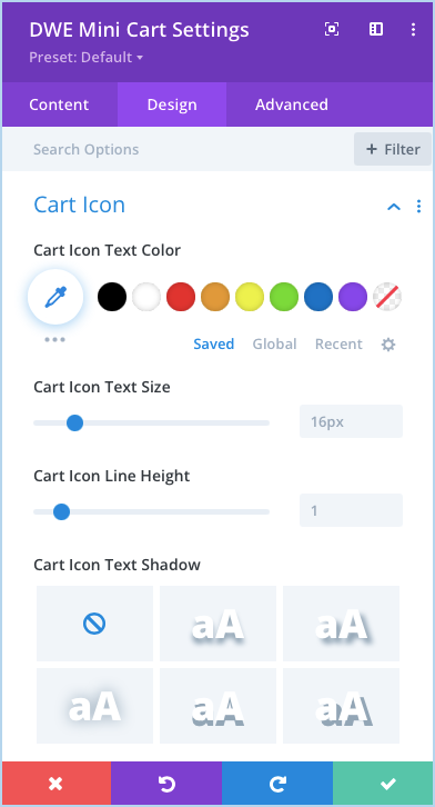
Cart Icon: Here you can perform all the customization associated with the cart icons like icon color, size, height, and shadow.
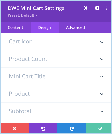
Same as the Cart Icon you can customize Product Count, Mini Cart Title, Product, and Subtotal elements all the design options available under the Design tab of the module setting.
View Cart Button
How to style View Cart Button: Go to Design tab >> View Cart Button >> enable the setting Use Custom Styles For View Cart Button.
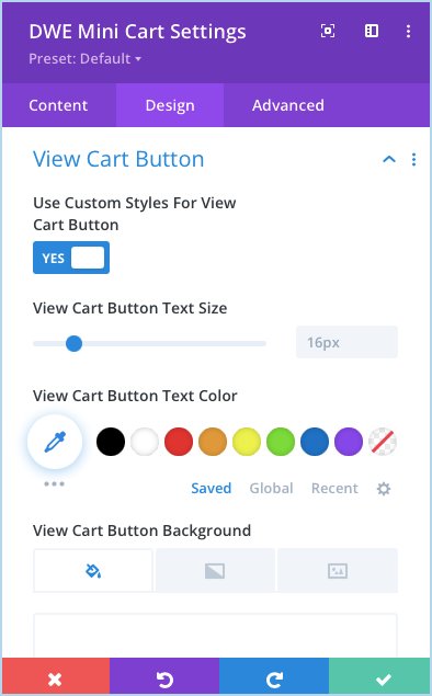
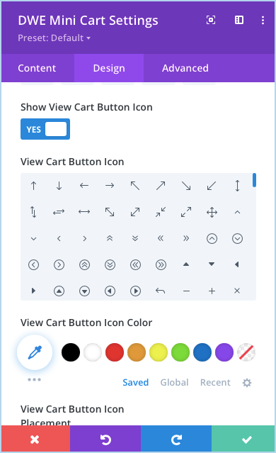
After enabling the option you can customize the button text size, color, background, button border color, radius, letter spacing, button font, weight style, also can show icons with the button.
How to use the icon with View Cart Button: Go to Design tab >> View Cart Button >> enable the setting Show View Cart Button Icon
Checkout Button Icon
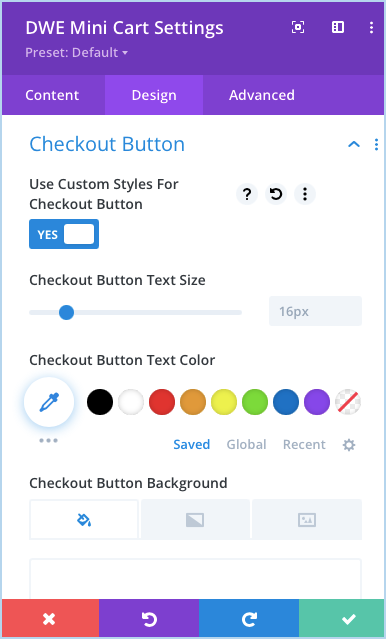
To style the Checkout Button Icon go to module setting >> Design Tab >> Checkout Button >> Enable the Use Custom Styles For Checkout Button.
Here you can perform all the styles options related to Checkout Button.
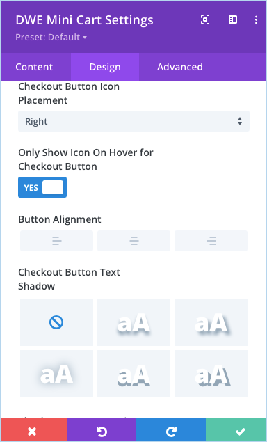
Show Icon On Hover: If you want to display the icon only on hover, enable the Only Show Icon On Hover for Checkout Button
