
Search Headers for Divi Documentation
Search for answers or browse our knowledge base.
Header 21: How to fix layout issues on WooCommerce product pages
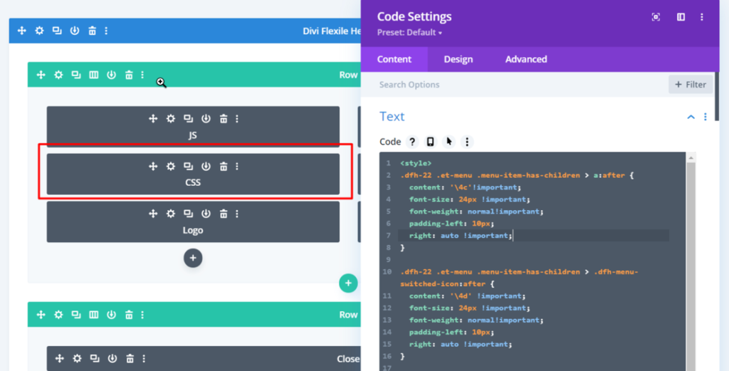
Edit the header and replace the code in the “CSS” code module with the given below code. Please see the screenshot for reference.
<style>
.dfh-21 .et-menu .menu-item-has-children > a:after {
  content: '\4c'!important;
  font-size: 24px !important;
  font-weight: normal!important;
  padding-left: 10px;
  right: auto !important;
}

.dfh-21 .et-menu .menu-item-has-children > .dfh-menu-switched-icon:after {
  content: '\4d' !important;
  font-size: 24px !important;
  font-weight: normal!important;
  padding-left: 10px;
  right: auto !important;
}

.dfh-21 .et-menu .menu-item-has-children > a {
  position: relative;
}

.dfh-21 .et-menu .menu-item-has-children .sub-menu li {
  display: none !important;
}

.dfh-21 .et-menu .menu-item-has-children .sub-menu .dfh-show-menu-items {
  display: block !important;
}

.dfh-21 .et_pb_menu__menu {
  display: block !important;
}

.dfh-21 .et_mobile_nav_menu {
  display: none !important;
}

.dfh-21 .et-menu-nav .et-menu {
  align-items: center !important;
  flex-direction: column;
}

.dfh-21 .et-menu > li {
  display: flex;
  flex-direction: column;
  margin-top: 15px !important;
}

.dfh-21 .sub-menu {
  border-top: 0 !important;
  box-shadow: none !important;
  display: flex;
  flex-direction: column;
  left: 0 !important;
  opacity: 1 !important;
  padding: 0 !important;
  position: relative !important;
  top: 4px !important;
  visibility: visible !important;
  width: auto !important;
}

.dfh-21 .et-menu li li a {
  font-size: 20px !important;
  font-weight: 600 !important;
  padding: 0 0 16px 0 !important;
  text-align: center;
  width: auto !important;
}

.dfh-21-menu-row {
  overflow: auto;
  scrollbar-width: none;
  transform: translateY(-100%);
  transition: all 1s ease;
}

.dfh-21-menu-row::-webkit-scrollbar {
  display: none;
}

.dfh-21-menu-row .et_pb_column {
  align-items: center;
  display: flex;
  min-height: 100vh !important;
}

.dfh-21-menu-row.dfh-21-menu {
  transform: translateY(0);
  transition: all 1s ease;
}

.dfh-21-hamburger-icon,
.dfh-21-close-icon {
  cursor: pointer;
}

.dfh-21-hamburger-icon {
  display: inline-block;
  float: right;
}

.dfh-21-hamburger-icon .et_pb_main_blurb_image,
.dfh-21-close-icon .et_pb_main_blurb_image {
  margin-bottom: 0 !important;
}

.dfh-21 .et-menu li li.menu-item-has-children>a:first-child:after {
  top: 0;
}

@media screen and (max-width: 980px) {
.dfh-21 .et-menu li li a {
  font-size: 18px !important;
}

.dfh-21 .et-menu .menu-item-has-children > a:after {
  font-size: 18px !important;
}

.dfh-21 .et-menu .menu-item-has-children > .dfh-menu-switched-icon:after {
  font-size: 18px !important;
}
}
</style>