
Search Headers for Divi Documentation
Search for answers or browse our knowledge base.
Header 14: Fix layout issues on WooCommerce product pages
If you are using WooCommerce with Flexile header 14, and have issues with formatting, it is because the CSS of the Flexile header pack is being overridden by WooCommerce. In this case, we add our CSS with higher priority to overcome this situation.
Edit the header and replace the code in the “CSS for color codes” code module and “Code” code module with the given below code. Please see the screenshot for reference.
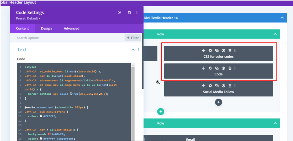
CSS for color codes
<style>
.dfh-14 .et_mobile_menu li:not(:last-child) a,
.dfh-14 .nav li li:not(:last-child),
.dfh-14 .et-menu-nav li.mega-menu>ul>li>a:first-child,
.dfh-14 .et-menu-nav li.mega-menu ul li ul li:not(:last-child) a {
  border-bottom: 1px solid rgb(255,255,255,0.2);
}
@media screen and (min-width: 981px) {
.dfh-14 .sub-menu:before {
  color: #FFFFFF;
}
.dfh-14 .nav > li:last-child a {
  background: #E02B20;
  color: #FFFFFF !important;
}
.et-db #et-boc .et-l .dfh-14.et_pb_menu .nav > li:last-child a:hover {
  background: #FFFFFF;
  color: #E02B20 !important;
}
}
</style>
Code
<script>
(function($) {
	function dfh_collapse_menu() {
		var ParentMenuItem = $('.dfh-14 .et_mobile_menu .menu-item-has-children > a');
		ParentMenuItem.off('click').click(function() {
			$(this).attr('href', '#/');
			$(this).parent().children().children().toggleClass('dfh-show-menu-items');
			$(this).toggleClass('dfh-menu-switched-icon');
		});
	}
	$(window).load(function() {
		setTimeout(function() {
			dfh_collapse_menu();
		}, 700);
	});
})(jQuery);
</script>
<style>
.dfh-14 .et_mobile_menu .menu-item-has-children > a:after {
  content: '\50';
  display: block !important;
	font-family: 'ETmodules';
	font-size: 16px;
	font-weight: normal;
	position: absolute;
	right: 10px;
	top: 13px;
}
.dfh-14 .et_mobile_menu .menu-item-has-children > .dfh-menu-switched-icon:after {
	content: '\4f';
}
.dfh-14 .et_mobile_menu .menu-item-has-children > a {
	position: relative;
}
.dfh-14 .et_mobile_menu .menu-item-has-children .sub-menu li {
	display: none;
}
.dfh-14 .et_mobile_menu .menu-item-has-children .sub-menu .dfh-show-menu-items {
	display: block;
}
.dfh-14 .et_pb_menu__wrap {
  max-width: 75%;
}
.dfh-14 .nav li {
  margin-top: 0 !important;
}
.dfh-14 .nav li li {
  padding: 0 !important;
}
.dfh-14 .et-menu .menu-item-has-children>a:first-child:after {
  top: 30px !important;
}
.dfh-14 .et_pb_menu .et_mobile_menu,
.dfh-14 .et_mobile_menu {
  padding: 0;
  border-width: 2px;
	border-radius: 5px;
}
.dfh-14 .et_pb_menu .et_mobile_menu a,
.dfh-14 .et_mobile_menu a {
  padding: 12px 20px;
}
.dfh-14.et_pb_menu .et-menu-nav li.mega-menu ul.sub-menu {
  border-width: 2px;
  border-radius: 5px;
  padding: 10px 20px;
  width: 100%;
}
.dfh-14 .nav li.mega-menu li {
  border-bottom: none;
}
.dfh-14.et_pb_menu .et-menu-nav li.mega-menu ul.sub-menu a {
  padding: 12px 0 !important;
}
@media screen and (min-width: 981px) {
.dfh-14 .et-menu > .menu-item-has-children > .sub-menu:before {
  font-family: ETmodules;
  content: '\42';
  position: absolute;
  right: 20px;
  top: -17px;
  font-size: 30px;
}
.dfh-14 .et-menu > .menu-item-has-children.mega-menu > .sub-menu:before {
  content: '';
}
.dfh-14 .et-menu .sub-menu .menu-item-has-children>a:first-child:after {
  content: "\35" !important;
  top: 10px !important;
  right: 10px !important;
}
.et-db #et-boc .et-l .dfh-14.et_pb_menu .et-menu-nav li ul.sub-menu li ul.sub-menu {
  left: 200px !important;
  top: 0;
}
.dfh-14.et_pb_menu .et-menu-nav li.mega-menu ul.sub-menu li ul.sub-menu {
  left: 0 !important;
  padding: 0;
}
.dfh-14 .nav > li:last-child {
  position: absolute !important;
  right: 0;
  padding-right: 0 !important;
  max-width: 25%;
}
.dfh-14 .nav > li:last-child a {
  padding: 30px 50px !important;
  border-radius: 0 5px 5px 0;
  font-size: 20px !important;
}
.dfh-14 .nav > li:last-child a:hover {
  opacity: 1 !important;
}
}
</style>