Search Divi Cart Pro Documentation
Search for answers or browse our knowledge base.
DCP Woo Products
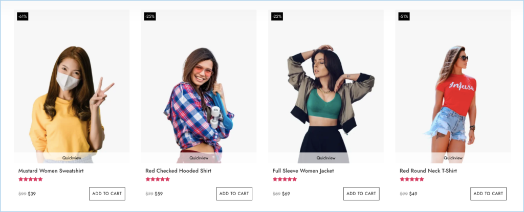
Content Options
Content
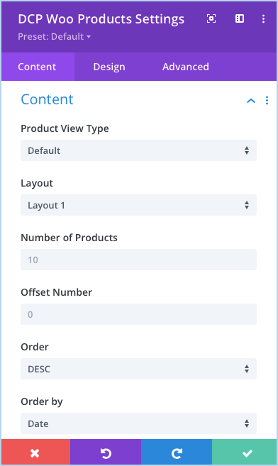
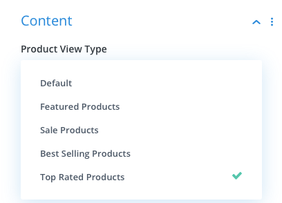
- Product View Type: This setting under the content option allows you to display product according to type of product. It gives 5 options including default.
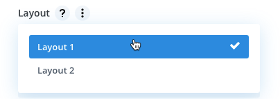
2. Layout: Here you can select a layout type for displaying product from two given options.
3. Offset Number: Using this setting you can define how many number of products you would like to skip to display.
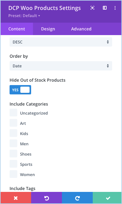
4. Hide Out of Stock Products: To hide out of stock products set as YES.
5. Include Categories: Tick the checkboxes next to the categories you want to include. (If you leave all categories unchecked, it will display products from all the categories.)
6. Include Tags: Select the tags and product associated with those tags will be display. If you will not select any one it will display all products.
7. Taxonomies Relation: Here you can define relation(OR, AND) between taxonomies.
Display
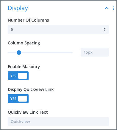
1. Select Number of Columns for WooCommerce Products: Go to the Display settings >> Number Of Columns >> select your preferred number of columns up to 6.
2. Adjust product columns space: Go to the Content tab >> Display settings >> Column Spacing >> move the slider or input the value.
3. How to display products in Masonry Format: Go to the Display settings >> Enable Masonry >> check as YES.
4. Display Quickview Link: To show the quickview link of product set this option as YES.
5. Quickview Link Text: Here you can define the text for Quickview link.
6. Show Thumbnail: Using this you can control thumbnail should be visible or not.
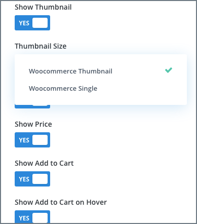
7. Thumbnail Size: Here you can define the size of product image it can be either WooCommerce Thumbnail or WooCommerce Single.
8. Show Star Rating: If you want to show star rating set as YES.
9. Hide Price: Go to the Display settings >> Show Price >> check as NO.
10. Hide Add to Cart: Go to the Display settings >> Show Add to Cart >> check as NO.
11. How to display Add to Cart on Hover: Go to the Display settings >> Show Add to Cart >> check as YES >> Show Add to Cart on Hover >> YES.
12. Simple Product Add to Cart Text: Define Add to Cart button text here for Simple Product.
13. Variable Product Add to Cart Text: Define Add to Cart button text here for Variable Product.
14. Grouped Product Add to Cart Text: Here you can specify Add to Cart button text for Grouped Product.
15. External Product Add to Cart Text: Specify Add to Cart button text for External Product.
16. Out of Stock/Unpurchaseable Add to Cart Text: Write Add to Cart button text for Out of Stock or Unpurchaseable product.
17. Hide Sale Badge: Go to the Display settings >> Show Sale Badge >> check as NO.
18. How to change Sale Badge text into “%” sign: Go to the Display settings >> Badge Text >> Select >> Sale Percentage.
19. How to style products background: Inside the Content tab >> Background >> Product Background >> apply customizations as required.
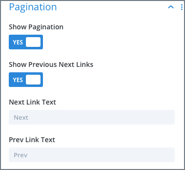
Pagination
Show Pagination: To show pagination set as YES.
Show Previous Next Link: To show Previous Next link set YES.
Design Options
- How to customize Title text of the products: Go to the Design >> Title >> Apply changes as required.
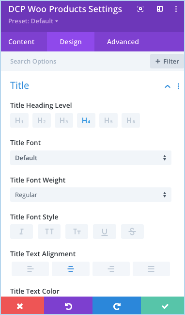
- How to customize Price text: Go to the Design tab >> Price >> Apply text customizations as required.
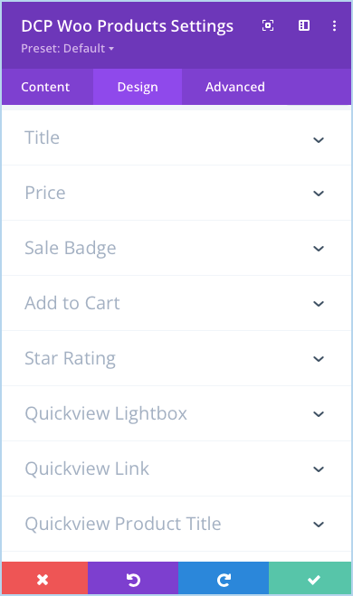
- Customize Sale Badge text and background color: Go to the Design tab >> Sale Badge >> Apply customizations as required.
- Customize Add to Cart text and background: Go to the Design tab >> Add to Cart >> Apply customizations as required.
- Customize Star Rating: Go to the Design tab >> Star Rating >> Apply customizations as required.
- Customize Pagination link: Go to the Design tab >> Pagination >> Apply customizations as required.
- Customize Quickview Lightbox: Go to the Design tab >> Quickview Lightbox >> Apply customizations as required.
- Customize Quickview Link: Go to the Design tab >> Quickview Link >> Apply customizations as required.
- Customize Quickview Product Title: Go to the Design tab >> Quickview Product Title >> Apply customizations as required.
- Customize Product Price: Go to the Design tab >> Quickview Product Price >> Apply customizations as required.
- Customize Quickview Product Description: Go to the Design tab >> Quickview Product Description >> Apply customizations as required.
- Customize Quickview Product Quantity: Go to the Design tab >> Quickview Product Quantity >> Apply customizations as required.
- Customize Quickview Add to Cart: Go to the Design tab >> Quickview Add to Cart >> Apply customizations as required.
- Customize Quickview Product Meta: Go to the Design tab >> Quickview Product Meta >> Apply customizations as required.
- Customize Quickview Product Attributes: Go to the Design tab >> Quickview Product Attributes >> Apply customizations as required.
- Customize Loader Icon Text: Go to the Design tab >> Loader>> Apply customizations as required.
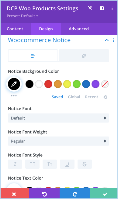
- Customize WooCommerce Notice: Go to the Design tab >> WooCommerce Notice >> Apply customizations as required.
- Adjust Product’s Content Padding: Go to the Design tab >> Spacing >> Product Content Padding >> Apply the padding as required.
- Adjust Product’s Image Padding: Go to the Design tab >> Spacing >> Product Image Padding >> Apply the padding as required.
- Add Rounded Corners to Products: Go to the Border settings >> Product Rounded Corners >> Make changes as required.
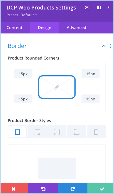
- Add Borders to Products: Go to the Border settings >> Product Border Styles >> Make the changes as required.
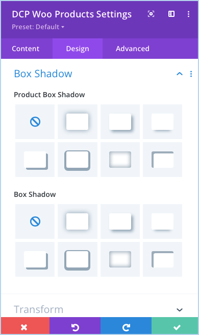
- Add Box Shadow to Products: Go to the Box Shadow settings >> Product Box Shadow >> select any box shadow from available options.
