Search Divi Cart Pro Documentation
Search for answers or browse our knowledge base.
DCP Mini Cart
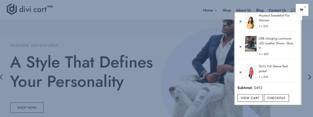
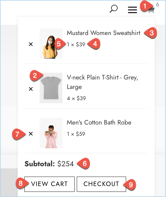
DCP Mini Cart module gives you a quick view of the cart. When you click on the cart icon a mini cart window is open with the option VIEW CART & CHECKOUT.
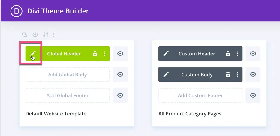
How to enable DCP Mini Cart module with the Default Divi Header
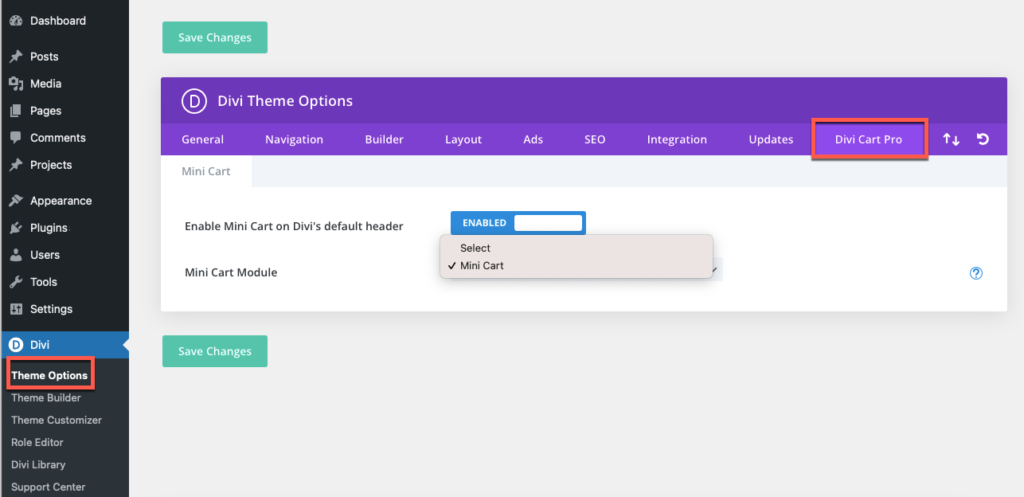
To use the mini cart with Default Divi Header you need to enable the Mini cart on Divi’s default header under Divi Theme Options.
Follow the below steps to do this:
Go to WordPress Dashboard >> Divi >> Divi Theme Options
Here you will find a new tab named Divi Cart Pro. Under this tab, you have two options.
- Enable Mini Cart on Divi’s default header: As you enabled this option another setting will appear name Mini Cart Module.
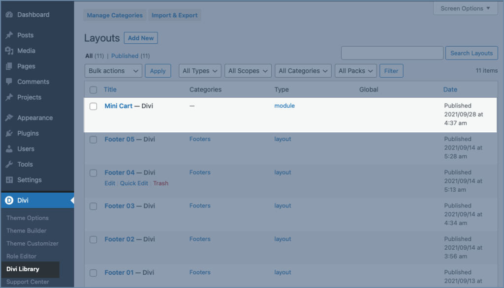
2. Mini Cart Module: There should be at least one Divi Library layout of type module with Mini Cart module in it.
To select the module you need to first create a Divi Library Layout of module type and need to take mini cart module in this.
To make a library layout Move to site Dashboard >> Divi >> Divi Library >> Add New >> A window will pop up.
Layout Name: Fill the layout name in this setting.
Layout Type: The layout type must be module.
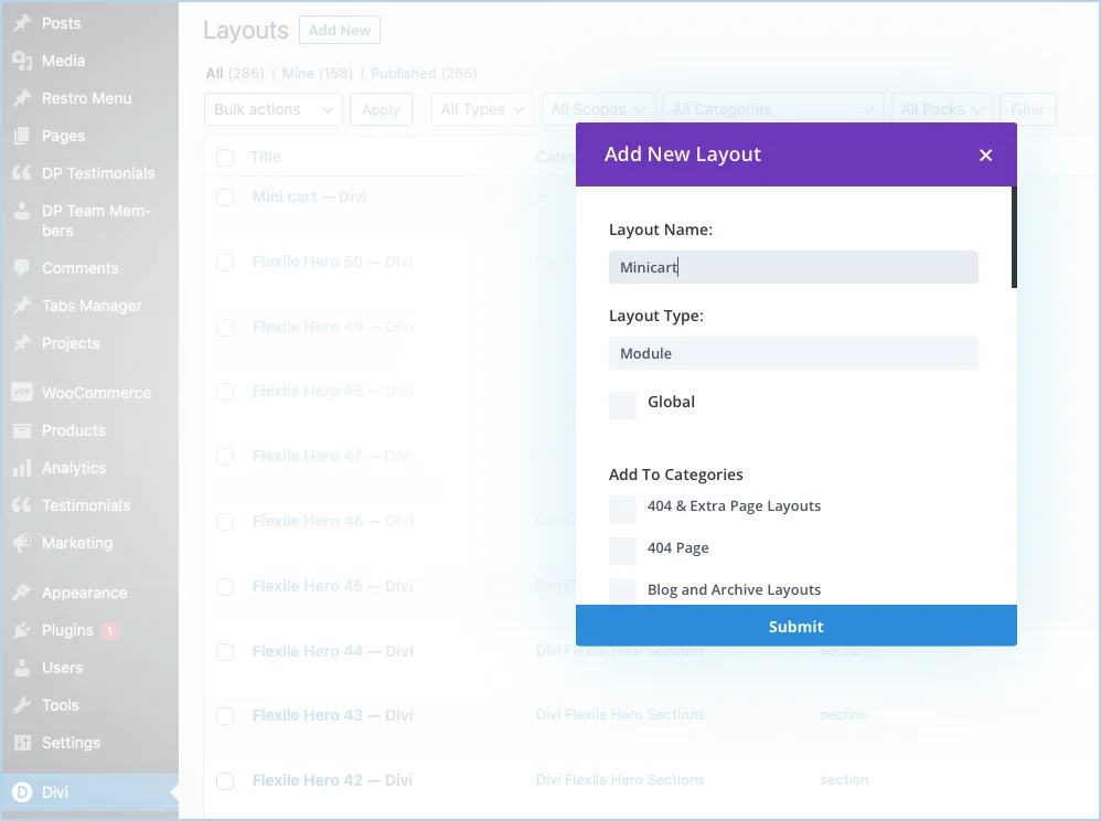
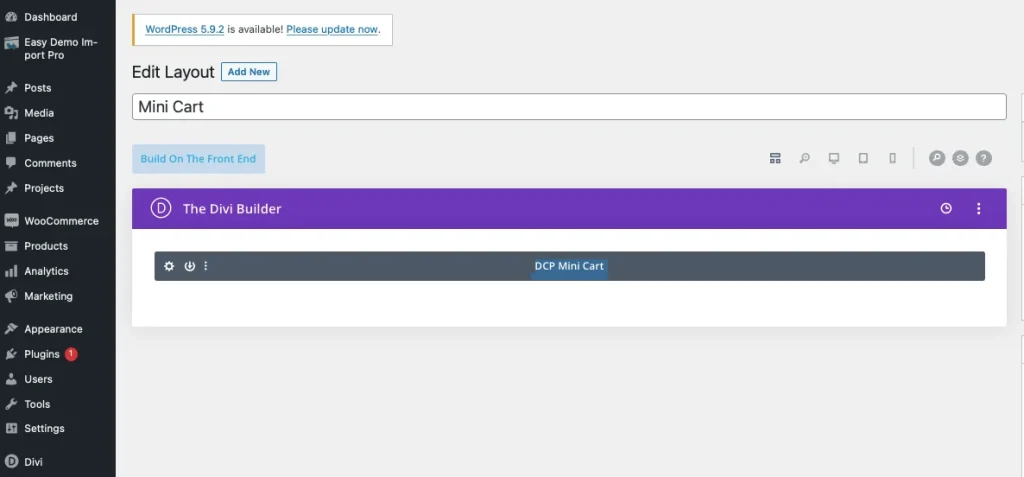
After clicking on the submit button you have a Divi builder window where you can edit the layout you have created. Take the module DCP Mini Cart under this. Here you can customize the mini cart as per your site requirement like you can change the cart icon, color, etc.
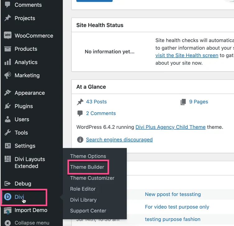
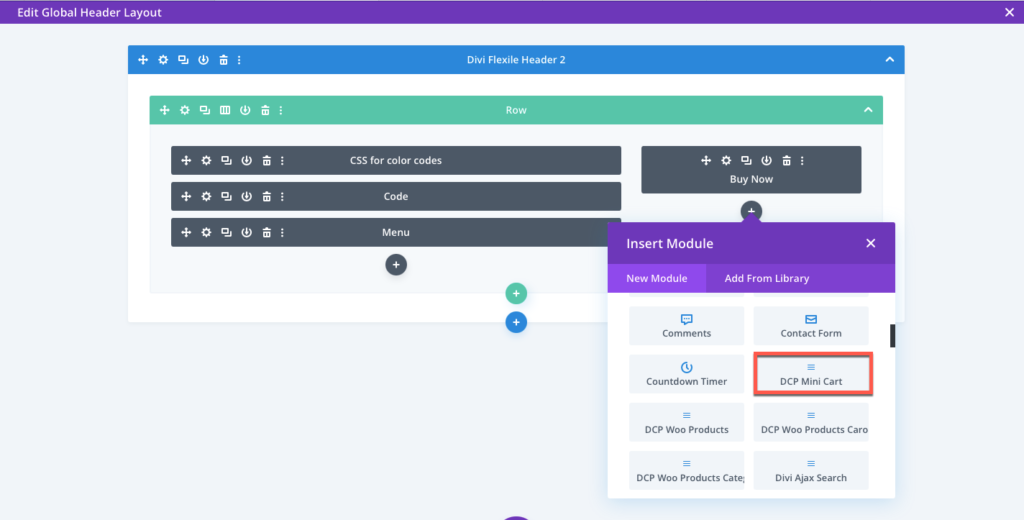
How to enable DCP Mini Cart module with the Custom Divi Headers
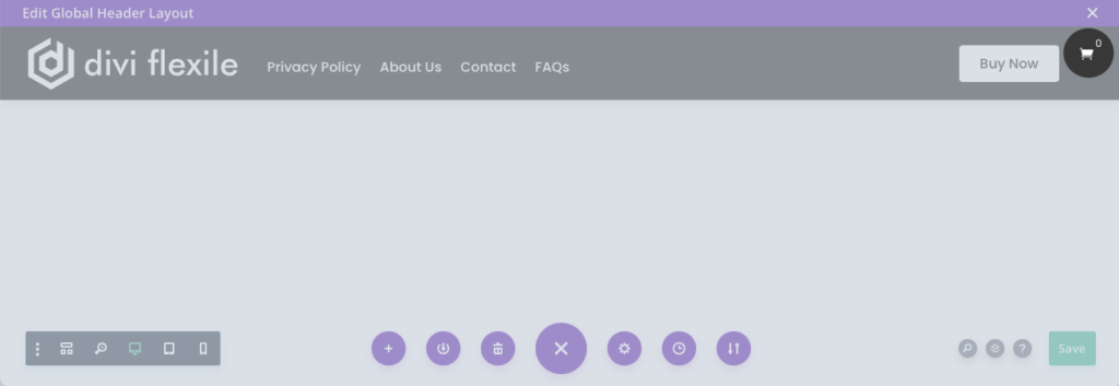
To use the Mini Cart module with Custom headers(Divi Theme builder headers), edit your header layout in Divi Theme Builder then add the module DCP Mini Cart as shown in the below screenshot, and save the changes. Further, you can apply design customization from the module settings.
Customisation of Module
Content Tab
Mini Cart
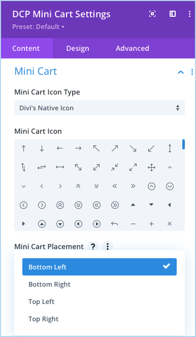
Mini Cart Icon Type: In this you have 2 icon type option Divi’s Native icon and other one is custom.
Mini Cart Placement: Here you can choose whether the mini cart should open. 4 options are listed here that is Bottom Left, Bottom Right, Top Left, Top Right.
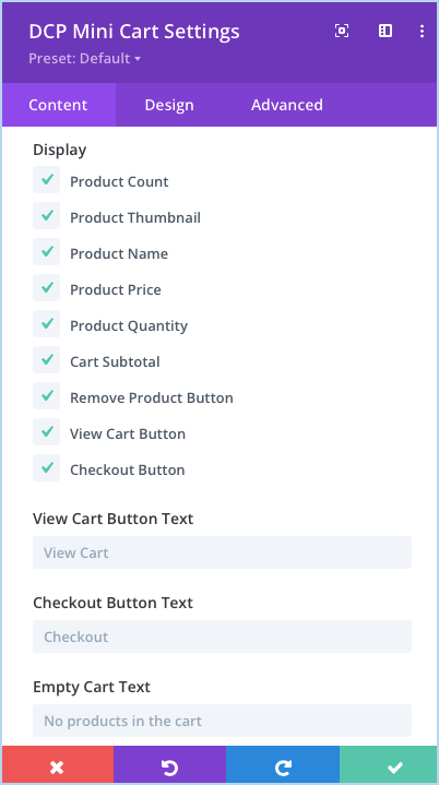
Display: Here we can choose the element you want to display in mini cart. Customisation of the element can be done in the design tab. These elements are:
- Product Count
- Product Thumbnail
- Product Name
- Product Price
- Product Quantity
- Cart Subtotal
- Remove Product Button
- View Cart Button
- Checkout Button
View Cart Button Text: Here you can input the text for View Cart Button.
Checkout Button Text: Here you can input the text to be used for Checkout Button Text.
Empty Cart Text: Input the text for Empty Cart text here.
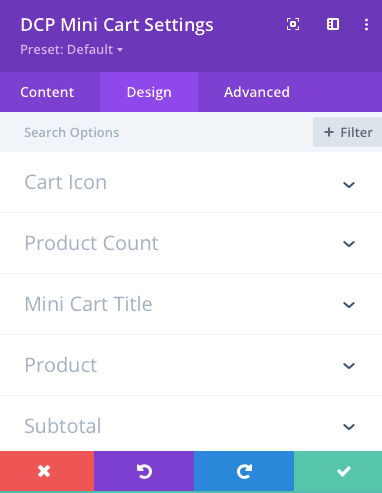
Design Options
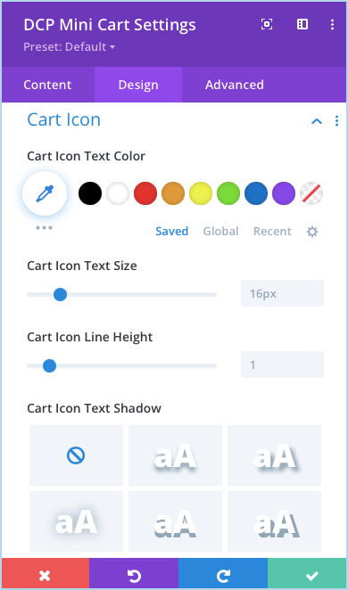
Cart Icon: Here you can perform all the customisation associated with cart icon like icon color, size, height, shadow.
Same as Cart Icon you can customise Product Count, Mini Cart Title, Product, and Subtotal elements all the design options available under the Design tab of the module setting.
View Cart Button
How to style View Cart Button: Go to Design tab >> View Cart Button >> enable the setting Use Custom Styles For View Cart Button.
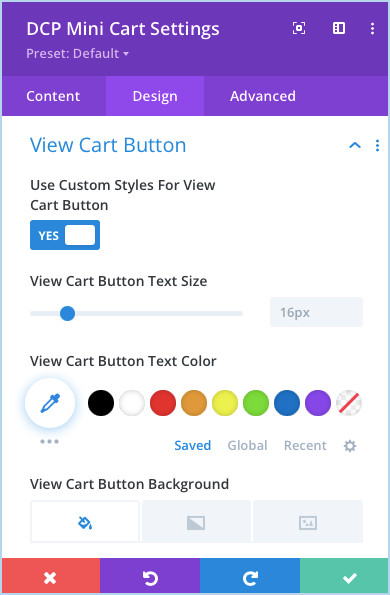
After enabling the option you can cusomize the button text size, color, background, button border color, radius, letter spacing, button font, wight style, also you can show icon with the button.
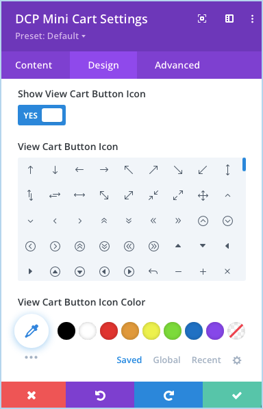
How to use icon with View Cart Button: Go to Design tab >> View Cart Button >> enable the setting Show View Cart Button Icon
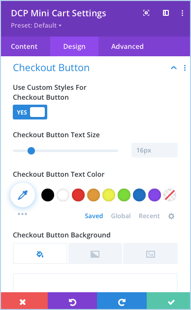
Checkout Button Icon
To style the Checkout Button Icon go to module setting >> Design Tab >> Checkout Button >> Enable the Use Custom Styles For Checkout Button.
Here you can perform all the styles options related to Checkout Button.
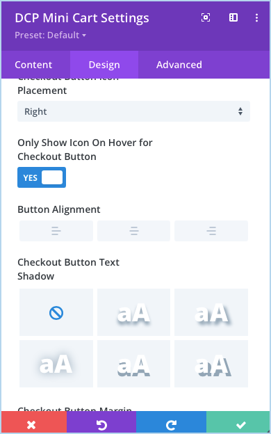
Show Icon On Hover: If you want to display the icon only on hover, enable the Only Show Icon On Hover for Checkout Button