Search Gravity Forms Styler for Divi Documentation
Search for answers or browse our knowledge base.
How to configure and style
Content Tab
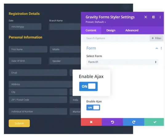
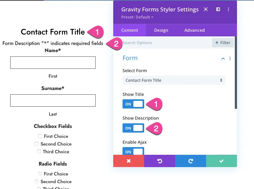
Form
Module setting >> Content Tab >> Form
Select Form: All forms created with Gravity Forms will appear here. You can choose the form to display and customize it.
Show Title: Here, you will have the option to enable or disable the form title.
Show Description: Enable to display the form description.
Enable Ajax: To make the ajax enable on the form, set it as ON.
Design Tab
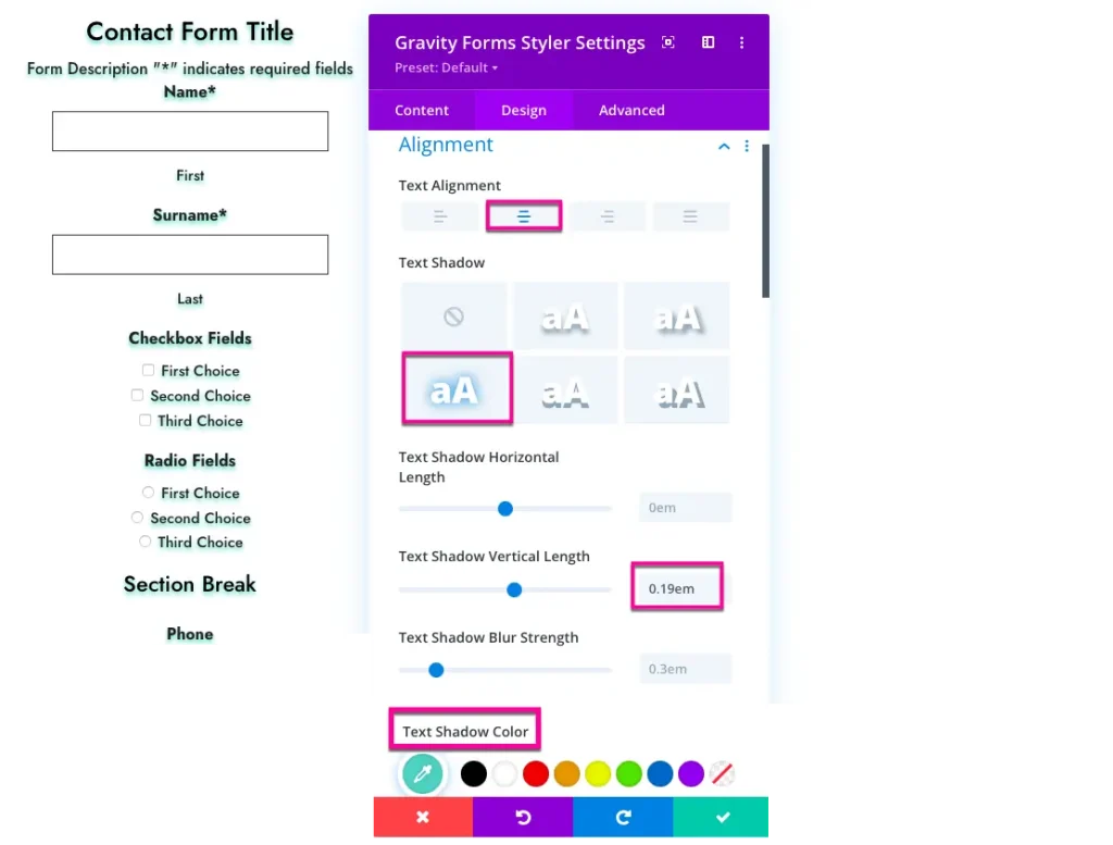
Alignment
Module setting >> Design Tab >> Alignment
Text Alignment: Using this you can control text alignment as left, right, center, or justify.
Text Shadow: Here you have text shadow options and to disable the text shadow style choose the option None.
Form Title
Module setting >> Design Tab >> Form Title
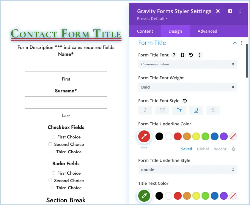
Here you have complete customization control over the form title. Following settings are available in the form title section
- Font
- Font Weight,
- Style
- Color
- Size
- Letter Spacing
- Line Height
- Shadow
Description
Module setting >> Design Tab >> Form Description
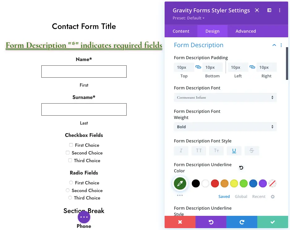
In the form description setting area, you can set the padding in the description and style the text font as well.
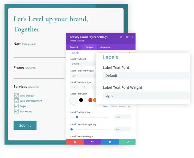
Labels
Module setting >> Design Tab >> Labels
To give advanced styling to the form labels, set the desired setting here.
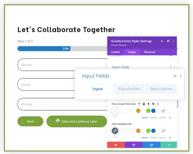
Input Fields
Module setting >> Design Tab >> Input Fields
In this setting field, you can set the customization for Input, Placeholder, and Description text.
Required Text
Module setting >> Design Tab >> Required Text
This section introduces the customizations for the required text.
Field Instructions
Module setting >> Design Tab >> Field Instructions Text
Here you can give the style to the instructions text.
Radio Fields
Module setting >> Design Tab >> Radio Fields
To add custom styling in the radio fields enable the option Use Custom Styling.
Checkbox
Module setting >> Design Tab >> Checkbox Fields
Just like the radio button, you have to enable the Use Custom Styling setting in the Checkbox to add advanced styling.
Dropdown
Module setting >> Design Tab >> Dropdown Fields
In this section, you can give a different style to the Selected and Option text.
Text Area
Module setting >> Design Tab >> Textarea Field
Here you can set Textarea fields’ height. Default value is 150px.
Upload Fields
Module setting >> Design Tab >> Upload Fields
This section introduces the customizations for upload fields. The options enabled in this setting are as follows:
Upload Field Background
- Padding
- Text Font
- Font Weight
- Style
- Text Color
- Text Font Size
- Text Letter Spacing
- Text Line Height
Next Previous Buttons
Module setting >> Design Tab >> Next/Previous Buttons
This offers the option to style the margin, padding, and background of the next and previous buttons. And also you can customize the button text.
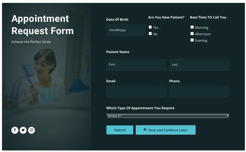
Submit Button
Module setting >> Design Tab >> Submit Button
Here you can customize the submit button according to your website theme.
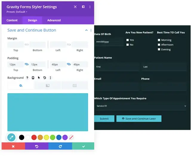
Save and Continue
Module setting >> Design Tab >> Save and Continue Button
This section introduces the customization for the save and continue button that includes button margin, padding, and button text customization.
Success/Error Message
Module setting >> Design Tab >> Success/Error Message
Various styling options are available here for the Success and Error